-
Notifications
You must be signed in to change notification settings - Fork 71
New issue
Have a question about this project? Sign up for a free GitHub account to open an issue and contact its maintainers and the community.
By clicking “Sign up for GitHub”, you agree to our terms of service and privacy statement. We’ll occasionally send you account related emails.
Already on GitHub? Sign in to your account
Title stays sticky #3187
Comments
|
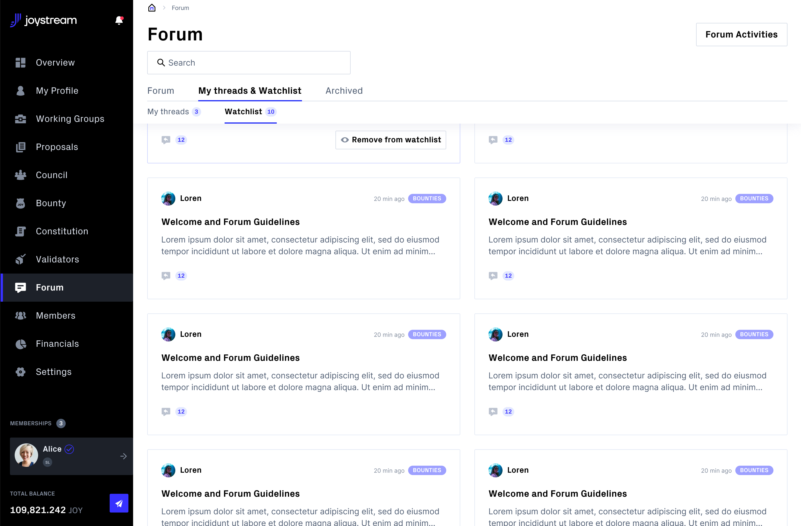
@MattAugustynowicz @dmtrjsg For now we’re using generic components for the header. It’s the same for proposals, forums etc. Based on the designs we should add sticky functionality, white background etc. Should we implement it for all views or only for forum ( if we add it only for the forum general look will be inconsistently, but up to you) |
|
@MattAugustynowicz can we look into this please and perhaps consider maintaining the off-white (light grey) header for consistency, or do you have smth else in mind to enable sticky header for Threads only? |
|
@dmtrjsg I think all headings should be sticky. This would allow quick access to go back to the previous screen (if someone would not like to use the native browser option), or perform a contextual action such as creating a bounty, or adding a new proposal. I think we talked about this in one of the first meetings, that it should be sticky |
|
Thank you for the analysis! @MattAugustynowicz can you pls paste it here for hte record?] This sounds a little more than we had the allowance for for general UX rn. While it sure does make sense, perhaps shall be parked for now as will not be insignificant.. 🙂 Sticky first level categories.. I am not sure tbf I have not ever seen this pattern 😞 Let’s just park this one for now..? |
|
@dmtrjsg Sure. Uploading a short version "It looks very good when we have only one nesting, i.e. these first level tabs. The moment we have the second level navigation it actually takes up some space. We could of course taper their top and bottom padding a bit so they don’t take up 1/3 of the screen when scrolling, but it still doesn’t look the most attractive. At this point, the second level navigation would need to be redesigned to make this screen work and look as it should We could make it so that only the first level navigation is sticky. Then we will achieve a victory in terms of visibility of contextual buttons, but as Dmitry also wrote, this will not be the best solution in terms of usability and user perception when part of the navigation disappears |


Make a sticky header on Forum Thread Page > FIGMA LINK
The text was updated successfully, but these errors were encountered: