Cannot generate data with cluster structure #14
Comments
|
let's start with the clean simulated data (i.e. before adding technical noise). The clean data, since represents the true mRNA levels in each cell, does not requires library size normalization. So, you can try using the clean simulated data, as it is, for clustering. Also, it would be good if you could first run PCA on the clean data to extract the first few PCs (e.g. top 20 PCs) and then use that as an input for UMAP. Also can you color the cells according to their cell type assignment so that we could see the global structure. Please make these changes and let me know how the results look like. After that we can move to noisy simulated data. |
|
Ok it shows me something like this: sim = sergio(number_genes=100, number_bins = 9, number_sc = 300, noise_params = 1, decays=0.8, sampling_state=15, noise_type='dpd')
sim.build_graph(input_file_taregts ='data_sets/De-noised_100G_9T_300cPerT_4_DS1/Interaction_cID_4.txt', input_file_regs='data_sets/De-noised_100G_9T_300cPerT_4_DS1/Regs_cID_4.txt', shared_coop_state=2)
sim.simulate()
expr = sim.getExpressions()
expr_clean = np.concatenate(expr, axis = 1)
anno = [np.array([str(x)] * 300, dtype=np.object) for x in range(9)]
anno = np.concatenate(anno, axis = 0)
# Plot
from sklearn.decomposition import PCA
from sklearn.manifold import TSNE
from umap import UMAP
import matplotlib.pyplot as plt
pca_op = PCA(n_components = 20)
tsne_op = TSNE(n_components = 2)
umap_op = UMAP(n_components = 2, min_dist = 0.4, n_neighbors = 15)
counts_true = expr_clean.T
x_pca = pca_op.fit_transform(counts_true)
x_umap = tsne_op.fit_transform(x_pca)
fig = plt.figure(figsize = (10, 7))
ax = fig.add_subplot()
colormap = plt.get_cmap("Paired")
for i, clust in enumerate(np.sort(np.unique(anno))):
idx = np.where(anno == clust)[0]
ax.scatter(x_umap[idx, 0], x_umap[idx, 1], color = colormap(i), label = clust)
ax.legend() |

|
Can you try log1p transformation on the clean simulated data before applying PCA? i.e. first transform the clean data with log(1+data) then apply PCA followed by UMAP or tSNE. Let me know the results. |
|
Yes, here is the result: The code that I used, the simulation part is from the sim = sergio(number_genes=100, number_bins = 9, number_sc = 300, noise_params = 1, decays=0.8, sampling_state=15, noise_type='dpd')
sim.build_graph(input_file_taregts ='data_sets/De-noised_100G_9T_300cPerT_4_DS1/Interaction_cID_4.txt', input_file_regs='data_sets/De-noised_100G_9T_300cPerT_4_DS1/Regs_cID_4.txt', shared_coop_state=2)
sim.simulate()
expr = sim.getExpressions()
expr_clean = np.concatenate(expr, axis = 1)
anno = [np.array([str(x)] * 300, dtype=np.object) for x in range(9)]
anno = np.concatenate(anno, axis = 0)
from sklearn.decomposition import PCA
from sklearn.manifold import TSNE
from umap import UMAP
import matplotlib.pyplot as plt
pca_op = PCA(n_components = 20)
tsne_op = TSNE(n_components = 2)
umap_op = UMAP(n_components = 2, min_dist = 0.4, n_neighbors = 15)
counts_true = expr_clean.T
# counts_true = counts_true/np.sum(counts_true, axis = 1)[:, None] * 100
counts_true = np.log1p(counts_true)
x_pca = pca_op.fit_transform(counts_true)
x_umap = tsne_op.fit_transform(x_pca)
fig = plt.figure(figsize = (10, 7))
ax = fig.add_subplot()
colormap = plt.get_cmap("Paired")
for i, clust in enumerate(np.sort(np.unique(anno))):
idx = np.where(anno == clust)[0]
ax.scatter(x_umap[idx, 0], x_umap[idx, 1], color = colormap(i), label = clust)
ax.legend() |

|
mmm ... it looks strange. Can you try simulating another GRN (the one with 400 genes). Also can you plot the umap results (I think your plots above are for tSNE). |
|
Yes, it seems to be better for 400 genes. sim = sergio(number_genes=100, number_bins = 9, number_sc = 300, noise_params = 1, decays=0.8, sampling_state=15, noise_type='dpd')
sim.build_graph(input_file_taregts ='data_sets/De-noised_100G_9T_300cPerT_4_DS1/Interaction_cID_4.txt', input_file_regs='data_sets/De-noised_100G_9T_300cPerT_4_DS1/Regs_cID_4.txt', shared_coop_state=2)
sim.simulate()
expr = sim.getExpressions()
expr_clean = np.concatenate(expr, axis = 1)
anno = [np.array([str(x)] * 300, dtype=np.object) for x in range(9)]
anno = np.concatenate(anno, axis = 0)
from sklearn.decomposition import PCA
from sklearn.manifold import TSNE
from umap import UMAP
import matplotlib.pyplot as plt
pca_op = PCA(n_components = 20)
# tsne_op = TSNE(n_components = 2)
umap_op = UMAP(n_components = 2, min_dist = 0.4, n_neighbors = 50)
counts_true = expr_clean.T
# counts_true = counts_true/np.sum(counts_true, axis = 1)[:, None] * 100
counts_true = np.log1p(counts_true)
x_pca = pca_op.fit_transform(counts_true)
x_umap = umap_op.fit_transform(x_pca)
fig = plt.figure(figsize = (10, 7))
ax = fig.add_subplot()
colormap = plt.get_cmap("Paired")
for i, clust in enumerate(np.sort(np.unique(anno))):
idx = np.where(anno == clust)[0]
ax.scatter(x_umap[idx, 0], x_umap[idx, 1], color = colormap(i), label = clust)
ax.legend() |

|
May I know why there are line-like structures? Feels like it still hasn't reached the steady-state. Should I add more
|

|
Great, for 100 genes I think you should lower the "noise_params" (maybe setting it to 0.1 or 0.3 instead of 1). The line-like structure is due to the clean nature of simulated data, after adding technical noise you will get more familiar structures. I think you don't need to add safety steps, simulations are already started from regions close to steady-state region. After adding technical noise, you need to do all standard normalizations including library size normalizations followed by log1p transformation. |
|
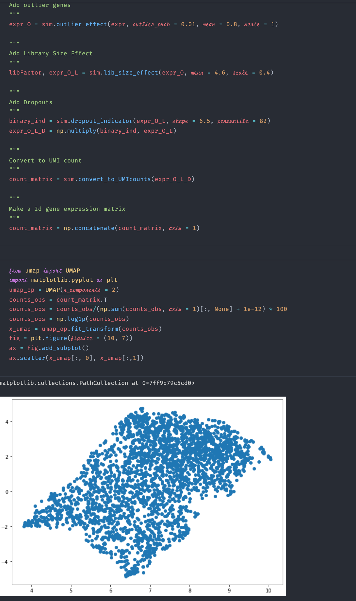
Ok after I reduce the """
Add outlier genes
"""
expr_O = sim.outlier_effect(expr, outlier_prob = 0.01, mean = 0.8, scale = 1)
"""
Add Library Size Effect
"""
libFactor, expr_O_L = sim.lib_size_effect(expr_O, mean = 4.6, scale = 0.4)
"""
Add Dropouts
"""
binary_ind = sim.dropout_indicator(expr_O_L, shape = 6.5, percentile = 82)
expr_O_L_D = np.multiply(binary_ind, expr_O_L)
"""
Convert to UMI count
"""
count_matrix = sim.convert_to_UMIcounts(expr_O_L_D)
"""
Make a 2d gene expression matrix
"""
count_matrix = np.concatenate(count_matrix, axis = 1) |


|
And I normalized and log-transformed the observed count from umap import UMAP
import matplotlib.pyplot as plt
umap_op = UMAP(n_components = 2, min_dist = 0.1)
counts_obs = count_matrix.T
counts_obs = counts_obs/(np.sum(counts_obs, axis = 1)[:, None] + 1e-6)* 100
counts_obs = np.log1p(counts_obs)
x_umap = umap_op.fit_transform(counts_obs)
fig = plt.figure(figsize = (10, 7))
ax = fig.add_subplot()
colormap = plt.get_cmap("Paired")
for i, clust in enumerate(np.sort(np.unique(anno))):
idx = np.where(anno == clust)[0]
ax.scatter(x_umap[idx, 0], x_umap[idx, 1], color = colormap(i), label = clust)
ax.legend() |
|
Can you plot UMAP instead? Also, incorrect noise parameters can result in excessive technical noise which in turn causes inaccurate low-dimensional representation. You can read the noise parameters used for each data from the supplementary files of the paper. I'll soon add to the github a python script for optimization of noise parameters with respect to a provided real data. |
|
Ok I tried adjusting the technical noise parameters. I changed the |

|
Reducing dropout percentile from 82 to ~65 or so should also result in good clusters (even without changing "library_size_effect"). The parameters of technical noise should be tuned with respect to a user-defined real data (such that certain statistical measures of real and simulated data become comparable.) I'll soon add an automated python script for such an optimization. |
|
Hello! |
Hi,
I wish to use sergio to benchmark the data imputation method. When I run the
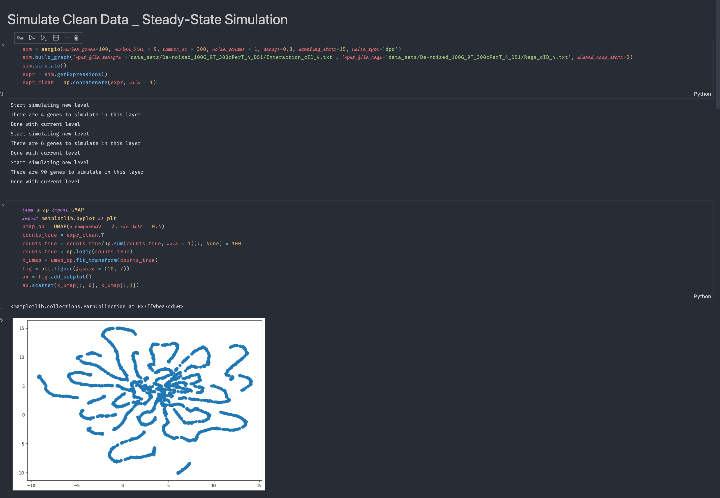
run_sergio.ipynbexample and visualize the clean expression data, I cannot see any clear cluster structure from the visualization (there should be 9 clusters according to the setting in the example function if I understand the readme file correctly). Please see the screenshot below for the code and visualization result:I also visualize the data after adding technical noise, still there is no cluster structure:
May I know how I can fix the problem? Thanks!
The text was updated successfully, but these errors were encountered: