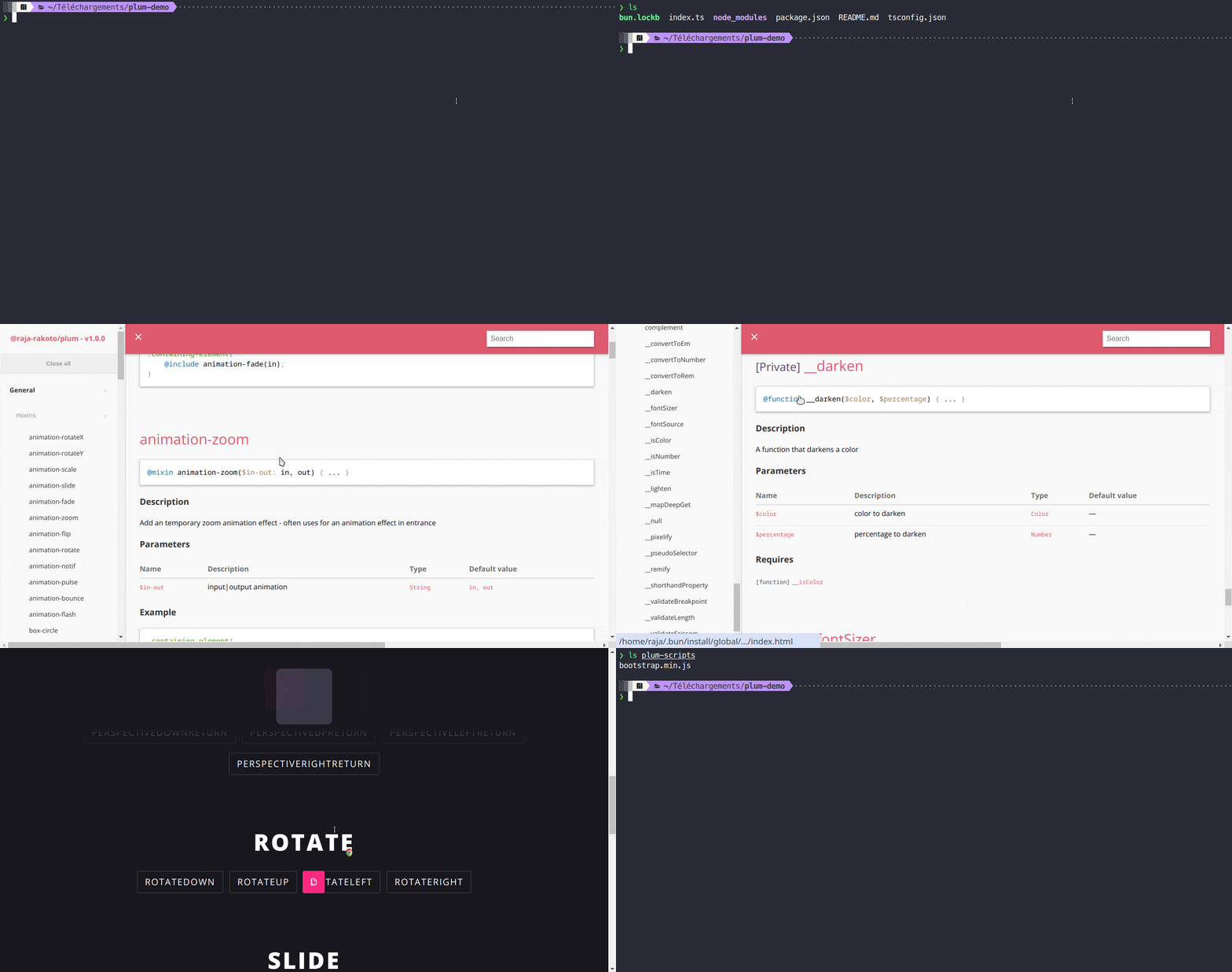
Accelerate your website customization process with PLUM — an efficient mixins toolset driven by SASS. Easily generate uniform, adaptable CSS stylesheets, regardless of project magnitude. Seamlessly incorporate third-party modules like animate, buttons2, flex, grid, hover2, magic, buttons, open-color, shadows ... Enjoy effortless integration with popular CSS frameworks such as Bootstrap for enhanced versatility.
Additional tools such as Plum CLI and Plum Extension for VSCode are utilized to enhance the use of Plum package.
You can use Plum CLI to install Plum package in your project:
npm install -g @raja-rakoto/plum-cliExecute the following command to start CLI:
plum-cliIf you use sass package for compiling your SCSS files, you can incorporate the following command in your package.json file to enable SCSS file monitoring:
"scripts": {
  "watch:sass": "sass --watch style.scss:style.css --load-path=node_modules --style=compressed"
},Plum's main attributes are consolidated through a mix of diverse mixins and useful functions that users can conveniently access offline via the plum CLI, facilitating easy access to the official documentation.
Here are some simple examples of different ways to use Plum (you can refer to all use cases in the plum-cli documentation):
@import "@raja-rakoto/plum/plum";

@include minireset();
@include normalize();
@include antialias();
@include typo-fontface(
	"Quicksand-regular",
	"./src/assets/fonts/Quicksand-regular.ttf"
);

.box {
	width: __convertToRem(100px);
	height: __convertToEm(150px);
	color: __color-pastel(blue);
}

.zoom-in {
	@include animation-zoom($in-out: in);
}

.box-debug {
	@include box-debugging(
		$colors: red,
		$size: 3px,
		$bg-color: false,
		$status: true
	);
}

.opacity-50 {
	@include effect-opacity($percent: 50%);
}

img {
	@include image-responsive($height: auto);
}

.video-element {
	@include video-responsive("4/3");
}

@include input-all(hover) {
	background-color: orangered;
}

@include button-all {
	background-color: teal;
	color: white;
}

.containing-element {
	@include position-set(sticky, null 30px null 30px);
}

.containing-element {
	@include spacing-padding-size(small);
}

.parent-element {
	@include clearfix;
}

.parent-element {
	@include columnize(4);
	.item {
		background-color: silver;
	}
}

.element {
	@include flex-box();
}

.element {
	@include flex-wrap(wrap-reverse);
}

.containing-element {
	@include breakpoint(only, 1200px) {
		background-color: teal;
	}
}

.main-container {
	@include adaptive();
}

.wrapper {
	.item {
		@include except(first) {
			background-color: dodgerblue;
			color: #eee;
		}
	}
}

.wrapper {
	.item {
		@include only(last) {
			background-color: dodgerblue;
			color: #eee;
		}
	}
}

.wrapper {
	@include overflow-wrap();
}

@include loadify(init);

img {
	@include loadify(0.5s); // note: you must initialize the loadify before
}

.containing-element {
	@include mobile(iPhoneX) {
		background-color: teal;
	}
}

.containing-element {
	@include tablet(iPadPro) {
		background-color: teal;
	}
}

.containing-element {
	@include resizable();
}

.containing-element {
	@include sizer(400px);
}

.element {
	@include trbl(55px, null, null, 15px);
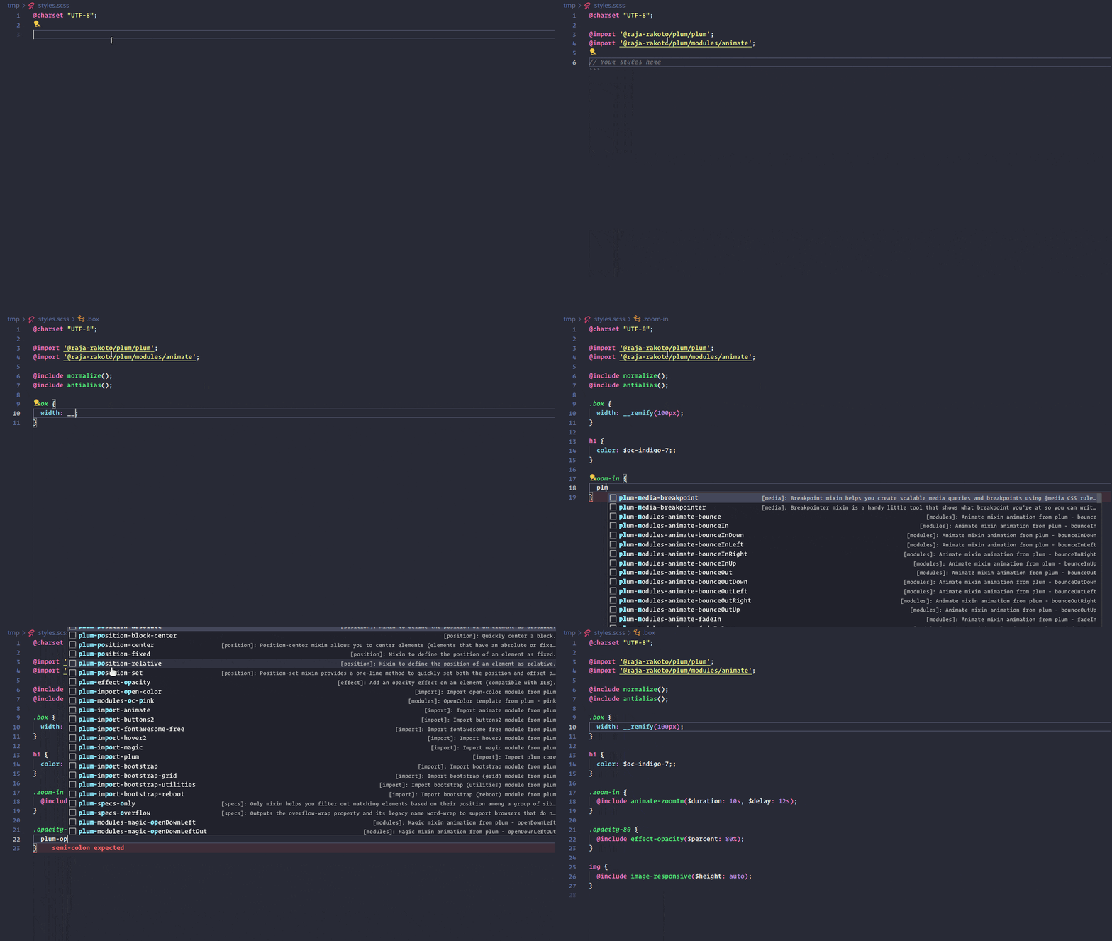
}Plum simplifies its utilization through a dedicated VSCode extension, encompassing a variety of code snippets. These snippets facilitate swift code generation for invoking mixins, functions, modules, frameworks, and more ...
Usage: You can install it by typing "plum" in the extension tab of your IDE
Prefix: The extension of Plum includes a particular "prefix" to better organize and classify its snippets:
plum-[category]-[name...] // e.g: plum-modules-oc-grape[category]: These keywords serve as quick references for identifying the appropriate snippets to utilize. Here are the examples of categories (you can see the full list in the extension):
- import
- modules
- specs
- animation
- box
- effect
- input
- image
- position ...
[name]: This designation denotes a mixin, function, module, or framework name. It acts as a quick identifier for the specific code snippet you wish to employ. For example, if you're opting for the "blue" color scheme, simply typing "plum-blue" will prompt the extension to suggest "plum-modules-oc-blue" for your selection.
Here are the lists of third-party modules, applications, and scripts that you can use with Plum:
The "module" tag signifies libraries or frameworks that can be imported into your SASS file using the @import directive. Meanwhile, "app" tag refer to a collection of tools that enable you to access documentation or generate code. Lastly, the "script" tag indicates that it requires a JavaScript file to be functional. All are available on plum CLI.
Animate (module + app): A collection of CSS animations to make your website more attractive !
@import "@raja-rakoto/plum/modules/animate";
.bounce-in-left {
	@include animate-bounceInLeft($duration: second, $delay: second);
}
Magic (module + app): Magic CSS are a set of simple animations to include in your web or app project's.
@import "@raja-rakoto/plum/modules/magic";
.open-up-left {
	@include magic-openUpLeft($duration: second, $delay: second);
}
Buttons2 (module + app + script): A highly customizable production ready mobile web and desktop css button library.
@import "@raja-rakoto/plum/modules/buttons2";
@include buttons2-borderless();
Hover2 (module + app): A collection of CSS3 powered hover effects to be applied to links, buttons, logos, SVG, featured images and so on. Easily apply to your own elements, modify or just use for inspiration.
@import "@raja-rakoto/plum/modules/hover2";
@include hover2-2d-transitions-shrink();
Open color | oc-scheme (module + app): Open-source color scheme optimized for UI like font, background, border and more ...
@import "@raja-rakoto/plum/modules/open-color";
h1 {
	color: $oc-green-5;
}
Fontawesome (module): The web's most popular icon set and toolkit.
@import "@raja-rakoto/plum/modules/fontawesome-free";Bootstrap (module + script): Plum integrates the sass source code of Bootstrap 5 in order to partially use its functionalities. You have 4 choices:
@import "@raja-rakoto/plum/modules/bootstrap";
@import "@raja-rakoto/plum/modules/bootstrap-grid";
@import "@raja-rakoto/plum/modules/bootstrap-reboot";
@import "@raja-rakoto/plum/modules/bootstrap-utilities";
Flex (app): Generate flexbox CSS code to make dynamic layouts !
Grid (app): Generate basic CSS Grid code to make dynamic layouts !
Buttons (app) : Generate stylish buttons in css !
Shadows (app): Collection of shadow variants for your boxes !
Start
- 📜
start- Run your application with bun. - 📜
start:smol- Run your application with bun and a flag which configures the JavaScriptCore heap size to be smaller and grow slower. - 📜
start:bin- Run your standalone binary app.
Clean
- 📜
clean- Remove coverage data, prod, build.
Development
- 📜
dev- Launch your application in development mode with bun. - 📜
dev:watch- Interactive watch mode to automatically transpile source files with bun in development. - 📜
dev:hot- Hot reloading of source files with bun in development. - 📜
dev:smol:watch- Interactive watch mode to automatically transpile source files with bun in development, while using --smol flag. - 📜
dev:smol:hot- Hot reloading source files with bun in development, while using --smol flag.
Build
- 📜
build- Transpile and bundle source files with bun. - 📜
build:watch- Interactive watch mode to automatically transpile source files with bun. - 📜
build:bin- bun's bundler implements a --compile flag for generating a standalone binary from a TypeScript or JavaScript file, use this in your production environment to ensure optimal execution of your app.
Testing
- 📜
test:plum- Run the watched file for sass testing. - 📜
test:unit- Run bun test. - 📜
test:unit:watch- Interactive watch mode to automatically re-run tests with bun.
Documentation
- 📜
documentation- Generate offline docs with Sassdoc
Linting and Formatting
- 📜
prettier- Reformat source files with Prettier. - 📜
biome:start- Starts the Biome daemon server. You can specify a custom configuration file path using the--config-pathoption. - 📜
biome:stop- Stops the Biome daemon server. - 📜
biome:fix- Runs a source code check and applies automatic fixes (linter & formatter) according to the defined rules. - 📜
biome:unsafe- Works likebiome:fix, but may apply more invasive or risky changes.
Backup and Dependency Management
- 📜
backup- Backup files with Grunt. - 📜
pkg-check- Check useless dependencies with depcheck. - 📜
pkg-upgrade- Upgrade outdated dependencies (interactive mode) with npm-check-updates.
Versioning
- 📜
versioning- Start ungit server.
npm Commands
- 📜
npm-version:major- Increments the major version number of your project using npm. - 📜
npm-version:minor- Increments the minor version number of your project using npm. - 📜
npm-version:patch- Increments the version patch number of your project using npm. - 📜
npm-publish- Publish your npm package with public access. - 📜
npm-unpublish- Forcefully unpublish the plum package from npm. - 📜
npm-reset:registry- Delete the custom npm registry. - 📜
npm-check:registry- Get the currently configured registry for npm. - 📜
npm-proxy-set:registry- Set the npm registry to use a local proxy. - 📜
npm-proxy:start- Start a Verdaccio server with a local npm proxy. - 📜
npm-login- Login to a registry user account. - 📜
npm-proxy:publish- Publish your npm package via the local proxy. - 📜
npm-proxy:unpublish- Forcefully unpublish the plum package from the npm registry via the local proxy. - 📜
npm-proxy:republish- Republish your npm package by first unpublishing it and then publishing it again via the local proxy.
scripts (utils)
- 📜
script:global-docs- Generate README.md for documentation - 📜
script:global-charset- Adds the @charset "UTF-8" declaration at the beginning of all SCSS files in the project. - 📜
script:hover-comment- Used to remove the first line of a SCSS file if it starts with a comment.


