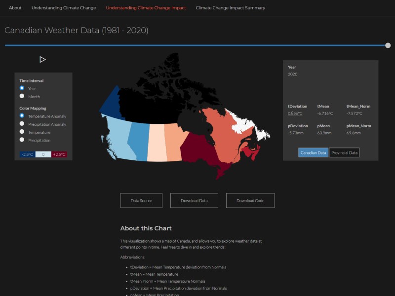
A website that uses D3.js to visually analyze climate change data. Data visualizations include line charts and stacked area charts of global climate change data, as well as a detailed choropleth map and other visualizations of Canadian weather data.
- Robert Michels
- Radu Orlandea
- Developed as part of the Introduction to Visual Analytics course IAT 355, at Simon Fraser University.