-
Notifications
You must be signed in to change notification settings - Fork 4.2k
New issue
Have a question about this project? Sign up for a free GitHub account to open an issue and contact its maintainers and the community.
By clicking “Sign up for GitHub”, you agree to our terms of service and privacy statement. We’ll occasionally send you account related emails.
Already on GitHub? Sign in to your account
Adjust borders on block-level controls in the Toolbar #25983
Comments
|
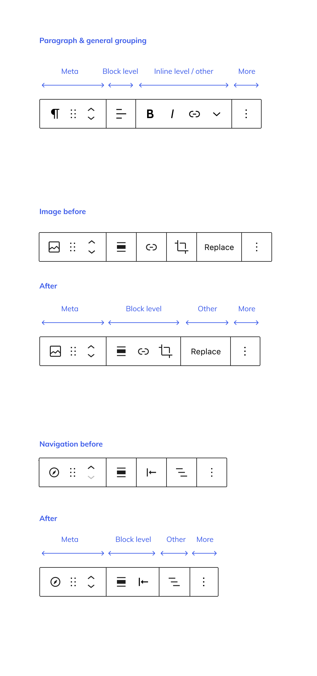
I took a little look at this and my current thinking is how far could we reduce the use of borders which would result in having much clearer groupings. Here is what just some look like currently to context. GroupingAs mentioned, the groupings naturally fall into the following. I would like to check my thinking on meta referring to document controls (moving within space), but this is what I think summarises a potential reduction here: In this case, if controls fell into that group, there would be no border. The outlayer here is the options section, which might be acceptable as additional information appended to the toolbar. There will need to be some working out of each case, but applying a pattern across all blocks seems like a good starting place. |
|
Great ticket. I've taken Tammies work above, and built upon it and expanded with some "before/after" ones, which I will take the liberty of updating the main ticket with. Note that this is about toolbar groupings in the design sense. There are some underlying tech issues that need to be addressed in order to make this happen to solve this PR. As already proposed by Matías and Tammie, I've embraced these 4 section descriptors:
Mockup: In the above mockup, the Paragraph already has correct groupings. Image and Navigation need a little work. Related issues:
|
|
This is really great, makes the grouping so much clearer 👍 Can it be picked up for 5.7? |
…trols

This takes a first stab at creating new documentation for block toolbar group best practices.

See also #25983.
|
Closing this as done. |


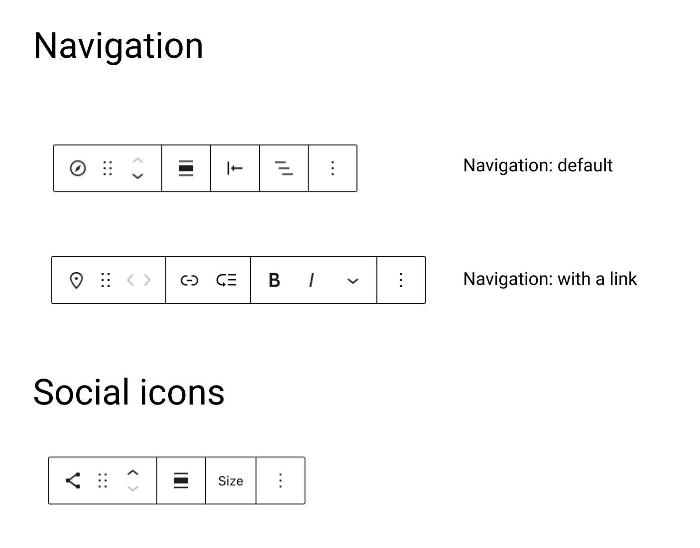
The semantic groupings we have in the toolbar — meta, block level, inline — should also have a visual representation with the borders. Right now separate block level controls have different representations, including cases like Navigation where every single one has borders.
Here's a before and suggested after:
The text was updated successfully, but these errors were encountered: