-
Notifications
You must be signed in to change notification settings - Fork 4.2k
New issue
Have a question about this project? Sign up for a free GitHub account to open an issue and contact its maintainers and the community.
By clicking “Sign up for GitHub”, you agree to our terms of service and privacy statement. We’ll occasionally send you account related emails.
Already on GitHub? Sign in to your account
Add FontSizePicker component to Storybook #18149
Conversation
|
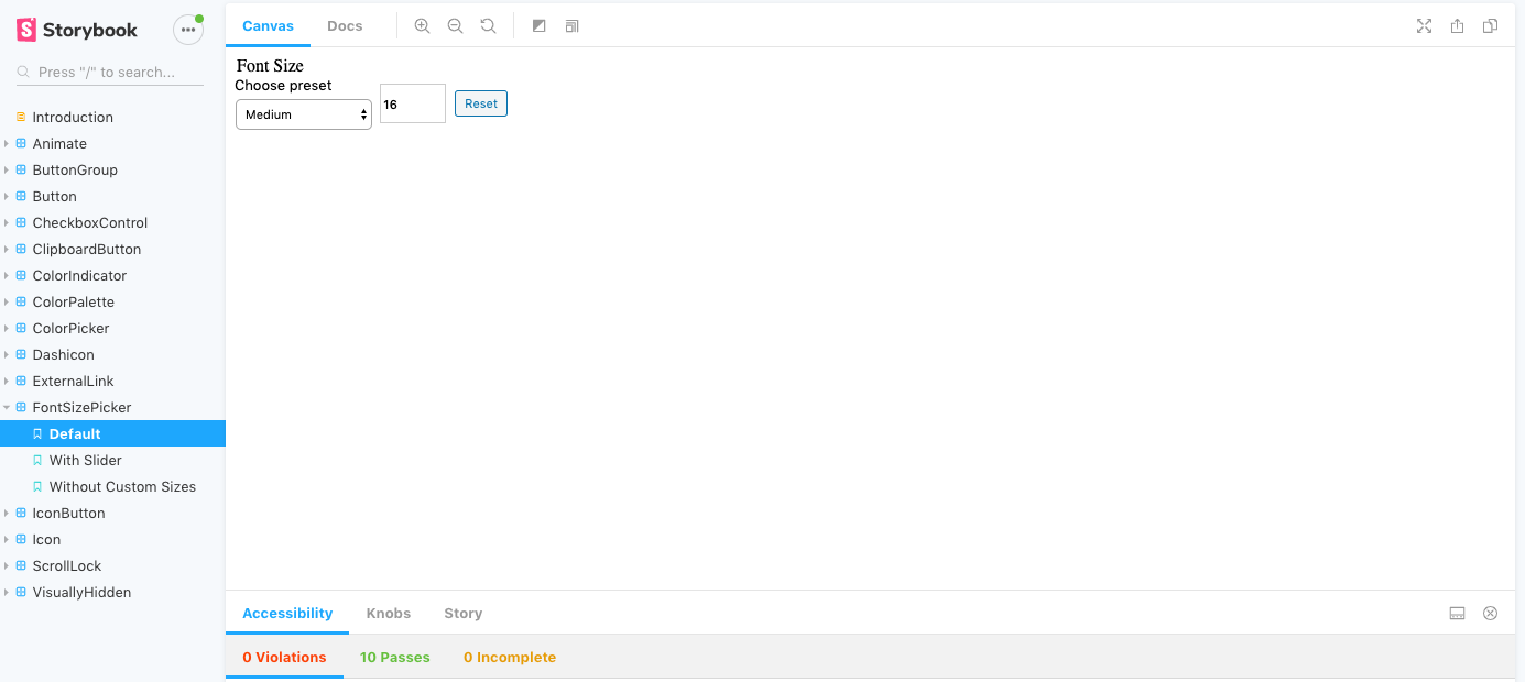
Hmm, this story is not looking right from a design perspective, is there a step I am missing for importing CSS from somewhere @gziolo? Still pretty new to working with Storybook. |
All styles should be included with the following import statement:
I filed an issue that describes very similar issues with the |
|
The "Choose preset" text will be fixed with #18165 which converts the base-control to use VisuallHidden component |
There was a problem hiding this comment.
Choose a reason for hiding this comment
The reason will be displayed to describe this comment to others. Learn more.
Looks good, a couple minor changes and it'll be good to go
9c50eb8 to
89c1d02
Compare
| export default { title: 'FontSizePicker', component: FontSizePicker }; | ||
|
|
||
| const FontSizePickerWithState = ( { ...props } ) => { | ||
| const [ fontSize, setFontSize ] = useState( 16 ); |
There was a problem hiding this comment.
Choose a reason for hiding this comment
The reason will be displayed to describe this comment to others. Learn more.
Actually, you could use knobs with the value and the fontSizes. This way folks could play with the default font size and all the possible font sizes provided. What do you think? @ItsJonQ will be able to help if that makes sense.
There was a problem hiding this comment.
Choose a reason for hiding this comment
The reason will be displayed to describe this comment to others. Learn more.
I added the fontSizes to a knob, but the value I left as it was. The default 16 is only used on page load, after which point the state takes over. Since changing a knob doesn't reload the component in storybook, there wouldn't be any point in making the value a knob. Because changing it wouldn't reload the component, and reloading the page would reset it to the initial value. Unless I am mistaken about something? (Which is entirely possible 😄 )
There was a problem hiding this comment.
Choose a reason for hiding this comment
The reason will be displayed to describe this comment to others. Learn more.
I gave it a spin and you are 100% correct. It isn't entirely what I assumed 🙂
Let's leave it as is. I need to double-check other stories and update those which set the initial state with knobs as it doesn't reload as you pointed out.
…e small code quality improvements
89c1d02 to
cb5da51
Compare
There was a problem hiding this comment.
Choose a reason for hiding this comment
The reason will be displayed to describe this comment to others. Learn more.
Let's merge it as. We will need to have another pass on the existing stories at some point and add some visuals. In this case, it could be helpful to have a text which dynamically changes when a new value is applied.
There are also two issues with the component I discovered while testing:


Description
Add the FontSizePicker component to Storybook as part of #17973.
Added with the following "stories":
Note: The last story brought to my attention a bug, which is in the process of being resolved in #18049. Once that is merged the story should look correct.
How has this been tested?
run
npm run design-system:devBrowse to the local Storybook instance
See FontSizePicker component is rendered with various options when selected in left-hand navigation
Types of changes
New feature (non-breaking change which adds functionality)