-
Notifications
You must be signed in to change notification settings - Fork 4.2k
New issue
Have a question about this project? Sign up for a free GitHub account to open an issue and contact its maintainers and the community.
By clicking “Sign up for GitHub”, you agree to our terms of service and privacy statement. We’ll occasionally send you account related emails.
Already on GitHub? Sign in to your account
Add 'insert from url' for image block #9264
Conversation
bea42f8 to
c079bc7
Compare
|
Thanks a lot for your hi-five 😍& sorry #4155 has become quite a mess to fix. |
|
@imath Not at all - these things happen. We really appreciate the time you've spent on it. |
|
Over having an input, could it be a button that opens to reveal an input? I do feel we're in danger of things getting a little complicated visually here. Before I mock that up what is the potential for that? |
It's important to note that this is using the same component as the video/audio/cover-image blocks to keep the same UI for all. If it's refactored, should it be done for all to keep them consistent? |
|
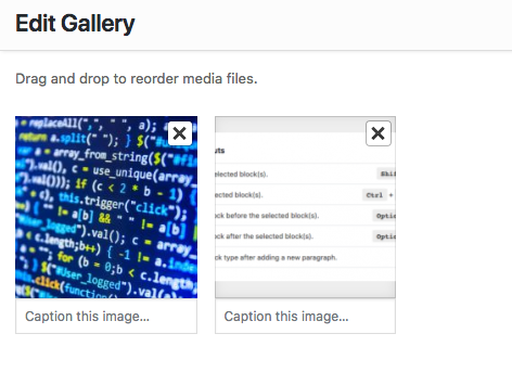
@brandonpayton also mentioned this morning that there would probably be issues when transforming to a gallery block from an image block with an external url, since the gallery block doesn't support external urls (at the moment it just ignores it and stays in the default state). Probably the best thing to do would be to make gallery blocks support external urls, though the UI around that is a little more complex - there's less space here: We also might not be able to show external images in the edit gallery dialog: Another option would be to prevent the user from transforming to a gallery if they're using an external url, but that might be a bit weird since the user wouldn't know why. |
Yes I think we should do my change for all. Apologies for dropping in and causing a change of direction but I think it would be better. |
c76aadf to
8934feb
Compare
|
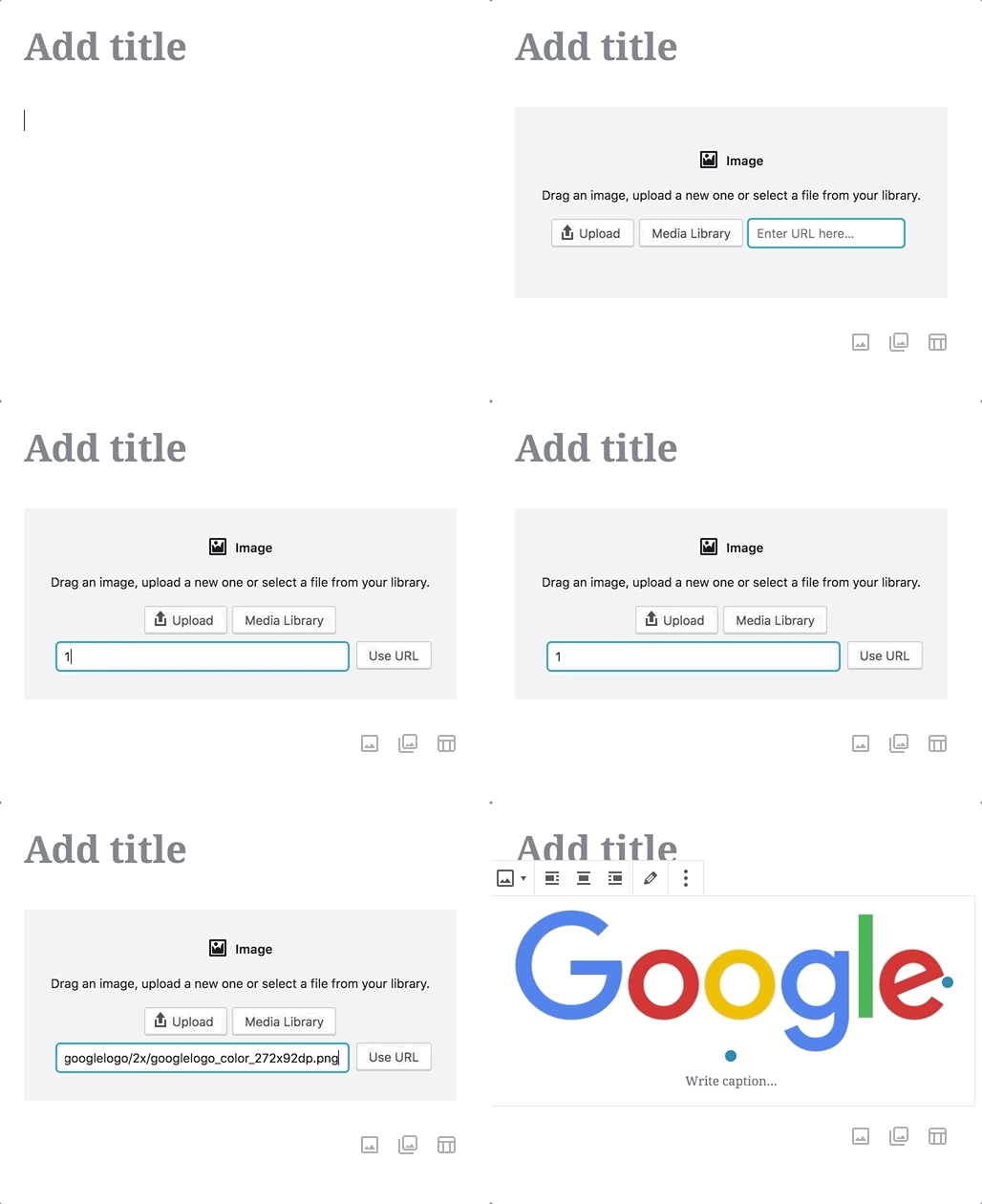
Hey @karmatosed! I've added a button to expand (and collapse) the url input. Here's a gif: Let me know what you think 😄 |
|
Thanks @talldan I think that's getting there. My only concern is the arrow down indicates a down action but it opens to the side. What other icons could be used to indicate this? |
|
I tried the right facing solid arrow, but it looks like a play button, so I've switched it to the chevron: Not sure if this is still quite right. Maybe we need something like this: There isn't anything like that in dashicons at the moment, so would need to add something new. |
|
Hey @karmatosed - if you get a chance, please could you take a look at the updated version of this in the gif above. I'm still not sure the arrows are quite right, let me know what you think. |
|
@talldan thanks for the work. I am so torn on the arrows here. They are better but because we don't use them anywhere else I am starting to get nervous about adding a new pattern. Let's get a second opinion! @jasmussen what do you think? |
|
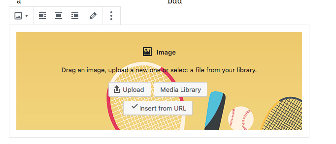
So, how about we take a different approach? Search fields can do magical things on focus. Like expand. So we could do this on the initial placeholder: Note how the search field is no wider than the text placeholder label. Then when you set focus in the search field, we do this: You can even do something like hide the "Use URL" button by default, and then do something like:
A separate button to expand/collapse feels like a headache we don't want. |
|
Just to throw out an alternate idea, what if there's an "Insert from URL" button that opens the modal with an "insert from URL" tab selected and have the UI there? Adds a little extra consistency too so the "Insert from URL" action is available in the modal, like the other two actions (upload/library). |
4796537 to
66f5215
Compare
|
Hi @jasmussen - thanks for the feedback. I had a test, and one thing to note is that if there's an input in a block, it becomes focused when the block is added. That causes the URL input to be expanded by default, which is undesirable. I tried a slightly different approach - having the url expand/collapse base on whether the input has any text entered. Here's a gif: IMO, it feels a little jarring that the input suddenly moves unexpectedly. |
|
@chrisvanpatten That seems like a good suggestion. I'll have to look into it. The modal itself is non-gutenberg code, so I'll have to track down where it comes from and what it's capable of. Will also have to make sure it works with the contributor role, as that's one of the aims for inserting via a url. |
|
Yep, a button that opened the existing UI could be a decent solution for now. |
|
@talldan in the non-Gutenberg media modal it shows up in the left panel: Not sure what would be required to make it a top tab though, instead of a side nav option. |
|
@chrisvanpatten I had a look into it but without much success. Not a lot of documentation for To apply the idea being discussed in that link to gutenberg would require quite a big rewrite of our media upload code - quite a lot of code for not much gain. What are the alternatives? We could always show a normal |
This reverts commit 6c8546c.
99aafbf to
72f302a
Compare
|
I rebased with |
|
Thanks for the comment @paaljoachim. This PR didn't change that functionality, it's worked the same way in the audio block since before this change, so I think you'd need to create a new issue to cover any changes you think need to be made. |
|
Thanks Daniel! @talldan |
* Extract isBlobURL into blob package and update usage

Co-authored-by: imath <math.viet@gmail.com>

* Add ability to insert an image in image block using a url

Co-authored-by: imath <math.viet@gmail.com>

* Position url input underneath upload file buttons and apply margin

Co-authored-by: imath <math.viet@gmail.com>

* Refactor styles to avoid use of element selector

Co-authored-by: imath <math.viet@gmail.com>

* Ensure form elements have bottom margin to separate them on tiny screens

Co-authored-by: imath <math.viet@gmail.com>

* Change type of block used in e2e test to a separator

As mentioned in the comment above, this test will not work for blocks that
contain an input. The image block now contains a url input field causing
the test to fail.

Co-authored-by: imath <math.viet@gmail.com>

* Fix invalid reference to this.isBlobURL

* Add expandable section for url form on media placeholder

* Change icon for media placeholder button to left/right chevron

* Update snapshots

* Try: expanding url input based on whether text is entered

* Try: use link popver for Insert from URL in media placeholder

* Implement URLPopover in MediaPlaceholder

* Use consistent declaration of defaults for props

* Use a generalized selector for buttons in the media placeholder

* Improve copy in URL input placeholder

* Make behaviour when selecting a differnent url the same as other media blocks

* Update snapshot tests

* Revert "Change type of block used in e2e test to a separator"

This reverts commit 6c8546c.

* Use onClose over onClickOutside (onClose implements onClickOutside)

* Rename functions

* Address code review feedback

* Update changelog for blob package

* Updated changelog for editor package


Description
Closes #1536
Depends on #10495
This PR is split from #4155 into a separate chunk to make it easier to review. Hi-five to @imath for all his hard work on this change! 🔥🔥🔥
Displays the 'Insert from URL' button for the image block. Makes the following changes:
How has this been tested?
Screenshots
Types of changes
New feature (non-breaking change which adds functionality)
Checklist: