In the current state of the world 🦠 and with many of us in lockdown, I thought it would be a good idea to put down Netflix for a bit, and build a COVID map similar to Hopkins Dashboard.
Our version will be simpler but it's up to you to include more features.
This is what we are going to build ⭐ https://mapbox-covid19.netlify.com/ ⭐. Thanks to Mapbox's ease of use this is a lot easier than you might think.
This will be a long tutorial but if you have no patience like me... here are all the links you need. You can also scroll to the bottom for an extended list of resources or click 👉 here.
🗒️NOTE: I will use React because it is my favourite framework/library and scss for writing css.
🔗Links:
- Live Demo
- Github Repo
- CodeSandbox(using the access key from Mapbox tutorial lol - might stop working at some point)
- COVID-19 API Data
Let's get started with the tutorial
| You can skip to each step using this menu.
- 1. Initial Setup
- 2. Setup Mapbox
- 3. Add COVID-19 data
- 4. Scale and colorize circles
- 5. Interpolate values to the dataset [2021 Update]
- 6. Add tooltips on hover
- 7. Complete Project
Ideally, you should clone this CodeSandbox which has everything setup, including the css and an empty map initialized.
{% codesandbox mapbox-covid19-init-3pg2t %}
But if you wish you can also use something like create-react-app:
# Create a new folder using create-react-app and cd into it
npx create-react-app mapbox-covid
cd mapbox-covid
# Packages to use in this tutorial
npm i node-sass mapbox-gl swr country-code-lookup
# Start a local server
npm i && npm start
Go to localhost:3000
Now you're all set with React and all the packages for this tutorial.
Next up: Clean up all the files that come by default, especially do this:
- remove everything from App.js
- remove everything from App.css
- rename App.css to App.scss to use sass
Get an account from https://account.mapbox.com/ and your access token will be in your account dashboard.
To initialize Mapbox you need 4 things:
- Your access token (which you just got)
- DOM container where to render the map
- A styled map to use:
- You could use Mapbox's default
mapbox://styles/mapbox/streets-v11. - But for this tutorial we will use Le-Shine theme by the talented Nat Slaughter - he works for Apple as a map designer.
- You could use Mapbox's default
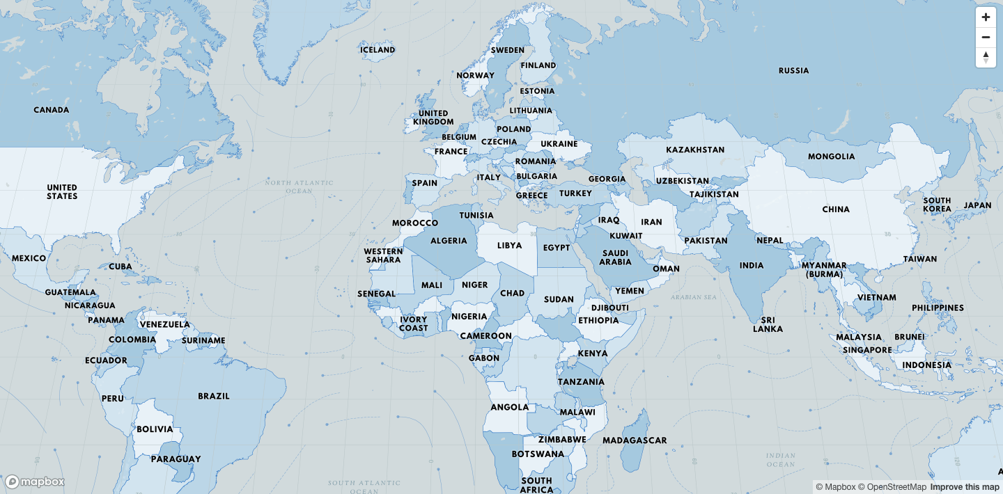
- Initial geolocation:
- You can use this tool to find your geolocation values.
- For this, let's use a very zoomed-out view of the world to show the impact of COVID-19.
This is the condensed code for App.js after putting together 👆 these steps.
import React, { useRef, useEffect } from 'react';
import mapboxgl from 'mapbox-gl';
import useSWR from 'swr'; // React hook to fetch the data
import lookup from 'country-code-lookup'; // npm module to get ISO Code for countries

import './App.scss';

// Mapbox css - needed to make tooltips work later in this article
import 'mapbox-gl/dist/mapbox-gl.css';

mapboxgl.accessToken = 'your-access-token';

function App() {
  const mapboxElRef = useRef(null); // DOM element to render map

  // Initialize our map
  useEffect(() => {
    // You can store the map instance with useRef too
    const map = new mapboxgl.Map({
      container: mapboxElRef.current,
      style: 'mapbox://styles/notalemesa/ck8dqwdum09ju1ioj65e3ql3k',
      center: [-98, 37], // initial geo location
      zoom: 3 // initial zoom
    });

    // Add navigation controls to the top right of the canvas
    map.addControl(new mapboxgl.NavigationControl());

    // Add navigation control to center your map on your location
    map.addControl(
      new mapboxgl.GeolocateControl({
        fitBoundsOptions: { maxZoom: 6 }
      })
    );
  }, []);

  return (
    <div className="App">
      <div className="mapContainer">
        {/* Assigned Mapbox container */}
        <div className="mapBox" ref={mapboxElRef} />
      </div>
    </div>
  );
}

export default App;- Next, let's add some css to
App.scss, this will include the css for the tooltip portion of the tutorial.
/* This usually goes in the global but let's keep it here
   for the sake of this tutorial */
body {
  width: 100vw;
  height: 100vh;
  margin: 0;
  padding: 0;
  overflow: hidden;
}

/*  Make our map take the full viewport - 100% */
#root,
.App,
.mapContainer,
.mapBox {
  width: 100%;
  height: 100%;
}

/* Tooltip code */
.mapboxgl-popup {
  font-family: 'Baloo Thambi 2', cursive;
  font-size: 10px;
  padding: 0;
  margin: 0;
  color: #424242;
}

.mapboxgl-popup-content {
  padding: 1rem;
  margin: 0;

  > * {
    margin: 0 0 0.5rem;
    padding: 0;
  }

  p {
    border-bottom: 1px solid rgba(black, 0.2);

    b {
      font-size: 1.6rem;
      color: #212121;
      padding: 0 5px;
    }
  }

  img {
    width: 4rem;
    height: 4rem;
  }
}📍Checkpoint: At this point, you should have something like this on your screen:
We're going to be using this API:
Let's use this API path https://corona.lmao.ninja/v2/jhucsse which returns a list of countries or provinces with COVID-19 stats.
The response looks like this:
[{
  "country": "Canada",
  "province": "Ontario",
  "updatedAt": "2020-03-29 23:13:52",
  "stats": { "confirmed": 1355, "deaths": 21, "recovered": 0 },
  "coordinates": { "latitude": "51.2538", "longitude": "-85.3232" }
},...]
We will use swr by the skilled Vercel team to fetch the data and convert it to a mapbox geojson formatted data which should look like this:
data: {
  type: "FeatureCollection",
  features: [{
      {
        type: "Feature",
        geometry: {
          type: "Point",
          coordinates: ["-85.3232", "51.2538"]
        },
        // you can add anything you want to the properties object
        properties: {
          id: 'unique_id'
          country: 'Canada',
          province: 'Ontario',
          cases: 1355,
          deaths: 21
        }
      }
  }, ...]
}🗒️NOTE: Notice how I'm adding a unique id to each point's properties object which we will use later for the tooltip functionality.
Mapbox works by combining a source and style layers.
The source supplies data to the map and the style layers are in charge of visually representing this data. In our case:
- our source is the
dataobject we got in the previous step - our style layer will be a point/circle layer
🗒️NOTE: You need to reference the source ID on the layer since they go hand in hand.
For example:
// once map load
map.once('load', function () {
  // Add our source
  map.addSource('points', options);

  // Add our layer
  map.addLayer({
    source: 'points' // source id
  });
});
By putting together these concepts your code should look like this by now:
function App() {
  const fetcher = (url) =>
    fetch(url)
      .then((r) => r.json())
      .then((data) =>
        data.map((point, index) => ({
          type: 'Feature',
          geometry: {
            type: 'Point',
            coordinates: [point.coordinates.longitude, point.coordinates.latitude]
          },
          properties: {
            id: index, // unique identifier in this case the index
            country: point.country,
            province: point.province,
            cases: point.stats.confirmed,
            deaths: point.stats.deaths
          }
        }))
      );

  // Fetching our data with swr package
  const { data } = useSWR('https://corona.lmao.ninja/v2/jhucsse', fetcher);

  useEffect(() => {
    if (data) {
      const map = new mapboxgl.Map({
        /* ... previous code */
      });

      // Call this method when the map is loaded
      map.once('load', function () {
        // Add our SOURCE
        // with id "points"
        map.addSource('points', {
          type: 'geojson',
          data: {
            type: 'FeatureCollection',
            features: data
          }
        });

        // Add our layer
        map.addLayer({
          id: 'circles',
          source: 'points', // this should be the id of the source
          type: 'circle',
          // paint properties
          paint: {
            'circle-opacity': 0.75,
            'circle-stroke-width': 1,
            'circle-radius': 4,
            'circle-color': '#FFEB3B'
          }
        });
      });
    }
  }, [data]);
}📍Checkpoint: If everything went well, you should have something like this:
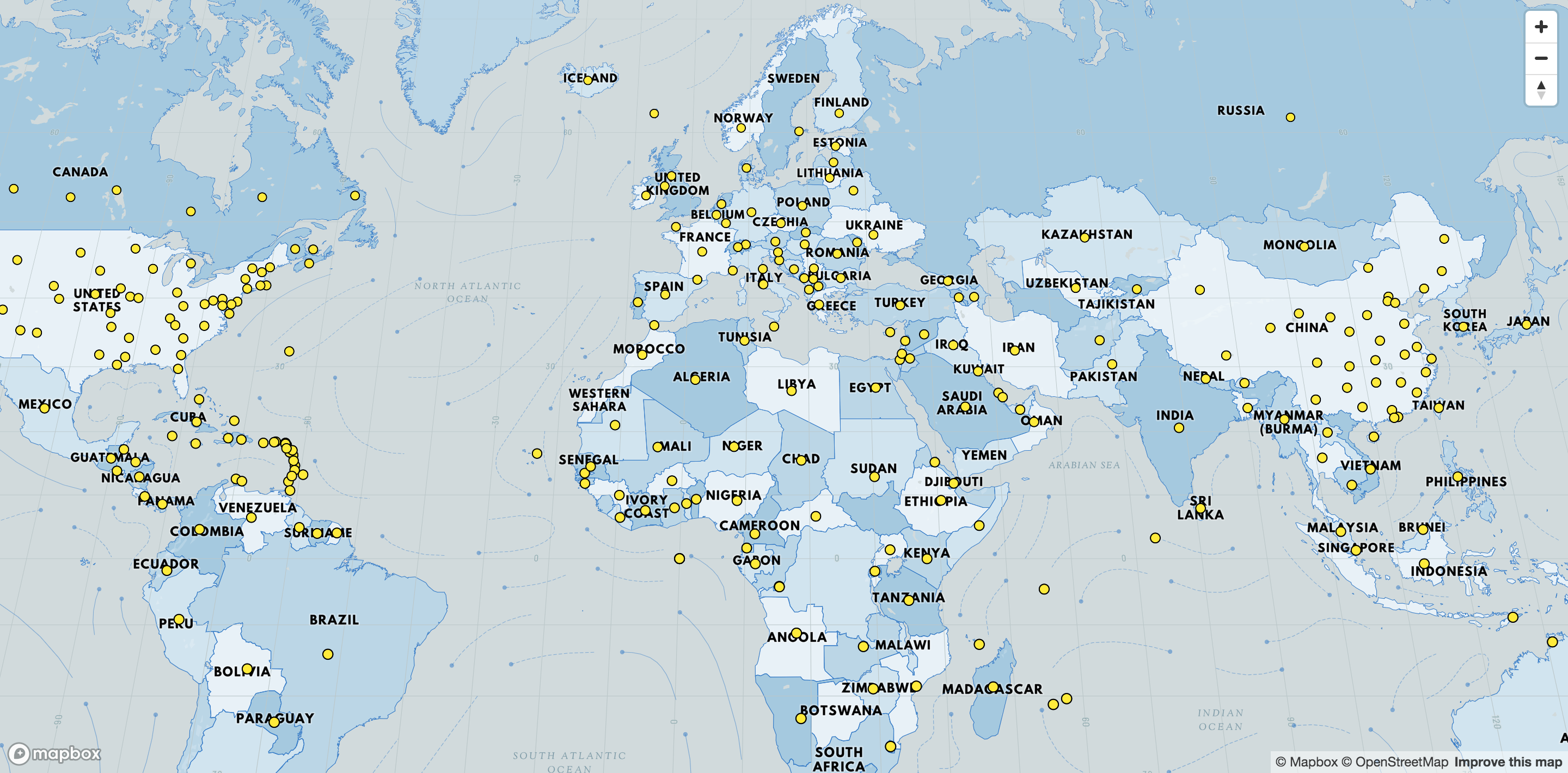
🌋But we have a problem: Every dot is equal and COVID-19 impact in the world is certainly not equal - to fix this let's increase the radius of each circle depending on the number of cases.
For this, let's use something called data-driven-styling. Here is a good tutorial.
In short, this is a way to modify the paint properties of a layer by using source data.
It looks like this for circle-radius:
   "circle-radius": [
     "interpolate",
     ["linear"],
     ["get", "cases"],
     1, 4,
     50000, 25,
     100000, 50
   ],
This 👆probably looks like some dark magic but it's not, this piece of code is doing the following:
- I will
interpolatethe data which is just a fancy word for mapping one range (amount of cases) to another one (circle-radius). - It will happen linearly.
- We will use the
casesproperty in ourdataobject to map it to the paint propertycircle-radius.
For example:
1active case = radius450000active cases = radius25100000active cases = radius50
Thus, if for instance, we have 75000 cases mapbox will create a radius of 37.5 as a midpoint between 25 and 50.
🗒️NOTE: You might need to change this range as the virus increases in numbers since sadly 100000 will be the norm and not the upper limit.
📆 [2021 Update] This 👆 sadly happened and is addressed on 5. Interpolate values to the dataset
For our tutorial we won't use a fully linear approach, our scale system will have some steps to better represent the data, but the interpolation between these will be linear.
This is how it looks but feel free to tweak it:
paint: {
-   "circle-radius": 4,
+   "circle-radius": [
+     "interpolate",
+     ["linear"],
+     ["get", "cases"],
+     1, 4,
+     1000, 8,
+     4000, 10,
+     8000, 14,
+     12000, 18,
+     100000, 40
+   ],
}🗒️NOTE: Mapbox will properly scale the circles as you zoom in and out so they fit in the screen.
📍Checkpoint: Now, you should have something like this on your screen:
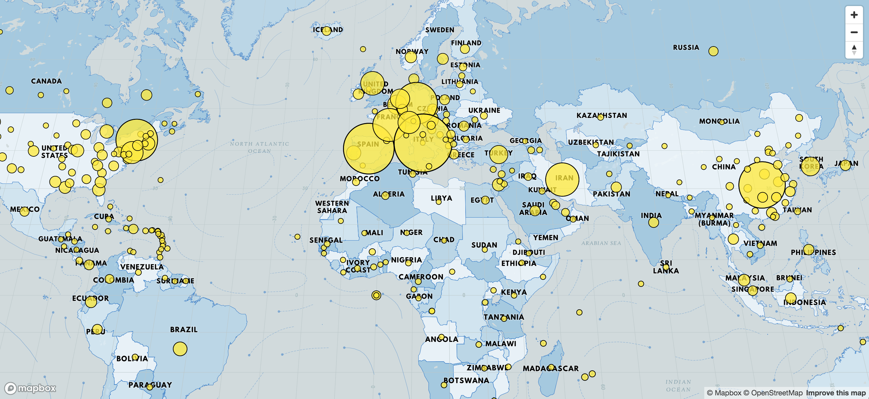
Next, let's do the same for the circle-color property.
I'm going to use a color palette from colorbrewer2 which has palettes that are made specifically for maps - this is the one I picked 👉 link 🔗.
paint: {
-   "circle-color": "#FFEB3B",
+   "circle-color": [
+     "interpolate",
+     ["linear"],
+     ["get", "cases"],
+     1, '#ffffb2',
+     5000, '#fed976',
+     10000, '#feb24c',
+     25000, '#fd8d3c',
+     50000, '#fc4e2a',
+     75000, '#e31a1c',
+     100000, '#b10026'
+   ],
}
I will also adjust the border width (circle-stroke-width) to scale from 1 to 1.75:
paint: {
-   "circle-stroke-width": 1,
+   "circle-stroke-width": [
+     "interpolate",
+     ["linear"],
+     ["get", "cases"],
+     1, 1,
+     100000, 1.75,
+   ],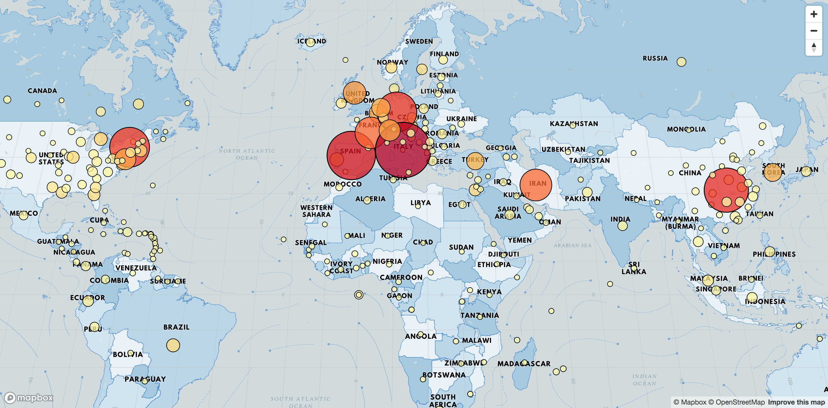
}📍Checkpoint: At this point, you should have this nice looking map going on your screen:
When I made this tutorial I thought that COVID numbers will never pass 100000 cases per province or country, turns out I was sadly very mistaken.
In order to future proof our app we need to create a proportional linear scale (interpolation) in order to do this we need to find the min, max and average of the dataset.
const average = data.reduce((total, next) => total + next.properties.cases, 0) / data.length;

const min = Math.min(...data.map((item) => item.properties.cases));

const max = Math.max(...data.map((item) => item.properties.cases));paint: {
- "circle-radius": { /* Old scale */},
+ "circle-radius": [
+ "interpolate",
+ ["linear"],
+ ["get", "cases"],
+ 1,
+ min,
+ 1000,
+ 8,
+ average / 4,
+ 10,
+ average / 2,
+ 14,
+ average,
+ 18,
+ max,
+ 50
+ ],
}paint: {
- "circle-color": { /* Old scale */},
+ "circle-color": [
+ "interpolate",
+ ["linear"],
+ ["get", "cases"],
+ min,
+ "#ffffb2",
+ max / 32,
+ "#fed976",
+ max / 16,
+ "#feb24c",
+ max / 8,
+ "#fd8d3c",
+ max / 4,
+ "#fc4e2a",
+ max / 2,
+ "#e31a1c",
+ max,
+ "#b10026"
+ ]
}paint: {
- "circle-stroke-width": { /* Old scale */},
+ "circle-stroke-width": [
+ "interpolate",
+ ["linear"],
+ ["get", "cases"],
+ 1,
+ 1,
+ max,
+ 1.75
+ ],You can play around with these values to create your own scale
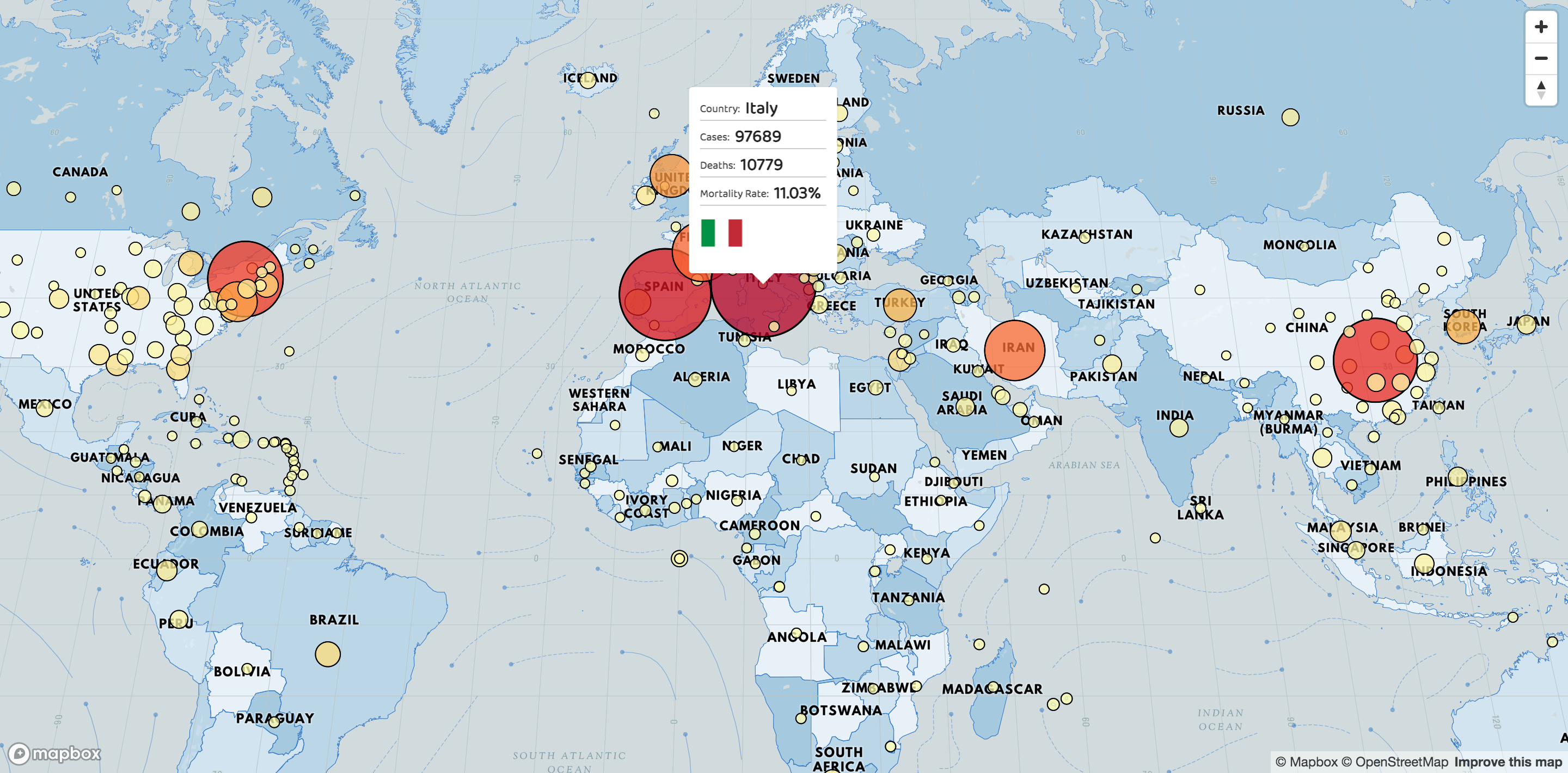
🌋Now we have another issue: the map doesn't tell much beyond the perceived perspective of the impact of the virus on each country, to solve this let's add country/province unique data on hover.
Let's add a mouse move and mouse leave listener to the circles layer and let's do the following steps:
- Toggle the cursor style from pointer to default.
- Create an HTML element to insert into the tooltip, this is the data we will use:
- Country
- Province or State (if it exists)
- Cases
- Deaths
- Mortality Rate (deaths / cases)
- Flag (for this we will use
country-lookup-codenpm package in combination with Country flags API)
- Keep track of the id of the country being hovered - this way if the points are too close together we guarantee that the tooltip still switches position.
🗒️NOTE: If there is enough space in between your points you can use mouseenter of mousemove instead which only gets called when entering the layer.
// After your mapbox layer code inside the 'load' event

// Create a mapbox popup
const popup = new mapboxgl.Popup({
  closeButton: false,
  closeOnClick: false
});

// Variable to hold the active country/province on hover
let lastId;

// Mouse move event
map.on('mousemove', 'circles', (e) => {
  // Get the id from the properties
  const id = e.features[0].properties.id;

  // Only if the id are different we process the tooltip
  if (id !== lastId) {
    lastId = id;

    // Change the pointer type on move move
    map.getCanvas().style.cursor = 'pointer';

    const { cases, deaths, country, province } = e.features[0].properties;
    const coordinates = e.features[0].geometry.coordinates.slice();

    // Get all data for the tooltip
    const countryISO = lookup.byCountry(country)?.iso2 || lookup.byInternet(country)?.iso2;

    const provinceHTML = province !== 'null' ? `<p>Province: <b>${province}</b></p>` : '';

    const mortalityRate = ((deaths / cases) * 100).toFixed(2);

    const countryFlagHTML = Boolean(countryISO)
      ? `<img src="https://www.countryflags.io/${countryISO}/flat/64.png"></img>`
      : '';

    const HTML = `<p>Country: <b>${country}</b></p>
              ${provinceHTML}
              <p>Cases: <b>${cases}</b></p>
              <p>Deaths: <b>${deaths}</b></p>
              <p>Mortality Rate: <b>${mortalityRate}%</b></p>
              ${countryFlagHTML}`;

    // Ensure that if the map is zoomed out such that multiple
    // copies of the feature are visible, the popup appears
    // over the copy being pointed to.
    while (Math.abs(e.lngLat.lng - coordinates[0]) > 180) {
      coordinates[0] += e.lngLat.lng > coordinates[0] ? 360 : -360;
    }

    popup.setLngLat(coordinates).setHTML(HTML).addTo(map);
  }
});

// Mouse leave event
map.on('mouseleave', 'circles', function () {
  // Reset the last Id
  lastId = undefined;
  map.getCanvas().style.cursor = '';
  popup.remove();
});📍Checkpoint: At this point, you should be done and it should look like this 🍾:
Find the completed code here - CodeSandbox - feel free to insert your access token since that one might not work after a while.
{% codesandbox mapbox-covid19-8sni6 %}
Some ideas to take this further:
- Filtering by country.
- Filter by deaths instead of cases.
- Add a sidebar with some general information, maybe use another API.
- Make the ranges dynamic to the data, instead of hard-coding 100000 as the upper limit, you could fetch the country with the biggest amount of cases and divide by 7 and create a dynamic range.
- Save data to local storage so you don't hit the API that often - for example, you can make the local storage expire every 24 hours.
Leigh Halliday 📺 - YouTube Channel that has many high-quality videos, including some about Mapbox. He also deserves a lot more followers :) Mapbox Examples - Great collection of Mapbox tutorials
Color Palettes
Color Palette Sequence for maps 🔗 Great Color Palette 🔗 Carto 🔗
Mapbox Links
Gallery of Mapbox themes 🔗 Location Helper 🔗 Data-driven styling tutorial 🔗 Popup on hover tutorial 🔗
COVID-19 Links
Covid API 🔗 Another good API 🔗
And..... that's it, we're done, stay safe 😷 and stay home 🏘️. Now you can go back to Netflix and binge Tiger King 🐅👑.
Two of my talented teammates at Jam3 with whom I learned a couple of things during a project that used Mapbox.
- Bonnie Pham - bonnichiwa
- Yuri Murenko - ymurenko