The Brand Sentiment Analyser (BSA) allows marketers, brand owners, customers or anyone else with an interest in a particular brand to find out the top search terms related to that brand, the brand's main competitors, topical questions about the brand, and concerns about the brand that users may have.
BSA is heavily influenced by Answer The Public, and while similar, it is not intended to be a clone of that service. Answer The Public presents users with graphical depictions of search terms, while this tool presents a list of terms that enables further research.
When users are presented with topical search terms, questions, competitors or concerns related to a brand, they can be saved for later research and compared to terms presented by subsequent analysis of other brands.
-
Heading
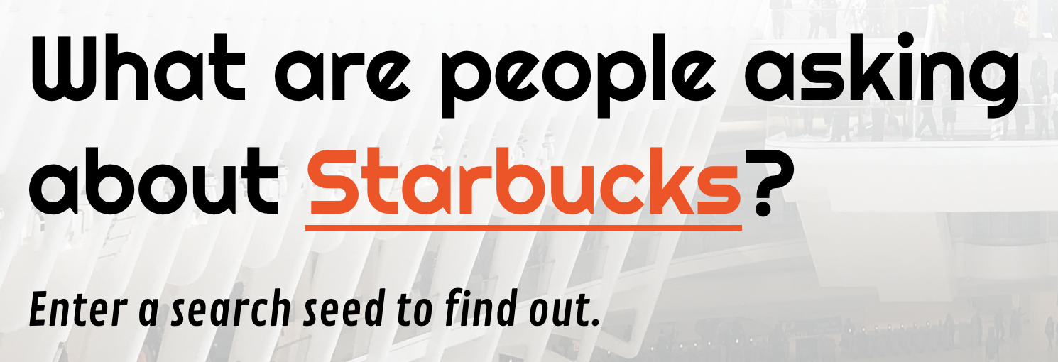
- Featured at the top of the site, the heading makes clear the benefit to the user: understanding what people are asking about a particular brand.
-
Background image
- The background image takes up the majority of the screen on initial page load, showing a crowd of people towards the bottom of the screen, to let the user know that the tool helps them to understand what people collectively are searching for in relation to a brand.
-
Rotating search seed suggestions
- The rotating suggestions within the heading highlight that the user can input any brand they wish, whether it is their own or a brand they are interested in.
- The "typewriter" effect on the suggested brands rotation emphasises that the user can enter these brands, or any other, as a search seed to get results.
- The typewriter effect is implemented in Javascript, firstly because this is a JS project so I was looking for a JS solution, but also because many CSS-only solutions seemed to be compromised when using a non-monospaced font (they rely on a progressive reveal / hiding of characters at fixed distance intervals). It may be that my JS solution is less performant than a CSS-only solution because I am adding to/from the DOM each time a letter is added or removed, but I have not benchmarked this as it seems beyond the scope of the project.
-
Call to action
- Immediately below the heading and seed suggestions, there is a clear call to action, asking the user to enter a search seed to get results.
- The placeholder text within the seed input box
-
Search seed input and Analyse button
- The search seed input box has a placeholder to give the user a prompt to enter a brand.
- Placeholder text tells the user to use a maximum of 2 words; while more than 2 will not cause an error, it will likely reduce the number of results and be less effective. For this reason, the user gets a prompt, but the limit is not enforced.
- The analyse button is initially disabled and greyed out, becoming clickable when a seed is entered. It is disabled again once clicked to avoid a duplicate query, and is enabled again when the user enters a different search seed.
-
Results area
- The results area lays out the top search suggestions for the user separated into 4 categories: Top searches, questions, competitors and concerns
- All results are derived from Google's autocomplete suggestions API
- The results area is hidden initially to direct the user to complete the seed input first
-
Loading animation
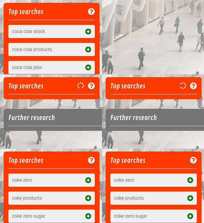
- The user is reassured that the system is calculating the results by presenting a loading animation on each results box until the query to the server is finished
- Each loading animation is independently controlled, in case the timing of the queries resolving is not synced
-
Help tooltips
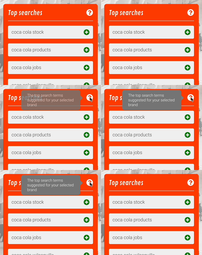
- The user can see the purpose of each results list by hovering over (or touching on mobile) the "?" icon
-
Top searches
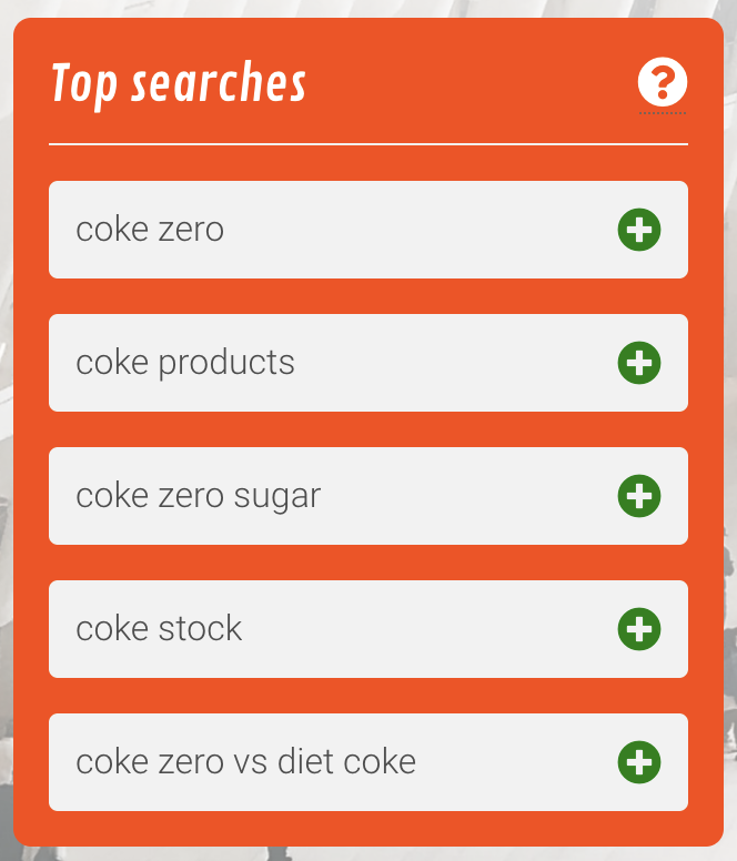
- This list presents the top search suggestions - i.e. the most common search terms that Google expects people to search for given the seed term that the user provided
-
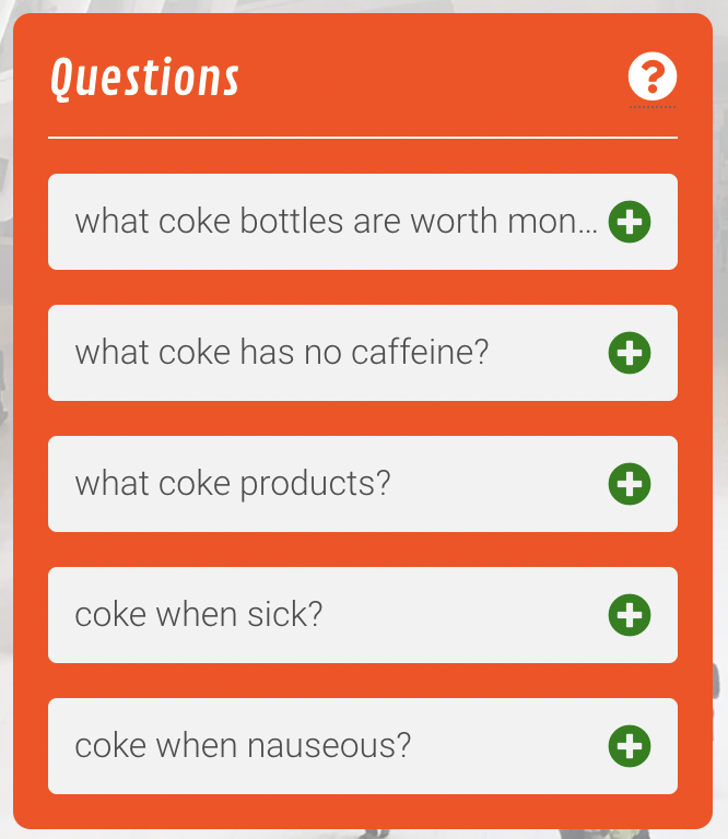
Questions
- The most common search terms that include the words "what" or "which" that Google expects people to search for given the provided seed
- Questions can be quite long, so are truncated with an ellipsis rather than wrapping to multiple lines to preserve the list layout across all boxes
-
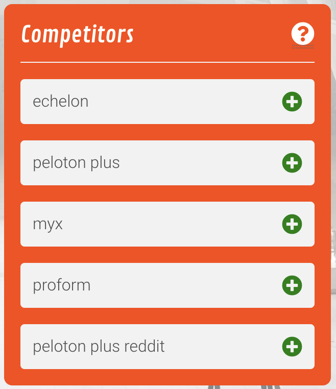
Competitors
- Brands and/or products that compete with the brand the user has selected, based on search suggestions containing the seed brand and "vs", i.e. brands or products that people often compare.
-
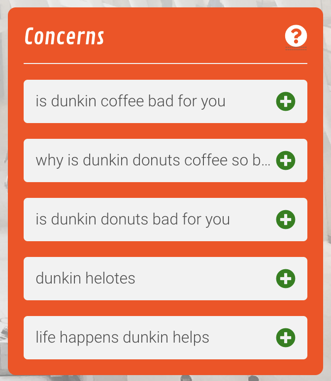
Concerns
- Common search terms that include the words "bad" or "help" - usually these are related to concerns about the brand or product.
-
Further research
- The user may wish to research some of the results further by doing a Google search for that term; adding items to the further research list allows them to do this
- The further research list saves items across multiple analysis sessions - e.g. if a user enters the seed "Macbook" and saves a term from the top searches list, the saved term will be retained there to allow the user to enter a new seed, e.g. "HP Spectre" and also saves an item from the results of that analysis, both saved terms will be available for further analysis.
-
Delete item from results list
- Items can not currently be deleted from results list, e.g. if they are unrelated to the brand search
- While it would be trivial to allow a user to delete individual list items, these would not persist across sessions without considerable additional infrastructure to maintain state, so I opted not to include a delete button to avoid user frustration
-
Animation when adding item to further research list
- It would be helpful to show the items moving from the results list to the further research list; presently, the item simply disappears from the results list and appears in the further research list, which has the potential to confuse the user or make them think the item was deleted instead of moved.
- This kind of animation is relatively straightforward with a component-based framework, but I view it as beyond the scope of this vanilla JS project given the difficulty of implementation.
-
Background video
- The background is highly visible on initial page load and replacing with a video may enhance visual appeal
-
Automated testing
- The testing checklists shown in this document could be automated and run as unit or end-to-end tests as part of the CI / build process
-
Region selection
- Autocomplete suggestions differ according to where they're obtained from geographically; currently, all suggestions are obtained from AWS servers in the US and are thus US-specific.
-
Download as CSV
- Currently neither the results lists nor the further research list can be downloaded for use in other applications; allowing users to download as CSV would be a useful feature.
-
Header
- Is visible on page load
- Is formatted as intended across desktop, tablet and mobile screen sizes
-
Background image
- Shown on all tested devices (desktop, mobile and tablet)
- Covers the full size of the page
- Remains fixed in position on scroll
- Is "dimmed" with an overlay to ensure good text contrast
- Is dimmed more towards the top of the page
-
Results area
- Hidden on page load
- Shown when analysis begins
-
Search seed
- Input box has placeholder text advising user to enter max. 2 words
- More than two words can be entered (i.e. limit is a guide but not enforced)
-
Analyse button
- Initially disabled
- Enabled when text is entered into the search seed input
- Runs the analysis when clicked, or when Enter is pressed while the search seed input has focus
- Re-disabled when the analysis is run (prevents duplicate query)
- Re-enabled when the search seed input text is changed by the user
- Greyed out while disabled
- Highlighted and clickable while enabled
- Formatted as intended on all screen sizes
-
Add to further research buttons
- Shown beside each list item in results lists
- Positioned and formatted as intended
- Shows a pointer cursor on hover
- Moves the item to the further research list when clicked
- Not shown beside items in the further research list
-
External search buttons
- Shown beside each list item in further research list
- Opens a Google search for the item in a new tab
- Formatted as intended on all screen sizes
-
Help buttons
- Shown in the header of each results list
- Show a tooltip text box describing the purpose of the results list on hover (desktop) or when active (i.e. touched - mobile / touchscreen)
- Hide the tooltip when not hovered or active
- Formatted as intended on all screen sizes
-
Expand / collapse further research list button
- Shown in header of further research box
- Expands the further research box on click (when collapsed)
- Rotates to become a "collapse" button when list is expanded
- Collapses the further research box on click (when expanded)
- Formatted as intended on all screen sizes
-
Search seed suggestions
- Shows suggested brands in sequence
- Removes and adds letters individually when changing between suggestions
- Pauses for 3s after each brand suggestion is shown
- Pauses for 6s on "your brand" suggestion
- Runs continuously on an infinite loop
- Runs asynchronously and does not block UI
- Reduces in size on smaller screens
- Does not wrap to second line on any tested screen size
-
Reveal results area
- Smoothly expands to reveal results boxes when "Analyse" is clicked
- Removes and adds letters individually when changing between suggestions
- Pauses for 3s after each brand suggestion is shown
- Pauses for 6s on "your brand" suggestion
-
Results loading animation
- Shown in the header of each results list when "Analyse" is clicked
- Remains visible while the API call is in progress
- Hidden when the API call completes (whether there are results to show or not)
- Animated (shows rotating circle of dots) on all platforms tested
-
Expand / collapse further research list
- List box smoothly expands to reveal list items when chevron icon is clicked
- Chevron icon rotates smoothly through 180 degrees when list is expanded or collapsed
-
Layout
- Results lists are arranged in a grid on tablet / desktop
- Lists are stacked vertically on mobile
- Grid or vertical stack covers the full width of the screen (except extremely large screens)
- List widths resize to fill available space
- Lists have equal height within rows
- List items cover the width of the list (with margins)
- List items are stacked vertically
- Lists reduce in height when items are removed from all lists in a row on desktop / tablet
- Lists reduce in height when items are removed from any list on mobile
-
Top searches
- Initially blank
- Shows top search term suggestions based on the user's seed
- Displays a maximum of 5 results
- Results do not wrap to multiple lines
- Long result text is truncated with an elipsis ("...") to avoid wrapping
- Items are removed when sent to the further research list
- Shows a "no results" placeholder if there are no appropriate search suggestions (e.g. if user specifies inappropriate / adult search seeds)
-
Questions
- Initially blank
- Shows search term suggestions containing "which" or "what" based on the user's seed
- Displays a maximum of 5 results
- Results do not wrap to multiple lines
- Long result text is truncated with an elipsis ("...") to avoid wrapping
- Items are removed when sent to the further research list
- Shows a "no results" placeholder if there are no appropriate search suggestions (e.g. if user specifies inappropriate / adult search seeds)
-
Competitors
- Initially blank
- Shows search term suggestions containing "vs" with the user's seed and "vs" removed from the result
- Does not include user's seed in results when seed has capitalised letters
- Displays a maximum of 5 results
- Results do not wrap to multiple lines
- Long result text is truncated with an elipsis ("...") to avoid wrapping
- Items are removed when sent to the further research list
- Shows a "no results" placeholder if there are no appropriate search suggestions (e.g. if user specifies inappropriate / adult search seeds)
-
Concerns
- Initially blank
- Shows search term suggestions containing "bad" or "help" along with the user's specified search seed
- Displays a maximum of 5 results
- Results do not wrap to multiple lines
- Long result text is truncated with an elipsis ("...") to avoid wrapping
- Items are removed when sent to the further research list
- Shows a "no results" placeholder if there are no appropriate search suggestions (e.g. if user specifies inappropriate / adult search seeds)
-
Further research
- Initially contains only a single instruction placeholder
- Shows items added by the user by clicking the "+" icon on a results list item
- No limit to number of results in the list
- Area spans full width of the page (with margins)
- Items are arranged in a grid
- New items fill from left of box by row
- rows wrap when full
- New items are added in front of the instruction item, but after any items added previously
- Long result text is truncated with an elipsis ("...") to avoid wrapping
- All items (except initial instruction placeholder) have an "external link" icon
- Clicking "external link" icon performs a Google search for the (non-truncated) search term in a new tab
- Items are retained in the list across analysis sessions (i.e. when user enters a new seed and clicks "Analyse")
The site displays well across a variety of screensizes and devices, tested using Firefox Developer Tools and also by opening the site an a laptop, tablet and phone to confirm. The specific checklist items for each feature detail the testing on each screensize.
I have tested cross-browser support by viewing the site in Firefox, Chrome and Safari on MacOS, and also Chrome and Safari on iOS. As noted in the CSS validator testing section of this readme, Safari on iOS does not support the text-decoration-skip-ink property, so the rotating seed suggestions in the header are slightly less readable, but otherwise no significant differences were observed.
- HTML
- No errors were returned when passing through the official W3C validator
- CSS
- 3 errors were noteed by the official (Jigsaw) validator, relating to 3 uses of two properties that do not exist according to the validator. These errors directly conflict with good browser support for these tags across all common platforms; Can I Use notes that
text-decoration-thicknessis supported by the browser for over 88% of users, while more than 75% of users have support fortext-decoration-skip-ink(the major difference with the latter being no support on Safari for iOS, which is ~10% of users). - As these properties enhance the readability of the text in the rotating search suggestions and also improve the visual hierarchy, I have opted not to remove them despite the validator errors, noting that I have been unable to find any suitable alternative property to replace them with. On browsers without support for
text-decoration-skip-ink, the text will be slightly less readable as characters descending below the line will merge with the underline, while browsers without support fortext-decoration-thicknesswill have a thinner underline that emphasises the suggestions less, but is no less readable.
- 3 errors were noteed by the official (Jigsaw) validator, relating to 3 uses of two properties that do not exist according to the validator. These errors directly conflict with good browser support for these tags across all common platforms; Can I Use notes that
- Javascript
- Passes through JSHint checker with no significant issues
- Multiple warnings that ES6 and ES8 functionality is used, but as this is supported in most modern browsers, I do not consider these to be errors
-
Asynchronous code
- While I recognised the need to make API calls asynchronously, building the rotating brand suggestions feature required me to learn a lot more anout asynchronous code in JS.
- Initially, I tried to build the feature with synchronous code, but found that it was blocking user input while running, which would not have worked. Given the single-threaded nature of Javascript, I recognised quickly that I needed to do this asynchronously.
- The concept of asynchronous JS is simple, but it took quite a while to get a handle on the various ways to implement it (including Promises), as is visible in the git history, though the ES6 async / await syntax seems to have simplified this significantly.
- While I have used async / await in most places, I found that using
.then()syntax can still be cleaner at times, such as the code block where I am making fetch requests to the API; in this case, async / await would have required an additional variable and been harder to read, so I opted to use the older promise chain syntax.
-
Serverless functions
- While I initially expected to implement the project entirely with client-side JS, it became apparent early on that CORS restrictions on the API would render this impossible.
- I was aware that I could make the API calls from a server, but I deemed that setting up a server-side infrastructure is beyond the scope of this project, so I looked for alternatives
- Serverless functions seemed to be a good fit as they are mostly free (for light use) and can handle NodeJS code, which allowed me to port the client-side code that I had already written to run on the server.
- AWS Lambda seems like a good option for this, but seemed extremely hard to configure, so I used Begin.com to create the API gateway and Lambda functions, which was a very straightforward experience and allowed me to focus on the code.
- One potential downside of using serverless functions is cold starts; becuase this project is expected to have little-to-no traffic beyond marking / appraisal, it may take 1-2 seconds more than usual to make API calls initially while the instance starts. There appear to be other services that have elimited this issue, such as Cloudflare Workers but I did not have time during this project to explore this further.
-
Parsing "&" in search seed is not parsed correctly
- E.g. entering "M&S sandwich" as the seed is interpreted as "M S sandwich" yielding strange results
- The API interprets "&" as joining two search terms, even when there are no spaces between the characters
- This can usually be worked around by putting quotes around the term containing the ampersand, but this is not clear to users and is not always effective
-
Competitors list can contain non-competitor results
- E.g. the seed term "Xbox" shows "PS5 sales" in the competitors list
- While "PS5" is a legitimate competitor, this is a limitation of the competitors search results since a suggestion to compare Xbox and PS5 sales will result in the full term "PS5 sales" being interpreted as a competitor, rather than just PS5
- This also leads to duplicates, since "PS5" is shown elsewhere in the list
-
Concerns list can include apparently positive suggestions
- E.g. when using the search seed "Peloton", the concerns list includes "Peloton help lose weight" which is not a concern about the brand or product
- This is a consequence of how the suggestions work, since a high-ranking suggestion containing "help" is expected to be a concern
- The site is deployed with AWS Lambda serverless functions, via Begin.com
The live link can be found here - https://donut-8xi.begin.app/
- The concept of the tool is heavily inspired by Answer The Public
- The results are derived from Google Autocomplete search suggestions via the API
- Code to trigger the analysis on pressing Enter was derived from W3Schools
- Element unique ID code was sourced from a GitHub Gist
- Async/await time delay function is from Stack Overflow
- Tooltips HTML & CSS is from the Menucool generator
- List item truncation CSS is derived from CSS Tricks
- The background image is from Unsplash
- The icons for the buttons are from Font Awesome
