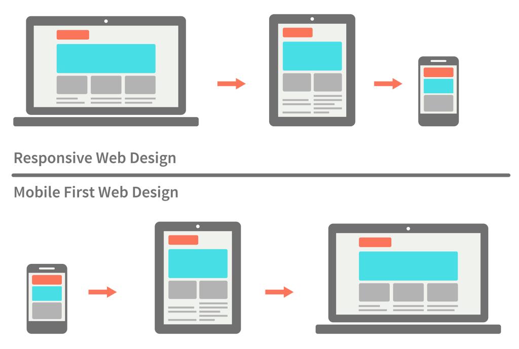
Responsive Design: Responsive design is an approach to web page creation that makes use of flexible layouts, flexible images and CSS media queries. The goal of responsive design is to build web pages that detect the visitor's screen size and orientation and then change the layout accordingly.
Mobile First: designing for the smallest screen first. Progressively enhancing the website as you design for larger screen sizes.
Pros of using Mobile First:
- Content is Prioritised
- Allows you to create a User Experience that favours mobile devices
- Decreases download times
- Offers a standardised experience on all platforms
Cons of using Mobile First:
- Requires a lot of time and effort to build from scratch
- Requires a team that understands the inherent differences of this approach
- Demands more resources and a higher budget
- Loss of content that may be relevant for some users
Some helpful links: Understanding the difference between mobile-first, adaptive and responsive design: Differences between Mobile First and Responsive CSS
The Two Approaches: Mobile First and Responsive Web Design:Mobile First Approach vs. Responsive Web Design
A Hands-On Guide to Mobile-First Responsive Design
BEM is a naming convention for CSS and HTML classes.
- BEM is extremely useful for helping to clarify the relationship between HTML and CSS.
- Makes it easier for other developers to understand what CSS classes mean and therefore work together.
- Hopefully results in better, more predictable code.
This is because:
- If we want to make a new style of component we can easily see which modifiers and children already exist.
- In reading the HTML we can see what element depends another.
- Consistency in naming components means the whole team has a declarative syntax they share.
Everything is a class and nothing is nested.
BLOCK - standalone entity, meaningful on its own e.g. header, container, checkbox, input
ELEMENT - a part of a block that has no standalone and is semantically tied to its block e.g. menu item, list item, checkbox caption, header title
MODIFIER - flag on block or element, use to change appearance or behaviour e.g. disabled, highlighted, checked, fixed
The naming convention follows this pattern: .block{} - represents the higher level if abstraction or componenet .block__element{} - represents a descendant of .block that helps from .block as a whole .block--modifier{} - represents a different state or version of .block
*Example*
.site-search {} /* Block */
.site-search__field {} /* Element */
.site-search--full {} /* Modifier */
Blocks are containers / wrappers for elements and contain minimal styling. Modifiers add subtle changes to blocks or elements, on top of their existing properties.
Why is it so important to split responsibilities between these blocks when it would probably be easier to put everything together in the main scenery? The answer is simple: modularity. It’s a lot easier to add more elements to the scene or to remove them if they’re separate and if every block handles it’s own concern.
Should you create a block or element?
-
Create a block If a section of code might be reused and it doesn't depend on other page components being implemented.
-
Create an element If a section of code can't be used separately without the parent entity (the block).
-
A modifier is an entity that defines the appearance, state, or behavior of a block or element.
In the example below, we can clearly see the relationship between the blocks, elements and modifiers. Person is at the block level, which has elements such as hand. A variation of person is female, who can also have a hand element.
.person {}
.person__hand {}
.person--female {}
.person--female__hand {}
.person__hand--left {}
If we look at the CSS, which didn't use BEM, the relationship is much more difficult to understand.
.person {}
.hand {}
.female {}
.female-hand {}
.left-hand {}
No BEM
<form class="site-search  full">
    <input type="text" class="field">
    <input type="Submit" value ="Search" class="button">
</form>
Using the BEM examples above
<form class="site-search  site-search--full">
    <input type="text" class="site-search__field">
    <input type="Submit" value ="Search" class="site-search__button">
</form>
BEM 101 BEM Project Website MindBEMnding: Getting your head 'round BEM syntax Naming in BEM