-
Notifications
You must be signed in to change notification settings - Fork 4.4k
New issue
Have a question about this project? Sign up for a free GitHub account to open an issue and contact its maintainers and the community.
By clicking “Sign up for GitHub”, you agree to our terms of service and privacy statement. We’ll occasionally send you account related emails.
Already on GitHub? Sign in to your account
Add Query Parameters and Snippets to the left area of the query editor #2645
Comments
|
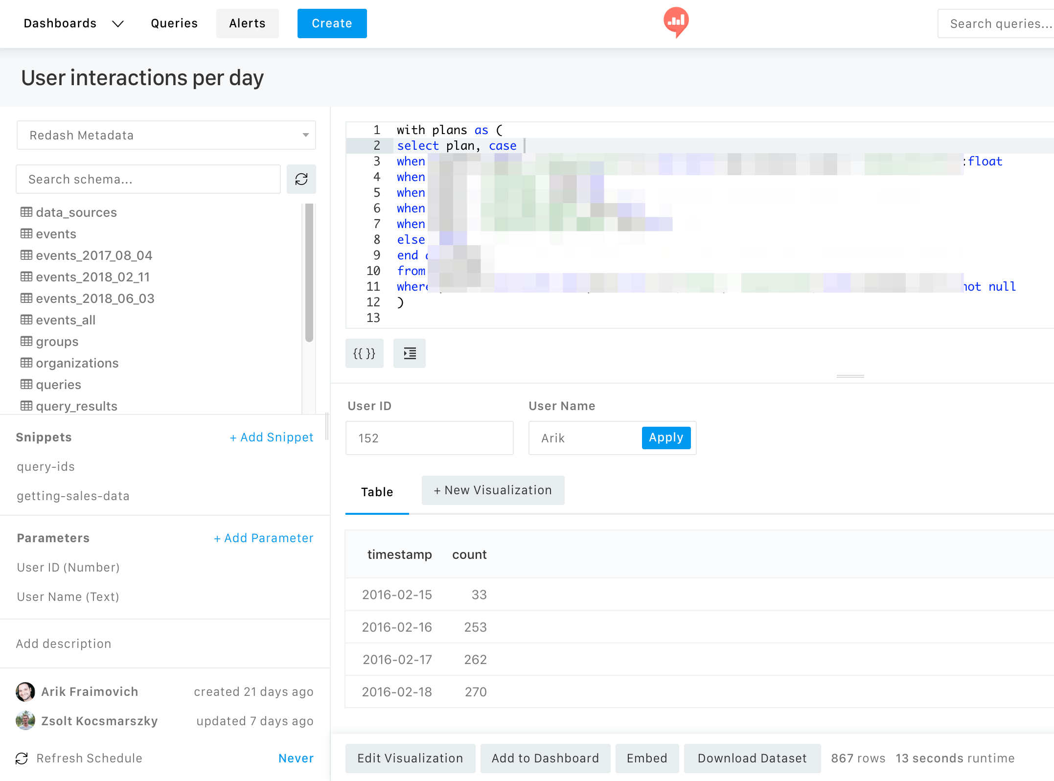
Here's the first draft of the extended left sidebar with parameters and code snippets. Thoughts:
|
|
I think that showing all of them in a single screen can be a bit too crowded and not give the space each one of them needs. How about we make the left pane into a tabbed one, so you have 3 tabs: Schema (default), Snippets & Parameters? As for description: maybe in the query editor, we can show an icon next to the header that opens the description? And in data set view, show it on the left side instead of the schema/snippets/etc place. Related to #2714. |
|
I'll explore the tab solution but I'd rather move the meta info and description to another tab and keep the querying related stuff (schema, snippets, params) close to each other. As for the description: I'd avoid re-arranging items on the screen based on editor/view mode and keep it consistent instead. If the tabs work, we could just switch the tabs with the editor mode: view mode has the meta + description, edit mode has the schema, snippets and params. |
Even if we move those, on some screen resolutions I think that it will be too little space. Why you don't like the tabs approach?
I think we should stop thinking about these two pages as a single page with two modes. They have some in common (header & visualization area) but that's about it. They have different purposes and at times, different users. Once we stop thinking about them as one page, it will free us to build the best UI/UX for each of the pages. |
|
I just think query editing tools should be placed together. Most of our query editor users use quite high resolutions and we can also add handlers to resize sections so it fits the best for smaller res. I'm thinking about those 2 views as 1 page because it is effectively the same page with 2 views currently and that's how we approached this in the past. Now that you are saying: "They have different purposes and at times, different users." that puts it in a very different light and we could have a completely different design for it. For example we don't need the schema (afaik) in view mode and that area should be hidden as well. We could also just introduce an entirely new layout for the read only mode. |
They are placed together, just in diff tabs :) Usually you won't need to look at the snippets, parameters and schema at the same time. Why give everything less space instead of giving each one of them the whole space of the left pane?
It's the largest group, but not sure if most the users. There is definitely 30% of users who have non high resolution screens and maybe even more. But 30% is not something to ignore.
|
|
The dejavu is valid :) |
|
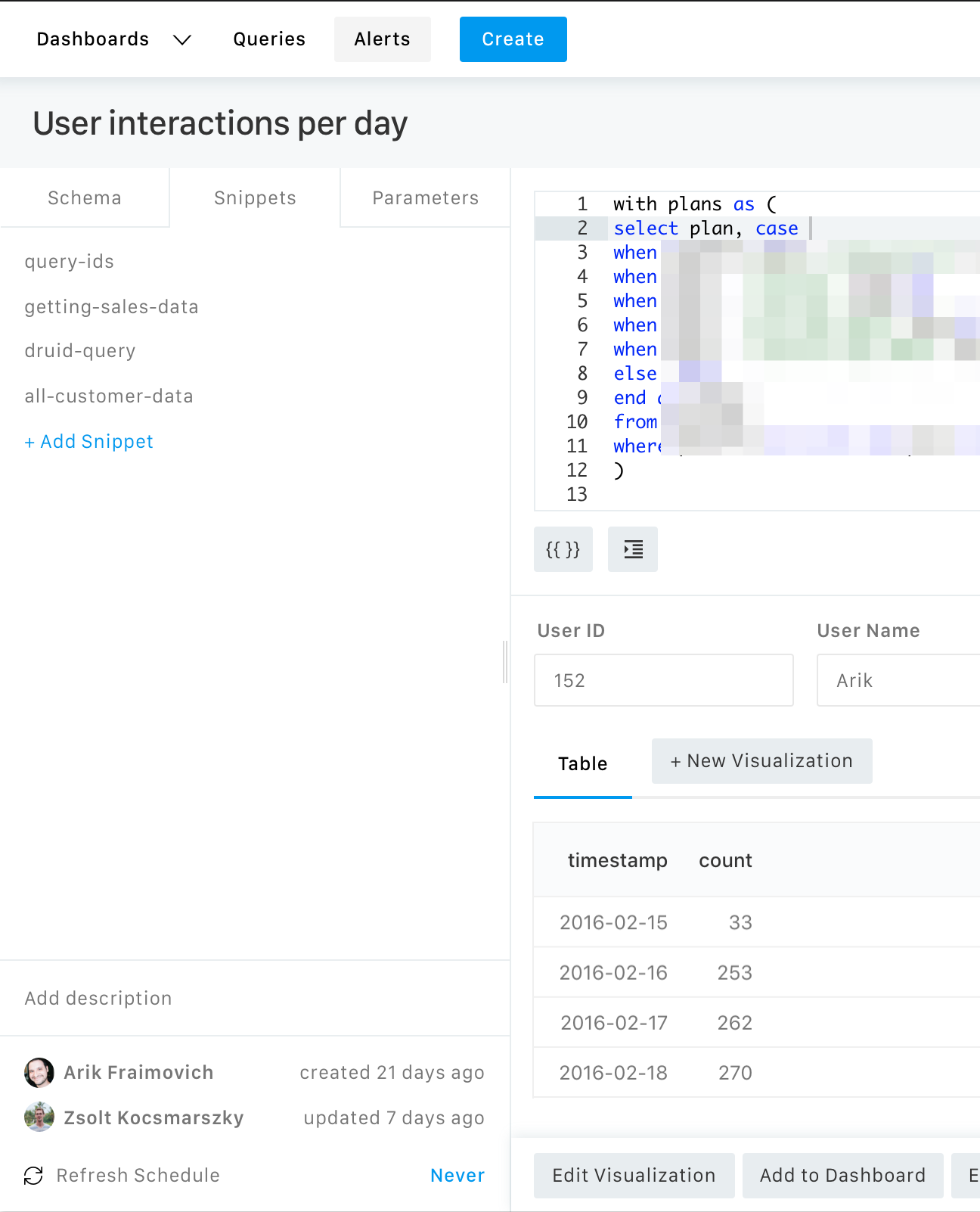
Ok, I've explored the sidebar tab direction: I think this works pretty well and we can keep the description where it is currently. I think it works better than expand/collapse sections which would make the interface look more complicated. I kind of like the clean design of the tabs and the design also clearly suggests what's going on. So this is working well for me. |
|
I've also looked into the markup implementation and happy to move forward if you decide so. |
|
I like the last version. The snippets view need some more work, as we need to show more than just the trigger word, like the description. Also let's wait with the markup until: 1) the page transforms into React, to avoid having to play catch up; 2) we finalize the design. |
|
I'll refine the snippets + params section. The Add button place is a bit off for me as it'd pushed down as more items come here so that needs some work too. |
|
We can either show it constantly at the bottom, regardless of the number of items or at the top... |
|
I was trying out different ways to place the Add Snippet but I ended up with this:
This will lead 2 issues in the future: too many snippets will introduce a scrollbar and hide the + Add Snippet button. In this case, we'd need a search for the snippets, so this design could be a good idea (might be too much work for now though, that's why I'm just proposing this for the future) |


This is not only parameters related, but we can have two additional areas between the schema and the query metadata:
The areas should be collapsed by default (when collapsed they will only show the title of the area), so they don’t take much space.
(we should split this into two separate tasks when we get to actually work on this)
The text was updated successfully, but these errors were encountered: