[css] 第6天 用css创建一个三角形,并简述原理 #17
Comments
|
|
@yxkhaha 能说明下原理吗? |
|
原理是宽高是两边固定,border不一样,有颜色,且有top、right、bottom、left的选项进行修改。在使用的时候需要宽高为零。三角形就需要数学知识(勾股定理),去考虑为等边、全等。重点是思考 |
CSS 三角形实现原理宽高设为0,四个边框设置border-width,border-style,border-color即可,如果某个三角要变为透明,设置border-color为transparent |
大家可以不看我上面代码,我的思想是做一个正方形然后进行旋转,将多余切除 |
<div class='rect'></div>
<style>
.rect {
width: 0;
height: 0;
background-color: #fff;
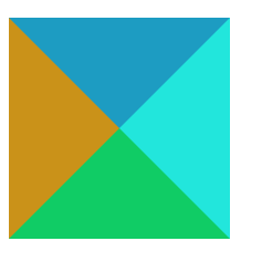
border-right: 100px solid rgb(34, 230, 220);
border-left: 100px solid rgb(202, 146, 25);
border-top: 100px solid rgb(29, 156, 194);
border-bottom: 100px solid rgb(16, 204, 101);
}
</style>
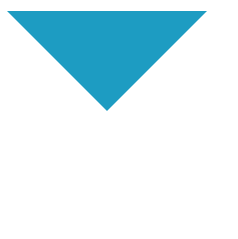
  <style>
    .rect {
      width: 0;
      height: 0;
      background-color: #fff;
      border-right: 100px solid transparent;
      border-left: 100px solid transparent;
      border-top: 100px solid rgb(29, 156, 194);
      border-bottom: 100px solid transparent;
    }
</style> |
|
利用边框实现,是因为bfc 盒模型。因为盒模型是一个长方形。边框是在原盒模型上面外面在实现成长方形。所以相邻两个边框之间边框的夹角是90度。 |
|
宽高设置一定数值,就明白了,就像木匠做相框,连接处都会锯成45度角, |
|
没有人画空心三角型的? |
|
width: 0;
height: 0;
border: 5px solid transparent;
border-bottom-color: orange; |
width:0px;
  height:0px;
  border:50px transparent solid;
border-bottom:50px solid Red; |
|
border-top: 50px solid blue; |
|
以尖角朝下的三角形为例:
效果图: 解析:
|

|
|
可以使用裁剪: |
<style>
div {
width: 0;
height: 0;
border: 50px solid;
border-color: transparent transparent red;
}
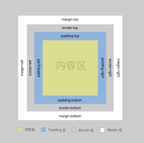
</style>一个盒子包括: margin+border+padding+content |
|
|
第一个就想到clip-path,用border不会。 |
|
用盒子border实现的上面已经讲得很详细了,就不赘述了,这里补充几个歪门邪道的方法。
效果图: 效果图: 效果图: |


|
.borderBox{ |
|
可以用svg或者border去绘制三角形, |
|
原理盒子都是一个矩形或正方形,从形状的中心,向4个角上下左右均分为四个部分 一个盒子包括: margin+border+padding+content – 上下左右边框交界处出呈现平滑的斜线. 利用这个特点, 通过设置不同的上下左右边框宽度或者颜色可以得到小三角, 小梯形等. – 调整宽度大小可以调节三角形形状. 实现<!DOCTYPE html>
<html lang="en">
<head>
<meta charset="UTF-8" />
<meta http-equiv="X-UA-Compatible" content="IE=edge" />
<meta name="viewport" content="width=device-width, initial-scale=1.0" />
<title>Document</title>
<style>
/* 依靠原来盒子的边 */
#test1 {
width: 0;
height: 0;
/* border-color: #ff9600 #3366ff #12ad2a #f0eb7a; */
border-color: #ff9600 transparent transparent transparent;
border-style: solid;
border-width: 50px 50px 0;
/* 兼容IE6 */
overflow: hidden; /* 这里设置overflow, font-size, line-height */
font-size: 0; /*是因为, 虽然宽高度为0, 但在IE6下会具有默认的 */
line-height: 0; /* 字体大小和行高, 导致盒子呈现被撑开的长矩形 */
border-style: solid dashed dashed dashed; /* 设置余下三条边的border-style为dashed */
}
/* 斜边在盒子的对角线上 */
#test2 {
width: 0;
height: 0;
border-color: #ff9600 transparent transparent transparent;
border-style: solid;
border-width: 40px 40px 0 0;
/* 兼容IE6 */
overflow: hidden; /* 这里设置overflow, font-size, line-height */
font-size: 0; /*是因为, 虽然宽高度为0, 但在IE6下会具有默认的 */
line-height: 0; /* 字体大小和行高, 导致盒子呈现被撑开的长矩形 */
border-style: solid dashed dashed dashed; /* 设置余下三条边的border-style为dashed */
}
/* 空心三角形(伪类实现) */
#test3 {
position: relative;
width: 0;
height: 0;
border-style: solid;
border-width: 0 50px 50px;
border-color: transparent transparent #d9534f;
/* 兼容IE6 */
/* overflow: hidden; 这里设置overflow, font-size, line-height */
font-size: 0; /*是因为, 虽然宽高度为0, 但在IE6下会具有默认的 */
line-height: 0; /* 字体大小和行高, 导致盒子呈现被撑开的长矩形 */
border-style: dashed dashed dashed solid; /* 设置余下三条边的border-style为dashed */
}
#test3:after {
content: "";
position: absolute;
top: 6px;
left: 0;
transform: translate(-50%);
border-style: solid;
border-width: 0 40px 40px;
border-color: transparent transparent white;
}
/* 带缺口的三角形效果 */
#test4 {
position: relative;
}
.t {
position: absolute;
left: 0;
top: 0;
width: 0;
height: 0;
border: 50px solid transparent;
border-width: 0 50px 50px;
}
#t1 {
border-bottom-color: #000;
}
#t2 {
border-bottom-color: #fff;
}
</style>
</head>
<body>
依靠原来盒子的边
<div id="test1"></div>
斜边在盒子的对角线上
<div id="test2"></div>
空心三角形(伪类实现)
<div id="test3"></div>
带缺口的三角形效果
<div id="test4">
<div class="t" id="t1"></div>
<div class="t" id="t2"></div>
</div>
</body>
</html> |

|
css绘制三角形主要用到border属性,也就是边框。border属性是右三角形组成的 |
div {
  width: 0;
  height: 0;
  border-top: 100px solid red;
  border-right: 100px solid transparent;
  border-bottom: 100px solid transparent;
  border-left: 100px solid transparent;
} |
|
推荐:clip-path |
|
总结来说就是,border边框不是长方形条状的,而是像画框一样,分割角各45°为梯形状,当内容区域为0时,即全为boder是,上左下右border便为三角形,因此将各方向三角形进行隐藏,修改宽度时,就能得到想要的三角形形状。 |
|
你的邮件我已收到,我会尽快处理
|
原理: |
原理: 因为面是由各个点连接围起来的,当width(height)设置成0时有两个点重合了,此时就仅有三个点了,进而成为了三角形。 |

|
div { |
先上口诀:宽高为0,一边为0,两边透明。 元素的border的形成机制是: 在盒子四边由4个三角形拼接而成,最先呈现的是每个三角形底部的内容,当border-width变大后,每个三角形的剩余部分会渐渐出现; 当盒子内容有宽高时,会遮住每个三角形底部之外的部分; 比如 width: 40px;
height: 40px;
border-width: 50px;
border-style: solid;
border-color: red yellow green blue;
当border-width设置过小时,就是平时的场景(只看到每个三角形底部区域): width: 40px;
height: 40px;
border-width: 1px;
border-style: solid;
border-color: red yellow green blue;
当盒子宽高设置为0后,每个三角形全部呈现: width: 0;
height: 0;
border-width: 30px;
border-style: solid;
border-color: red yellow green blue;
如果有一边不设置border-width,就只有三个三角形: width: 0;
height: 0;
border-width: 30px 30px 30px 0;
border-style: solid;
border-color: red yellow green #fff;
如果将上下两边的color设置为透明,不就是只看到一个三角形吗: width: 0;
height: 0;
border-width: 30px 30px 30px 0;
border-style: solid;
border-color: transparent yellow transparent #fff;
不难发现,不设置border-width那一边就是三角形的方向,三角形方向的方向的邻近两边需要设置透明。
width: 0;
height: 0;
border-width: 30px 30px 30px 0;
border-style: solid;
border-color: transparent yellow transparent #fff; |


|
div { |
|
利用border实现 *{ boeder-left:5px solid transparent; |
 and others
第6天 用css创建一个三角形,并简述原理
The text was updated successfully, but these errors were encountered: