-
-
Notifications
You must be signed in to change notification settings - Fork 80
New issue
Have a question about this project? Sign up for a free GitHub account to open an issue and contact its maintainers and the community.
By clicking “Sign up for GitHub”, you agree to our terms of service and privacy statement. We’ll occasionally send you account related emails.
Already on GitHub? Sign in to your account
[WIP] Change presentation of test results #113
Conversation
|
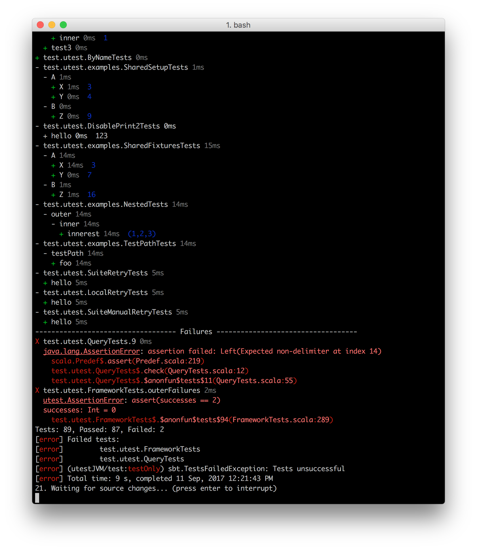
Here's what it looks like running on a real project ( https://github.com/japgolly/scalajs-react ) |
Oh @drhumlen, that's very nice! I like that and love that timing info as well. |
Thanks 😄
It turned out that @lihaoyi had already captured all the timing information for each test 💰 -- so all that was left to do was to actually print it 😛 Not sure why he left it out in the first place, but it's a nice secondary information I think when it doesn't steal too much attention. The "faint" (or "dim gray") ANSI code does just that 🎉 but I'm not sure if it's supported in all terminals(?). Perhaps including the timings should be a parameter/option/flag?
Not yet, so feel free to join. In particular it would be nice to hear if the immediate test result printing is deeply missed, or if it's reasonable to skip it and only print the results at the end 🤔 . I think that's how the others (specs2, scalatest, (etc?)) does it. Or actually I think they do the middle ground where they print the entire results for each suite, but one suite at the time. My futher plans for the PR is to render the titles for each spec (e.g. |
|
One possible resolution to the "avoid printing stack traces twice, but still allow them to be printed as-they-arrive" is to let the end-user flip on as-they-arrive printing with a flag. Thus for small test suites you don't get duplication, but for large test suites that may take a few minutes you can flip the switch and get live feedback as stuff goes wrong |
|
Just checking in, what's the status of this? For the record, I like @lihaoyi's suggestion about error messages. Although I'd want to ensure I could configure SBT to set my preference. I wouldn't want to provide it by CLI each time I run tests. Unfortunately I don't have time to be in Gitter chatting back and forth so if there's anything waiting on me, please let me know here and I'll get on it. I hoped to provide more feedback (and still hope that I eventually will) but let that not block this issue. Change can be incremental. |
|
Sorry for disappearing all of a sudden. I've been busy with work, and then I forgot all about it unfortunately 😛. But I see there's been some activity since my last visit. I'm revisiting the code now. I see a couple of tiny refactorings I'd like to do, but I'm also thinking this is good enough for now(?), and then we can open another new PR with further improvements such as Also if somebody wants to help me nitpick on the code, that would be great 😛 If not, I'll take that as code is good enough for merge. |
|
I'm cherry-picking the code from this diff into a new release I'm working on. Won't go in exactly as-is, but it should end up pretty close to what you have here. Stay tuned |
|
FWIW looks like the "as it comes in" logging is set by a flag in SBT http://www.scala-sbt.org/1.0/docs/Howto-Logging.html#Print+the+output+of+tests+immediately+instead+of+buffering |
|
Here's what I have in master. Large numbers of tests: uTest still shows the results/failure summaries at the end, because the failure's own output can be quite far up and it's annoying to scroll to copy-paste the full test path (what I always end up doing). For small numbers of tests (threshold configurable) It skips those because you can probably already see the initial output that occurred when the test was run: Some differences from your code:
Not super-pretty, but not as ugly as they used to be, and they still have the useful information
The new That, I think, should be enough to satisfy the requirements of this PR. |


I've tried to work on the presentation of the test results to increase readability and also (hopefully) look a little prettier. It's still pretty work-in-progress both the presentation and the code, but I hope it's a step in the right direction..(?)
Some feedback would be nice. Is it better or worse? Is it too much color, or should I try to colorize/syntax-highlight more?
One controversial/debetable change I've made is that I've skipped the first test-printing phase. Where as before the output was printed "twice" (first when it actually runs, and then a second time with the "results" of the test running). Personally I strongly prefer to just get the summary (like now), but if anyone has a different opinion, I'm open for changing it back. Perhaps make it configurable somehow?
Before:

After:
