-
-
Notifications
You must be signed in to change notification settings - Fork 18k
New issue
Have a question about this project? Sign up for a free GitHub account to open an issue and contact its maintainers and the community.
By clicking “Sign up for GitHub”, you agree to our terms of service and privacy statement. We’ll occasionally send you account related emails.
Already on GitHub? Sign in to your account
Scatter plot with colour_by and size_by variables #16827
Comments
|
I think there's some overlap here with
Is that correct? Can you go through those and explain the differences to this one? IMO, I'd like to see pandas handle the |
|
@nipunbatra do you have any interest in working on either of those two issues? Or in the meantime, submitting that cookbook recipe would be helpful. |
|
Hi, I would like to help with this. This would be my first contribution to open source so I might need guidance in the process. I'll give it a try and should be back in the next two weeks with something hopefully. |
|
@VincentAntoine great! Just holler early and often if you get stuck. |
|
Hi, I have started to look around and fiddle with the ScatterPlot class. class ScatterPlot(PlanePlot):
_kind = 'scatter'
def __init__(self, data, x, y, s=None, c=None, **kwargs):
if s is None:
# hide the matplotlib default for size, in case we want to change
# the handling of this argument later
s = 20I changed this bit to detect whether s was a column name and grab and normalize the data in the corresponding column. I think a maximum size of 200 pts is a decent default, but of course the most appropriate maximum bubble size will depend on the number of points to display so I think it is necessary to have a new parameter s_grow = 1 to allow users make bubbles bigger or smaller and find the correct scaling for each situation. So this is what I wrote so far: class ScatterPlot(PlanePlot):
_kind = 'scatter'
def __init__(self, data, x, y, s=None, s_grow=1, c=None, **kwargs):
if s is None:
# Set default size if no argument is given
s = 20
elif is_hashable(s) and s in data.columns:
# If s is a label of a column of the df, grab and normalize the data to 200 * s_grow
size_data = data.loc[:, s].values
if is_numeric_dtype(size_data):
s = 200 * s_grow * size_data / size_data.max()
else:
raise TypeError('s must be of numeric dtype')So s can be any of the following when creating a scatter plot from a DataFrame:
There is a possible confusion, if for instance "s=50" and 50 is a column name --> should we use a fixed bubble size of 50, or use the data in the column 50? This does not seem like a serious problem to me, and I think it makes more sense to use the data in the column 50 in this case. I will now make the bubble size scale. Your feedback will be greatly appreciated! Thanks |
I think we always default to a scalar FWIW, I think a simple / partial solution is great here. If |
|
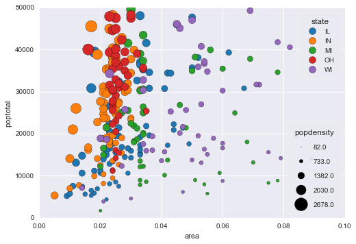
Hey! I've made progress with the sizes, haven't looked at colors yet. Taking the same data as @nipunbatra in his example above, this is what I have now: import matplotlib.pyplot as plt
import pandas as pd
# fetching and filtering data
midwest = pd.read_csv("http://goo.gl/G1K41K")
midwest = midwest[midwest['poptotal'] < 50000]
# plotting
midwest.plot(kind='scatter', x='area', y='poptotal', s='popdensity',
title='Popuation vs area and density')
plt.show()And if you want to make the bubbles smaller or bigger, you can use s_grow (defaut 1) to change that: midwest.plot(kind='scatter', x='area', y='poptotal', s='popdensity',
title='Popuation vs area and density', s_grow=0.2)
plt.show()Here is what I did so far:
Grabbing & normalizing dataCompared to what I explained in my previous post, I only slightly modified the init method of the ScatterPlot class to turn s_grow, size_title, size_data_max and bubble_points (the default bubble max size of 200 points) into attributes of ScatterPlot instances, as that makes these 4 parameters easily accessible to the other methods when building the legend for the bubble sizes. class ScatterPlot(PlanePlot):
_kind = 'scatter'
def __init__(self, data, x, y, s=None, s_grow=1, c=None, **kwargs):
if s is None:
# Set default size if no argument is given
s = 20
elif is_hashable(s) and s in data.columns:
# Handle the case where s is a label of a column of the df
# The data is normalized to 200 * s_grow
size_data = data.loc[:, s].values
if is_numeric_dtype(size_data):
self.size_title = s
self.size_data_max=size_data.max()
self.s_grow= s_grow
self.bubble_points = 200
s = self.bubble_points * s_grow * size_data / self.size_data_max
else:
raise TypeError('s must be of numeric dtype')
super(ScatterPlot, self).__init__(data, x, y, s=s, **kwargs)Building the legendBefore actually building the legend, we must define the sizes and labels of the bubbles to include in the legend. For instance if we want 4 bubbles in our legend, a straighforward approach is to use data_max, 0.75 * data_max, 0.5 * data_max and 0.25 * data_max. However as you can see in the graph built by @nipunbatra this leads to values like 82, 733, 1382... which is not as nice having labels with "round" values like in the graph produced by Altair (see @nipunbatra 's blog post). I have therefore tried to achieve this nice behaviour and to build a legend with round values. In order to make a legend with 4 bubbles, we therefore need to define 4 bubble sizes and the 4 corresponding labels, with 'round' values for the labels, the biggest of which is close to the maximum of the data. For this I first need a helper function to extract the mantissa (or coefficient) and exponent of a number in decimal base. #class ScatterPlot(PlanePlot):
def _sci_notation(self, num):
scientific_notation = '{:e}'.format(num)
expnt = float(re.search(r'e([+-]\d*)$', scientific_notation).groups()[0])
coef = float(re.search(r'^([+-]?\d\.\d)', scientific_notation).groups()[0])
return coef, expntExample: _sci_notation(782489.89247823) returns (7.8, 5.0) Then, given a data_max, s_grow and bubble_points, this function finds 4 appropriate sizes and labels for the legend: #class ScatterPlot(PlanePlot):
def _legend_bubbles(self, data_max, s_grow, bubble_points):
coef, expnt = self._sci_notation(data_max)
labels_catalog = {
(9, 10) : [10, 5, 2.5, 1],
(7, 9) : [8, 4, 2, 0.5],
(5.5, 7) : [6, 3, 1.5, 0.5],
(4.5, 5.5) : [5, 2, 1, 0.2],
(3.5, 4.5) : [4, 2, 1, 0.2],
(2.5, 3.5) : [3, 1, 0.5, 0.2],
(1.5, 2.5) : [2, 1, 0.5, 0.2],
(0, 1.5) : [1, 0.5, 0.25, 0.1]
}
for lower_bound, upper_bound in labels_catalog:
if (coef >= lower_bound) & (coef < upper_bound):
labels = np.array(labels_catalog[lower_bound, upper_bound]) * 10**expnt
sizes = list(bubble_points * s_grow * labels / data_max)
labels =['{:g}'.format(l) for l in labels]
return (sizes, labels)Example: _legend_bubbles(data_max = 2678.0588199999, s_grow = 1, bubble_points = 200) returns: The first list gives 4 bubbles sizes (in points) and the second list the 4 corresponding labels. In our exemple with population density, the maximum of popdensity is 2678.0588199999. So what happens is:
Finally, we put all the pieces together in a _make_legend method which is specific to the ScatterPlot class. After building the legend for the bubbles, we call the _make_legend method of the parent. #class ScatterPlot(PlanePlot):
def _make_legend(self):
if hasattr(self, "size_title"):
ax = self.axes[0]
size_title = self.size_title
data_max = self.size_data_max
s_grow = self.s_grow
bubble_points = self.bubble_points
import matplotlib.legend as legend
sizes, labels=self._legend_bubbles(data_max, s_grow, bubble_points)
bubbles=[]
for size in sizes:
bubbles.append(ax.scatter([], [], s=size, color='white', edgecolor='gray'))
bubble_legend=legend.Legend(ax, handles=bubbles, labels=labels, loc='lower right')
bubble_legend.set_title(size_title)
ax.add_artist(bubble_legend)
super()._make_legend()I also have a few questions:
How does this look to you? Thanks! |
|
It may be easiest to make a PR at this point so we can review the code. My only general comment is we shouldn't worry about edge cases, like the values getting too large, with this high-level API. If people need to customize it further, they can just use matplotlib directly. |
|
Is anyone still working on this? I miss this functionality. If the column contains strings the method should use distinct colors. Similar to what happens in plotly plots. Same with shapes. |
|
take |
|
Hi all who are still interested in this topic, I have completed the general functionality, and it is out in my PR if you would like to take a look My only question is, what is the best way to choose default colors for strings here? Currently, I am pulling the largest list of mpl's colors and randomly choosing as just iterating though normally tends to pick too similar of colors |


Problem description
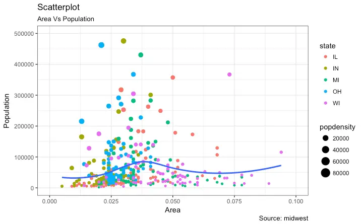
Use case: Say we have a df with 4 columns- a, b, c, d. We want to make a scatter plot, with x=a, y=b, color_by=c and size_by=d. Here, if c is a categorical, we get a discrete set of colours and corresponding legend, else a continuous scale. size_by decides the size of the marker.
Such cases are often needed as evidenced by questions on Stack Overflow.
Image below shows an example.

I wrote a blog post(hand-wavy at times- marker size legend) on how to generate such a plot in Pandas. The code below shows how to make a similar plot.
Code Sample, a copy-pastable example if possible
This produces the following plot:

I was wondering, if the use case is important enough to introduce changes in the API for scatter plot, so that color_by and size_by arguments can be passed? I understand that the same set of arguments are used across different plots, and a size_by will not make sense for many plots.
If this will not make it into the API, it still might be useful to have a detailed example in the cookbook. Or, a function that would work out of the box for such plots.
The text was updated successfully, but these errors were encountered: