-
-
Notifications
You must be signed in to change notification settings - Fork 34
/
samples.json
519 lines (519 loc) · 25.3 KB
/
samples.json
1
2
3
4
5
6
7
8
9
10
11
12
13
14
15
16
17
18
19
20
21
22
23
24
25
26
27
28
29
30
31
32
33
34
35
36
37
38
39
40
41
42
43
44
45
46
47
48
49
50
51
52
53
54
55
56
57
58
59
60
61
62
63
64
65
66
67
68
69
70
71
72
73
74
75
76
77
78
79
80
81
82
83
84
85
86
87
88
89
90
91
92
93
94
95
96
97
98
99
100
101
102
103
104
105
106
107
108
109
110
111
112
113
114
115
116
117
118
119
120
121
122
123
124
125
126
127
128
129
130
131
132
133
134
135
136
137
138
139
140
141
142
143
144
145
146
147
148
149
150
151
152
153
154
155
156
157
158
159
160
161
162
163
164
165
166
167
168
169
170
171
172
173
174
175
176
177
178
179
180
181
182
183
184
185
186
187
188
189
190
191
192
193
194
195
196
197
198
199
200
201
202
203
204
205
206
207
208
209
210
211
212
213
214
215
216
217
218
219
220
221
222
223
224
225
226
227
228
229
230
231
232
233
234
235
236
237
238
239
240
241
242
243
244
245
246
247
248
249
250
251
252
253
254
255
256
257
258
259
260
261
262
263
264
265
266
267
268
269
270
271
272
273
274
275
276
277
278
279
280
281
282
283
284
285
286
287
288
289
290
291
292
293
294
295
296
297
298
299
300
301
302
303
304
305
306
307
308
309
310
311
312
313
314
315
316
317
318
319
320
321
322
323
324
325
326
327
328
329
330
331
332
333
334
335
336
337
338
339
340
341
342
343
344
345
346
347
348
349
350
351
352
353
354
355
356
357
358
359
360
361
362
363
364
365
366
367
368
369
370
371
372
373
374
375
376
377
378
379
380
381
382
383
384
385
386
387
388
389
390
391
392
393
394
395
396
397
398
399
400
401
402
403
404
405
406
407
408
409
410
411
412
413
414
415
416
417
418
419
420
421
422
423
424
425
426
427
428
429
430
431
432
433
434
435
436
437
438
439
440
441
442
443
444
445
446
447
448
449
450
451
452
453
454
455
456
457
458
459
460
461
462
463
464
465
466
467
468
469
470
471
472
473
474
475
476
477
478
479
480
481
482
483
484
485
486
487
488
489
490
491
492
493
494
495
496
497
498
499
500
501
502
503
504
505
506
507
508
509
510
511
512
513
514
515
516
517
518
519
[
{
"sourcePath": "lib/src/material/floating_action_button.dart",
"sourceLine": 118,
"serial": "1",
"package": "flutter",
"library": "material",
"element": "FloatingActionButton",
"id": "material.FloatingActionButton.1",
"file": "material.FloatingActionButton.1.dart",
"description": "This example shows how to make a simple [FloatingActionButton] in a\n[Scaffold], with a pink [backgroundColor] and a thumbs up [Icon]."
},
{
"sourcePath": "lib/src/material/dropdown.dart",
"sourceLine": 581,
"serial": "1",
"package": "flutter",
"library": "material",
"element": "DropdownButton",
"id": "material.DropdownButton.1",
"file": "material.DropdownButton.1.dart",
"description": "This sample shows a `DropdownButton` whose value is one of\n\"One\", \"Two\", \"Free\", or \"Four\"."
},
{
"sourcePath": "lib/src/material/raised_button.dart",
"sourceLine": 101,
"serial": "1",
"package": "flutter",
"library": "material",
"element": "RaisedButton",
"id": "material.RaisedButton.1",
"file": "material.RaisedButton.1.dart",
"description": "This sample shows how to render a disabled RaisedButton, an enabled RaisedButton\nand lastly a RaisedButton with gradient background.\n\n"
},
{
"sourcePath": "lib/src/material/checkbox_list_tile.dart",
"sourceLine": 250,
"serial": "3",
"package": "flutter",
"library": "material",
"element": "CheckboxListTile",
"id": "material.CheckboxListTile.3",
"file": "material.CheckboxListTile.3.dart",
"description": "\n\nHere is an example of a custom LabeledCheckbox widget, but you can easily\nmake your own configurable widget."
},
{
"sourcePath": "lib/src/material/chip.dart",
"sourceLine": 219,
"serial": "1",
"package": "flutter",
"library": "chip",
"element": "DeletableChipAttributes.onDeleted",
"id": "chip.DeletableChipAttributes.onDeleted.1",
"file": "chip.DeletableChipAttributes.onDeleted.1.dart",
"description": "This sample shows how to use [onDeleted] to remove an entry when the\ndelete button is tapped."
},
{
"sourcePath": "lib/src/material/expansion_panel.dart",
"sourceLine": 309,
"serial": "1",
"package": "flutter",
"library": "material",
"element": "ExpansionPanelList.radio",
"id": "material.ExpansionPanelList.radio.1",
"file": "material.ExpansionPanelList.radio.1.dart",
"description": "Here is a simple example of how to implement ExpansionPanelList.radio."
},
{
"sourcePath": "lib/src/widgets/single_child_scroll_view.dart",
"sourceLine": 196,
"serial": "1",
"package": "flutter",
"library": "widgets",
"element": "SingleChildScrollView",
"id": "widgets.SingleChildScrollView.1",
"file": "widgets.SingleChildScrollView.1.dart",
"description": "In this example, the children are spaced out equally, unless there's no more\nroom, in which case they stack vertically and scroll.\n\nWhen using this technique, [Expanded] and [Flexible] are not useful, because\nin both cases the \"available space\" is infinite (since this is in a viewport).\nThe next section describes a technique for providing a maximum height constraint."
},
{
"sourcePath": "lib/src/material/scaffold.dart",
"sourceLine": 1182,
"serial": "2",
"package": "flutter",
"library": "material",
"element": "Scaffold.of",
"id": "material.Scaffold.of.2",
"file": "material.Scaffold.of.2.dart",
"description": "When the [Scaffold] is actually created in the same `build` function, the\n`context` argument to the `build` function can't be used to find the\n[Scaffold] (since it's \"above\" the widget being returned in the widget\ntree). In such cases, the following technique with a [Builder] can be used\nto provide a new scope with a [BuildContext] that is \"under\" the\n[Scaffold]:"
},
{
"sourcePath": "lib/src/material/expansion_panel.dart",
"sourceLine": 217,
"serial": "1",
"package": "flutter",
"library": "material",
"element": "ExpansionPanelList",
"id": "material.ExpansionPanelList.1",
"file": "material.ExpansionPanelList.1.dart",
"description": "Here is a simple example of how to implement ExpansionPanelList."
},
{
"sourcePath": "lib/src/material/chip.dart",
"sourceLine": 219,
"serial": "1",
"package": "flutter",
"library": "material",
"element": "DeletableChipAttributes.onDeleted",
"id": "material.DeletableChipAttributes.onDeleted.1",
"file": "material.DeletableChipAttributes.onDeleted.1.dart",
"description": "This sample shows how to use [onDeleted] to remove an entry when the\ndelete button is tapped."
},
{
"sourcePath": "lib/src/widgets/basic.dart",
"sourceLine": 5479,
"serial": "1",
"package": "flutter",
"library": "widgets",
"element": "Listener",
"id": "widgets.Listener.1",
"file": "widgets.Listener.1.dart",
"description": "This example makes a [Container] react to being entered by a mouse\npointer, showing a count of the number of entries and exits."
},
{
"sourcePath": "lib/src/material/switch_list_tile.dart",
"sourceLine": 255,
"serial": "2",
"package": "flutter",
"library": "material",
"element": "SwitchListTile",
"id": "material.SwitchListTile.2",
"file": "material.SwitchListTile.2.dart",
"description": "\n\nHere is an example of a custom labeled radio widget, called\nLinkedLabelRadio, that includes an interactive [RichText] widget that\nhandles tap gestures."
},
{
"sourcePath": "lib/src/material/floating_action_button.dart",
"sourceLine": 118,
"serial": "2",
"package": "flutter",
"library": "material",
"element": "FloatingActionButton",
"id": "material.FloatingActionButton.2",
"file": "material.FloatingActionButton.2.dart",
"description": "This example shows how to make an extended [FloatingActionButton] in a\n[Scaffold], with a pink [backgroundColor] and a thumbs up [Icon] and a\n[Text] label."
},
{
"sourcePath": "lib/src/material/switch_list_tile.dart",
"sourceLine": 255,
"serial": "3",
"package": "flutter",
"library": "material",
"element": "SwitchListTile",
"id": "material.SwitchListTile.3",
"file": "material.SwitchListTile.3.dart",
"description": "\n\nHere is an example of a custom LabeledSwitch widget, but you can easily\nmake your own configurable widget."
},
{
"sourcePath": "lib/src/material/scaffold.dart",
"sourceLine": 887,
"serial": "1",
"package": "flutter",
"library": "material",
"element": "Scaffold",
"id": "material.Scaffold.1",
"file": "material.Scaffold.1.dart",
"description": "This example shows a [Scaffold] with an [AppBar], a [BottomAppBar] and a\n[FloatingActionButton]. The [body] is a [Text] placed in a [Center] in order\nto center the text within the [Scaffold] and the [FloatingActionButton] is\ncentered and docked within the [BottomAppBar] using\n[FloatingActionButtonLocation.centerDocked]. The [FloatingActionButton] is\nconnected to a callback that increments a counter."
},
{
"sourcePath": "lib/src/widgets/basic.dart",
"sourceLine": 4837,
"serial": "1",
"package": "flutter",
"library": "widgets",
"element": "Flow",
"id": "widgets.Flow.1",
"file": "widgets.Flow.1.dart",
"description": "This example uses the [Flow] widget to create a menu that opens and closes\nas it is interacted with. The color of the button in the menu changes to\nindicate which one has been selected.\n\n{@animation 450 100 https://flutter.github.io/assets-for-api-docs/assets/widgets/flow_menu.mp4}"
},
{
"sourcePath": "lib/src/material/ink_well.dart",
"sourceLine": 813,
"serial": "1",
"package": "flutter",
"library": "material",
"element": "InkWell",
"id": "material.InkWell.1",
"file": "material.InkWell.1.dart",
"description": "Tap the container to cause it to grow. Then, tap it again and hold before\nthe widget reaches its maximum size to observe the clipped ink splash."
},
{
"sourcePath": "lib/src/widgets/image.dart",
"sourceLine": 637,
"serial": "1",
"package": "flutter",
"library": "widgets",
"element": "Image.frameBuilder",
"id": "widgets.Image.frameBuilder.1",
"file": "widgets.Image.frameBuilder.1.dart",
"description": "The following sample demonstrates how to use this builder to implement an\nimage that fades in once it's been loaded.\n\nThis sample contains a limited subset of the functionality that the\n[FadeInImage] widget provides out of the box."
},
{
"sourcePath": "lib/src/material/scaffold.dart",
"sourceLine": 1182,
"serial": "1",
"package": "flutter",
"library": "material",
"element": "Scaffold.of",
"id": "material.Scaffold.of.1",
"file": "material.Scaffold.of.1.dart",
"description": "Typical usage of the [Scaffold.of] function is to call it from within the\n`build` method of a child of a [Scaffold]."
},
{
"sourcePath": "lib/src/services/keyboard_key.dart",
"sourceLine": 124,
"serial": "1",
"package": "flutter",
"library": "services",
"element": "LogicalKeyboardKey",
"id": "services.LogicalKeyboardKey.1",
"file": "services.LogicalKeyboardKey.1.dart",
"description": "This example shows how to detect if the user has selected the logical \"Q\"\nkey."
},
{
"sourcePath": "lib/src/material/icon_button.dart",
"sourceLine": 125,
"serial": "1",
"package": "flutter",
"library": "material",
"element": "IconButton",
"id": "material.IconButton.1",
"file": "material.IconButton.1.dart",
"description": "This sample shows an `IconButton` that uses the Material icon \"volume_up\" to\nincrease the volume."
},
{
"sourcePath": "lib/src/material/radio_list_tile.dart",
"sourceLine": 293,
"serial": "1",
"package": "flutter",
"library": "material",
"element": "RadioListTile",
"id": "material.RadioListTile.1",
"file": "material.RadioListTile.1.dart",
"description": "\n\nThis widget shows a pair of radio buttons that control the `_character`\nfield. The field is of the type `SingingCharacter`, an enum."
},
{
"sourcePath": "lib/src/widgets/image.dart",
"sourceLine": 705,
"serial": "1",
"package": "flutter",
"library": "widgets",
"element": "Image.loadingBuilder",
"id": "widgets.Image.loadingBuilder.1",
"file": "widgets.Image.loadingBuilder.1.dart",
"description": "The following sample uses [loadingBuilder] to show a\n[CircularProgressIndicator] while an image loads over the network."
},
{
"sourcePath": "lib/src/widgets/basic.dart",
"sourceLine": 4421,
"serial": "1",
"package": "flutter",
"library": "widgets",
"element": "Expanded",
"id": "widgets.Expanded.1",
"file": "widgets.Expanded.1.dart",
"description": "This example shows how to use an [Expanded] widget in a [Column] so that\nit's middle child, a [Container] here, expands to fill the space."
},
{
"sourcePath": "lib/src/services/keyboard_key.dart",
"sourceLine": 2019,
"serial": "1",
"package": "flutter",
"library": "services",
"element": "PhysicalKeyboardKey",
"id": "services.PhysicalKeyboardKey.1",
"file": "services.PhysicalKeyboardKey.1.dart",
"description": "This example shows how to detect if the user has selected the physical key\nto the right of the CAPS LOCK key."
},
{
"sourcePath": "lib/src/widgets/focus_scope.dart",
"sourceLine": 135,
"serial": "1",
"package": "flutter",
"library": "widgets",
"element": "Focus",
"id": "widgets.Focus.1",
"file": "widgets.Focus.1.dart",
"description": "This example shows how to manage focus using the [Focus] and [FocusScope]\nwidgets. See [FocusNode] for a similar example that doesn't use [Focus] or\n[FocusScope]."
},
{
"sourcePath": "lib/src/material/radio.dart",
"sourceLine": 92,
"serial": "1",
"package": "flutter",
"library": "material",
"element": "Radio",
"id": "material.Radio.1",
"file": "material.Radio.1.dart",
"description": "Here is an example of Radio widgets wrapped in ListTiles, which is similar\nto what you could get with the RadioListTile widget.\n\nThe currently selected character is passed into `groupValue`, which is\nmaintained by the example's `State`. In this case, the first `Radio`\nwill start off selected because `_character` is initialized to\n`SingingCharacter.lafayette`.\n\nIf the second radio button is pressed, the example's state is updated\nwith `setState`, updating `_character` to `SingingCharacter.jefferson`.\nThis causes the buttons to rebuild with the updated `groupValue`, and\ntherefore the selection of the second button.\n\nRequires one of its ancestors to be a [Material] widget."
},
{
"sourcePath": "lib/src/material/card.dart",
"sourceLine": 99,
"serial": "2",
"package": "flutter",
"library": "material",
"element": "Card",
"id": "material.Card.2",
"file": "material.Card.2.dart",
"description": "This sample shows creation of a [Card] widget that can be tapped. When\ntapped this [Card]'s [InkWell] displays an \"ink splash\" that fills the\nentire card."
},
{
"sourcePath": "lib/src/material/switch_list_tile.dart",
"sourceLine": 255,
"serial": "1",
"package": "flutter",
"library": "material",
"element": "SwitchListTile",
"id": "material.SwitchListTile.1",
"file": "material.SwitchListTile.1.dart",
"description": "\n\nThis widget shows a switch that, when toggled, changes the state of a [bool]\nmember field called `_lights`."
},
{
"sourcePath": "lib/src/material/radio_list_tile.dart",
"sourceLine": 293,
"serial": "3",
"package": "flutter",
"library": "material",
"element": "RadioListTile",
"id": "material.RadioListTile.3",
"file": "material.RadioListTile.3.dart",
"description": "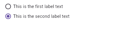\n\nHere is an example of a custom LabeledRadio widget, but you can easily\nmake your own configurable widget."
},
{
"sourcePath": "lib/src/material/list_tile.dart",
"sourceLine": 606,
"serial": "5",
"package": "flutter",
"library": "material",
"element": "ListTile",
"id": "material.ListTile.5",
"file": "material.ListTile.5.dart",
"description": "Here is an example of an article list item with multi-line titles and\nsubtitles. It utilizes [Row]s and [Column]s, as well as [Expanded] and\n[AspectRatio] widgets to organize its layout.\n\n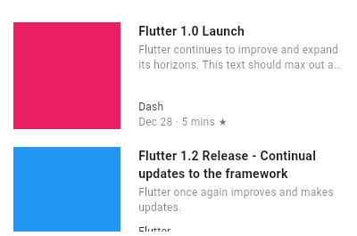"
},
{
"sourcePath": "lib/src/services/system_chrome.dart",
"sourceLine": 376,
"serial": "2",
"package": "flutter",
"library": "services",
"element": "SystemChrome.setSystemUIOverlayStyle",
"id": "services.SystemChrome.setSystemUIOverlayStyle.2",
"file": "services.SystemChrome.setSystemUIOverlayStyle.2.dart",
"description": "The following example creates a widget that changes the status bar color\nto a random value on Android."
},
{
"sourcePath": "lib/src/material/list_tile.dart",
"sourceLine": 606,
"serial": "4",
"package": "flutter",
"library": "material",
"element": "ListTile",
"id": "material.ListTile.4",
"file": "material.ListTile.4.dart",
"description": "Here is an example of a custom list item that resembles a Youtube related\nvideo list item created with [Expanded] and [Container] widgets.\n\n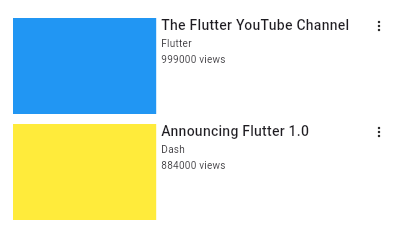"
},
{
"sourcePath": "lib/src/material/app_bar.dart",
"sourceLine": 166,
"serial": "1",
"package": "flutter",
"library": "material",
"element": "AppBar",
"id": "material.AppBar.1",
"file": "material.AppBar.1.dart",
"description": "This sample shows an [AppBar] with two simple actions. The first action\nopens a [SnackBar], while the second action navigates to a new page."
},
{
"sourcePath": "lib/src/material/card.dart",
"sourceLine": 99,
"serial": "1",
"package": "flutter",
"library": "material",
"element": "Card",
"id": "material.Card.1",
"file": "material.Card.1.dart",
"description": "This sample shows creation of a [Card] widget that shows album information\nand two actions."
},
{
"sourcePath": "lib/src/material/checkbox_list_tile.dart",
"sourceLine": 250,
"serial": "2",
"package": "flutter",
"library": "material",
"element": "CheckboxListTile",
"id": "material.CheckboxListTile.2",
"file": "material.CheckboxListTile.2.dart",
"description": "\n\nHere is an example of a custom labeled checkbox widget, called\nLinkedLabelCheckbox, that includes an interactive [RichText] widget that\nhandles tap gestures."
},
{
"sourcePath": "lib/src/material/radio_list_tile.dart",
"sourceLine": 293,
"serial": "2",
"package": "flutter",
"library": "material",
"element": "RadioListTile",
"id": "material.RadioListTile.2",
"file": "material.RadioListTile.2.dart",
"description": "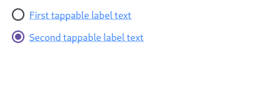\n\nHere is an example of a custom labeled radio widget, called\nLinkedLabelRadio, that includes an interactive [RichText] widget that\nhandles tap gestures."
},
{
"sourcePath": "lib/src/widgets/focus_manager.dart",
"sourceLine": 337,
"serial": "1",
"package": "flutter",
"library": "widgets",
"element": "FocusNode",
"id": "widgets.FocusNode.1",
"file": "widgets.FocusNode.1.dart",
"description": "This example shows how a FocusNode should be managed if not using the\n[Focus] or [FocusScope] widgets. See the [Focus] widget for a similar\nexample using [Focus] and [FocusScope] widgets."
},
{
"sourcePath": "lib/src/widgets/single_child_scroll_view.dart",
"sourceLine": 196,
"serial": "2",
"package": "flutter",
"library": "widgets",
"element": "SingleChildScrollView",
"id": "widgets.SingleChildScrollView.2",
"file": "widgets.SingleChildScrollView.2.dart",
"description": "In this example, the column becomes either as big as viewport, or as big as\nthe contents, whichever is biggest."
},
{
"sourcePath": "lib/src/material/stepper.dart",
"sourceLine": 236,
"serial": "1",
"package": "flutter",
"library": "material",
"element": "Stepper.controlsBuilder",
"id": "material.Stepper.controlsBuilder.1",
"file": "material.Stepper.controlsBuilder.1.dart",
"description": "Creates a stepper control with custom buttons."
},
{
"sourcePath": "lib/src/material/bottom_navigation_bar.dart",
"sourceLine": 137,
"serial": "1",
"package": "flutter",
"library": "material",
"element": "BottomNavigationBar",
"id": "material.BottomNavigationBar.1",
"file": "material.BottomNavigationBar.1.dart",
"description": "This example shows a [BottomNavigationBar] as it is used within a [Scaffold]\nwidget. The [BottomNavigationBar] has three [BottomNavigationBarItem]\nwidgets and the [currentIndex] is set to index 0. The selected item is\namber. The `_onItemTapped` function changes the selected item's index\nand displays a corresponding message in the center of the [Scaffold].\n\n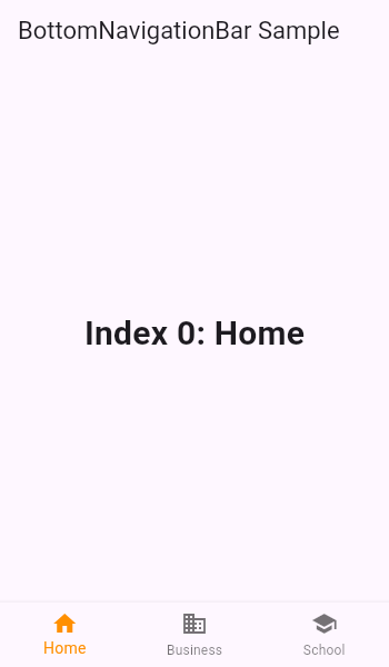"
},
{
"sourcePath": "lib/src/widgets/navigator.dart",
"sourceLine": 747,
"serial": "1",
"package": "flutter",
"library": "widgets",
"element": "Navigator",
"id": "widgets.Navigator.1",
"file": "widgets.Navigator.1.dart",
"description": "The following example demonstrates how a nested [Navigator] can be used to\npresent a standalone user registration journey.\n\nEven though this example uses two [Navigator]s to demonstrate nested\n[Navigator]s, a similar result is possible using only a single [Navigator].\n\nRun this example with `flutter run --route=/signup` to start it with\nthe signup flow instead of on the home page."
},
{
"sourcePath": "lib/src/widgets/form.dart",
"sourceLine": 66,
"serial": "1",
"package": "flutter",
"library": "widgets",
"element": "Form",
"id": "widgets.Form.1",
"file": "widgets.Form.1.dart",
"description": "This example shows a [Form] with one [TextFormField] and a [RaisedButton]. A\n[GlobalKey] is used here to identify the [Form] and validate input."
},
{
"sourcePath": "lib/src/widgets/basic.dart",
"sourceLine": 4421,
"serial": "2",
"package": "flutter",
"library": "widgets",
"element": "Expanded",
"id": "widgets.Expanded.2",
"file": "widgets.Expanded.2.dart",
"description": "This example shows how to use an [Expanded] widget in a [Row] with multiple\nchildren expanded, utilizing the [flex] factor to prioritize available space."
},
{
"sourcePath": "lib/src/widgets/editable_text.dart",
"sourceLine": 119,
"serial": "1",
"package": "flutter",
"library": "widgets",
"element": "TextEditingController",
"id": "widgets.TextEditingController.1",
"file": "widgets.TextEditingController.1.dart",
"description": "This example creates a [TextField] with a [TextEditingController] whose\nchange listener forces the entered text to be lower case and keeps the\ncursor at the end of the input."
},
{
"sourcePath": "lib/src/material/icon_button.dart",
"sourceLine": 125,
"serial": "2",
"package": "flutter",
"library": "material",
"element": "IconButton",
"id": "material.IconButton.2",
"file": "material.IconButton.2.dart",
"description": "In this sample the icon button's background color is defined with an [Ink]\nwidget whose child is an [IconButton]. The icon button's filled background\nis a light shade of blue, it's a filled circle, and it's as big as the\nbutton is."
},
{
"sourcePath": "lib/src/material/checkbox_list_tile.dart",
"sourceLine": 250,
"serial": "1",
"package": "flutter",
"library": "material",
"element": "CheckboxListTile",
"id": "material.CheckboxListTile.1",
"file": "material.CheckboxListTile.1.dart",
"description": "\n\nThis widget shows a checkbox that, when checked, slows down all animations\n(including the animation of the checkbox itself getting checked!).\n\nThis sample requires that you also import 'package:flutter/scheduler.dart',\nso that you can reference [timeDilation]."
}
]