Replies: 5 comments 6 replies
-
|
We would also like to rename the "ISO file" option to something like "Device with an ISO file". Using just "ISO file" is confusing, because users can select only an ISO file on a mountable device. They cannot specify for example an URL. Also the device description can be shown on one line if we use an ellipsized label instead of a hard-coded new line. It looks much better. |
Beta Was this translation helpful? Give feedback.
-
|
It might a good idea to hide the "Additional repositories" section by default in an expander. |
Beta Was this translation helpful? Give feedback.
-
|
@mairin Could you look at this proposal, please? What do you think? |
Beta Was this translation helpful? Give feedback.
-
|
What about unifying the design for the base repository and additional repositories? I mean, place the configuration fields for the base repository vertically instead of horizontally next to each other. There is some space on the screen and it would allow more space for the URL or NFS path. Also, I'm not sure about the "Install from a specified URL" label. If I were installing from a NFS server, I would try to provide Otherwise it looks like a nice improvement. |
Beta Was this translation helpful? Give feedback.
-
|
Sorry @poncovka I missed the GitHub notification on this one - in case my review is still helpful: I like the solutions you came up with here generally, I think they are good simplifications. General ideasTo make this screen a bit cleaner / less cluttered, would it be possible to only show options that depend on a dropdown selection when that item is selected? For example, some options apply to https that don't apply to ftp. Here's a visual to show what I mean: by default in the "On the network" dropdown, only show that dropdown with a default "please choose option" item selected by default, and fade in / otherwise display the other form fields that apply to the selected drop down option? E.g., something like this: I also see some areas where the size / alignment / padding of elements is just a bit off and a few visual tweaks might give it overall a nicer appearance - but I know these can be kind of tricky to do in GTK. Let me know if you are interested and I can mock something up to show what I mean. Autodetected mediaI would look at maybe adjusting the alignment of the "auto detected media section", try this maybe, it might make things feel a bit lighter: For on the network source configuration
Additional repo source configurationI like your idea of hiding the additional repos configuration area under a disclosure widget - that would make things cleaner and less intimidating to a lot of users who won't use these options but still keep them easily at hand for those who need them. Another thing to think about - if you applied the idea under "General ideas" at the top of this comment to the additional repo configuration section.... it would make it a lot less cluttered without hiding it below a disclosure triangle. I would still think some kind of horizontal seperator between the main source section and additional sources section would be a good idea, though. I hope this helps :) Happy to chat more on this if it makes sense. |
Beta Was this translation helpful? Give feedback.


-
Introduction
We are planning an extensive clean-up of the code for the Installation Source spoke to prepare the code for the payload modularization. That creates a good opportunity for revisiting the design of the user interface as well. We would like to address some of the long-term issues and propose an alternative. It shouldn't be anything drastic, just a small reorganization of the current components and options.
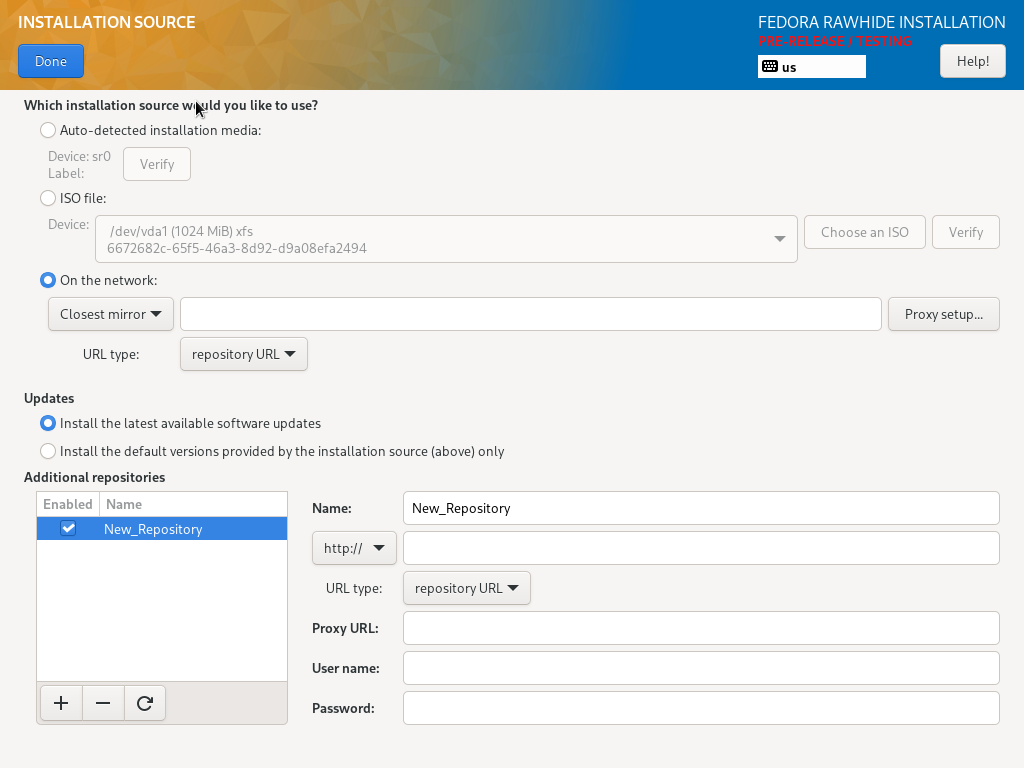
At this moment, the spoke looks (for example) like this:

The installer supports several options, that doesn't have to be always available:
What are the issues?
What would we like to achieve?
Suggestions for the "On the network" option
We have some suggestions for the "On the network" option of the main installation source.
HTTP, HTTPS and FTP
Current solution
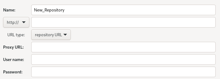
When you select the HTTP source, it looks like this. HTTPS looks the same.

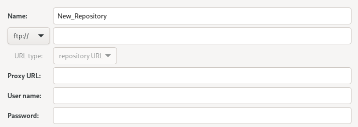
When you select the FTP source, it looks like this. The URL type is "repository URL" by default.

New solution
The drop-down menu with protocols could be replaced with a drop-down menu with actions. Choose "Install from a specified URL" to see all configuration options related to the URL source. Users could specify an URL of the source, an URL type and a proxy. The "Configure proxy" button would open a dialog for the proxy configuration.

NFS
Current solution
When you select the NFS source, it looks like this. The URL has to be specified as

<server>:<path>. The NFS mount options are optional.New solution
Choose "Install from a NFS server" to see all configuration options related to the NFS source. Users could specify a NFS server, a path on the server and optionally NFS mount options.

Closest mirror
Current solution
When you select the closest mirror, it looks like this. The closest mirror is the only option that supports installation of updates, so the Updates section is included on this screenshot, but it is visible always. The proxy configuration and the URL type are irrelevant to the closest mirror and ignored by the installer.

New solution
Choose "Install the latest available software updates from the closest mirror" to select the closest mirror with enabled updates.

Choose "Install the default software versions from the closest mirror" to select the closest mirror with disabled updates.

The "Updates" section would be removed from the screen.
Suggestions for the "Additional repositories" section
We have some suggestions for the "Additional repositories" section.
HTTP, HTTPS and FTP
Current solution
When you select the HTTP source, it looks like this. HTTPS looks the same.

When you select the FTP source, it looks like this. The URL type is "repository URL" by default.

New solution
The drop-down menu with protocols could be replaced with a drop-down menu with Source actions. Choose "Install additional software from a specified URL" to see all configuration options related to the URL source in the same way as in the "On the network option".

NFS
Current solution
When you select the NFS source, it looks like this. The URL has to be specified as
<server>:<path>or<options>:<server>:<path>if you want to specify mount options.New solution
Choose "Install additional software from a NFS server" to see all configuration options related to the NFS source in the same way as in the "On the network option".
Other locations
In some cases, the installer shows uneditable details of other types of sources.
Current solution
We are trying to modify the drop-down menu with protocols and we are not always successful.
New solution
The installer will choose "Install additional software from another source" to show details about another type of source. These details won't be editable.
Summary
With the changes suggested above (and some additional changes in the "ISO file" option), the spoke could look like this:
Or like this when the installation source is switched to URL:
Beta Was this translation helpful? Give feedback.
All reactions