Releases: rsms/inter
v2.5
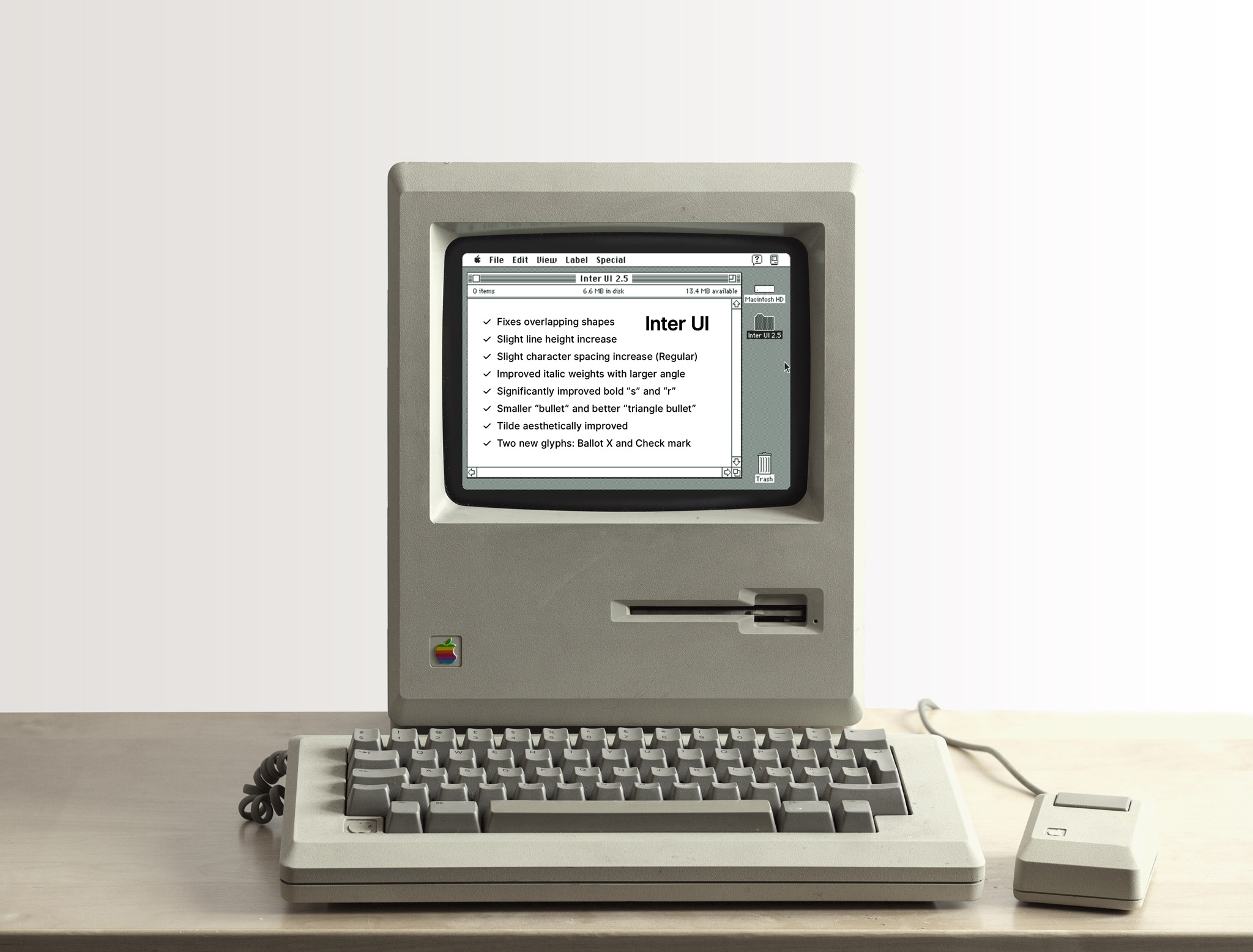
- Fixed issues:
- Fixes issue #51 ("overlapping shapes") where some glyphs' vector data
would include overlapping paths that would cause issues in some particual
software that didn't pre-process glyph vector data.
This causes a very slight increase in file size.
- Fixes issue #51 ("overlapping shapes") where some glyphs' vector data
- Metrics:
- Ascender changed from 2688 to 2708 and descender from -640 to -660.
This means that the natural line height has increased slightly.
In practice it's now about x-height distance between two lines. - The spacing of the Regular weight has been increased very slightly by
16 UPM, or 0.0057em. You may want to correct any letter-spacing/tracking
adjustments you've made using earlier versions by -0.0057em. - Underline position has been increased by 0.0589em (from 256 to 422 UPM)
- Underline and overline thickness has been increased to 170 UPM (from 128)
- Ascender changed from 2688 to 2708 and descender from -640 to -660.
- Glyphs & appearance:
- Italic (oblique, really) angle has increased very slighlty (by 2 degrees)
- Spacing and placement of glyphs in italic weights has been improved, meaning
that cursor and selection ranges should now be more precise. - "s" glyph of Black and Bold weights has been significantly improved to
provide both better contrast and a better over-all pace. - Significantly improved kerning of U+00EF "idieresis", U+1E2F "idieresisacute"
and U+0129 "itilde" - Bullet glyph is now slightly smaller, especially in the lighter weights.
- "a" glyph has been slightly refined. The changes are most visible in Black
and Bold weights at the lower vertical stem which has been made a little more
narrow. The connecting loop at that point has also been made thinner to
increase contrast. - "~" (U+007E "asciitilde") glyph has been aesthetically improved
- Two new glyphs: U+2717 "Ballot X" and U+2713 "Check mark"
- Notable minor improvements to U+00D7 "multiply" and to U+2023 "trianglebullet"
- "r" glyph of Black weight has recieved an update and the extension at the top
is now longer and terminates into the vertical stem with higher contrast. - Change to contextual alternate glyph substitution of arrows:
Hyphen combined with greater (">") or less ("<") now causes the substitution
of the shorter arrows (U+2190 and U+2192). Combinations with ndash and emdash
still yields substitutions with the longer arrows. In previous versions,
hyphen combinatins would also cause substitutions with longer arrows, which
would make the advance longer than expected.
https://gist.github.com/rsms/33683776e955847399984a2ee2eb750a contains a complete
list of all modified and removed glyphs.
v2.5-beta
This is a pre-release of v2.5 that is essentially the same as v2.4 except:
All glyphs are now completely outlined and flattened. This affects you if you use software that does not flatten glyphs itself and you are either stroking the type or (for certain software), blending. In particular, Adobe Illustrator behaves this way, while pretty much all other design apps are unaffected by this.
A side effect of this fix is an increase in file size by around 20 kB for an OTF file and about 2 MB for the release ZIP archive. However, there should be no difference in raserization performance.
Example from Adobe Illustrator, comparing v2.4 with v2.5-beta:


v2.4
Major release. Here are the highlights:
- Wider capital letters (O, C, D, X, Y, etc) Some stay same size (N, E, etc.)
- "bends" now on most lower-case letters to create a bit more visual harmony (t, f, y, r, etc.)
- Base letter spacing of the medium weight has increased by a small amount, mainly to very slightly increase legibility.
- Base letter spacing of bold and black weights has increased by a noticable amount. The main reason for this is to balance the spacing to look similar to lighter weights, making it easier to intermix various weights without the need for manual tracking.
- Lots of kerning improvements
- Lots of glyph detail improvements
- Many glyphs have been completely redrawn across weights
Here's a sample showing just a few of the changes compared to the previous release v2.3:

v2.3
Major release that focuses on refinement of glyphs and kerning.
The following glyphs have been updated since the previous version 2.2. This list does not include kerning (there's a lot of kerning updates in this release.)
v2.2
Significant update with lots of changes and improvements.
Notable glyph changes:
- a
- s
- 1


Complete list of changed glyphs (does not include kerning):
a, afii10048, afii10147, approxequal, asciitilde, bullseye, C, dhook,
divide, divide.case, e, eight, eight.tnum, equal, equal.case, f, G,
germandbls, Germandbls, greater, greaterequal, less, lessequal, minus,
minus.case, multiply, multiply.case, nine, nine.tnum, notequal,
notequal.case, O, Ohorn, one, one.1, one.tnum, one.tnum.1, Oslash, P,
plus, plus.case, plusminus, plusminus.case, Q, R, s, S, six, six.tnum,
t, three.tnum, U, Uhorn, uni0244, uni048E, zero
v2.1
v2.0
Major new release with a large amount of reworked glyphs, new glyphs and improved kerning.
Affected glyphs:
Added:
feng, hturnhook2, hturnlthook, lcurl, ncurl, Q_rthook, qrthook, slongstroke,
tcurl, zhook
Removed:
dhook.cn, finalnun, ghook.cn, bhook.cn, chook.cn, Chook.cn, Oopen.cn,
phook.cn, qhook.cn
Renamed and/or updated:
uni023D -> L_bar
Ibar -> Istroke
Lslash -> L_slash
uni02A9 -> feng.glif
uni1E9C -> slongstroke
uni02AE -> hturnlthook
uni0234 -> lcurl
uni0235 -> ncurl
uni024A -> Q_rthook
uni024B -> qrthook
uni0236 -> tcurl
uni0225 -> zhook
Updated:
Almost all glyphs have either been reworked, updated or had their sidebearings adjusted.
v1.11
- Improved kerning
- Reduced character set. Glyphs in the following Unicode ranges have been removed:
- U+0500-052F Cyrillic Supplement
- U+1AB0-1AFF Combining Diacritical Marks Extended
- U+1D00-1DBF Phonetic Extensions
- U+27C0-27EF Miscellaneous Mathematical Symbols-A
- U+2980-29FF Miscellaneous Mathematical Symbols-B
- U+2C60-2C7F Latin Extended-C
- U+2DE0-2DFF Cyrillic Extended-A
- U+2E00-2E7F Supplemental Punctuation
- U+A640-A69F Cyrillic Extended-B
- U+A720-A7FF Latin Extended-D
- U+AB30-AB6F Latin Extended-E
v1.10
- Web fonts served from the CDN are no longer containing hints for ClearType. This reduces size (makes loading faster) and in most cases it looks better on Windows. Fonts with hints are still available in the distribution zip archive.
- Adjusts sidebearings of "o"-like glyphs
- Fixes bottom of q in black weight
- Reworked oe in black weight
- Reworked beta in all weights
- Reworked alpha in regular weight
- Reworked thorn (upper and lower case) in all weights


