Story source for component that is wrapped by HoC show wrapping component in story source #4143
Comments
|
Have you tried something like this: import React from "react";
import PropTypes from "prop-types";
const withBase = Component => {
/** Base component description */
class Base extends React.Component {
constructor(props) {
super(props);
}
render() {
return (
<div>
<Component {...this.props} />
</div>
);
}
}
Base.displayName = Component.displayName;
Base.propTypes = Component.propTypes;
Base.defaultProps = Component.defaultProps;
return Base;
};
export default withBase; |
|
No, I hadn't tried that and it certainly fixes the story source part of the sample. In my actual code I'm using react-themed which I didn't think was relevant at the time of creating this issue. To demonstrate with the sample code I've provide here, it looks something like this: However, in case it is helpful to anyone else, if I do the following I get exactly what I want: Thanks for you help with that! I'm guessing your suggestion was just pertaining to the story source part of the issue, but just to be clear, setting the displayName had no effect on the parsing of inline comments into a component description or prop descriptions. Perhaps I should log that as a separate issue? |
|
I'll start work on https://storybook.canny.io/roadmap/p/docs-view-mode after the UI refactor and 4.0.0 release. It will likely be the biggest change storybook ever: adding a completely new method of looking at components. I mention this because I will personally not spend a lot of time on the addon info because of that. I think docs-view will render addon-info obsolete. (It will still work) Happy to take suggestions and help.
Not sure what you mean, but if you can give us a clear description of the feature / bug, yes please open an issue for it! 👍 |
The second issue I was trying to describe was that my inline documentation of the component did not get rendered in my story info. My understanding was that by putting the following comments into the component source, they would be parsed and rendered by withInfo: But something about the way that the Test component is wrapped is interfering with that. The component description does not show up and, although the proptypes table renders nicely with default values and types, the "text to display" string does not get rendered in the description column of the table. When this didn't work for me, I tried putting the inline comments in Base instead (and in addition to Test) but none of these approaches led to the comments getting rendered by withInfo. If I remove the HoC Base wrapper and just "export default Test;", things render as expected. |
|
How about putting the ThemeProvider in a decorator? |
|
The issue with inline documentation not getting rendered by withInfo does not appear to be related to react-themed. After more research, I think this is an issue with react-docgen. I haven't figured out how to solve my particular problem yet, but I have a feeling these issues may be related: |
|
Hi everyone! Seems like there hasn't been much going on in this issue lately. If there are still questions, comments, or bugs, please feel free to continue the discussion. Unfortunately, we don't have time to get to every issue. We are always open to contributions so please send us a pull request if you would like to help. Inactive issues will be closed after 30 days. Thanks! |
|
Hey there, it's me again! I am going close this issue to help our maintainers focus on the current development roadmap instead. If the issue mentioned is still a concern, please open a new ticket and mention this old one. Cheers and thanks for using Storybook! |
|
Hi, any update on this issue ? |
|
My example is using when it should be From Material UI docs Note: JSX addon does the exact same thing. |
|
Based on Norbert's suggestion, my solution has been to export this way: |
|
Oh cool, I missed that somehow. Glad it's possible. Thanks a lot. |
|
Is there any sample for write a story for FOC component ? |
|
Ugh, stalebot is a crime. This issue shouldn't be closed just because nobody's fixed it or talked about it much - it hasn't gone away! @maintainers please reopen? Anyway, I've worked around the two aspects of this:
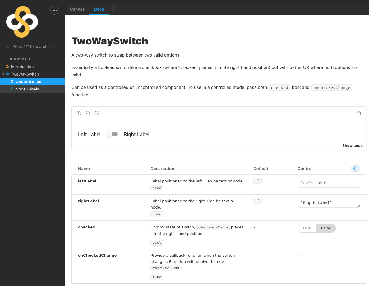
The workaround requires that the unwrapped component must also be exported, so I've adopted a pattern of exporting the unwrapped component as a named export, and the wrapped as the default component. Here's a complete working example (for a custom MUI component), for which the use of the TwoWaySwitch.jsximport React from 'react'
import PropTypes from 'prop-types'
import FormGroup from '@material-ui/core/FormGroup'
import Switch from '@material-ui/core/Switch'
import Grid from '@material-ui/core/Grid'
import Typography from '@material-ui/core/Typography'
import controllable from 'react-controllables'
/**
* A two-way switch to swap between two valid options
*
* Essentially a boolean switch like a checkbox (where 'checked'
* places it in hte right hand position) but with
* better UX where both options are valid.
*
* Can be used as a controlled or uncontrolled component. To use
* in a controlled mode, pass both `checked` bool and `onCheckedChange`
* function.
*
*/
function TwoWaySwitch({
leftLabel, rightLabel, checked, onCheckedChange,
}) {
const handleChange = (event) => {
if (onCheckedChange) {
onCheckedChange(event.target.checked)
}
}
const color = checked ? 'primary' : 'secondary'
return (
<FormGroup>
<Typography component="div">
<Grid component="label" container alignItems="center" spacing={1}>
{leftLabel ? <Grid item>{leftLabel}</Grid> : null}
<Grid item>
<Switch
checked={checked}
onChange={handleChange}
value="checked"
color={color}
/>
</Grid>
{rightLabel ? <Grid item>{rightLabel}</Grid> : null}
</Grid>
</Typography>
</FormGroup>
)
}
TwoWaySwitch.defaultProps = {
leftLabel: '',
rightLabel: '',
}
TwoWaySwitch.propTypes = {
/**
* Label positioned to the left. Can be text or node.
*/
leftLabel: PropTypes.node,
/**
* Label positioned to the right. Can be text or node.
*/
rightLabel: PropTypes.node,
/**
* Control state of switch, `checked=True` places it
* in the right hand position.
*/
// eslint-disable-next-line react/require-default-props
checked: PropTypes.bool,
/**
* Provide a callback function when the switch changes.
* Function will receive the new `checked` value.
*/
// eslint-disable-next-line react/require-default-props
onCheckedChange: PropTypes.func,
}
// Working around https://github.com/storybookjs/storybook/issues/4143
export { TwoWaySwitch }
const exportComponent = controllable(TwoWaySwitch, ['checked'])
exportComponent.displayName = 'TwoWaySwitch'
export default exportComponentTwoWaySwitch.stories.jsAs per your normal story file, except: // NOTE - SEE I'M IMPORTING THE UNWRAPPED COMPONENT
// If you want to use is as if it were wrapped, you'll need to wrap it yourself here...
import { TwoWaySwitch } from './TwoWaySwitch'End resultThis produces documentation as expected: |
I'm using a higher order component to wrap several other components that I want to export for others to use. Clients don't need to use or know about the HoC. In the following simplified example I'm calling the HoC "Base" and the exported component that I want to create stories for "Test".
Steps to reproduce
Base.jsx:
Test.jsx:
Story code:
This renders the following story source:
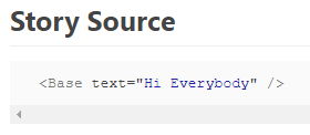
i.e. Instead of showing my actual story source
<Test text="Hi Everybody"/>it shows<Base text="Hi Everybody" />In addition to the issue with the story source, I'm also seeing an issue with the prop descriptions and component descriptions not being picked up when components are designed in this way.
The text was updated successfully, but these errors were encountered: