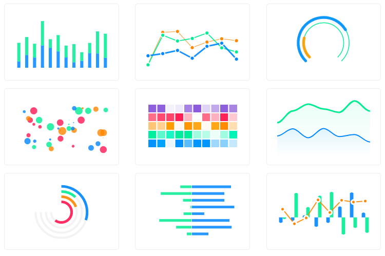
Beautiful and interactive web charts for rubyist.
Example series used for cartesian charts:
<% series = [
  {name: "Inactive", data: @inactive_properties},
  {name: "Active", data: @active_properties}
] %>
To build the data, you can use gem groupdate.
In my case, it was:
@inactive_properties = Property.inactive.group_by_week(:created_at).count
@active_properties = Property.active.group_by_week(:created_at).count
and I'll get the data in this format:
{
  Sun, 29 Jul 2018=>1,
  Sun, 05 Aug 2018=>6,
  ..
}
Example options used for cartesian charts:
<% options = {
  title: 'Properties Growth',
  subtitle: 'Grouped Per Week',
  xtitle: 'Week',
  ytitle: 'Properties',
  stacked: true
} %><%= line_chart(series, options) %><%= area_chart(series, {**options, theme: 'palette5'}) %><%= column_chart(series, {**options, theme: 'palette4'}) %><%= bar_chart(series, {**options, xtitle: 'Properties', ytitle: 'Week', height: 800, theme: 'palette7'}) %><%= scatter_chart(series, {**options, theme: 'palette3'}) %>You can mix charts by using mixed_chart or combo_chart methods. For example:
Given that:
@total_properties = Property.group_by_week(:created_at).countyou can do this:
<%= combo_chart({**options, theme: 'palette4', stacked: false, data_labels: false}) do %>
  <% line_chart({name: "Total", data: @total_properties}) %>
  <% area_chart({name: "Active", data: @active_properties}) %>
  <% column_chart({name: "Inactive", data: @inactive_properties}) %>
<% end %>You can synchronize charts by using syncing_chart or synchronized_chart methods. For example:
<%= syncing_chart(chart: {toolbar: false}, height: 250, style: 'display: inline-block; width: 32%;') do %>
  <% mixed_chart(theme: 'palette4', data_labels: false) do %>
    <% line_chart({name: "Total", data: @total_properties}) %>
    <% area_chart({name: "Active", data: @active_properties}) %>
  <% end %>
  <% area_chart({name: "Active", data: @active_properties}, theme: 'palette6') %>
  <% line_chart({name: "Inactive", data: @active_properties}, theme: 'palette8') %>
<% end %>All cartesian charts can have annotations, for example:
<%= line_chart(series, options) do %>
  <% x_annotation(value: ('2019-01-06'..'2019-02-24'), text: "Busy Time", color: 'green') %>
  <% y_annotation(value: 29, text: "Max Properties", color: 'blue') %>
  <% point_annotation(value: ['2018-10-07', 24], text: "First Peak", color: 'magenta') %>
<% end %><%= pie_chart([
{name: "Series A", data: 25},
{name: "Series B", data: 100},
{name: "Series C", data: 200},
{name: "Series D", data: 125}
], legend: "left") %><%= donut_chart([25, 100, 200, 125], theme: 'palette4' %>Also called circle_chart.
<%= radial_bar_chart([
  {name: "Circle A", data: 25},
  {name: "Circle B", data: 40},
  {name: "Circle C", data: 80},
  {name: "Circle D", data: 45}
], legend: true) %>Add this line to your application's Gemfile:
gem 'apexcharts'And then execute:
$ bundleAfter installing the gem, require it in your app/assets/javascripts/application.js.
//= require 'apexcharts'Or, if you use webpacker, you can run:
yarn add apexchartsand then require it in your app/javascript/packs/application.js.
require("apexcharts")- To bring out as much apexcharts.js capabilities as possible but in ruby ways.
- Other charts (
pie,donut, radar, heatmap, etc.) - Support other ruby frameworks (sinatra, hanami, etc.)
- Render as Vue or React elements
Everyone is encouraged to help improve this project by:
- Reporting bugs
- Fixing bugs and submiting pull requests
- Fixing documentation
- Suggesting new features
The gem is available as open source under the terms of the MIT License.


