-
-
Notifications
You must be signed in to change notification settings - Fork 7k
New issue
Have a question about this project? Sign up for a free GitHub account to open an issue and contact its maintainers and the community.
By clicking “Sign up for GitHub”, you agree to our terms of service and privacy statement. We’ll occasionally send you account related emails.
Already on GitHub? Sign in to your account
Add notification quick-filter bar in the frontend app #9399
Conversation
|
I addressed the The PR should be ready to merge. I can add unit tests in a separate PR not to clutter this one. |
|
Thoughts:
|
Expanding the second point, I think grouping the notifications as mentioned in #1483 could work even better, but for now I would opt for leaving these two as they are. EDIT: Also, did I miss any locale files? I couldn't find anything on how these strings should be handled in the developer's docs, so I just went with two |
|
I created a fork of the code with a @Gargron 's suggested unified design: https://github.com/pawelngei/mastodon/tree/filter-bar-unified-look The drawback is that it doesn't look that well multiline: |
|
I think we can remove |
|
If there's a concern about overflows, why not simply use the icons? They should be very straightforward:
|
|
"Why not use icons?"
Because icons can often be unfamiliar to new users, it's just one more thing they have to learn.
… On 3. Dec 2018, at 01:31, trwnh ***@***.***> wrote:
If there's a concern about overflows, why not simply use the icons? They should be very straightforward:
asterisk = all
at-sign = mentions
star = favorites
retweet = boosts
contact-plus = follows
—
You are receiving this because you were mentioned.
Reply to this email directly, view it on GitHub, or mute the thread.
|
|
Actually, icons don't look that bad, especially if we use tooltips explaining them: With longer languages like this: Tooltip example: Everything is implemented at https://github.com/pawelngei/mastodon/tree/filter-bar-icons |
|
The icons look great and are also used throughout the UI already. Love it! :) |
|
@ThisIsMissEm , I see three options now:
What do you think would be the best version? Can we accept the line overflowing into the next row? I'm currently supporting the 3rd option the most. If you agree that icons with tooltips are readable (since there's a huge "Notifications" for context above), I can merge the changes and we can ask the devs to review this PR. |
|
Personally I'm not in favour of icons, but I'm also not heavily involved in the mastodon project anymore.
… On 3. Dec 2018, at 16:31, Paweł Ngei ***@***.***> wrote:
@ThisIsMissEm , I see three options now:
We implement your initial design, which is a little bit different than the standard.
We cut out some of the categories (I would not like that myself).
We use the icons with the unified design.
What do you think would be the best version? Can we accept the line overflowing to the next row?
I'm currently supporting the 3rd option the most. If you agree that icons with tooltips are readable (since there's a huge "Notifications" for context above), I can merge the changes and we can ask the devs to review this PR.
—
You are receiving this because you were mentioned.
Reply to this email directly, view it on GitHub, or mute the thread.
|
|
I agree with @ThisIsMissEm that icons are very confusing for users. I also agree with @Gargron that this is a really complex UI to throw at new users, and most people would be better served by only having "All" and "Mentions" (and maybe "Follows") tabs. |
|
I think these two concerns are also intersecting—I could support a design that had one or two icons, instead of 5. |
|
Since being able to use all 5 is very important to me, I could propose two solutions:
@nightpool @Gargron what do you think about it? I'll give you mockups / code in a moment. |
|
@pawelngei I like both approaches a lot. :) |
There was a problem hiding this comment.
Choose a reason for hiding this comment
The reason will be displayed to describe this comment to others. Learn more.
I do not see the code affecting the server-side query, so pagination is going to be wonky with any of these filters enabled. For example, if you only view mentions, and there is a page of follows, all are going to be invisible, and the next page won't load. See how the other toggles work in this column
|
"advanced view" is completely undescriptive of what the slider actually
does. let's make it something like "Show more filters"
…On Sun, Dec 9, 2018, 3:26 PM Eugen Rochko ***@***.***> wrote:
***@***.**** requested changes on this pull request.
I do not see the code affecting the server-side query, so pagination is
going to be wonky with any of these filters enabled. For example, if you
only view mentions, and there is a page of follows, all are going to be
invisible, and the next page won't load. See how the other toggles work in
this column
—
You are receiving this because you were mentioned.
Reply to this email directly, view it on GitHub
<#9399 (review)>,
or mute the thread
<https://github.com/notifications/unsubscribe-auth/AAORV30DBbxsJOytB-8BaUNiKIttuOf5ks5u3XH1gaJpZM4Y7meA>
.
|
|
I'm also confused about how this is supposed to interact with the other
existing filters. if I turn off showing follows in the notifications
column, and then I drill down to follows only, what does it show?
…On Sun, Dec 9, 2018, 3:26 PM Eugen Rochko ***@***.***> wrote:
***@***.**** requested changes on this pull request.
I do not see the code affecting the server-side query, so pagination is
going to be wonky with any of these filters enabled. For example, if you
only view mentions, and there is a page of follows, all are going to be
invisible, and the next page won't load. See how the other toggles work in
this column
—
You are receiving this because you were mentioned.
Reply to this email directly, view it on GitHub
<#9399 (review)>,
or mute the thread
<https://github.com/notifications/unsubscribe-auth/AAORV30DBbxsJOytB-8BaUNiKIttuOf5ks5u3XH1gaJpZM4Y7meA>
.
|
|
@nightpool "All" shows the filters that you set in the notification column, so if you unticked Follows, you won't see them there. Each separate category will always show only what's in there, independent of your Notification options. @Gargron Thank you, I'll write the queries tomorrow. |
|
hi, I have a question regarding this: Will the tabs have any indications that there are new elements within them? or will I have to constantly toggle between them to check? Don't get me wrong, I think something like this is sorely needed but this is a new type interface that differs from the current columns approach where things are always being shown. |
|
@LoMakesComics thanks for asking these questions! The end result depends mainly on maintainers and their vision, but I was planning to finish this PR without implementing per-type notifications, as that would require more Ruby knowledge than I currently have. We would need to change the API and need to introduce a "notification read" system unified among different Mastodon clients (if I understand it correctly). I wanted to tackle the "group notifications" next, but I think that creating the indicators may be a better, smaller task after this ticket. I will prepare some sketches of API and the interface in a separate issue. I can't see how implementing separate filters could affect grouping negatively: even within one type of notification, it's great to see "5 people boosted post X" and "3 people boosted post Y". |
|
@Gargron I have tweaked with the filters and I have two questions:
I'd rather remove the |
…ed for FilterBar"

This reverts commit 9f4be78.
|
Okay, I created a new action and handled the pagination. Now this feature is a little bit heavier, but I think it deals with all the edge cases. Oh, and |
* create FilterBar componer and its container, unstyled

* introduce basic styling for FilterBar

* add selection css

* allow FilterBar to display active CSS with js

* connect the FilterBar to the Redux state

* change getNotifications to use filter

* remove temporary comments

* add an option to turn the FilterBar off in settings

* fix showFilterBar data type to boolean

* fix eslint errors

* add English and Polish translations

* allowed filter bar overflow to accomodate for longer languages

* fix mispelled translation key

* add unified CSS look

* replace text in FilterBar with icons

* add tooltips

* replace text @ with an icon

* introduce simple and advanced filtering view

* add ability to toggle the advanced view

* add Polish translations

* change Advanced View description to be more clear

* make each filter flush notifications and load new ones, fixing pagination

* simplify getNotifications once frontend filtering is not needed for FilterBar

* add a semicolon

* Revert "simplify getNotifications once frontend filtering is not needed for FilterBar"

This reverts commit 9f4be78.

* reset filter to 'all' when turning off FilterBar


Implements #7123 .
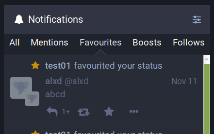
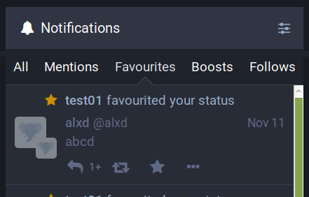
The quick-filter bar is toggleable in settings and visible by default in the Notifications column. The filtering options are ignored when it's turned off.
It filters specific types of notifications (one at a time), even if that type is absent from the general view due to the user's other settings.
EDIT: Polished the code and added Polish translations ;)