You signed in with another tab or window. Reload to refresh your session.You signed out in another tab or window. Reload to refresh your session.You switched accounts on another tab or window. Reload to refresh your session.Dismiss alert
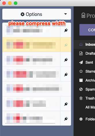
Thank you for your work on this great app. I find the "Tabs view mode" to be overwhelming when you have several accounts to monitor. The compact view seems better except for the fact that the names are lengthy.
Could you please allow for custom names for each account and/or a custom icon that could be used instead? I simply would like to see the left bar area compressed down to no more than 80 or 90 pixels wide. A custom icon with overlaid status info could be useful.
I also personally don't think the P vs T indicator is necessary since most people should know what kind of service it is that's being checked by the name.
The text was updated successfully, but these errors were encountered:
Thanks for the input. There is already a similar issue open #175, so closing this one as duplicate.
I also personally don't think the P vs T indicator is necessary since most people should know what kind of service it is that's being checked by the name.
I think it's better to keep the P vs T indicators at least until Tutanota got dropped, #180. But surely in a new / very compact mode can be hidden.
Thank you for your work on this great app. I find the "Tabs view mode" to be overwhelming when you have several accounts to monitor. The compact view seems better except for the fact that the names are lengthy.

Could you please allow for custom names for each account and/or a custom icon that could be used instead? I simply would like to see the left bar area compressed down to no more than 80 or 90 pixels wide. A custom icon with overlaid status info could be useful.
I also personally don't think the P vs T indicator is necessary since most people should know what kind of service it is that's being checked by the name.
The text was updated successfully, but these errors were encountered: