Column & Page Settings
Located below the Data Table Setup in Form and List Configuration, there are many options that allow you to control the way Form and List operates and displays data.
Column Settings allows you to manage display options that are applied to all Type URL and Image columns in this Form and List module. (Figure 6-1).
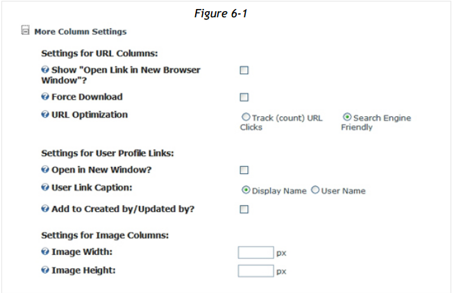
Show "Open Link in New Browser Window?"
Enable this option to offer the user the option to open a new browser window whenever a Type URL column hyperlink is clicked. Disabled by default, all Type URL columns will open pages and local URL addresses in the currently opened window. All links to files and external URLs will open in a new browser window.
Force Download
Enable this option to configure all Form and List resource URLs as file download, forcing the browser to immediately download the resource.
URL Optimization
When you do not wish to count link clicks for page URLs contained in the Form and List module, choose the option Search Engine Friendly to instruct Form and List to use search engine friendly links. If you wish to utilize LinkClick.aspx and count clicks to page URLs contained in Form and List, choose Track (count) URL Clicks option instead. For Form and List links to files, LinkClick.aspx is always used.
Open in New Window
Enable this setting to set Form and List to open all links to a User Profile in a new browser window.
User Link Caption
Choose to display either the user’s Display Name or Username when Form and List renders a link to the User’s Profile.
Add to Created by / Updated by?
Enable this setting to have the Form and List columns Created by or Updated by display as links to the User’s Profile.
Image Width / Image Height
If you leave these fields blank, images are displayed in their original size. If you specify a width or height value (numeric, in pixel) all images are scaled proportionally to fit the sizes you specify.
Settings in this section apply only to the Form and List instance on the current page only. If you use the same Form and List instance on different pages, you may vary the way Form and List displays on various pages using these settings (Figure 6-2).
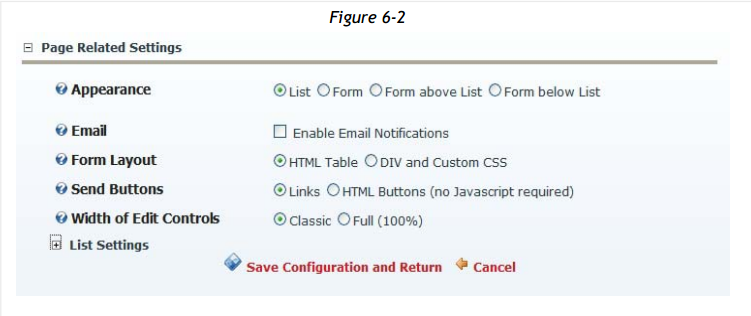
Appearance
Appearance is the primary setting that configures Form and List for either List or Form mode. Choose to display in either List or Form mode, or if you choose, display both form and list on the same page by selecting the appropriate Appearance setting.
Email
You can configure Form and List module to send a notification email when one or more trigger conditions are met, e.g. when a new record is added, or when an existing record is changed or deleted. You may specific one or more notification recipients, and even send to select recipients based on the contents of email addresses collected in a Form. Notification messages are completely customizable, and you may include variable [token] values based on data input in a Form.
Form Layout
Choose to render Forms using underlying code that utilizes HTML Table structure or DIV and Custom CSS structure.
Send Buttons
Select either Links or HTML Buttons to choose if the Send and Cancel links under input Forms should display as simple text links, or as HTML buttons.
Width of Edit Controls
Set the width of Form and List edit controls by choosing either Classic (fixed width) or Full (100%), which attempts to size fields based on the width of the browser display.
Rendering Method
Choose between two rendering methods - Default or XSL (eXtensible Stylesheet Language) - (Figure 6-3):
- Default Grid Table: simple tabular column format, one column aside the next
- XSLT using Self Made or Generated Stylesheets: use your own XSL code, or use the Token Based XSLT Generator and Editor to create XSL scripts, wizard style
- XSLT using Built-In Stylesheets: pre-built XSL that come with Form and List
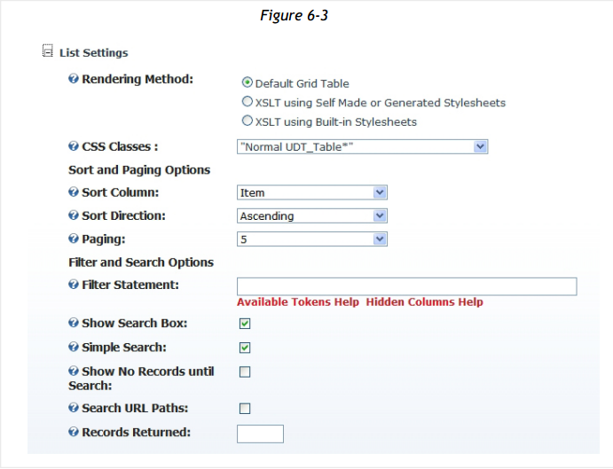
CSS Classes
This option determines which CSS classes are used to format the output of the Default Grid Table (Figure 6-3). You can switch between three CSS class sets:
- “Normal UDT_Table*”
- “DataGrid_*”
- YUI DataTable Styled
Each CSS class has a unique look and feel. Experience the various CSS classes by applying them to an existing Form and List instance containing at least a few records.
The following table lists the applied CSS classes for the corresponding <tr> tag.
“Normal UDT_Table*”
“DataGrid*”
Table Head
Normal
Bold UDT_Table_Head
DataGrid_Header
Table Row
Normal
UDT_Table_Item
DataGrid_Item
Table Row (Alternating)
Normal
UDT_Table_AlternateItem
DataGrid_AlternatingItem
The CSS classes Normal and NormalBold are part of the default DotnetNuke CSS. These classes typically define the layout of your DNN portal/site. Careful not to disturb settings outside of Form and List, you should only override the “Normal UDT_Table*” classes.
Example:
.UDT_Table_Head { background-color: yellow } .UDT_Table_AlternateItem { background-color: whitesmoke }
When you select Rendering Method: Default Grid Table, you can specify any of the following settings. When you choose XSLT Self Made or Built-In rendering, Sort and Paging options are disabled, but Filter, Search and Records Return are active:
Sort
Column Select the column on which to sort Form and List records in List view. When using the Default Grid Table, Form and List allows you to choose only one primary column on which to sort. If you choose no sort column, Form and List records are displayed in the order the records were entered.
Sort Direction
Choose the default sort direction to be applied to the Sort Column. Choose Ascending (lowest to highest) or Descending (highest to lowest).
Paging
If Paging is set to <no paging>, all records are displayed in one long list. By specifying a paging size, you set the maximum number of records to display per page, using the DotNetNuke paging control, with the built-in navigation control to move between pages.
Filter Statement
Enter an expression that must be ‘True’ for a Form and List record to be displayed. When you apply a Filter Statement, you cannot access all records. It is recommended that you use Filter Statement only on a copy of a Form and List module (‘Add Existing Module’ from the DotNetNuke toolbar).
Enter a Boolean expression that follows the Data.Column.Expression syntax. For more information on the Data.Column.Expression syntax, please refer to the MSDN link in the Additional Information section at the end of this user guide.
Click Available Tokens Help or Hidden Columns Help for information on which Tokens and Hidden Columns may be used in your Filter Statements.
Here are a few examples of valid Filter Statements (assuming the column names “Price”, “Quantity”, “City”, “Available” and “Unit Price” are columns defined in Form and List):
Price * Quantity <> 0
(City LIKE 'London') AND (Country = 'UK')
Available_UDT_Original = 'true'
([Unit Price]) is not null
Show Search Box: Display a Search Box that allows users to search for data contained in the columns marked ‘Searchable’ in the column definition list.
Simple Search: Enable this setting to activate a single, simple Search Box. This Search Box will perform a LIKE (contains) search on all the columns currently specified as ‘Searchable’ in the column definition list.
Show No Records Until Search: Enable this option to show no records until the user performs a search. Only the Form and List Search Box will display until a search is performed. Disable this option to display records in the default sort order.
Search URL Paths: enable this option, in order to search URL strings as well, i.e. find portal in http://www.mydomain.com/portals/0/my.gif URL of an image, URL or download data type as well.
Records Returned
Enter an integer value between 1 and 1000 to set the maximum number of records returned from file for this Form and List instance. This setting is applied after all other settings which may limit the number of records returned, e.g. Filter Statement.
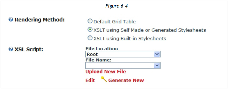
When you select Rendering Method: XSL using Self Made or Generated Stylesheets, select an XSL from the DotNetNuke file system, or you may Upload New File from your local system. (Figure 6-4). Choose Edit to modify an existing XSL script, or to create a brand new XSL transformation using the powerful Token Based XSLT Generator and Editor, choose Generate New.
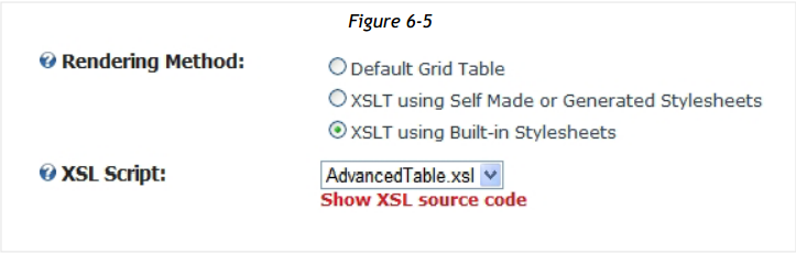
When you select Rendering Method: XSLT using Built-in Stylesheets, select from one of the predefined XSL Scripts included with Form and List (Figure 6-5):
AdvancedTable appears as the Default Grid Table, and includes a clickable ‘magnifier’ to show more detail about a record.
BasicTable appears as the Default Grid Table and is an excellent starting point for editing your own XSL transformations.
CardView will show the first visible text column as a Title, the first Type Image column as the record image and the first HTML/Rich Text column as a description.
OnlyOwnItems shows only the rows entered by the current user. You should also enable Form and List Module Settings > “Users are only allowed to manipulate their own items” to prevent users from guessing foreign edit URLs and viewing other user’s data.
Transpose renders a table with records displayed in a vertical column format, each record occupying one column.
Quick Tip
You can examine any style sheet by clicking “Show XSL source code”. Save the XSL locally, modify it, then upload your changes as XSLT using Self Made or Generated Stylesheet.
Show XSL Source Code
Click this link to see the source code for the current XSL script. View the sheet to examine the logic of the stylesheet, or to save the script and modify it. You can upload your changed stylesheet as an XSLT using Self Made or Generated Stylesheets.