Animated UI components for react-native
- Install library from npm
yarn add react-native-animated-ui
- Link native code
react-native link
Start using the components by importing them
import { Button, ActionButton } from 'react-native-animated-ui';

<Button />- ActionButton

| Prop | Type | Default | Note |
|---|---|---|---|
text |
string |
||
color |
string |
||
onPress |
function |
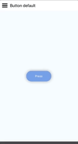
- Button
| Prop | Type | Default | Note |
|---|---|---|---|
text |
string |
Press |
|
color |
string |
#333 |
|
onPress |
function |
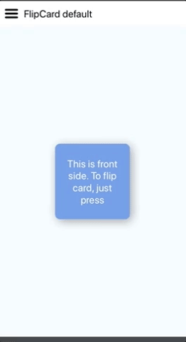
- FlipCard
| Prop | Type | Default | Note |
|---|---|---|---|
text |
string |
||
backText |
string |
||
fontSize |
number |
20 | |
color |
string |
cornflowerblue |
|
backColor |
string |
rebeccapurple |
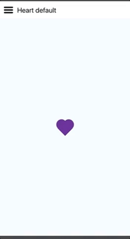
- Heart
| Prop | Type | Default | Note |
|---|---|---|---|
explosion |
boolean |
false |
|
color |
string |
crimson |
|
onPress |
function |
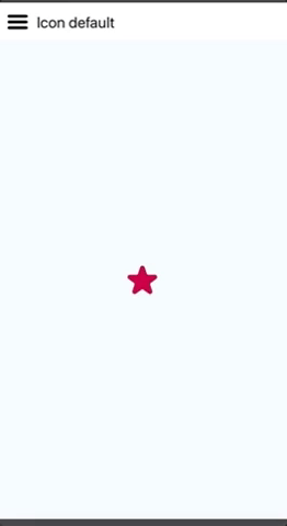
- Icon
| Prop | Type | Default | Note |
|---|---|---|---|
size |
number |
30 |
|
color |
string |
cornflowerblue |
|
svgPath |
string |
M44,19.7c0.1,8-7.1,10.7-11.7,14.1c-4.2,3.1-7.8,7.4-8.3,9.2c-0.5-1.8-3.8-6-8.3-9.1C11,30.7,3.9,27.7,4,19.8C4.1,5.3,18.8,2.4,24,14.9C29.2,2.5,43.9,5.2,44,19.7z |
|
viewBox |
string |
0 0 48 48 |
|
onPress |
function |
- HorizontalParallax
| Prop | Type | Default | Note |
|---|---|---|---|
images |
Array<{ image: string, title: string }> |