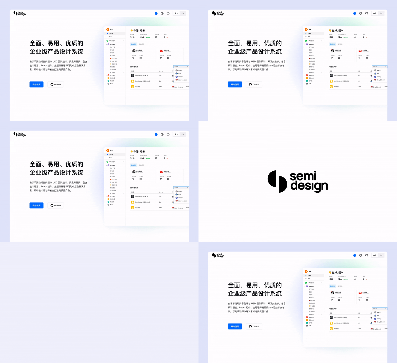
A modern, comprehensive, flexible design system and UI library. Connect DesignOps & DevOps. Quickly build beautiful React apps.
English | 简体中文
- 💪 Up to 60+ high-quality Components. Stable update since 2019
- 🚀 Official Design to Code (D2C) support, convert figma draft to real code in a few seconds
- 💅 Code to Design (C2D), automatically generate Figma UI Kit according to different themes, keep same between design and code
- 💕 Complete A11y support, follows W3C standards to provide keyboard interaction, focus management and ARIA for all components
- 💅 Design system management Semi DSM, up to 3000+ Design Tokens, make Semi Design to Any Design quickly.
- 🌍 Internationalization Support for Dozens of Languages, timezone, RTL support
- ⚙️ Strict quality assurance, covering unit testing, E2E testing, visual testing.
- 👏 Written in Typescript, friendly Static Type Support. Based on Foundation/Adapter architecture, easy to read and contribute
- 🥳 SSR (Server Side Rendering) Compatible.
- 📦 Easily compatible with web components, providing a complete adaptation solution, more suitable for building SDKs, browser plugins and other scenarios that require DOM isolation.
npm install @douyinfe/semi-uiHere is a quick example to get you started, it's all you need:
import React from 'react';
import { createRoot } from 'react-dom/client';
import { Button, Form } from '@douyinfe/semi-ui';

const App = () => (
    <Form>
        <Form.Input field='name' initValue='semi design'></Form.Input>
        <Button htmlType='submit'>submit</Button>
    </Form>
);

const root = createRoot(document.querySelector('#app'));

root.render(<App />);
Semi UI Doc Site has hundreds of editable examples and live preview, welcome to play with those examples.
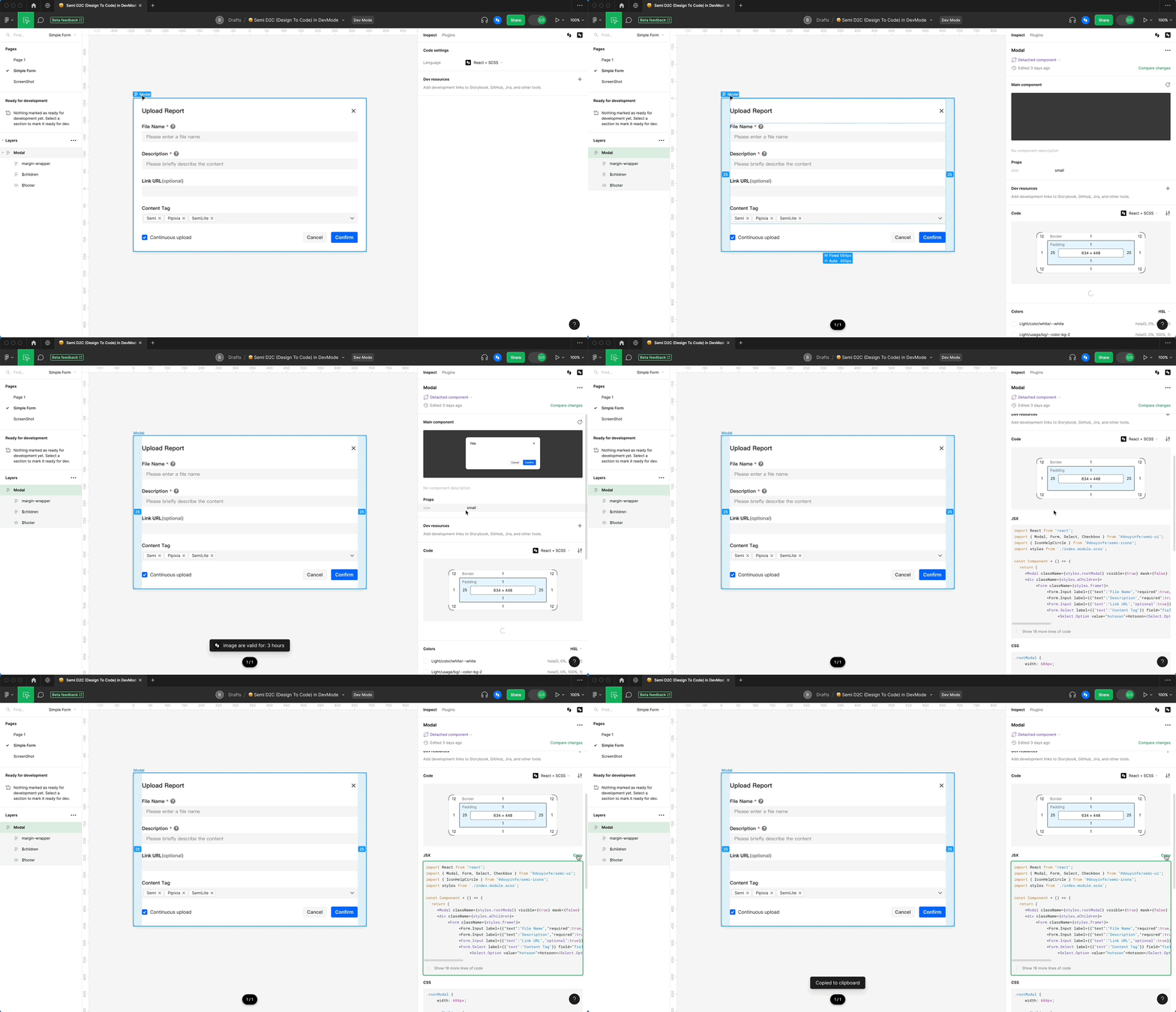
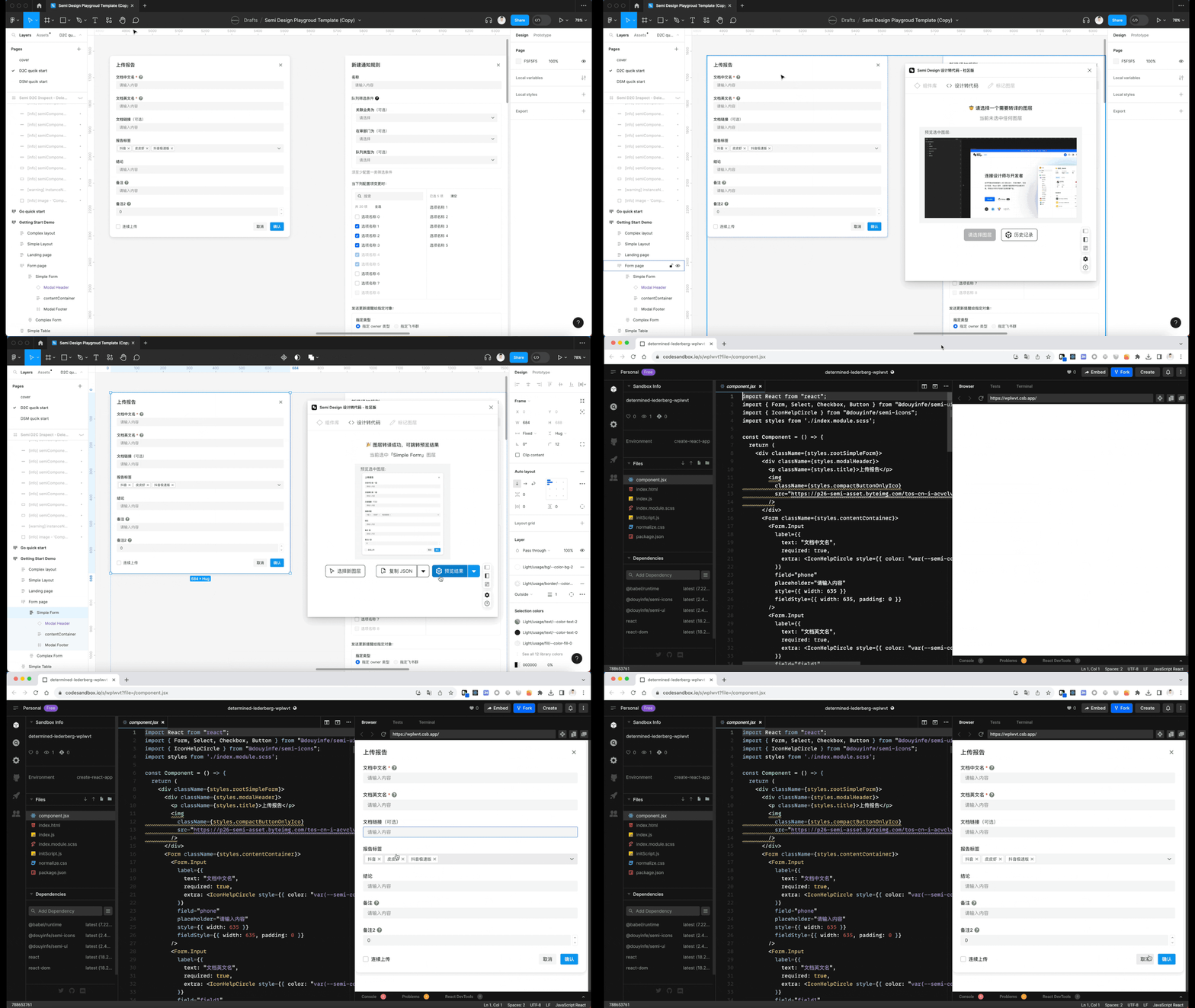
Install Semi Figma Plugin. Translate Figma to real code in seconds. Support multiple output formats: JSX + SCSS / Emotion/Tailwind, or JSON Schema DSL
- Support figma devmode, selecting a layer, directly get corresponding code on the right
- Or jump to codesandbox to continue editing
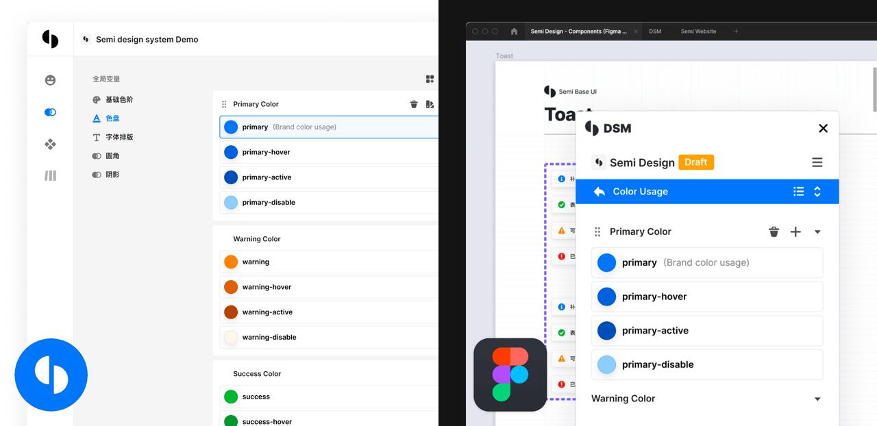
Define your own design system base on Semi UI with DSM in one click, Provide more than 3000 tokens for you to configure every detail. Sync between Figma and Code at all times.
- Semi DSM
- Design to Code
- Semi Figma Plugin
- Quick Start
- Components Overview
- Customizing Themes
- Design Tokens
- Dark Mode
- Semi Icons
- Global Config
- Internationalization
- FAQ
- CHANGELOG
- The Evolution of Semi D2C Design to Code
- How to design component library architecture to adapt to different mvvm frameworks
- How we test semi ui
- In-depth explanation of Semi theme
- Accessibility in Semi Design
Semi UI supports all major modern browsers.
 chrome |
 firefox |
 safari |
 IE/Edge |
 Electron |
|---|---|---|---|---|
| latest 2 versions | latest 2 versions | latest 2 versions | Edge | latest 2 versions |
Join User Group on Feishu / Lark
Thanks to Chromatic for providing the visual testing platform that helps us review UI changes and catch visual regressions.
Thanks to Cypress for providing E2E testing.
Thanks to VisActor for providing the data visualization solution.
Thanks to all the people who already contributed!
Read the contributing guide to learn about our development process, how to propose bugfixes and improvements, and how to build and test your changes to Semi UI.
See CONTRIBUTING documentation.
Semi UI is MIT Licensed


