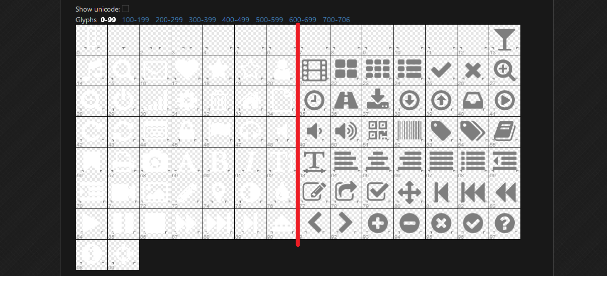
Fix Github Font Preview mini glyph fill color #14
Add this suggestion to a batch that can be applied as a single commit.
This suggestion is invalid because no changes were made to the code.
Suggestions cannot be applied while the pull request is closed.
Suggestions cannot be applied while viewing a subset of changes.
Only one suggestion per line can be applied in a batch.
Add this suggestion to a batch that can be applied as a single commit.
Applying suggestions on deleted lines is not supported.
You must change the existing code in this line in order to create a valid suggestion.
Outdated suggestions cannot be applied.
This suggestion has been applied or marked resolved.
Suggestions cannot be applied from pending reviews.
Suggestions cannot be applied on multi-line comments.
Suggestions cannot be applied while the pull request is queued to merge.
Suggestion cannot be applied right now. Please check back later.

The font preview userscript was previously drawing the glyphs within the preview pages without specifying the fill color as was done when drawing the large glyph. This worked fine when the default fill color was the
standard black, but when the color was very light, like it is in dark themes such as Github Dark, this resulted in having nearly-white glyphs drawn on top of a nearly-white background. The readability problem this
caused has been fixed by drawing all the glyphs, both the small preview glyphs and the large detail glyph, using a specific color. That color is controlled by the
glyphFillColorvariable, which is simply a rename ofthe
bigGlyphFillColorvariable but still using the same default color.Before/after UI fix (Github Dark style):
