Data Visualization of IPL data using datasets provided by Kaggle User - harsha547 here.
Demo: Click here to view my webapp.
npm install
touch .env
echo "VUE_APP_GMAPS_API_KEY=<YOUR_GOOGLE_MAP_API_KEY>" >> .env
npm run serve
Replace < YOUR_GOOGLE_MAP_API_KEY > with your GMaps API key.
The visualizations have been divided into four sections - Teams, Players, Venues and Seasons and some observation has been provided with some of the visualizations in a side card format.
-
Vue Framework: Provides features like client side routing using vue-router package, virtual DOM for performance, data binding, conditional rendering and a lot more out of the box.
-
ChartJS: Provides super simple and powerful API to create different type of charts with animations.
-
vue-d2b: Vue extension for d2b data viz library, used Sunburst Chart from the same which comes with handy features like breadcrumbs, section highlighting, etc.
-
vue2-google-maps: Vue Component library for integrating google maps with ease in the app, it provides data-binding (which is hard thing to do with native maps API) with map features and made implementation of maps with vue comfortable.
| Point | Status | Description |
|---|---|---|
| web-app created in Vue | ✅ | Developed in Vue from scratch, started project via vue-cli. Followed component architecture. |
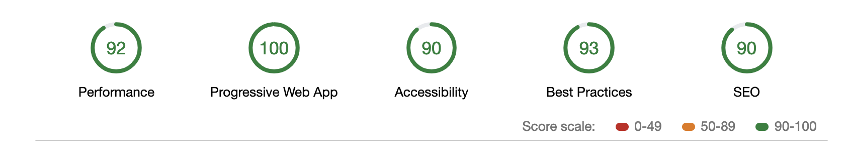
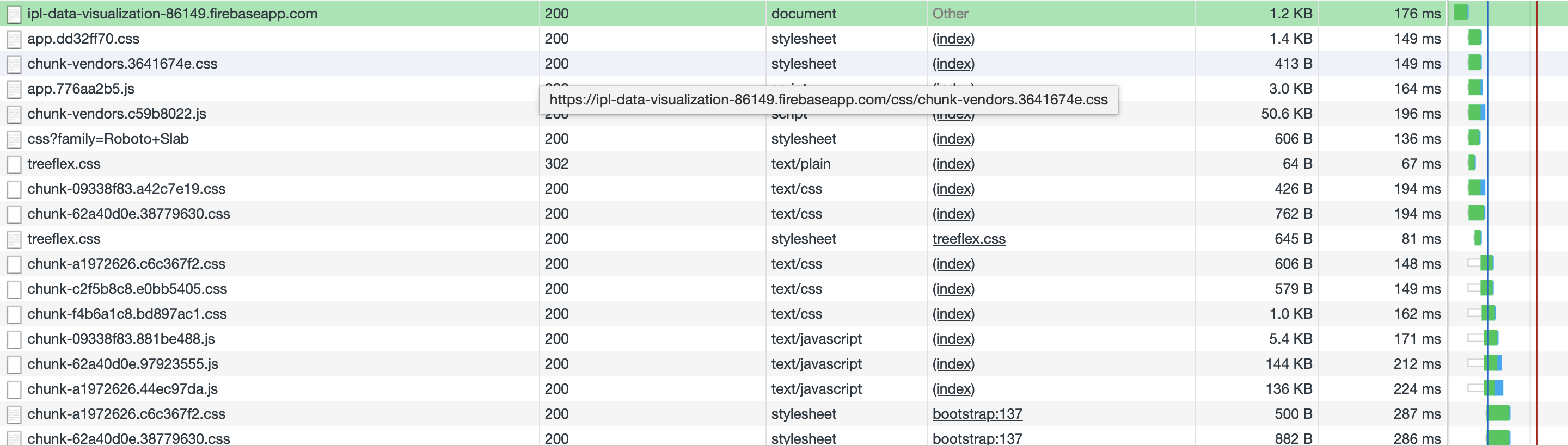
| Optimize Loading Time | ✅ | - Code Splitting using dynamic import to decrease bundle size. - Loading routes lazily at runtime. - Removed bootstrap library and implemented own css for small components like card and header. - Precalculated results from given data CSVs and directly using results via json files generated to not show user Crunching data dot dot dot, it optimized loading times by a good extent, usage of webwokers was also not required by going with this approach. |
| Mobile Responsive | Implemented links in header converting to menu style on mobile viewport. ChartJS was chosen to maintain mobile responsive since the library provides out of the box support for it to some extent. Warning here because couldn't spend time to convert inline-blocks to blocks on mobile. |
|
| PWA | ✅ | User can add to home screen and install it like native app. - Updated manifest.json created by vue cli to fulfill the PWA checklist provided here, added / initialized background_color, themeColor, name, short_name, display, start_url properties.- Added Icons of required size - Served over HTTPS using firebase - Service worker registration (used workbox by google, default with vue cli). |
| Offline Usable | ✅ | - Fully works offline - Javascript (which also contain our results json) and CSS chunks are cached after first load hence users can view visualizations with slow/no internet connectivity. - Only dependent things on internet is google-maps which will fallback to card based interface to view Venue details |
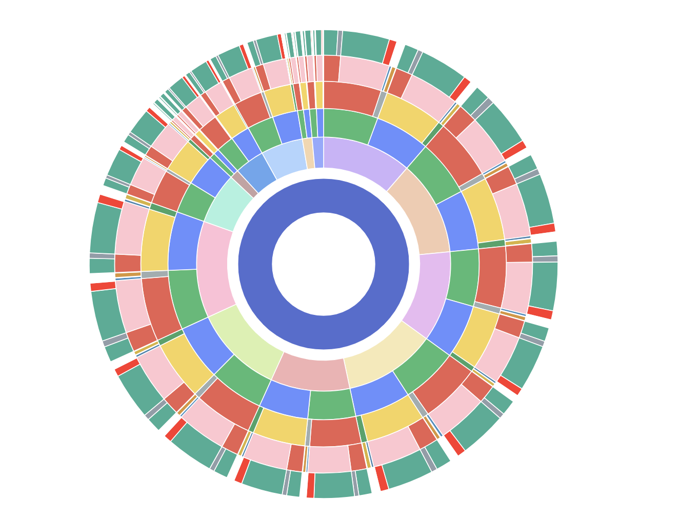
The above graph is called sunburst graph which represents a hierarchy, it shows detailed view of each team's performance including their batting performance (sixes, fours, singles taken, etc.) and bowling performance which elaborates the runs conceded by the team overall.
User can click on particular team to view their detailed hierarchy more clearly.
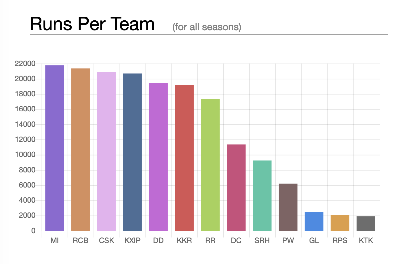
This chart denotes total runs scored by teams in all seasons in sorted manner which gives a slight idea about a team's batting performance.
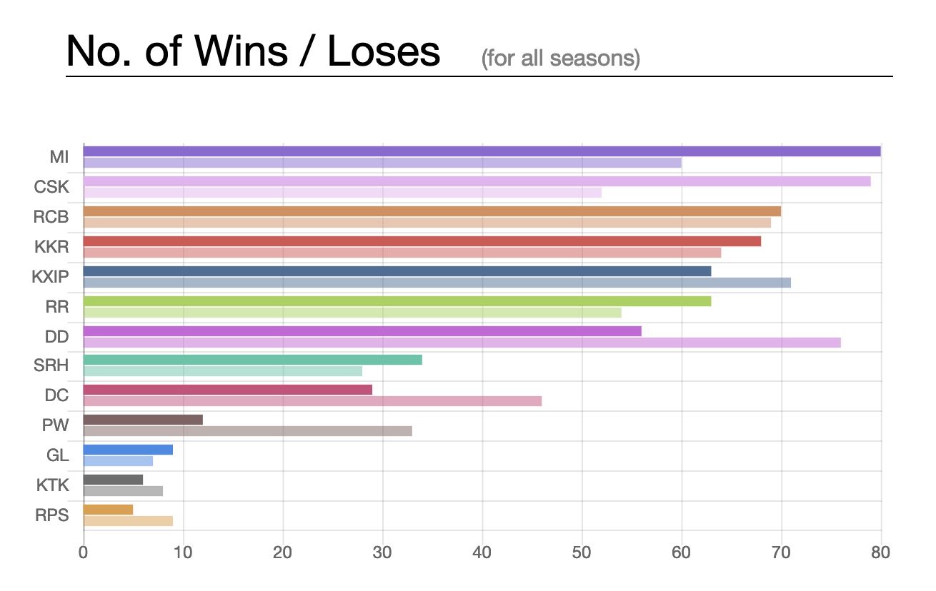
This chart denotes total number of wins and loses of the teams in all seasons which shows best team overall based on their performance in IPL.
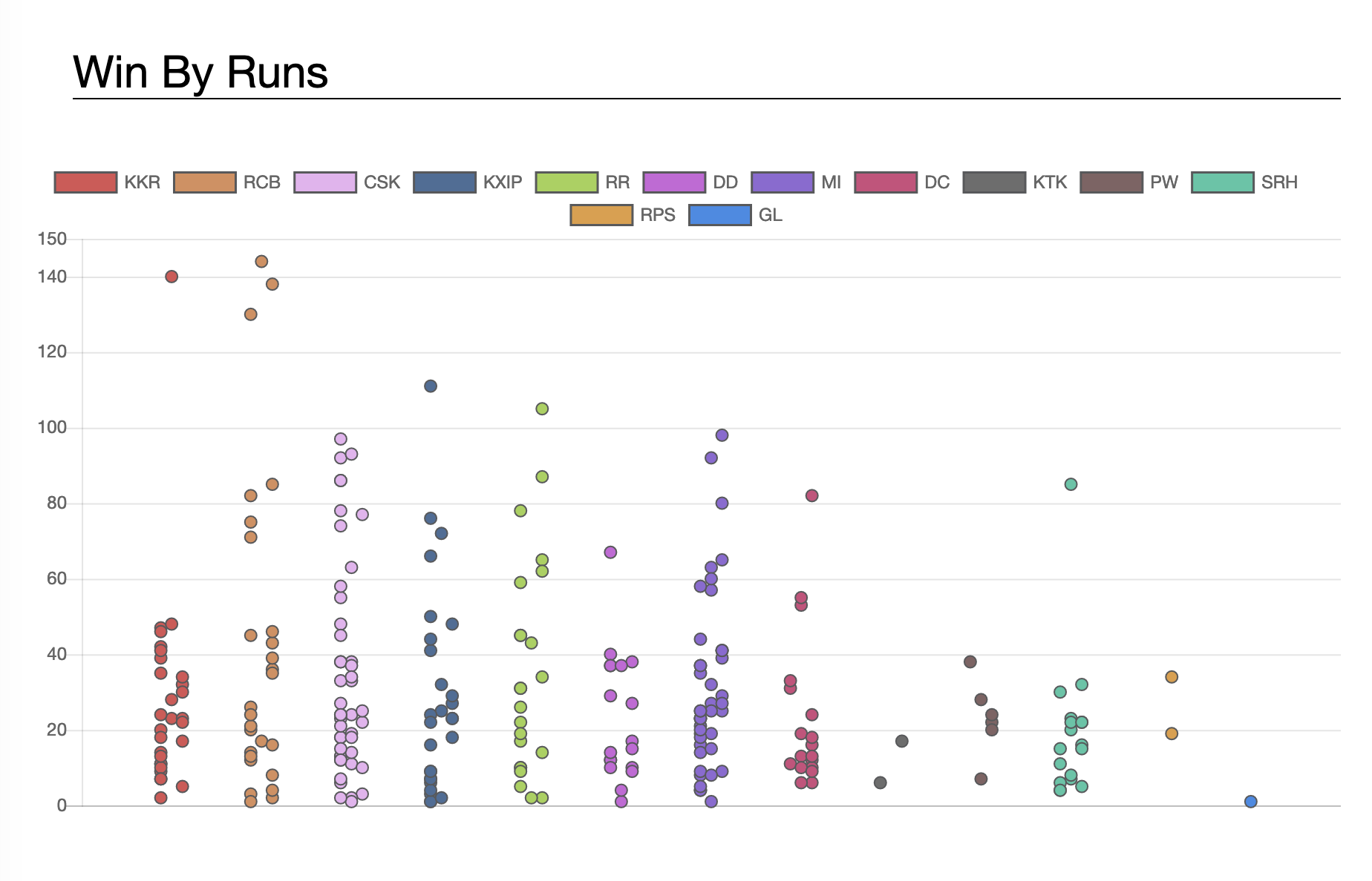
This chart denotes total number of wins by particular runs of each team in all seasons, this gives a good insight about a team's bowling performance altogether.
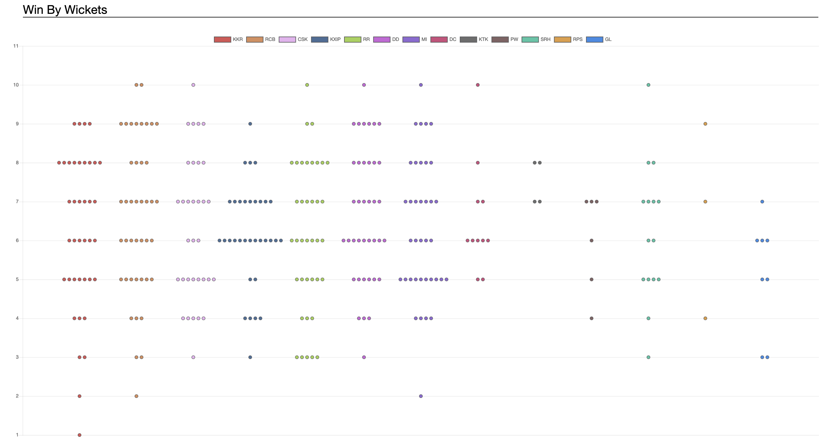
This chart denotes total number of wins by wickets of each team in all seasons, this gives a good insight about a team's batting performance altogether.
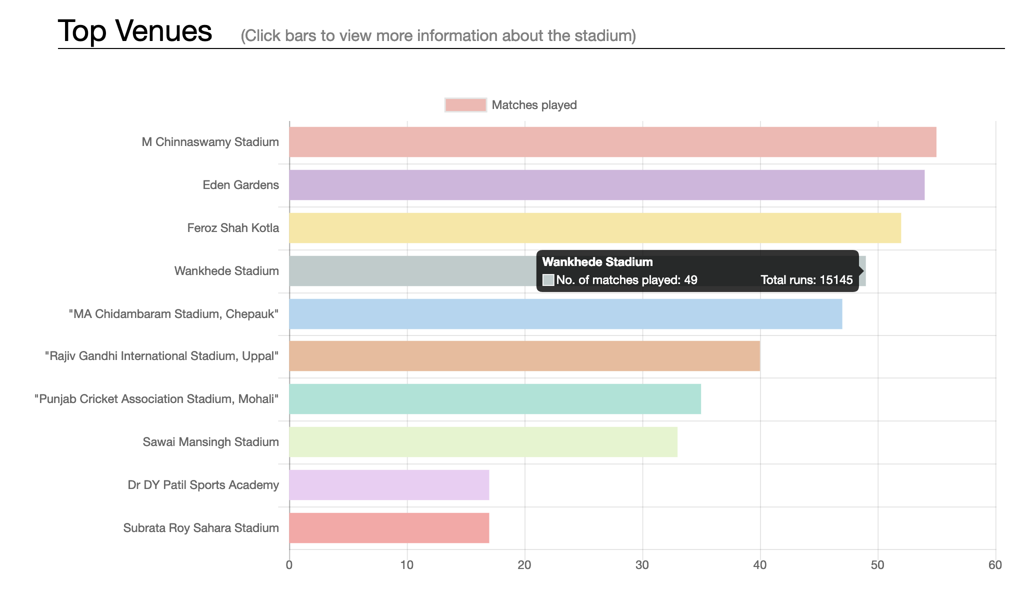
This chart denotes top 10 venues based on matches played at each venue, hovering on bar shows the total runs scored on that particular venue and if user clicks on a particular venue (bar), a detailed view of venue detail is shown by scrolling user to next discussed chart.
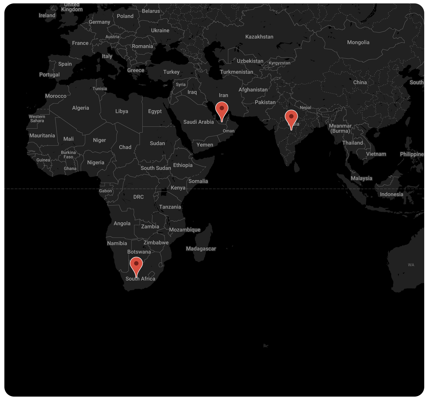
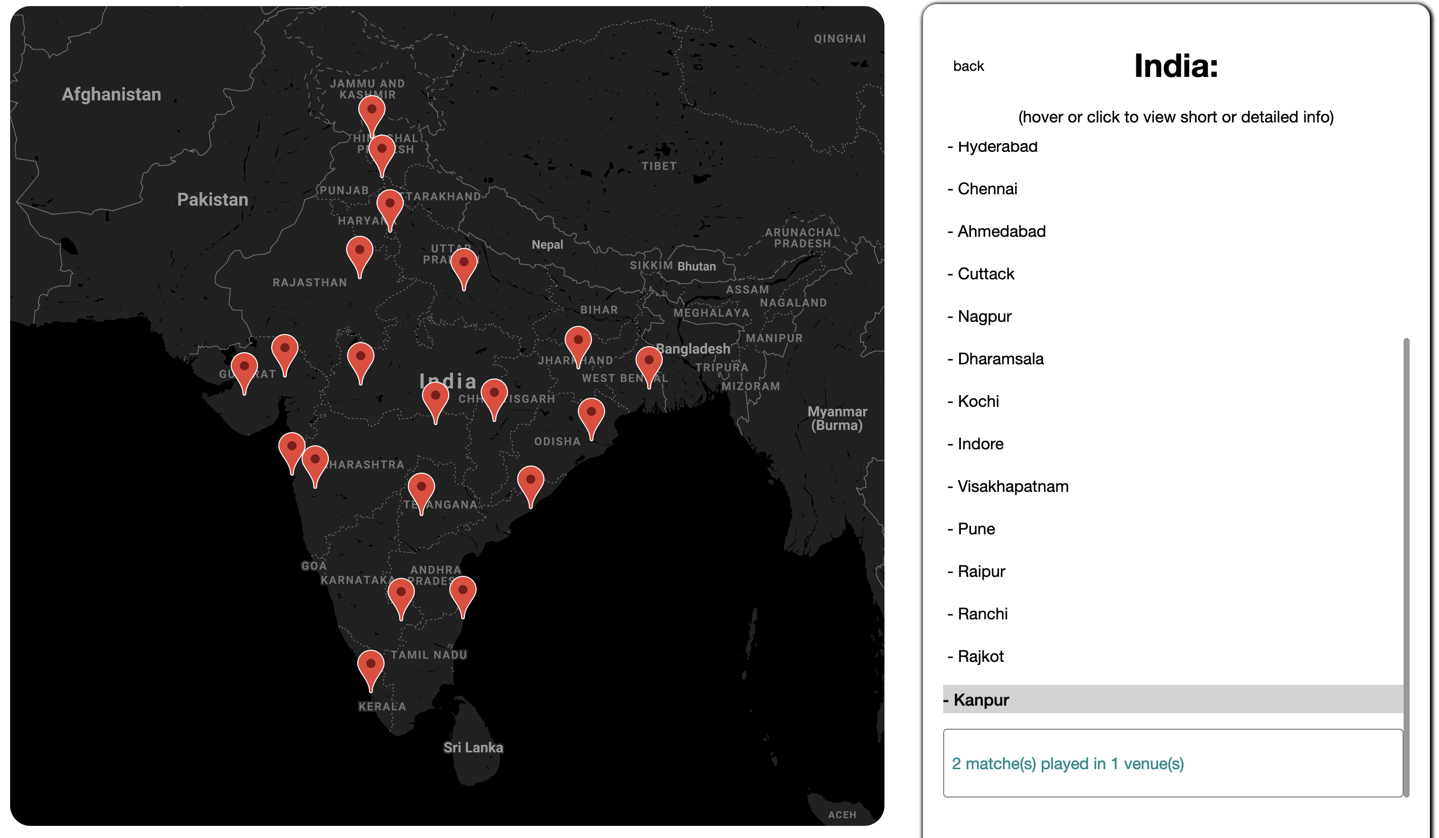
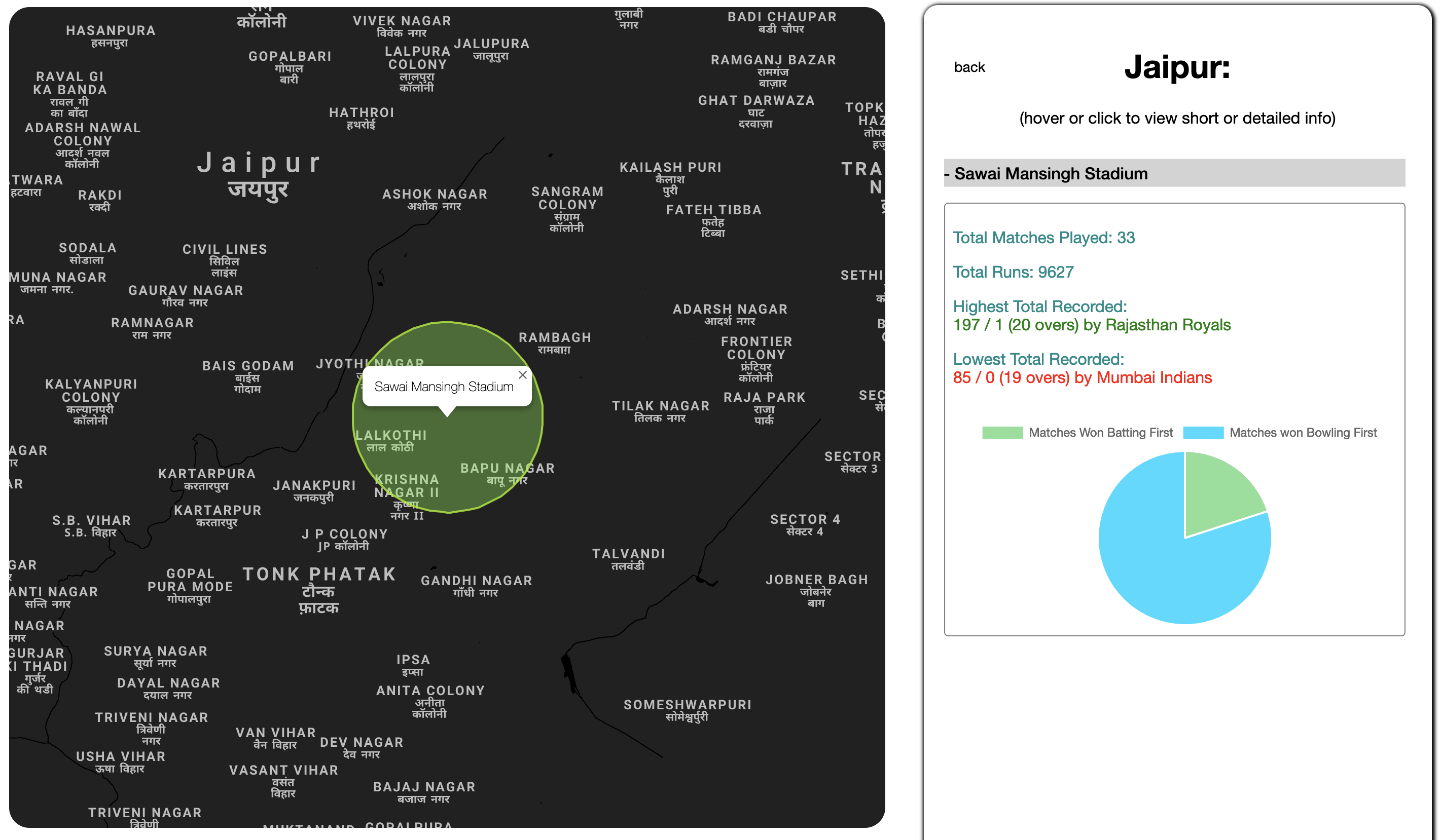
This chart shows a map interface along with a card interface, both reacts simultaneously as one of them changes. User can hover on any country marker or country name in the sidelist and it will show some basic info like number of matches played in that country, clicking on the same will result to zoom-into the city view showing all cities of that country involved in IPL matches, this view will behave the same as country view except when clicked it will take user to a venue detail view which finally shows a detailed card for the venue showing total matches played, highest and lowest total recorded runs with basic match result, batting / bowling first pick wins.
If user clicks on some venue bar in top10 venues chart discussed before, they will be scrolled to this component and directly be jumped to venue info level.
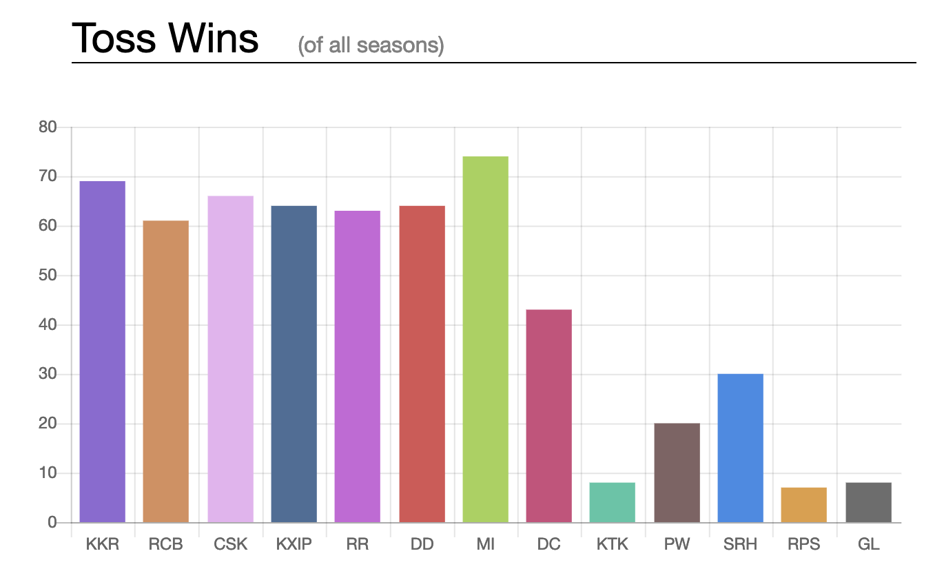
This chart shows the number of times a team has won toss (a luckiness factor maybe?)
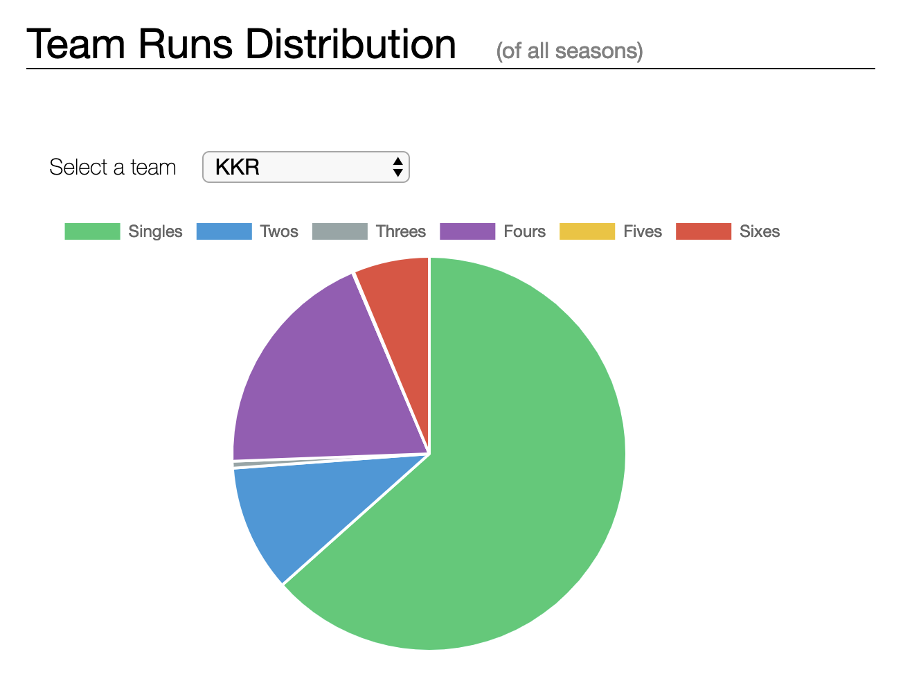
Above Chart shows runs scored by teams distribtued based on singles, twos, threes, fours, fives and sixes in all matches of all seasons, it gives insight about team's batting performance. It allows user to select a team to view their stats for the same.