Adapt predictive search layout to new api #2192
Conversation
Support all resource types
There was a problem hiding this comment.
Requesting changes for the aria-hidden text.
FYI: I made a codepen where I used grid-template-area to manage the display in order to avoid duplicating the HTML. However, I realized it would make the JS a lot more complicated because the order of the DOM nodes couldn't be relied upon to match the visual order. Similar to focus order issues with Grid talked about here on MDN. So ultimately I think the repeated HTML is fine here.
41cbcca to
4a5f90d
Compare
| display: flex; | ||
| flex-direction: column; | ||
| flex: 1 1 auto; | ||
| gap: 3rem; |
There was a problem hiding this comment.
| gap: 3rem; | |
| gap: 2rem; |
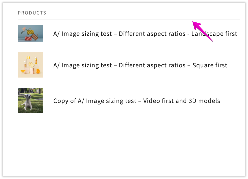
I find the 3rem gap to be very large. Suggesting 2rem to balance white space. Thoughts @al-mcquiston ? (Visual reference at 2rem for desktop, this is on Mobile)
There was a problem hiding this comment.
@melissaperreault totally agree. myself and @FCalabria chatted about this and this should be updated to your suggestion
There was a problem hiding this comment.
Thank you Paqui! I took a quick look and will continue tomorrow! Only feedback would be about not being convinced we need 3 times the loading spinner as the query is typed. @al-mcquiston
There was a problem hiding this comment.
Nit about the use of h3 for the list options. These can be safely changed to p tags as the .h5 class overwrites all the styling.
Tested on VoiceOver in Mobile Safari, Safari, and Chrome. And JAWS in Edge. The arrow keys navigation isn't picked up in Safari unfortunately, but I can walkthrough the page correctly with a virtual cursor (hence the addition of an aria-label on the queries list)
sections/predictive-search.liquid
Outdated
| <h3 class="predictive-search__item-heading h5">{{ product.title }} | ||
| </h3> |
There was a problem hiding this comment.
| <h3 class="predictive-search__item-heading h5">{{ product.title }} | |
| </h3> | |
| <p class="predictive-search__item-heading h5">{{ product.title }}</p> |
There was a problem hiding this comment.
I wouldn't say I disagree with this suggestion, but just FYI it looks like during a11y review of the original implementation of predictive search it was specifically recommended that these product titles use h3. Though I could maybe see that being more relevant if the vendor or price is also showing. If we're confident about this change though, feel free.
There was a problem hiding this comment.
Thanks for pointing that out. I read the past PR; the comment about using an h2 here made sense to me; but I don't understand why an h3 was recommended. These node don't have any child content - so I don't see it as a "heading" for any section. @svinkle : do you recall why you recommended an h3 in this past commit?
Given we're using listbox and identifying group roles, I don't believe we need this h3 to communicate structure. https://www.w3.org/WAI/ARIA/apg/example-index/listbox/listbox-grouped.html. However, I don't think h3 was communicating structure in the last PR either because the heading was put on the lowest text node in the list 🤔
There was a problem hiding this comment.
do you recall why you recommended an h3 in this past commit?
I do not. As mentioned, the heading structure is not conveyed here. Swap for a generic container.
|
@melissaperreault you wrote
I had noticed the pattern for loading is a bit strange as well. Though something to note is that there isn't always 3 loaders. The number of loaders depends on how many resource headings (suggestions, pages, products) were on the page before the next search. 📹 In this video, I slow down the network connection, and the following can be seen:
The loading indication could be changed. This approach may have made sense when 'Products' was the only possible heading you'd see, but now the number of resource types you get back is dynamic. Perhaps the loaders next to the resources headings should be removed completely - so no indication that anything is happening, the next content will just pop into existence. Related, but separate issue to this PR: there's a larger issue with how loading is already being done IMO. The contents of the listbox aren't cleared between searches. This makes sense for as you're typing, but not so much when the search box is emptied; as a result, you will briefly see the results of the previous search when you start a new search. Video example where I show typing "V", clearing results, then type "T". I see the results for "V" as my new results are being loaded. This issue exists in the search box that's in production. |
|
Maestrooo developers here. Just found this. Do you have any documentation? As this feature may have visual implication on our themes I would like to start working on this as soon as possible. I have tried to add a new "query" resource type but I have a 422 error. As always, we would appreciate if we (theme dev) could be also added in the loop for important upgrades like this, it would also eventually allow us to provide feedback. |
|
We have received a translation request but there is a question blocking translation work. Your help is needed. Please answer the following questions.
|
@NathanPJF I have created this issue to fix this problem later, since it is a current bug and not caused by my changes. Take a look in case you want to suggest any changes. About the loading, I talked with @al-mcquiston and we decided to remove the loading icons on the headers, since that seem to be a common pattern in other websites. |
| .predictive-search__heading { | ||
| border-bottom: 0.1rem solid rgba(var(--color-foreground), 0.08); | ||
| border-bottom: 0.1rem solid rgba(var(--color-foreground), 0.2); |
There was a problem hiding this comment.
It seems like for this use case we typically use 0.08, though I do see a couple instances of 0.2 in the cart. Will let @melissaperreault's weigh in though if this the added opacity is warranted. (note there's an additional instance of this value above around line 27.
There was a problem hiding this comment.
+1 The opacity should not change here and remain at 0.08.
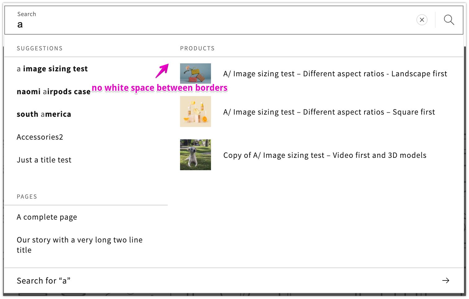
- Another point I just noticed; I am not sure what happened but we lost the type specific dividers here. When I initially reviewed, they were in place properly, now they just blend from left to right. The initial layout is best to maintain hierarchy between the results and the CTA at the bottom of the box.
There was a problem hiding this comment.
Looks like the borders are extending to the left of the headings now. I don't believe I've see any discussion about this here or in the figma so I assume it's unintentional.
There was a problem hiding this comment.
@melissaperreault "we lost the type specific dividers here" I had just noticed this too! Definitely want to get this reverted back.
Updating opacity to 0.08 sounds good to me!
There was a problem hiding this comment.
Regression fixed in latest commit
|
@bakura10 the API changes are not yet ready for consumption. Theme developer comms should be going out soon (1-2 weeks) with more information ahead of the launch. If you have any specific feedback, feel free to DM me on partner slack. |
4e7922a to
80b0b2b
Compare
80b0b2b to
7b6609d
Compare
|
Adding last piece of observations! Transition*This feedback is not launch blocking but something I'd like us to improve.
Yeah, this is the first impression that I would hope we could spend more time in a follow up task to improve the perceived performance. I am going to throw a few buzz word with hope that it helps convey in which direction we can explore: it could be smoother, snappier; buyers don't need to hold on their toes to only find out there is none of X result type. I am not sure what is the common pattern but I think we can explore further. Would a fade in animation instead help? Is 3 relevant because things are very likely to load at different times? Could customers have the perception that things all load together, all load separate, populates as it loads (e.g. skeleton) . I just wonder if we can build an opinion of what is the most ideal experience for the buyers.
We need to keep at least 1 spinner though. This will help the customer waiting as they type their query on slower connection to not be holding their breath with an empty screen. |
| .predictive-search__heading { | ||
| border-bottom: 0.1rem solid rgba(var(--color-foreground), 0.08); | ||
| border-bottom: 0.1rem solid rgba(var(--color-foreground), 0.2); |
There was a problem hiding this comment.
Looks like the borders are extending to the left of the headings now. I don't believe I've see any discussion about this here or in the figma so I assume it's unintentional.
| @@ -20,7 +20,7 @@ | |||
|
|
|||
| .template-search__search { | |||
There was a problem hiding this comment.
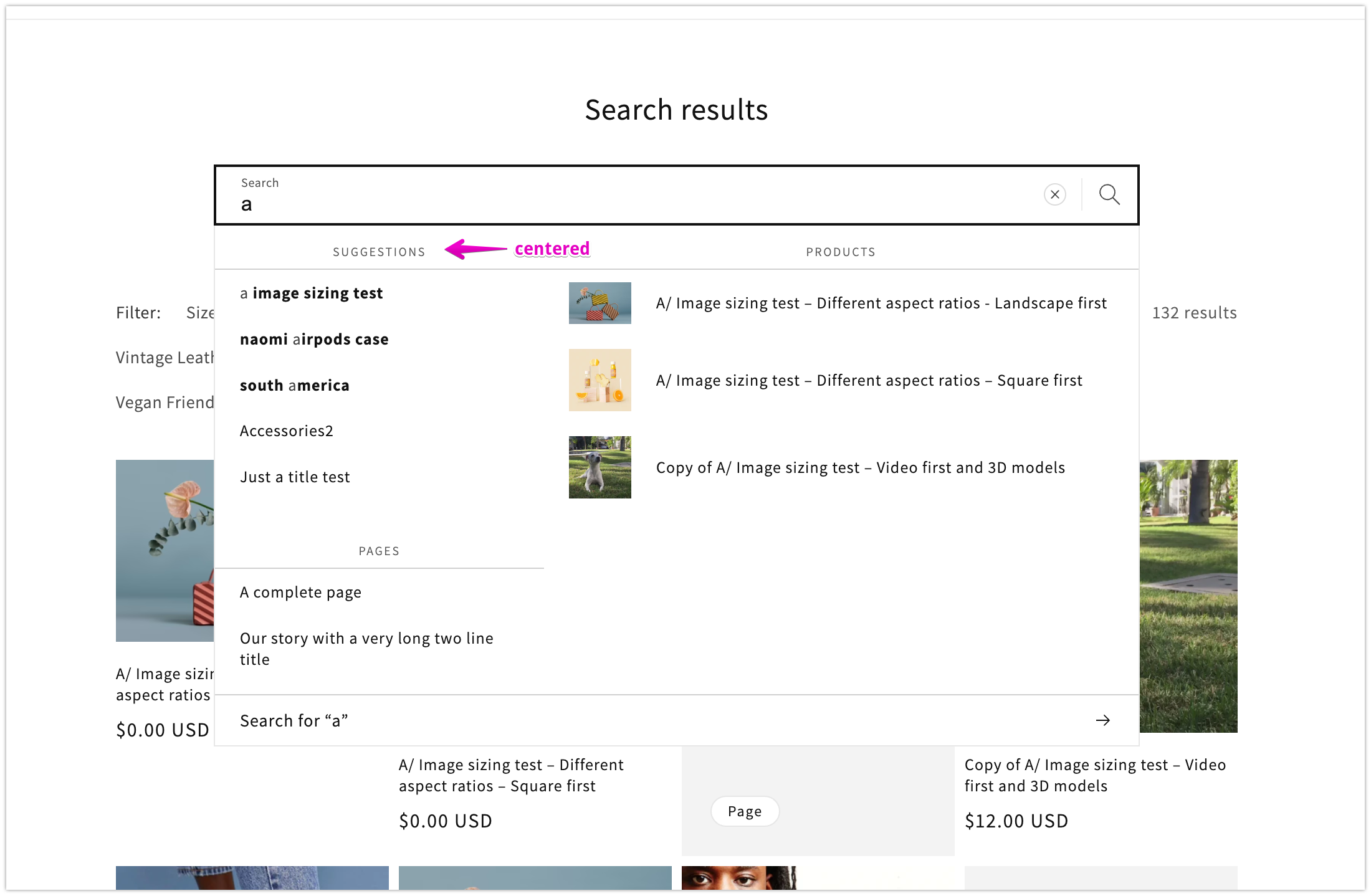
Group headings are centered on the search page.
There was a problem hiding this comment.
Fixed by moving the center class off the container to the heading.
| @@ -15,7 +15,7 @@ | |||
| {%- if predictive_search.resources.queries.size > 0 or predictive_search.resources.collections.size > 0 -%} | |||
| <div> | |||
| <h2 id="predictive-search-queries" class="predictive-search__heading text-body caption-with-letter-spacing"> | |||
| {{ 'templates.search.suggestions' | t }} | |||
| {{- 'templates.search.suggestions' | t -}} | |||
There was a problem hiding this comment.
While reviewing the output, I noticed that the whitespaces were being rendered in the inspector. This doesn't have an impact on the UI really, but it makes the output more inline with what we want.
There was a problem hiding this comment.
My comments about the output in VoiceOver and JAWS have been addressed, and the feature works as expected. Nice work @FCalabria !
There was a problem hiding this comment.
Thank you! Looks good to me!
Tiny detail for when we tackle loading states, we need to consider this use case too for when no results are found and are only left with the CTA. (video example)
There was a problem hiding this comment.
Approved. Overall, the feature works well and I see no real issues with the implementation 👍 Nice work!
I do find the Voiceover experience in safari a little unfortunate in that arrow key navigation doesn't provide much [if any] feedback, nor does it announce the results live region updates. However, the markup here looks to spec (announcements in JAWS work well) and these VO issues seem to be preexisting in dawn, so I can't really consider these issues to be blocking.
Given the increased complexity in the search results with this change though, I do think it would be nice if you could timebox a follow-up to see if we can make any improvements here at all. I believe there is also some ongoing UX discussion around loading states and we would appreciate any effort to come to a solution in a follow-up as well. Let me know if we can help with any of this.
Adapt predictive search layout to new api

Co-authored-by: translation-platform[bot] <34770790+translation-platform[bot]@users.noreply.github.com>
Co-authored-by: Nathan Ferguson <nathan.pj.ferguson@gmail.com>
PR Summary:
Update the predictive search component to take advantage of the new default values in the API and support all resource types
Why are these changes introduced?
https://github.com/Shopify/discovery/issues/6681
New default values on resource[types] https://github.com/Shopify/discovery/issues/6617
What approach did you take?
The two column structure has been done with flex, using the
flex-directionproperty to change between the mobile and desktop structure, with the appropiate changes inflex-growfor the children to fill the space when needed.The trickiest part is the "Pages" section, that is placed in a different column depending on the screen size. I solved this duplicating the html, adding some conditional classes to the wrapper and using them with media queries to hide the page section that was not needed.
Very simplified, the final html structure looks like this
Visual impact on existing themes
Users will start to get more type of results on the predictive search. They will also see the max number of results increased to 10
Testing steps/scenarios
Figma for reference
Demo links
Checklist