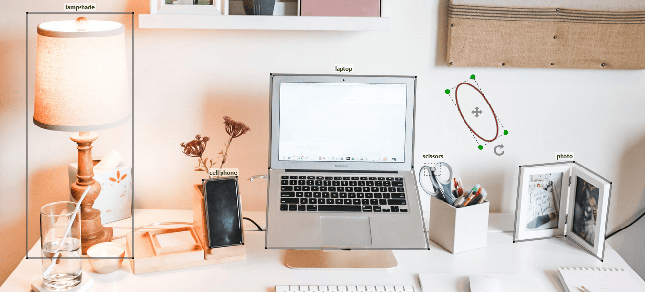
A comprehensive component for tagging images. Check out demo 1 and demo 2 for some examples.
- Bounding Box (Rectangle, Square, Circle, and Ellipse), and Polygon Annotations
- Add, Edit, Drag, Rotate, and Delete Annotations
- Zoom and Pan
- Changing image on the fly
- Colorful annotations
- Raw or typed input/output
Install react-image-label using npm.
npm install react-image-labelThen you can just import the component and its hook:
import { ImageAnnotator, useImageAnnotator } from 'react-image-label';and use it as below:
const { setHandles, annotator } = useImageAnnotator();<ImageAnnotator
setHandles={setHandles}
naturalSize={true}
imageUrl={'your-image-url'}
onReady={annotator => { annotator.drawRectangle() }} />Now you can draw rectangles on the image by dragging the left mouse button.
- click: Edit/Stop Edit Annotations
- Ctrl + mouse wheel: Zoom
- Ctrl + mouse drag: Pan
- Delete key: Delete Annotations
- mouse drag: Drag/Edit/Rotate Annotations
The following props can be defined on ImageAnnotator:
| Prop | Type | Description | Default |
|---|---|---|---|
imageUrl * |
string |
Use a state for image url if you want to change it on the fly | |
shapes |
Shape[] | any[] |
Annotations being displayed on load (see shapes) | |
naturalSize |
boolean |
To show image in its natural size | false |
width |
number |
container width |
image.naturalWidth |
height |
number |
container height |
image.naturalHeight |
discRadius |
number |
The radius of the green discs in edit mode | 5 |
hideBorder |
boolean |
To Hide annotation border | false |
onAdded |
Shape => any |
When an annotation is drawn (see Annotations with Categories) | |
onSelected |
Shape => any |
When an annotation goes into edit mode by double-clicking | |
onContextMenu |
Shape => any |
When an annotation is right-clicked (see Annotations with Categories) | |
onReady |
AnnotatorHandles => any |
When the component is mounted |
(*) required props
You can access the handles using the annotator object as follows:
<button onClick={() => { annotator.drawCircle() }}>Draw Circle</button>Below is a list of all handles:
| Handle | Type | Description |
|---|---|---|
drawCircle |
() => void |
Allows drawing circles by dragging the left mouse button |
drawEllipse |
() => void |
Allows drawing ellipses by dragging the left mouse button |
drawRectangle |
() => void |
Allows drawing rectangles by dragging the left mouse button (keep the shift key to draw square) |
drawPolygon |
() => void |
Allows drawing polygons by clicking and double-clicking |
drawDot |
() => void |
Allows adding dots (points) by clicking |
stop |
() => void |
Stops draw/edit/drag mode |
edit |
(id: number) => void |
The annotation identified by id can be edited and dragged |
stopEdit |
() => void |
Stops editing and dragging |
updateCategories |
(id: number, categories: string[], color?: string) => void |
Updates the categories associated with the annotation identified by id |
zoom |
(factor: number) => void |
Multiplies the dimensions by factor |
getShapes |
() => Shape[] |
Gets all annotations (shapes) |
container |
HTMLDivElement |
The div wrapping the SVG |
To attach one or more categories to an annotation, utilize onAdded and onContextMenu props being called when an annotation is drawn and right-clicked, respectively. Use shape.categories to get the previous categories as string[]:
const showCategoriesDialog = (shape) => {
  console.log(shape.id) // 1
  console.log(shape.getCenterWithOffset()) // { X: 247.5, Y: 193 }
  console.log(shape.categories) // string []
  // Show a category selection component
}

return (
  <ImageAnnotator
    onAdded={showCategoriesDialog}
    onContextMenu={showCategoriesDialog}
    ...
);
Finally, call annotator.updateCategories to update the categories of the annotation.
The data models for all shapes are listed below:
| Shape | Data Model | type Value |
|---|---|---|
Circle |
{ id: number, centre: [number, number], radius: number, categories: string[], type: string, color: string } |
circle |
Ellipse |
{ id: number, centre: [number, number], radiusX: number, radiusY: number, phi: number, categories: string[], type: string, color: string } |
ellipse |
Rectangle |
{ id: number, points: [number, number][], phi: number, categories: string[], type: string, color: string } |
rectangle |
Polygon |
{ id: number, points: [number, number][], categories: string[], type: string, color: string } |
polygon |
Dot |
{ id: number, position: [number, number], categories: string[], type: string, color: string } |
dot |
- Fork the project.
- Make changes.
- Run the project in development mode:
npm run ladle. - Write your own tests and/or update existing ones in src/test dir.
- Check the new features and changes using
annotator.stories.tsxor your own Stories (*.stories.tsx). - Update README with appropriate docs.
- Commit and PR
The package is dependent on SVG.js through react-svgdotjs package. The following peer dependencies must be specified by your project in order to avoid version conflicts:
react,
react-dom.
NPM will not automatically install these for you but it will show you a warning message with instructions on how to install them.