-
Notifications
You must be signed in to change notification settings - Fork 4.2k
New issue
Have a question about this project? Sign up for a free GitHub account to open an issue and contact its maintainers and the community.
By clicking “Sign up for GitHub”, you agree to our terms of service and privacy statement. We’ll occasionally send you account related emails.
Already on GitHub? Sign in to your account
Block Patterns: Add ability for predefined block layouts to be added to a document #17335
Comments
|
These concepts are largely influenced by:
I believe standardizing a UX flow for this interaction would benefit Gutenberg & users. |
|
We have support for this, but only per-post-type and the template gets applied on load, with the following logic: I don't see much value in that though and would love to have something like what you just described. I like the overlay approach more because it has more screen real estate to show off the available patterns. This feature would be parallel to any block areas work. There could be patterns made for posts and patterns made for templates or any other block area. E.g. a template pattern could be used to quickly change the single post template to a layout with a sidebar. Gutenberg shouldn't define defaults, but the default themes should definitely ship with them. |
|
My initial thought is that this added block pattern would NOT replace any content on the page, but rather just append the blocks to the bottom. This way the block pattern can be added at anytime during the construction/writing of content. This would be a similar flow to Atomic blocks, but I'm hoping without a block that contains all the other blocks as they do it. |
|
Yeah, I like it more that way too, for the same reasons you stated. |
|
There might be something interesting to learn from this plugin as well. https://wordpress.org/plugins/full-site-editing/ @obenland is the plugin currently up to date? |
|
It's missing the block preview work that we've been adding in the past few weeks but is functional otherwise. |
|
@epiqueras wrote:
Just before anyone gets any ideas about this feature replacing block templates, I just want to note that this capability is extremely valuable. It allows developers to specifically define the composition of a given post type. We make extensive use of this functionality at @MeredithCorp where many of our content types are strictly organized. I think this "Block Patterns" feature is an awesome idea, but want to make sure it's considered as an "in addition to", not a full replacement for the current post type block template functionality. |
Next Steps:
|
|
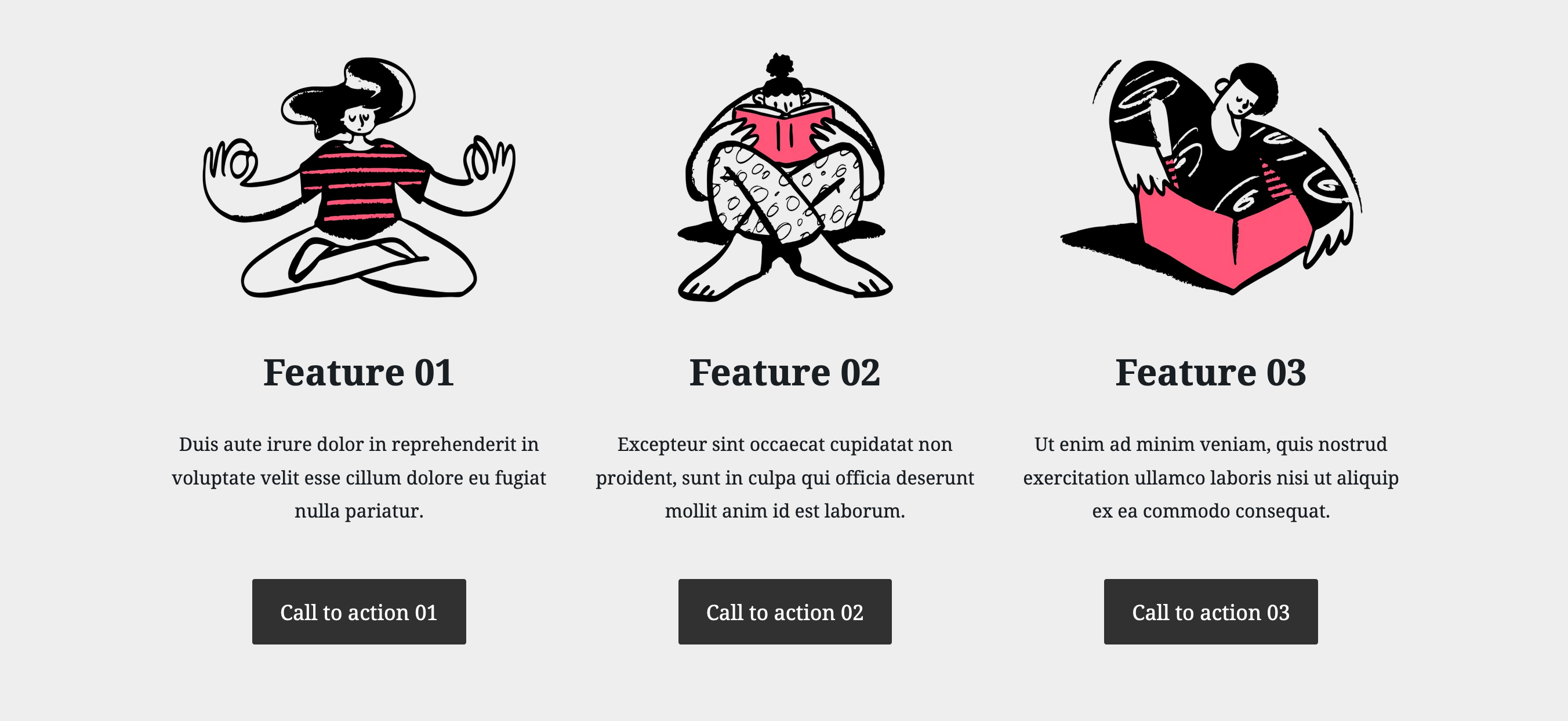
Last year I explored some prototypes for Gutenberg page layouts. My explorations had a couple pieces:
DesktopNote: this prototype was from an earlier round I tried, and some of the elements are outdated. MobileThe breakdownThe layout picker, like everything else in Gutenberg, is a block. It consists of a couple elements:
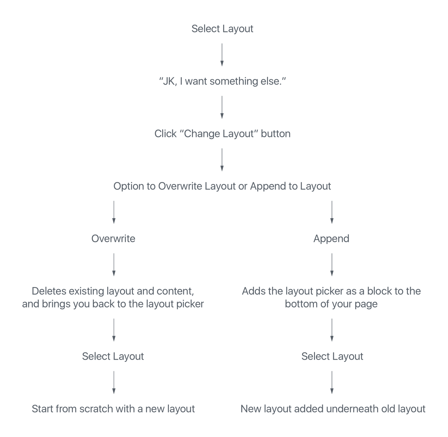
Changing LayoutsI worked through what the flow could look like: The breakdownSo wait, I can have more than one page layout? Won’t that get ridiculous? What if they didn’t mean to overwrite their content? What about page-specific elements like Features Images and Page Titles?
How about duplicate blocks? Generic blocks can be duplicated to your heart’s content. What do we call a layout once you’ve appended another layout onto it? There's a lot of outdated stuff in these mocks since they're over a year old, but we might be able to reuse some concepts. |
|
Great discussion here, thanks for starting it. I feel very strongly that this can help making page layouts even simpler, and I can't wait for it to land. I also strongly feel that we should not be adding an additional button next to the block library, because:
Once you learn the block UI, you learn how to do everything, was a guiding principle from early on, and although it should be refined still, it has scaled relatively well. Just yesterday we discussed how treating the site itself as a block (#16998) could be beneficial as it re-uses existing UI. If instead of treating a "block pattern" as a new feature, but instead treat it as just another block that happens to be pre-designed and have child blocks inside, suddenly it's not a new feature, it's a refinement to an existing feature, which seems both pragmatic and sensible, scope-wise. To me, the Block Library seems the obvious location for this interface. What changes can we make to it, to better accommodate block patterns? It already contains reusable blocks, arguably precursors to patterns like these, and any improvements we make will likely benefit those too. Is there a Block Patterns tab? Is the block library wider — as wide as the block library and the new preview pane together? Do block patterns need a separate preview window or can we leverage the extra space of that preview pane? Another exercise is to flip the question on its head: what is it about the block library as it exists today that suggests we need a new UI for block patterns? Another interface, and Mel very elegantly touches on this, is to tap in to the placeholder interface. What if the Site block, by default, let you pick base template? The following is, as is no doubt evident, not an exceptionally considered idea, but just a quick sketch showing how it would look if we added a "type selector" dropdown to the block library, allowing you to search both blocks and block patterns together: |
Thanks for diving in, @jasmussen! Figuring out that question is key. Recently, Happiness Engineers shared that some users don't even scroll the Block Library to find other blocks outside of what is front-and-center. This is another problem, but something to consider in relation to adding anything else to this very small interface.
I'd say it's the very size of the Block Library that makes it difficult to add full page block patterns there. Right now, the user views a block icon and a tiny preview of the block. It works because it's a small area of the page that is focused. Block Patterns work much better when the user can see most of the page and how these blocks exist together. The size of the Library makes this difficult. The concept of a "Site block" sounds rather interesting. Many blocks have a placeholder, so a Site block might be able to have a placeholder with layout options too. This idea works well for new pages, but not so much for pages that have existing content. But here's a quick mockup around this anyways. Block Placeholder (for reference): Site Block Placeholder: This really jives with @melchoyce's mockups above. |
|
Good thoughts, thank you.
That's a good insight, and all the more reason to improve the block library together with any improved designs we make for block patterns.
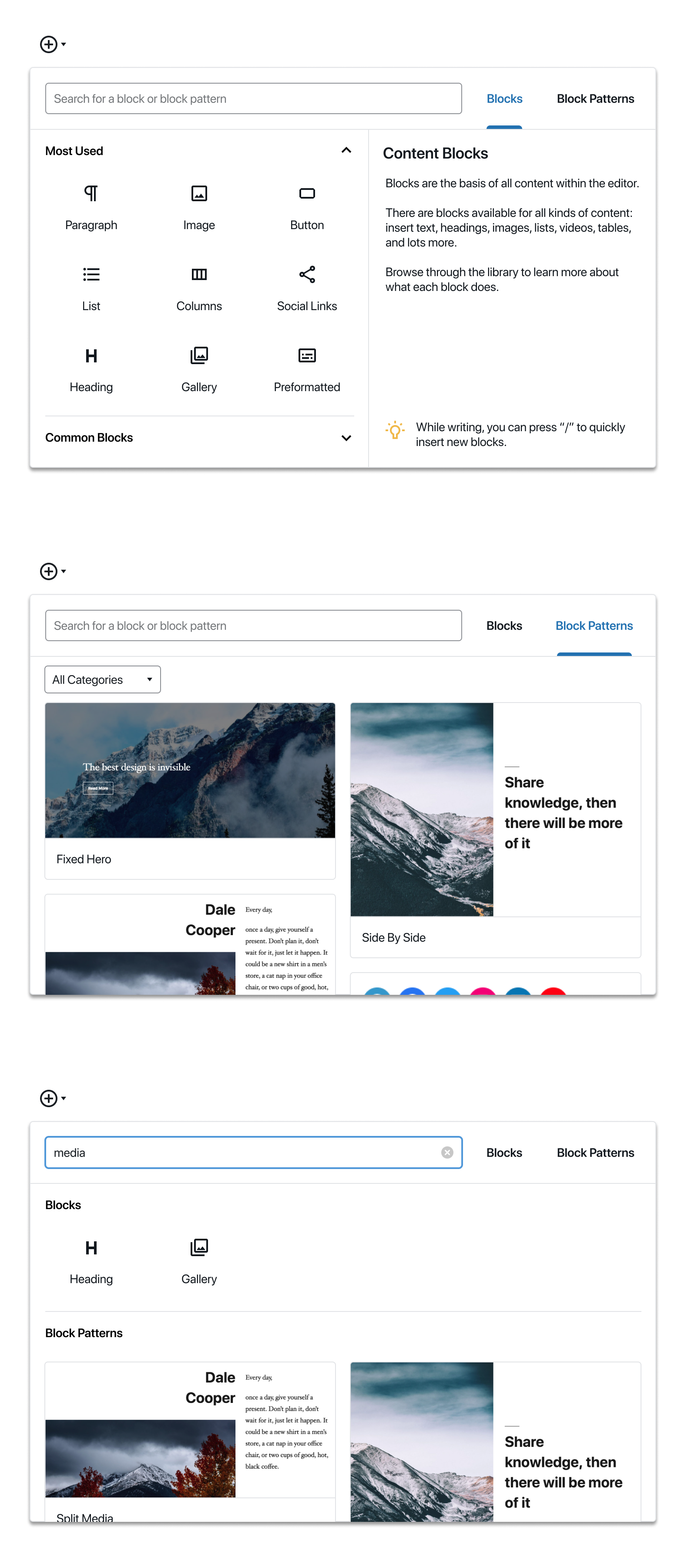
That rings true. I took a little time to try and mock up a little bit based on that feedback, but combining this with the idea of a singular block library. Don't put too much weight in the high fidelity of this mockup, partly this is my comfort zone, partly it's a way to make it "feel real". So just because it looks done, doesn't mean it can't be rejected based on further feedback: What you see here is the same singular block library that you press the The UI builds on what we have, but adds two tabs in addition to the search field:
Again, while this looks high fidelity it should not be taken as gospel. It is intended to simply further the conversation. I was inspired by some of @shaunandrews work for Full Site Editing, and I'm sure he'll have thoughts to share too. Hope this helps! Thoughts? |
|
Alright, so based on the above explorations, I see us breaking this down into two tasks:
@jasmussen has some excellent inserter explorations in #17335 (comment) that we can iterate on for the inserter. @shaunandrews also shared this idea that he's working on for WordPress.com with me: When you create a new page, you'd be presented with an option to select a layout. The preview is a nice addition that neither @mapk nor I have explored yet. One question we should think through: should full page layouts just happen for pages, not posts? |
One aspect is what we default to, another is the technical distinction. I.e. it's very probably technically trivial since it's the same under the hood, so merely a question of deciding what we allow. The benefit of allowing it everywhere is that it's a predictable flow that's the same everywhere. The downside is: we probably don't want you to create a new Post that uses the Blog Homepage template. Perhaps the template, when it's registered, decides itself which taxonomies it should be allowed on? |
Good idea — then templates could also be used for categories/tags, and CPTs. (A template picker on taxonomy pages could be cool!) |
|
Tangentially related to block patterns — sections of content — a friend shared some thoughts on the sibling inserter, the plus that appears on hover between blocks, noting that it would be more usable when always visible when the block was selected. The reason this is not the case right now is because that conflicts with just wanting to click text to edit, and with the resize controls present on Spacer and Cover blocks. Key here being that everything is a block. A couple of screenshots of the GoDaddy site builder were shared, where a similar interface exists and is permanently visible on select. The main difference being that this UI differentiates between small blocks (text, images) and bigger sections, and shows this control only on the latter: As we continue on block patterns, it would be interesting to think about whether this concept opens the doors for further simplification of the base UI at the addition of features to the larger sections. |
|
@jasmussen Can I grab your file for #17335 (comment)? |
|
Yes of course. I put it quickly together in kind of a messy Figma file, so I copied it here: https://www.figma.com/file/VaSKQJDS70ov87XY1alOVs/Block-Library-w.-Block-Patterns?node-id=0%3A1 |
|
Thanks! |
|
Been toying with a few ideas: I started with the idea of a dropdown and tried a single list of blocks: Along with this I tried both a two columns and a single column for patterns, using thumbnails for the patterns in the list: I then decided the search was in a confusing spot, and took a step back. I tried adding a dropdown next to the search and tabs below the search: With the tabs below the search, I also tried showing thumbnails of patterns in both a landscape and portrait orientation. I do like what @joen did with the more interesting layout of patterns so I also tried a quick mockup with that: |
|
Great explorations. I think the tabs work a little better as a pattern, because the dropdown next to search makes it look like the two are tied together — like, I can only search within patterns or templates, not change my view by selecting one. |
|
I thoroughly enjoyed reading through this issue, the ideas read and look great! I'd like to flag the related issues #15623 and #17512 which focus on providing the necessary block types and infrastructure respectively for enabling full site editing. While block patterns as discussed here make sense in both contexts (individual post vs entire template), I think we need to differentiate between two types of templates:
So far this issue seems mostly focused on the template parts, and that makes sense, but it would be great if we could also think about how to expand that to full templates in the future. |
One clarification — the "block patterns" setup is less about template parts (which are structurally meaningful) and more about general design elements made of smaller blocks. Once inserted they are not stored separately. For example, a "Cover" image that combines a few blocks to achieve a specific look that would otherwise take users some work to accomplish. Think of it more as a collection of designs that can be added anywhere without necessarily representing a reusable part of a theme template. |
|
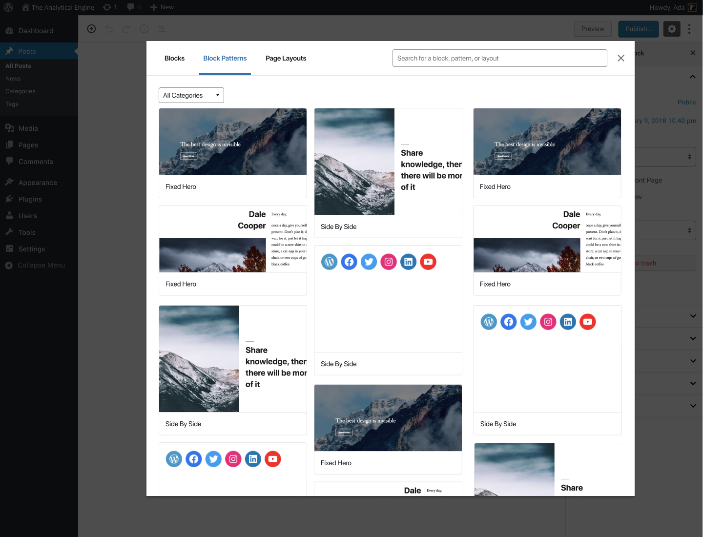
A quick and dirty exploration, taking @shaunandrews' and @jasmussen's ideas and applying them to a modal instead of a popover: |
|
I dig the tabs and search layout, though I must admit I personally always use the search in the block library, so as a data point of one, I would prefer search first. The modal dialog inserter definitely brings the space. That's good. But it also loses a little bit of the visual context of where your cursor is/where the block or block pattern will be inserted. Additionally it opens up the question of whether this becomes the global behavior for the block inserter, or for example just what you see when you use the sibling inserter or a variant like the "section inserter" suggested above. And if we do fragment the behavior, is that good? |
|
For what it's worth, it would be really helpful to edit the original comment to succinctly define This would be helpful to expedite the process of onboarding potential contributors; There has been some confusion among existing core members (also read the comments that immediately follow the linked comment) about the conflicting usage of terminology with templates. From reading the first couple comments, I was unsure how "block patterns" are different than inner templates (that can be reused across multiple post types, are not required to be tied to a specific part of a page). From what I gathered; block patterns series of blocks that are layout ; but the content inside the blocks has not yet been defined by the user and that the content is the same Would a block pattern be solving a use case of "I need a callout block that would consist of multiple blocks: a heading (whose heading level I'd be able to customize based on semantics) |
I actually think that having the preview in a fixed position might make it easier to scrub items in the list — you can keep your eye in the same space. |
|
hi @mrleemon! We have not considered that scenario. As of right now, block patterns are intended to be sections users can add and edit as necessary. This also means adapting the content to their needs. Would you mind elaborating a bit more about the use case you shared? When or why would it be useful to have it? |
|
I'm thinking of a one-page design with a series of group blocks in a specific order allowing users (with the editor role, for example) to modify the content of those blocks, but not delete them or change their order, so the menu anchors at the top of the page continue matching the page structure. |
From past client work, I've also heard this request, usually from larger organizations with specific editorial workflows. Usually they want to provide an approved layout for a specific type of content, and then have authors who can edit the content (images, videos, text, etc) within the layout, but not change the layout itself. The reasoning behind this is usually to maintain consistent design and branding for content across the site(s), even when many different people are generating and editing content. |
Yes, basically having the ability to lock layout-type blocks (groups, columns, etc.) would be great. |
|
I know for a fact this has come up before, and I could swear there was some locking aspect to templates that would let you accomplish this, but it escapes me. In any case, the use case seems legitimate, and interesting to solve. |
|
This is definitely available when creating templates. Since it's lower level API, it's not accessible from the pattern creation level yet. |
|
Here is a suggestion based on the newest mockup from Rich's @richtabor Big modul vs small modul. There could perhaps be an icon somewhere to make the inserter screen smaller. One clicks the smaller icon and Block inserter becomes small so that one can focus on the one pattern one is thinking about using in relation to the content of the layout. I have continued Rich's mockup and added Use and Edit and a lock icon. Alternative. Clicking Edit. Focused area for only editing a pattern/reusable block. |
|
The initial version of this is done. There are still some follow-up tasks here (searching, categories...) I'm going to close this issue though as we have this one #21080 with a good list of follow-ups. |


Block Patterns are becoming a requested feature. With the advent of Gutenberg, the blank canvas has become a bit more frightening. Rather than just worrying about content, now people also worry about page layout. While it's easy to wrangle with Gutenberg, the blank canvas leaves more questions than answers.
Adding a feature to include Block Patterns would be ideal!
Themes would be able to register block patterns. With this in mind, this feature could potentially eliminate all support questions of "How do I make it look like the demo?" 😱
Questions:
UX Example – Overlay
Prototype
UX Example – Sidebar
Prototype
cc: @epiqueras @youknowriad I'm not sure if this relates to some of the content areas and CPT work you've been doing.
Todo:
Potentially outside the scope of this issue but still part of the same project
The text was updated successfully, but these errors were encountered: