Skip to content
New issue

Have a question about this project? Sign up for a free GitHub account to open an issue and contact its maintainers and the community.

By clicking “Sign up for GitHub”, you agree to our terms of service and privacy statement. We’ll occasionally send you account related emails.

Already on GitHub? Sign in to your account

Add a help panel to the inserter available in all blocks #16813

Merged
merged 14 commits into from
Aug 19, 2019

Conversation

youknowriad
Copy link
Contributor

First step towards #16592

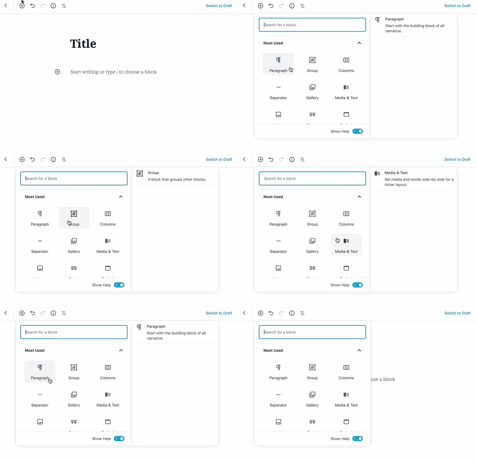
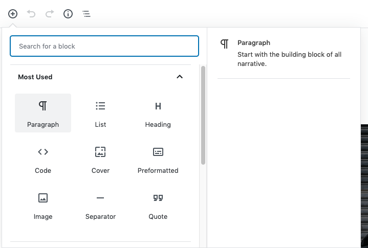
This expands the current "preview panel" when you hover reusable blocks in the inserter to become a help panel.

For the moment the PR only adds the "BlockCard" (title, icon and description) to that panel.
It raises some questions though:

  • Do we want to keep showing this panel on hover? How can we show it in a more permanent way but without having to click (as it would insert the block)
  • Don't mind the broken reusable blocks preview (this is broken in master too and tracked in Reusable blocks preview not working. #16808)

Capture d’écran 2019-07-30 à 2 18 04 PM

@youknowriad youknowriad self-assigned this Jul 30, 2019
@youknowriad youknowriad added [Feature] Inserter The main way to insert blocks using the + button in the editing interface [Status] In Progress Tracking issues with work in progress Needs Accessibility Feedback Need input from accessibility Needs Design Feedback Needs general design feedback. labels Jul 30, 2019
@kjellr
Copy link
Contributor

kjellr commented Jul 30, 2019

Thanks for getting this started!

A couple quick observations so far:

First, the empty space in between each item causes this to be a little jarring:

dead-space

The constant show/hide gets to be a little flashy. We could fix this in one of two ways:

  1. Adjusting the hit area for the hover, so that here are no gaps in between each item.
  2. Keep the panel itself visible at all times, but use some sort of "Hover over a block on the left to preview it" placeholder message when a block isn't selected. In this case, at least it's just the content that's showing/hiding, not he entire panel.

In both cases, I think we can refine by adding some more relaxing fade animations.

Regarding this note:

How can we show it in a more permanent way but without having to click (as it would insert the block)

This is a great question. I do think it would be beneficial to allow folks to keep a specific block's panel open beyond just the hover state. Especially if we place tips in there — the extra reading time is beneficial. In the current PR, this is possible by using he keyboard to activate the :focus state, but I'm stumped so far on a good way to enable that using just the mouse. If anyone has any great ideas, please share...

@kjellr
Copy link
Contributor

kjellr commented Jul 31, 2019

Keep the panel itself visible at all times, but use some sort of "Hover over a block on the left to preview it" placeholder message when a block isn't selected. In this case, at least it's just the content that's showing/hiding, not he entire panel.

If we go with this option (which I think is probably the simplest?) here's a first pass at a mockup for it:

Block Library Help Panel - Default

This would provide a great place to surface the first tip from #16582 as well.

@youknowriad
Copy link
Contributor Author

@kjellr Another possibility I considered is to keep the last hovered block visible even if you move out from it.

@kjellr
Copy link
Contributor

kjellr commented Jul 31, 2019

@kjellr Another possibility I considered is to keep the last hovered block visible even if you move out from it.

🎉 I like that better. Let's try that first.

@mtias
Copy link
Member

mtias commented Jul 31, 2019

Keeping the last block visible could be disconcerting. I was hoping we could use this as a permanent place for saying what blocks are and showing some tips. We could rotate different tips that don't fit in a specific block but are related to editing / insertion.

@kjellr
Copy link
Contributor

kjellr commented Jul 31, 2019

Keeping the last block visible could be disconcerting. I was hoping we could use this as a permanent place for saying what blocks are and showing some tips. We could rotate different tips that don't fit in a specific block but are related to editing / insertion.

I think keeping the last block selected is worth trying, since it'll help eliminate the flash that you see when you hover over the empty areas in between the block buttons.

The more general tips and intro panel are still definitely possible either way — It would make sense to have the panel open with general information about blocks when you first open up the inserter, and before you hover over a block icon.

@mtias
Copy link
Member

mtias commented Jul 31, 2019

to have the panel open with general information about blocks when you first open up the inserter, and before you hover over a block icon.

Agreed, it'd also prevent the entire preview panel from showing / not showing which is disconcerting already.

@youknowriad
Copy link
Contributor Author

I applied both suggestions at the same time: show a generic thing when you open the inserter (no block hovered) and avoid dismissing the last hovered block when you leave it. I can remove this if needed. Let me know how it feels.

@mtias
Copy link
Member

mtias commented Aug 1, 2019

I think this control is a bit excessive where it's placed.

image

Can we remove it entirely or place it in the general "settings" modal?

@mtias
Copy link
Member

mtias commented Aug 1, 2019

Exploring something more like this for the default view:

image

@kjellr
Copy link
Contributor

kjellr commented Aug 1, 2019

I applied both suggestions at the same time: show a generic thing when you open the inserter (no block hovered) and avoid dismissing the last hovered block when you leave it. I can remove this if needed. Let me know how it feels.

In general this interaction feels pretty good... The main thing missing is a way to get back to the original welcome panel/general message. Maybe if you mouse out of the modal, or onto the search panel, that returns?

I suppose we could also try returning to the default panel when you hover over the right panel too, and see if that feels more natural. I may just be reacting positively to the fact that things don't flash when I'm moving the mouse in the gutter between block items, and less to the specific fact that the last item remains selected.

@youknowriad
Copy link
Contributor Author

I moved the setting to the options modal and pushed (Github seem to have trouble to refresh the UI but the commit is there somewhere :) )

@marekhrabe
Copy link
Contributor

The help panel might be a good place for more details like the one suggested in #16521. Crossposting here just in case.

@kjellr
Copy link
Contributor

kjellr commented Aug 2, 2019

Pushed some tiny content + spacing changes to get us a little closer to the mockup:

Screen Shot 2019-08-02 at 3 46 01 PM

@youknowriad
Copy link
Contributor Author

youknowriad commented Aug 19, 2019

@mapk I removed the horizontal space, let me know what you think? Feel free to push commits here if needed ;)

@mapk
Copy link
Contributor

mapk commented Aug 19, 2019

This looks great now! It's working smoothly on the horizontal cursor flow between block buttons.

👍 :shipit:

@youknowriad youknowriad merged commit df7afa8 into master Aug 19, 2019
@youknowriad youknowriad deleted the add/inserter-help-panel branch August 19, 2019 16:35
@youknowriad
Copy link
Contributor Author

Let's try it thanks everyone.

@rickybanister
Copy link

It might be nice to use the help panel to display the block description for the hovered or highlighted block, providing more context for the element you're considering adding to the page.

Rough mockup:

Screen Shot 2019-08-22 at 9 29 48 AM

@senadir
Copy link
Contributor

senadir commented Aug 22, 2019

@rickybanister this is the current behavior, pull master to the latest version to see it

pic from master
image

@rickybanister
Copy link

haha, sorry for not testing, great work everyone!

@talldan
Copy link
Contributor

talldan commented Aug 23, 2019

Noted that this PR removed some padding around the blocks in the menu in order to keep the transitions in the side panel smooth. It doesn't seemed to have stopped the issue when moving the mouse up and down.

An alternative might be to keep the spacing as it was but use a small delay on the side panel item disappearing.

@kjellr
Copy link
Contributor

kjellr commented Aug 23, 2019

@talldan Yeah, I just opened #17168 to track that. The padding removal also created issues with the focus state, so it needs to be reassessed.

@CreativeDive
Copy link
Contributor

I'm just wondering what to do with this big empty space?

empty-area

This area is perfect for displaying a reusable blocks selection for each block type. This would be great if we could select the most used reusable block directly from this panel.

reusable-blocks

This would be awesome and encourage the user to work even more with reusable blocks :-)

@kjellr
Copy link
Contributor

kjellr commented Aug 28, 2019

Hey @CreativeDive. The current plan for that space is to add:

  1. A block preview, as was enabled for the paragraph block in Add the block example API and use it for inserter and switcher previews #17124
  2. A set of rotating tips for each block, as described in Add rotating block-specific tips to the inserter's help panel #17091

@CreativeDive
Copy link
Contributor

@kjellr Thanks for reply. I think a reusable block selection would be more interesting and useful :-)

Sign up for free to join this conversation on GitHub. Already have an account? Sign in to comment
Labels
[Feature] Inserter The main way to insert blocks using the + button in the editing interface Needs Accessibility Feedback Need input from accessibility Needs Design Feedback Needs general design feedback. [Status] In Progress Tracking issues with work in progress
Projects
None yet
Development

Successfully merging this pull request may close these issues.