Use div in text columns and create responsive grid. #3438
Conversation
|
Many times comes to my mind WP core would make it very easy for themself, save lot of time, to use Bootstrap library for back-end. This problem with columns is practicaly solved with Bootstrap, and for all screen sizes. And very popular library. Not only magic with columns, but all other magic too. Other plugins could use it to. For instance ACF, Pods, CMB2, etc... and tweaking fields layout, Metaboxes in back-end. Right now they use some limited hard tweaking for it. Start by little steps and in some distant future convert whole back-end to Bootstrap. Replace all HTML tables with it. |
|
I personally don't see benefits using Bootstrap or any CSS framework for Grids. You can do that for couple of lines of CSS. But unified Design System for WP admin would be nice. But that's out of scope from this PR :) |
|
Using a div instead of improperly using a section make sense to me. Not an expert about |
|
Couple of question to think about:
|
|
So, two avenues of answers to this one. First: the "Text Columns" block is sort of a one-off. As we implemented it, the chief reason for doing so was to demonstrate the power of what Gutenberg can do with layouts, even in its current state. But because of all the questions asked in this thread (all of which have already also been asked on the Columns ticket, #219), this might be the type of block that doesn't actually ship with Gutenberg initially. Secondly, the thing is — depending on the implementation of columns — we might want the UI for nested blocks to be in place first in #428, and once work properly starts on #219 we might not want a separate block for "Text Columns" at all, but depending on the approach perhaps a generic column container. This container could then have options for columns as well as responsiveness. This is also where CSS Grid can come into play, and CC: @mor10 because he's mentioned that a number of times. All of this is not to say that we can't or shouldn't make improvements to text-columns, just that it's perhaps worth starting to think about what form those improvements should take, before we spend too much time optimizing for something that may not exist indefinitely. If it's just a quick markup change, that's probably super fine. |
|
@jasmussen thanks, postponing any CSS change sounds good to me. @samikeijonen when you have a chance, mind updating your PR to have just the markup changes? 🙂 |
|
I'll update or create fresh PR at some point. I still think my questions is good base for deciding how the columns/nested blocks could work. The CSS part is the easy part, using Grid or flexbox, or both. |
 samikeijonen
force-pushed
the
update/text-columns
branch
from
samikeijonen
force-pushed
the
update/text-columns
branch
from
6dd59cb to
b65c74d
Compare
Codecov Report
@@            Coverage Diff            @@
##           master   #3438      +/-   ##
=========================================
- Coverage   39.17%   33.8%   -5.38%
=========================================
  Files         299     249      -50
  Lines        7025    6713     -312
  Branches     1292    1207      -85
=========================================
- Hits         2752    2269     -483
- Misses       3588    3754     +166
- Partials      685     690       +5
Continue to review full report at Codecov.
|

|
Removed responsive grid (which still feels super weird to me). |
|
Seems like this is ready for a final review? |
|
Yep, should be just change to |
| @@ -102,20 +102,20 @@ registerBlockType( 'core/text-columns', { | |||
| /> | |||
| </div> | |||
| ) } | |||
| </section>, | |||
| </div>, | |||
| ]; | |||
| }, | |||
|
|
|||
| save( { attributes } ) { | |||
There was a problem hiding this comment.
Since we change the save I guess we need a deprecated version here unless we're ok showing a warning for old text-columns blocks considering this block as not a block that is used that much? cc @jasmussen
There was a problem hiding this comment.
In general I think all these sorts of semi-breaking changes we should make as fast as we can in this phase, and not worry too much. We have great tools to help users "fix" the blocks when they are updated, so I think we should just do it.
If we are going to do something different once nested blocks come into play, then we'd need to do further changes regardless.
Description
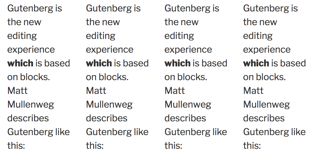
Update text columns block markup and create responsive Grid. See issues #2908. Note that depending on content width 3-4 columns blocks might not have 3-4 columns.
We can always force 4 columns using media queries but I wanted to hear opinions first using fluid responsive Grid.
Columns could get really narrow and unreadable if we force them to be in 4 columns.
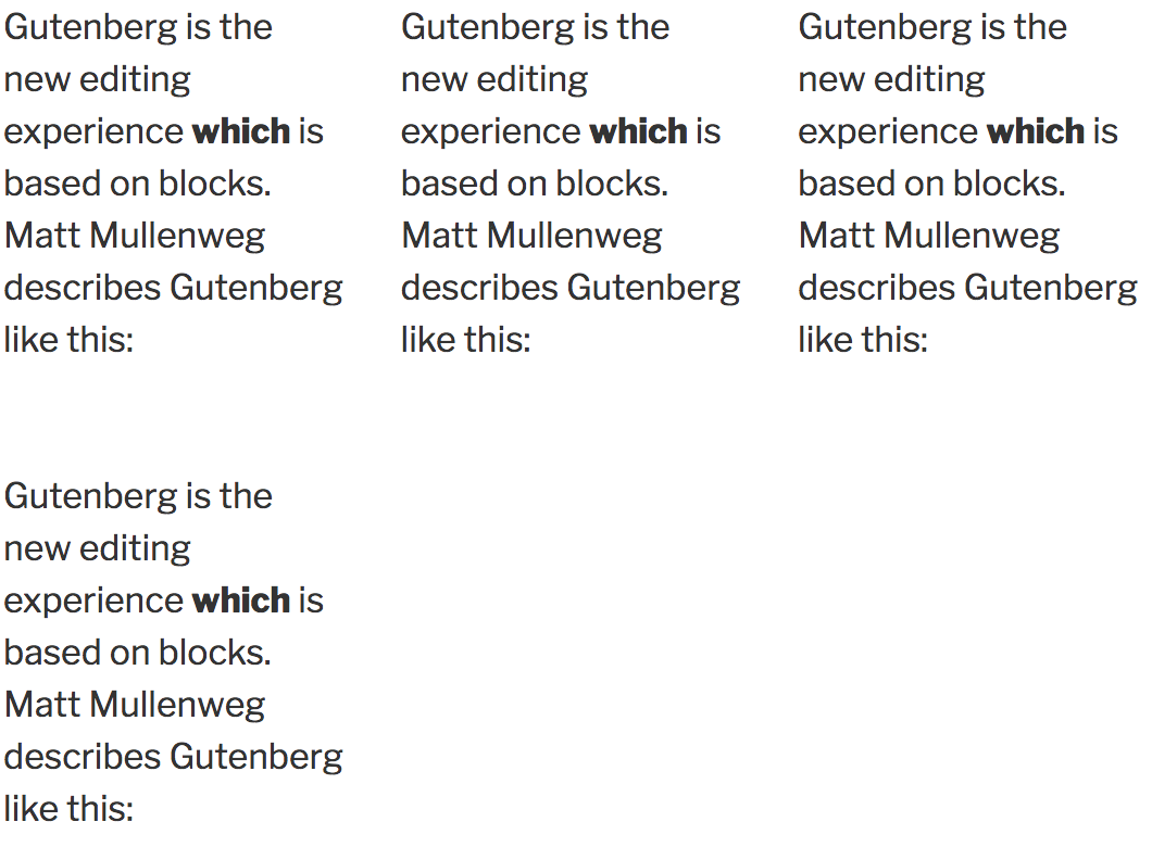
Screenshots (jpeg or gifs if applicable):
Screenshot of Twenty Seventeen (current PR):
Screenshot of Twenty Seventeen if forcing to 4 columns:
How Has This Been Tested?
npm testwas successful.Types of changes
<section>to<div>.Checklist: