


This project is inspired by Angular Material Schematics and adds PrimeNG (V7) support to your Angular (V7) project.
with npm init
or yarn create
 No globally installed NPM modules are required.
Executing one of these commands will:
No globally installed NPM modules are required.
Executing one of these commands will:
- create a new Angular 7 project called "my-primeng-app" (angular ng-new schematic)
- add PrimeNg support to the newly created project (primeng-schematics add schematic)
- ensure project dependencies in
package.json- ensure project dependencies in your app module - add prebuilt PrimeNG theme intoangular.jsonandstyles.<EXTENSION>files - add Prime icons - add Flex grid - add Chart.js - run npm install - create sample dashboard component (png g dbr schematic), which includes: - primeNG menubar (png g mb schematic) - six types of primeNG charts (png g chr --type schematic) - primeNG table (png g t schematic)
- run ng serve -o command
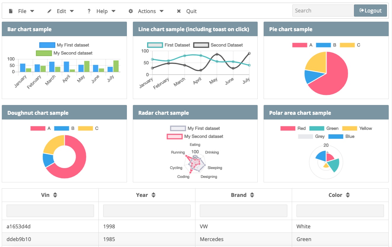
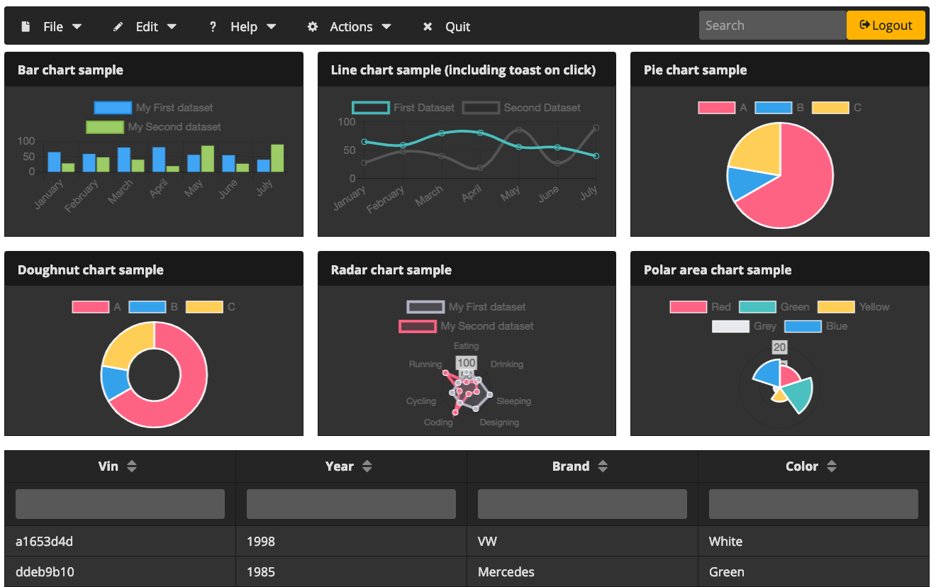
The newly created app should now look like (with rhea default theme):
Any additional Angular NG NEW or PrimeNG ADD options may be passed along with this command:
Test your new app (if the app was created without --minimal flag):
You may install @angular/cli, and primeng-schematics globally, which will expose ng and primeng-schematics (along with its alias png) global executables respectively:
In further examples I will assume that these packages are installed globally. It is also possible to use local or temporary cached with npx packages. So instead of running
$ ng add c componentNamealternatives ways may be used:
# using npx
$ npx @angular/cli c componentName
# using local package (must be run from the project root)
$ npm run ng -- c componentName
# the same using npm bin (note use of back ticks)
$ `npm bin`/ng c componentName
# the same using relative path
$ node_modules/.bin/ng c componentName
Similarly, instead of running
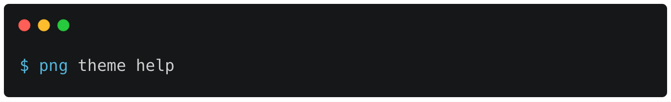
$ png helpalternatives ways are:
# using npx
$ npx primeng-schematics help
# using local package (must be run from the project root)
$ npm run png -- help
# the same using npm bin (note use of back ticks)
$ `npm bin`/png help
# the same using relative path
$ node_modules/.bin/png c componentName
To see Angular NG NEW options run:
To see PrimeNG ADD options run:
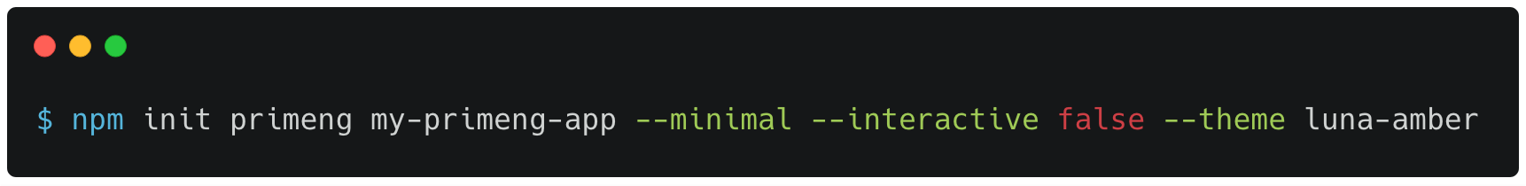
and then choose the theme from the dialog or pass it with --theme flag, for example:
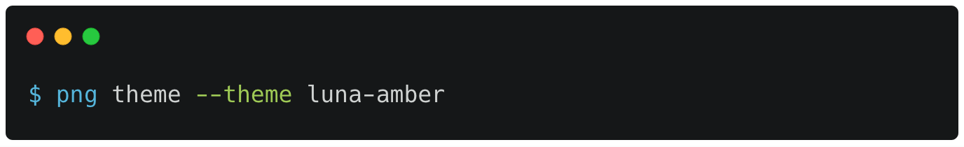
After switching to luna-amber palette, the app should look like
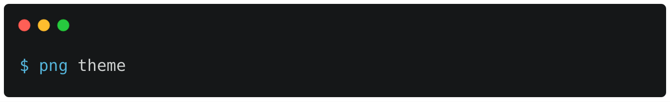
to see available themes:
In addition to the install, PrimeNG schematic module has currently six schematics it comes packaged with:
- Menu bar
- Organization chart (including PrimeNG growl)
- Side bar
- Table with a new state storage
- Chart
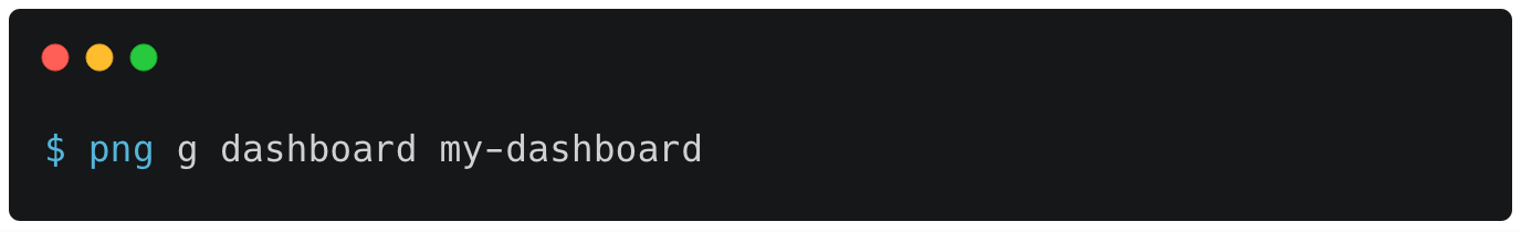
- Dashboard: a collection of different charts and table, using Prime flex and panels
Each component schematic will create a new angular component that includes PrimeNG component. (ng g is an alias for ng generate)
$ ng g menubar <COMPONENT_NAME>$ ng g org-chart <COMPONENT_NAME>$ ng g sidebar <COMPONENT_NAME>$ ng g table <COMPONENT_NAME> [--storage [none, session, local]]$ ng g chart <COMPONENT_NAME> [--type [line, bar, doughnut, pie, polarArea, radar]]$ ng g dashboard <COMPONENT_NAME>You may also use png g command instead of ng g:
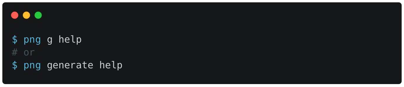
Too see components' aliases and options:
After executing one of these commands, a new angular component will be created with provided name. After this point you can add this new component to any existing component.
For example, assuming that you created <app-mb>, <app-oc>, <app-sb> and <app-t> components (menu bar, organization chart, side menu and table), you may modify your app.component.html file to something like:
<app-mb></app-mb>
<app-sb></app-sb>
<h1>
  Welcome to {{ title }}!
</h1>
<app-oc></app-oc>
<app-t></app-t>
- Improve / fix / add tests
- Implement ng-update schematic