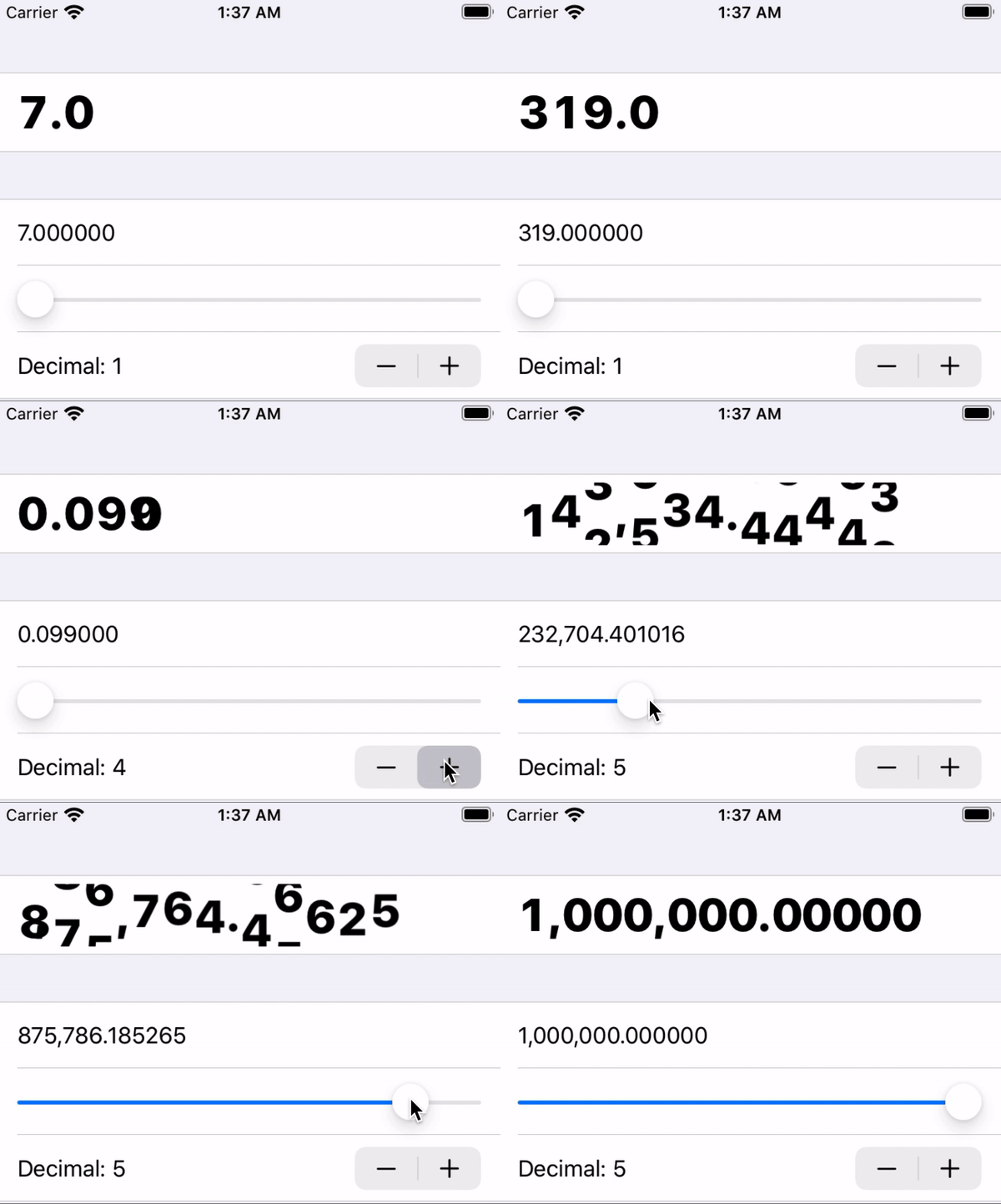
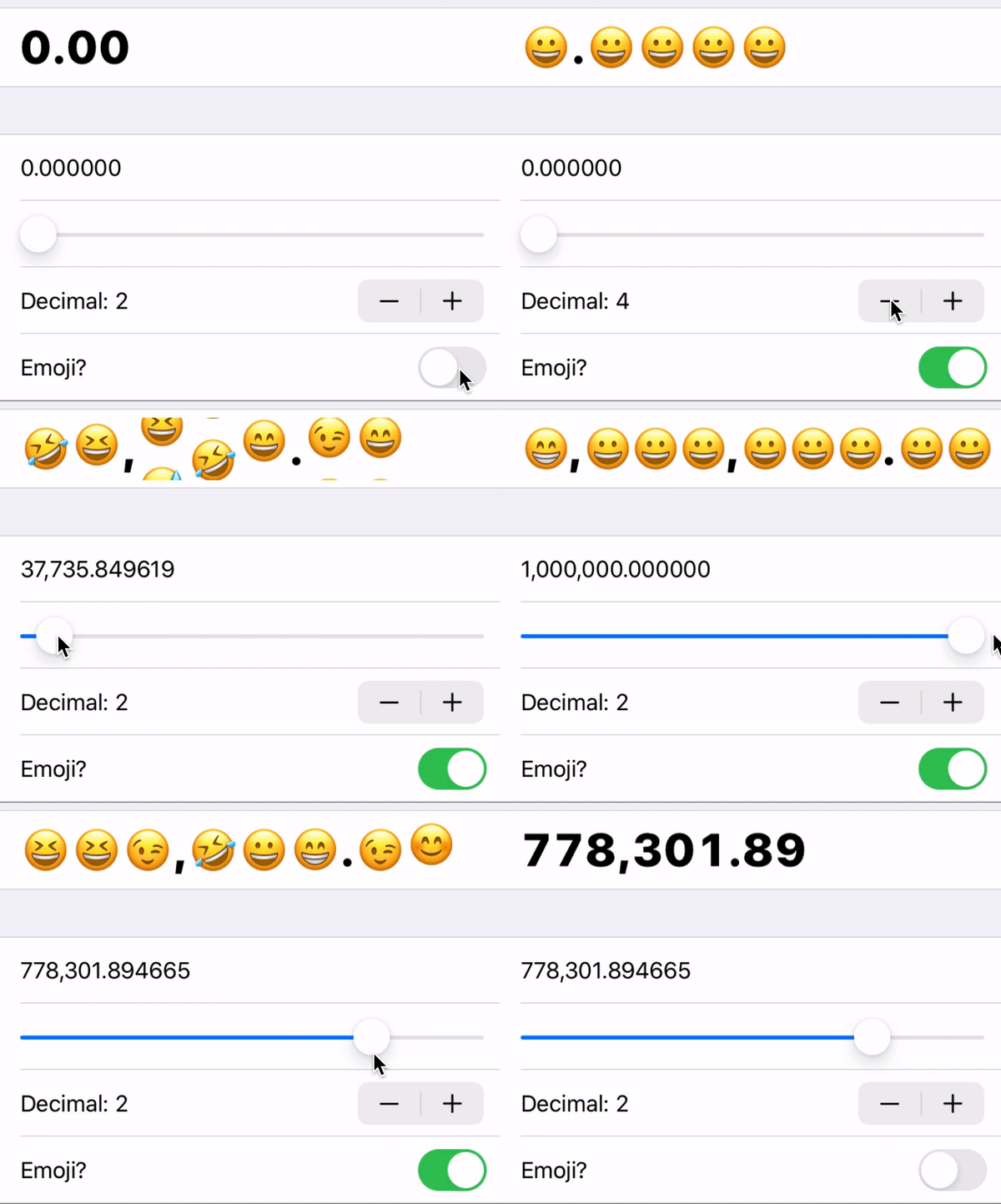
Moving numbers effect in SwiftUI.
Custom element:
Also used in the Robinhood-like line plot library RHLinePlot.
- Smooth digit transition
- Custom digit view builder
- Dynamic decimal places
- Support integer (just set to 0 decimal place)
- Support commas
- Support negative numbers
- iOS 13, macOS 10.15
- Swift 5.1
- Xcode 11
pod install MovingNumbersView
Go to File → Swift Packages → Add Package Dependency then put the repo URL (https://github.com/aunnnn/MovingNumbersView.git).
Initialize it with number, numberOfDecimalPlaces, and trailing closure elementBuilder:
import MovingNumbersView

MovingNumbersView(
    number: 123.456,
    numberOfDecimalPlaces: 3) { str in
        // How to build each character
        Text(str)
            .font(.largeTitle)
}
To display whole numbers, just set numberOfDecimalPlaces to 0.
The elementBuilder: (String) -> some View will be used by the library to build each visual element such as digits, dots, and commas. You can return any View, so the text style is fully customizable.
Optional parameters are fixedWidth*, verticalDigitSpacing, and animationDuration. verticalDigitSpacing allows you to control the spacing between digits in the vertical digit stack, and animationDuration is the duration for the vertical digit stack to move up and down.
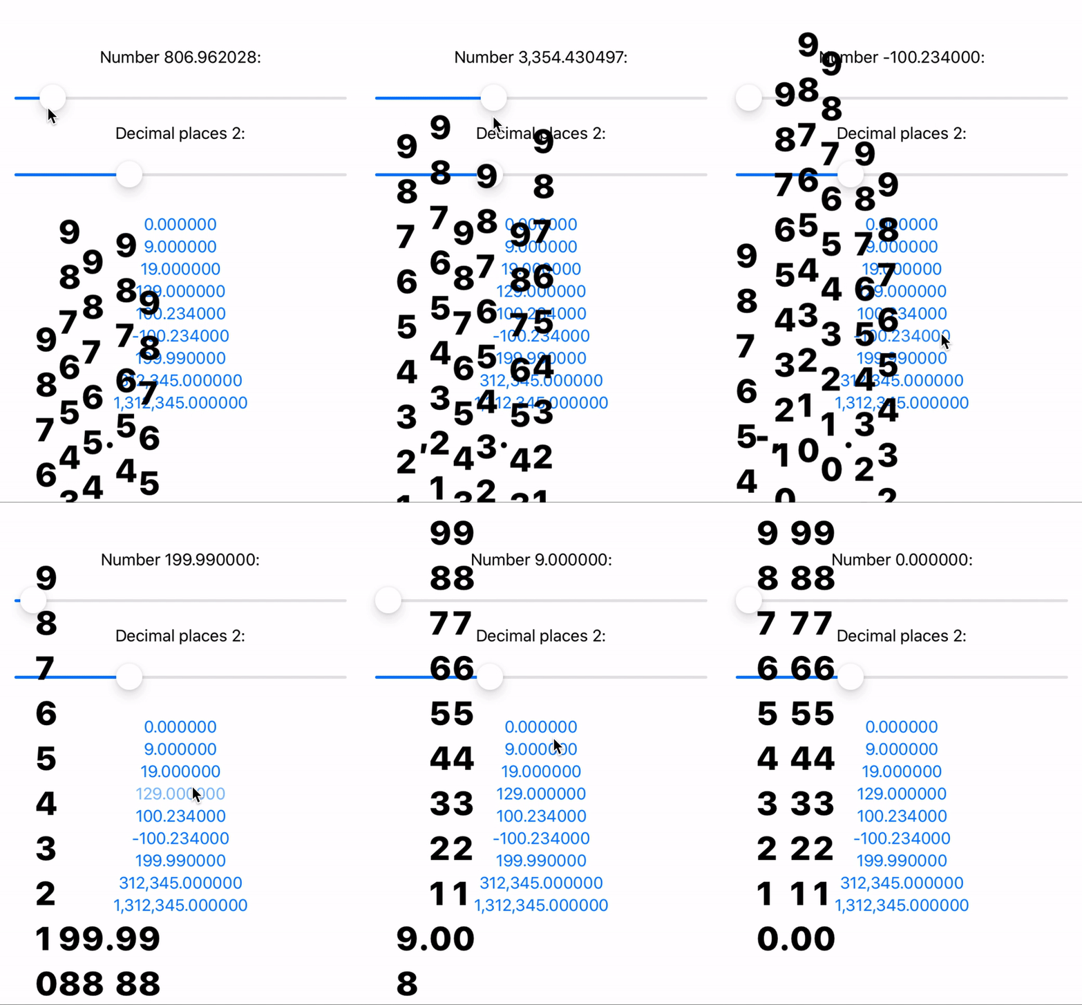
fixedWidth: CGFloat? is optional but important. It will give a fixed width to the label to give space for digit transitioning. Without it, when the last few digits are moving in and out, the label frame shrinks faster that the transition so you could see trailing digits getting cropped out:
Setting fixed width will prevent the frame to shrink, and makes the transition/animation effect looks better:
This will also leading align the digits. With the default value (nil), the MovingNumbersView will shrink and expand at its own center, since its size depends on the number of current visual elements and make the transitioning weird. While this could be fixed by using extra VStack with leading alignment, the former cropping problem is still there.
P.S. Another way to solve it is to put a couple of invisible digit(s) at the end, so it has some extra space to transition out. It kind of work, but probably won't scale if multiple digits are gone simultaneously (like 1,234,567 -> 0).
To have the top and bottom edges look blurry, simply apply a gradient mask on the MovingNumbersView:
MovingNumbersView(...)
    .mask(LinearGradient(
        gradient: Gradient(stops: [
            Gradient.Stop(color: .clear, location: 0),
            Gradient.Stop(color: .black, location: 0.2),
            Gradient.Stop(color: .black, location: 0.8),
            Gradient.Stop(color: .clear, location: 1.0)]),
        startPoint: .top,
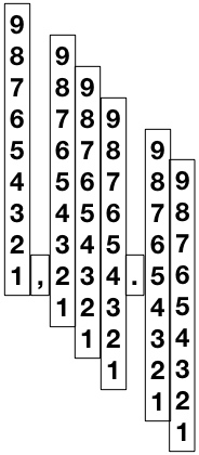
endPoint: .bottom))Basically there are one view for each digit, comma, dot, and minus sign, all centered in a HStack by default. Check out VisualElementType enum.
To show a number, we move only the vertical digit stack up and down to the right offset. Try removing the mask and see it in action:
The digit is represented as 10-digit stack, and it's being moving up and down via VerticalShift geometry effect, which just offsets the digit stack by the current digit presented. (I believe the normal transform/offset might work too.)
The assigned ids are important. Each visual element is assigned a number relative to its significance. We use a multiple of 10s for digit, a negative multiple of 10s for decimal places, 0 for dot and 1 is for minus sign. Comma has the id of next digit plus 5.
For example, -1,234.56 -> ids = [1(-), 40, 35(,), 30, 20, 10, 0(.), -10, -20].
This scheme allows SwiftUI to calculate the right insertion/removal transitioning.
Moving from 9 to 19 is moving from ids = [10("9")] to ids = [20("1"), 10("9")]. That is, we don't animate 9 to 1, but simply bring in a new 1.


