This was a group project where we were given COVID-19 data which covered the period from Jan. 22, 2020 to May 2, 2021, and we were to work together to create various queries in Scala/Spark to find trends and other information from that data, and then turn that data into various visualizations.
- Brian Vegh @brianvegh
- Jeffrey Hafner @JeffH001
- Eric Thistle @erthis
- Dare Fatade @ofatade
- Md Tahmid Khan @MdTahmidKhan
- Scala v2.12.15
- sbt v1.6.2
- Java v8 (v1.8.0_312)
- Spark v3.1.3
- Tableau 2022.1.0
Relationship between COVID-19 Case Rate and Historical Average Temperature by Country (Feb. '20 - April '21)
The first query (here) found the average number of cases per month per country, normalized by population size.
The second query (here) used the data from that first query, plus historical climate data from the Berkeley Earth data page to look at the COVID-19 data for a relationship between average historical temperatures and the rate of COVID-19 cases by country.
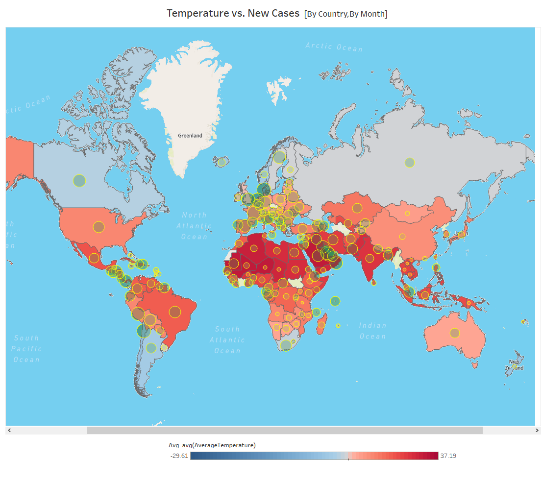
Data shown for June 2020 (color represents temperature, circles represent number of cases) (click image for full size view)
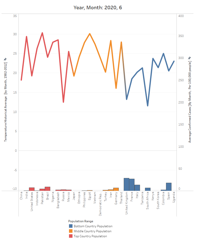
Data shown for June 2020 (top line is temperature data, population numbers at the bottom) (click image for full size view)
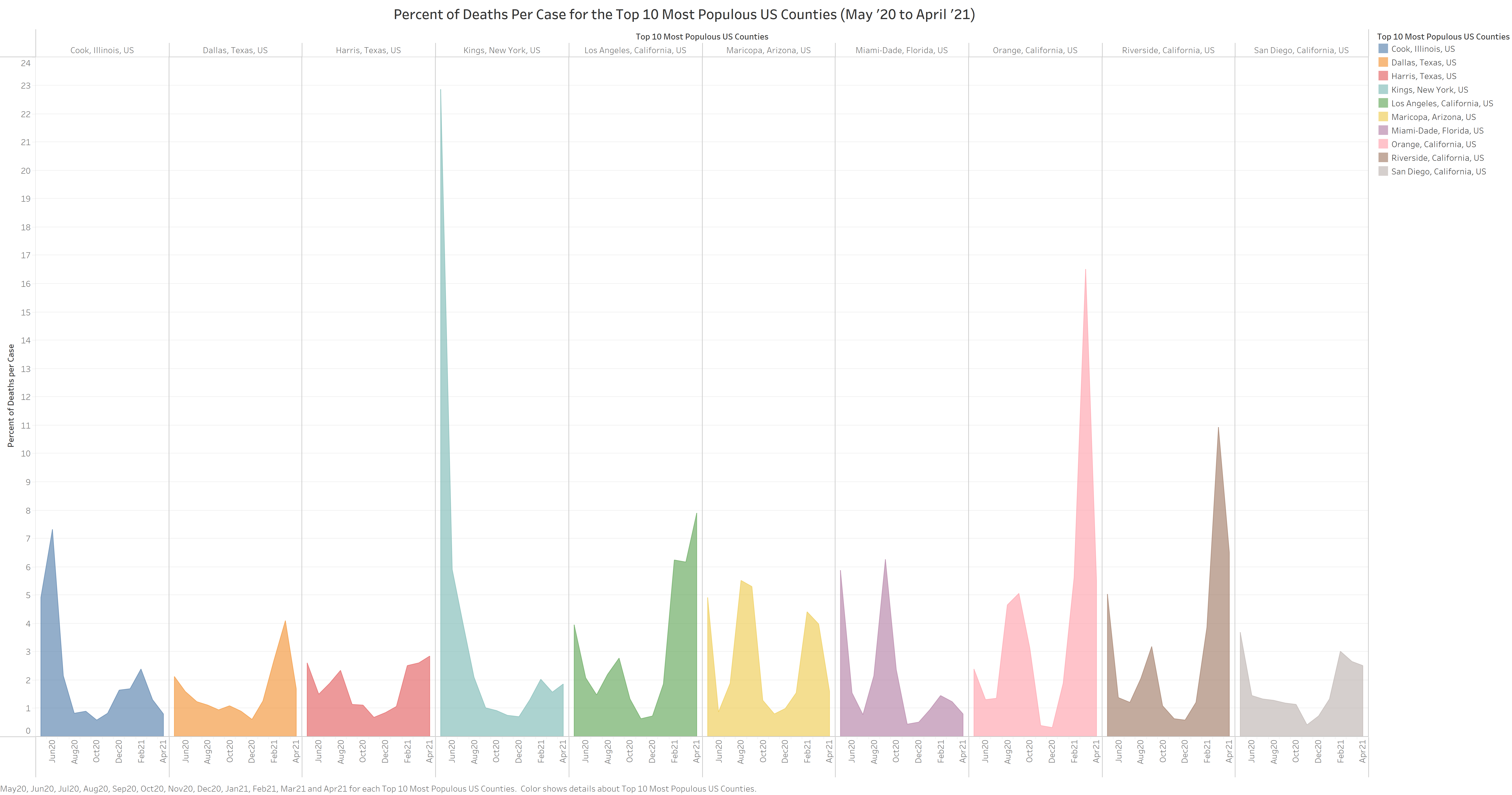
Percent of Deaths Per Case for the Top 10 Most Populous US Counties (May '20 – April '21)
This query (jq1.scala) looked at the ten most populous counties in the US and showed deaths per confirmed case of COVID-19 for each month from May '20 to April '21.
(click image for full size view)
Deaths Per Month Per Million in US States + DC (May '20 – April '21)
This query (jq2.scala) looked at the 50 US states plus Washington DC and showed the number of deaths per million for each month, plus the average number of deaths per month, for the 12 month period starting from May '20.
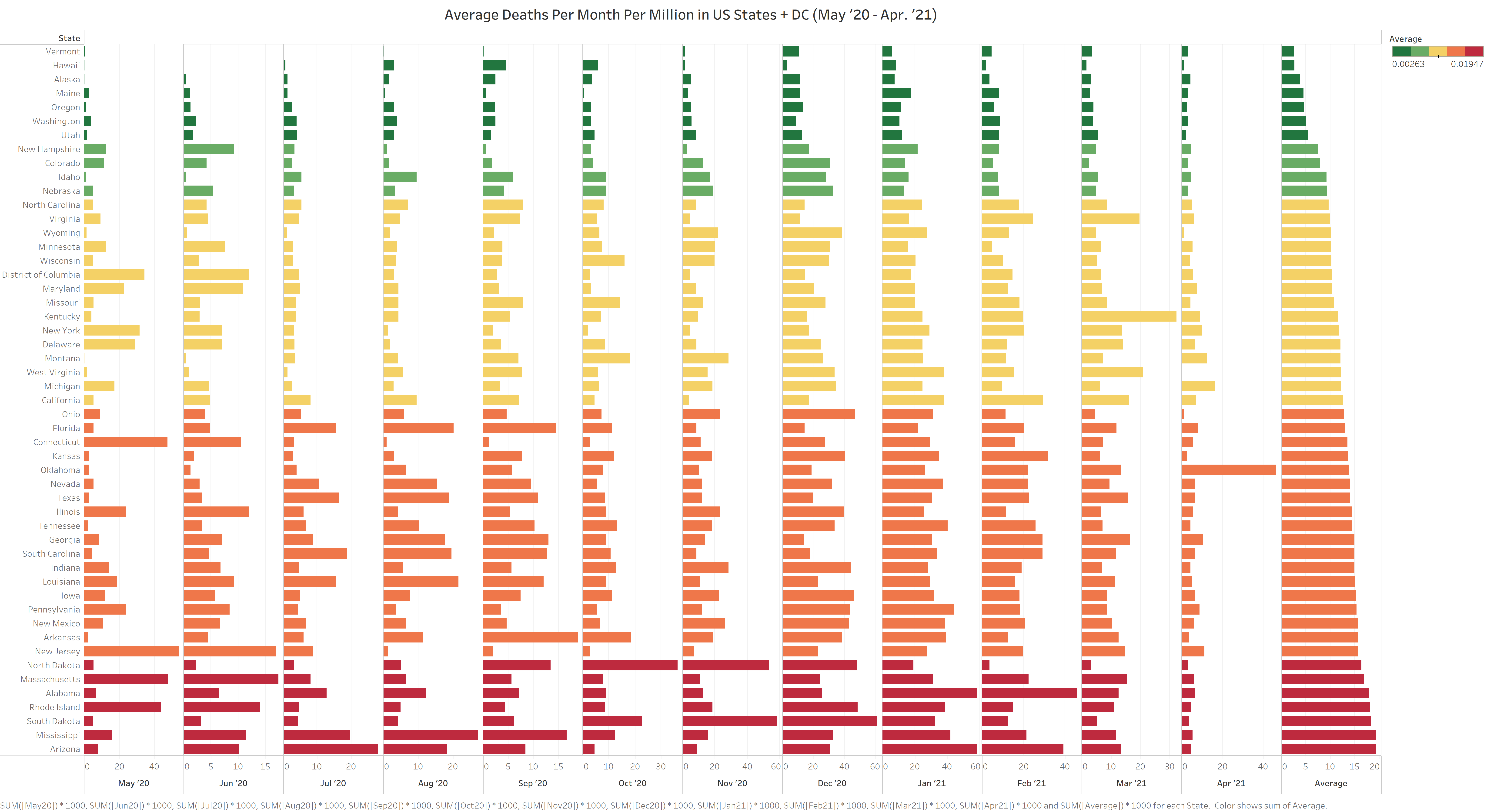
Full graph of data (click image for full size view)
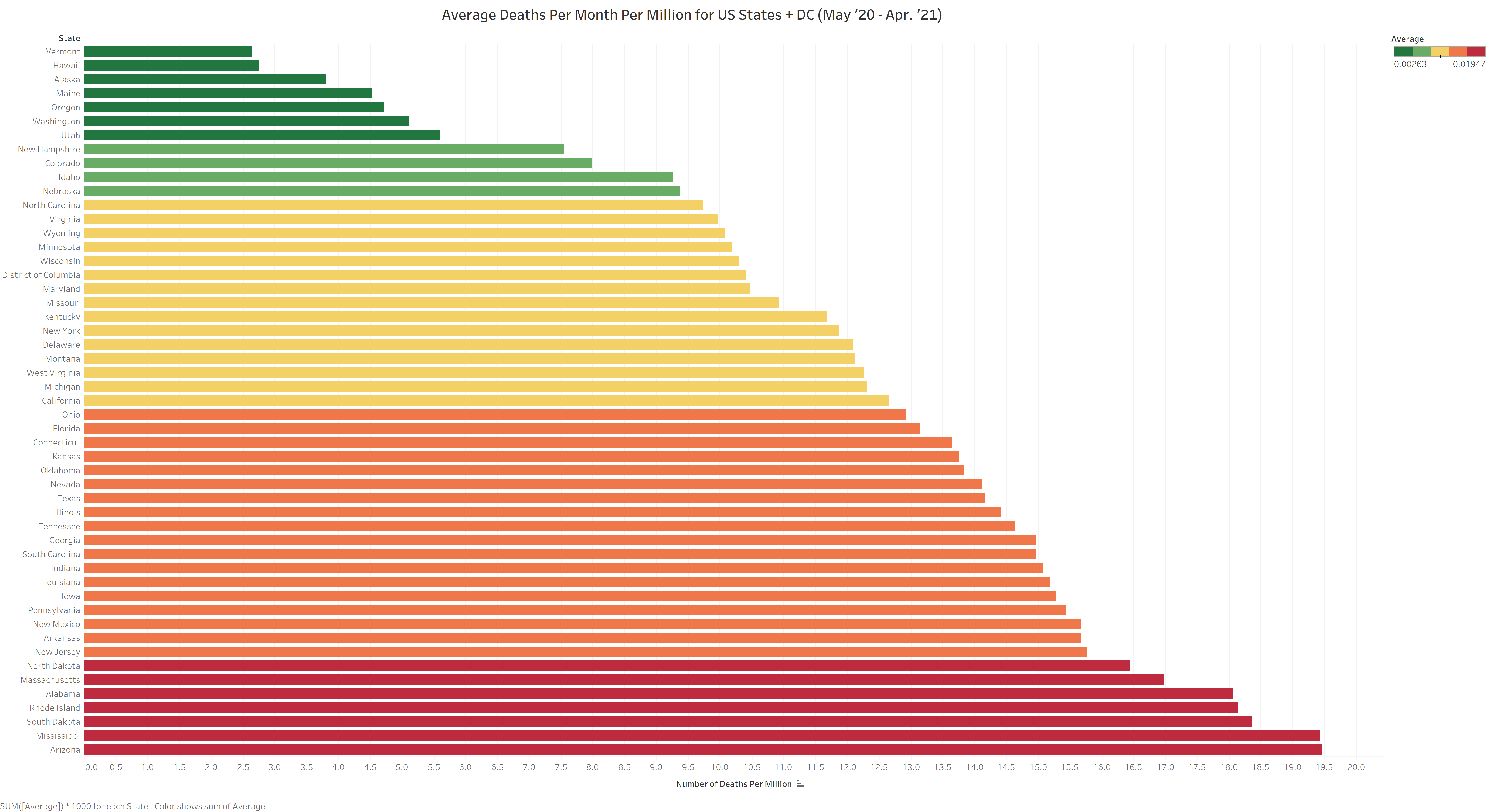
Graph of just the averages (click image for full size view)
Deaths Per Capita Compared with Population Density of US States
This query (eq1.scala) used the COVID-19 data and 2020 US census data on population density by state to look for a relationship between the number of deaths per capita and the population density of each state.

(click image for full size view)
Comparison of Number of Overall Deaths in 2019, 2020, and COVID-19 Deaths in 2020 for Texas
This query (eq2.scala) compared the overall death rate in Texas between 2019 and 2020, showing that the death rate was significantly higher in 2020, and showing that the rise in overall deaths matched the rise in COVID-19 deaths in 2020.
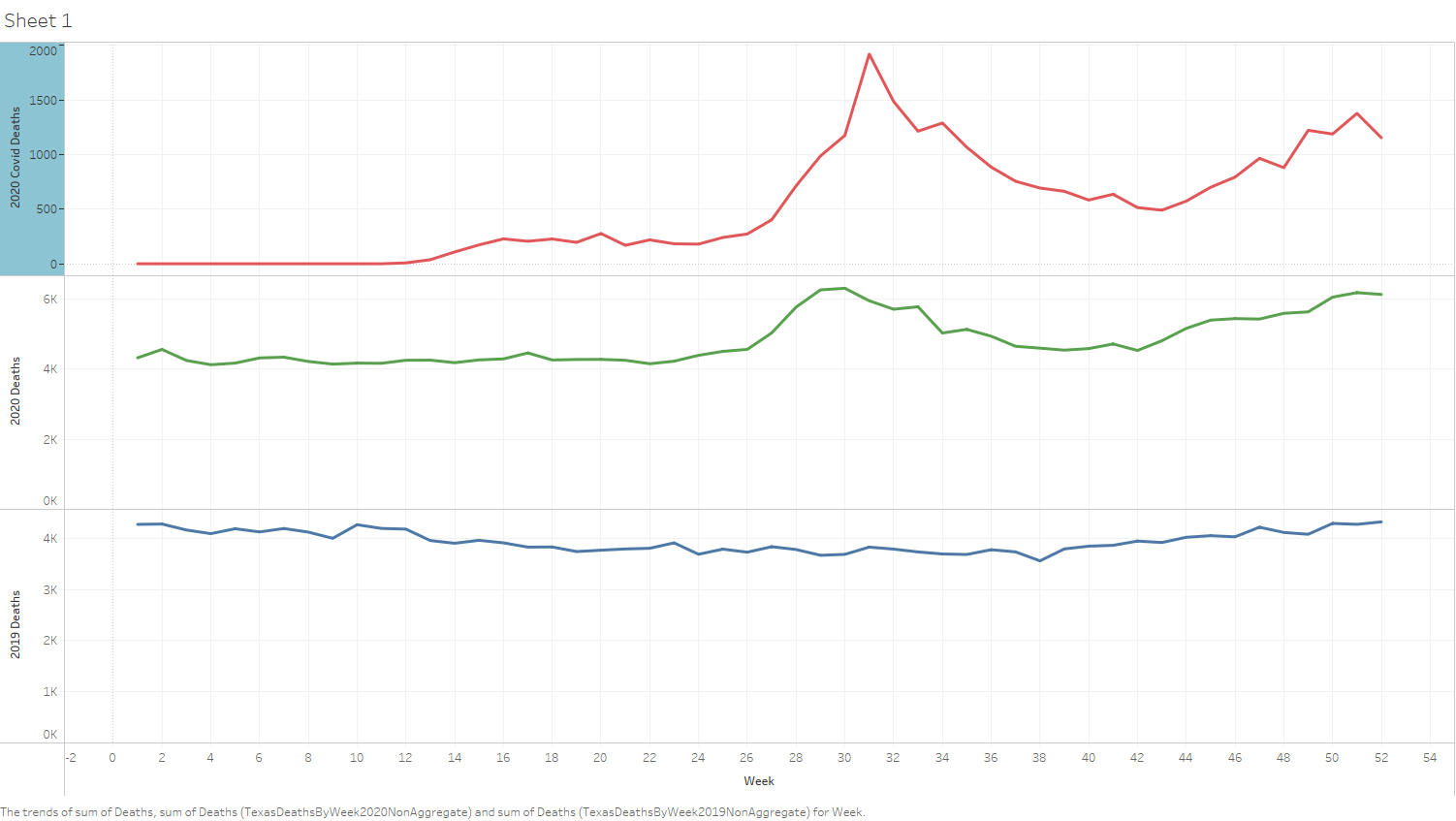
(click image for full size view)
Most and Least Deaths by COVID-19 in US States and Territories
This query (dq1.scala) looked at the ten US states and territories with highest and lowest raw number of deaths due to COVID-19.
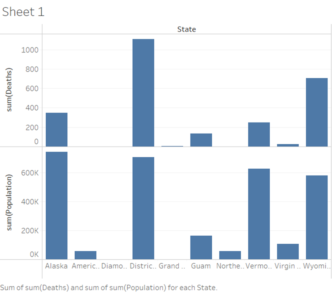
10 US states and territories with the lowest death totals, along with their populations (click image for full size view)
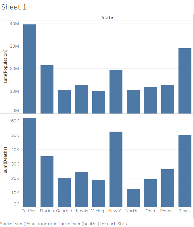
10 US states and territories with the highest death totals, along with their populations (click image for full size view)
COVID-19 Death/Case Ratio by Country as of April '21
This query (dq2.scala) looked at the ratio of COVID-19 deaths to the confirmed cases in countries around the world, as of April 2021.

(click image for full size view)
Percent of Total Deaths Due to COVID-19 by US State
This query (tq1.scala) pulled in outside data from the CDC on the total number of deaths in 2020 by State, and used that to show what percentage of deaths overall that year were due to COVID-19 for each state.
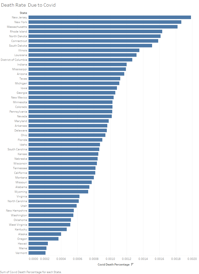
(click image for full size view)
This query (tq2.scala) found the top ten best and worst states based on COVID-19 death rates vs population.
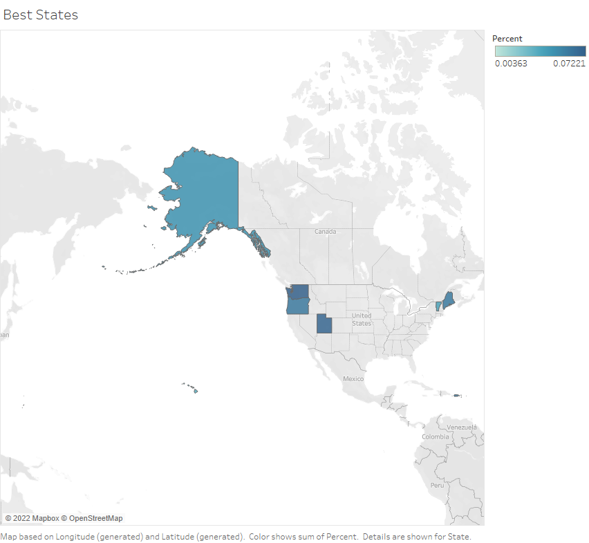
Best 10 US states with the lowest COVID-19 death rates (click image for full size view)
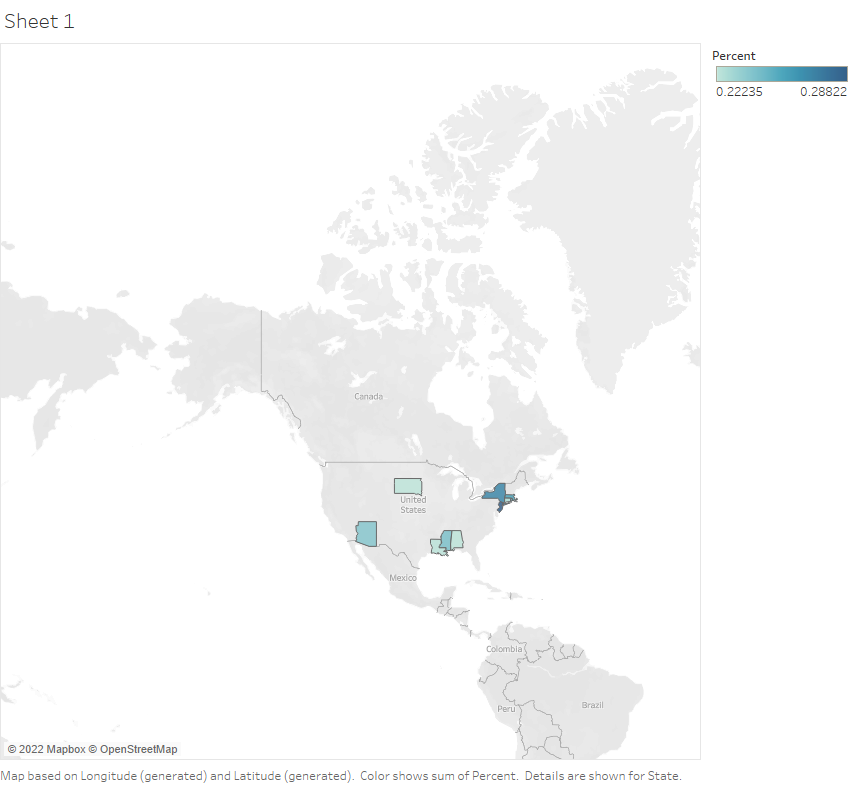
Worst 10 US states with the highest COVID-19 death rates (click image for full size view)