| title | author | date | output | vignette |
|---|---|---|---|---|
How to make a Nightingale's rose plot with ggplotAssist |
Keon-Woong Moon |
2017-11-15 |
rmarkdown::html_vignette |
%\VignetteIndexEntry{RosePlot} %\VignetteEngine{knitr::rmarkdown} %\VignetteEncoding{UTF-8}
|
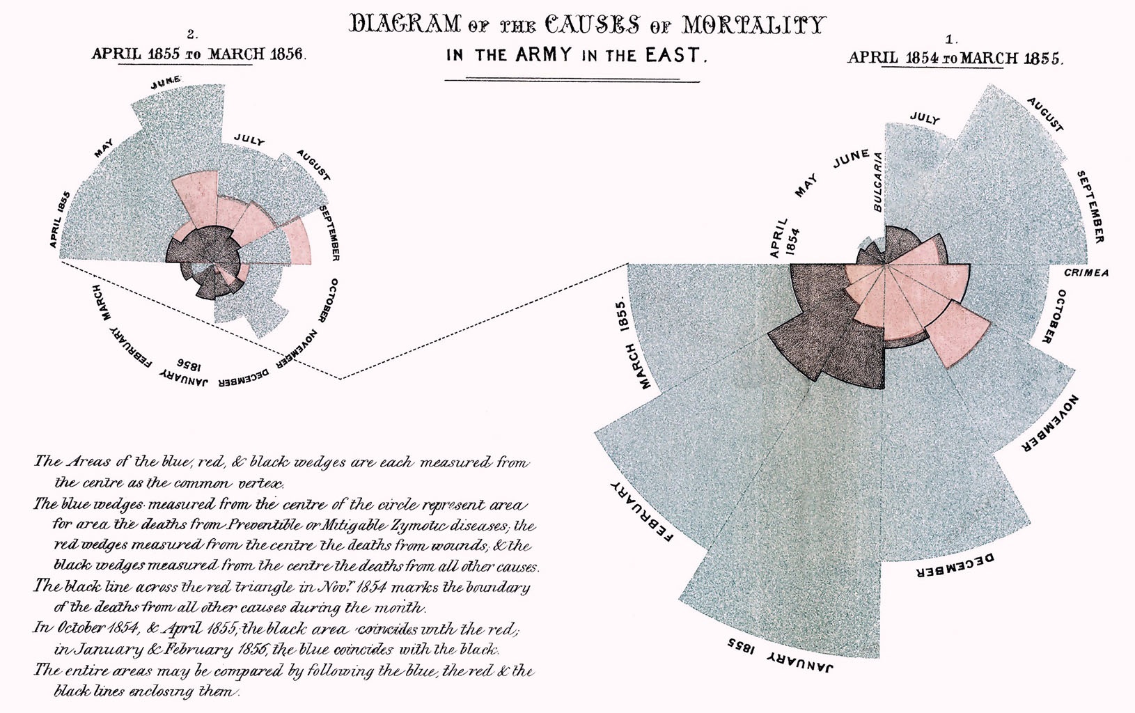
In 1858 nurse, statistician, and reformer Florence Nightingale published Notes on Matters Affecting the Health, Efficiency, and Hospital Administration of the British Army. Founded Chiefly on the Experience of the Late War. Presented by Request to the Secretary of State for War. This privately printed work contained a color statistical graphic entitled "Diagram of the Causes of Mortality in the Army of the East" which showed that epidemic disease, which was responsible for more British deaths in the course of the Crimean War than battlefield wounds, could be controlled by a variety of factors including nutrition, ventilation, and shelter. The graphic, which Nightingale used as a way to explain complex statistics simply, clearly, and persuasively, has become known as Nightingale's "Rose Diagram." (http://www.historyofinformation.com/expanded.php?id=3815)
You have to install the developmental version of R package editData from github.
#install.packages("devtools")
devtools::install_github("cardiomoon/editData")You can install ggplotAssist package from github.
#install.packages("devtools")
devtools::install_github("cardiomoon/ggplotAssist")A rose plot is a stacked bar plot with polar coordinate. With ggplot2, you can make the rose plot easily.
I will use the rose data included in package ggiraphExtra. The rose data is a phony dataset representing rose sales.
library(ggiraphExtra)
head(rose)
# A tibble: 6 x 3
Month group value
<fctr> <chr> <dbl>
1 January G 10
2 February G 5
3 March G 7
4 April G 9
5 May G 11
6 June G 13
Alternatively, you can download the rose.csv file from my github using the following code.
library(readr)
url <- "https://raw.github.com/cardiomoon/ggplotAssistFigures/master/rose.csv"
rose=read_csv(url)
Parsed with column specification:
cols(
Month = col_character(),
group = col_character(),
value = col_double()
)
rose$Month=factor(rose$Month,levels=month.name)First, make a bar plot. In this plot the height of bar represent values in the data.
require(ggplot2)
ggplot(data=rose,aes(x=Month,y=value,fill=group))+geom_bar(stat="identity")The default bar width is 0.9(90% of the resolution of data). To remove the spaces between the bars, set the width of bar 1 and the boundary color "black" and the thickness of line 0.1.
ggplot(data=rose,aes(x=Month,y=value,fill=group))+
geom_bar(stat="identity",width=1,color="black",size=0.1)To make a rose plot, apply polar coordinate with coord_polar(). Apply "Reds" palette with scale_fill_brewer().
ggplot(data=rose,aes(x=Month,y=value,fill=group))+
    geom_bar(stat="identity",width=1,color="black",size=0.1)+
    coord_polar()+
scale_fill_brewer(palette="Reds",direction=-1)- In RStudio, Select File ... New File...R script. To use data rose, highlight the data name
rose(1). Execute ggplotAssist addin(arrow), to interactively manipulate it.
- To mapping the variables, select
xamong aesthetics andMonthamong mapping. Selectyamong aesthetics andvalue. Selectfill(1) andgroup(arow) to map the fill variable.
- Press
geombutton(1). Selectgeom_bar(2). Selectidentityas stat(3). To set the color argument of geom_bar(), selectcolor(4) and enterblack(5) and selectaddquotecheckbox(6). The R code for this layer is shown(7) and you can see the plot preview at lower right corner(8).
- Set the
size(9) of bar0.1(10). To remove the spaces between the bars, set thewidthof bar 1(11). You can see the R code for this layer(scarlet rectangle). PressAdd Layerbutton to add this layer.
- To apply
Redspalette to this plot, pressscalebutton(12). Select scale_fill_brewer(13) and selectRedspalette(14) and set the direction of palette -1(15). PressAdd layerbutton to add this layer(16).
- To apply ploar coordinate, press
coordbutton(17). Selectcoord_polar(18) and pressAdd Layerbutton(19).
- You can see the plot layer by layer. Press the
Layer by layerbutton(20) and press the arrow head(arrow). You can see the plot layer by layer.
- After maaping the variables, press the
geombutton(1). Selectgeom_bar(2) among geoms and set the statidentity(3). You can see the R code for this layer(4) and the plot preview(5). Press theMake a Rose Plotbutton(6) and you can get the rose plot.
- Press the
Donebutton(arrow).
- The code for the rose plot will be emitted at the cursor position(scarlet rectangle).


