[Elastic Charts] Added value labels styles for bar charts #4845
Conversation
|
Preview documentation changes for this PR: https://eui.elastic.co/pr_4845/ |
|
Preview documentation changes for this PR: https://eui.elastic.co/pr_4845/ |
|
Preview documentation changes for this PR: https://eui.elastic.co/pr_4845/ |
|
Preview documentation changes for this PR: https://eui.elastic.co/pr_4845/ |
1 similar comment
|
Preview documentation changes for this PR: https://eui.elastic.co/pr_4845/ |
|
Preview documentation changes for this PR: https://eui.elastic.co/pr_4845/ |
Co-authored-by: Caroline Horn <549577+cchaos@users.noreply.github.com>
|
Preview documentation changes for this PR: https://eui.elastic.co/pr_4845/ |
|
Preview documentation changes for this PR: https://eui.elastic.co/pr_4845/ |
There was a problem hiding this comment.
I've only one comment:
when rendering stacked bars, I agree with the choice of having the labels centered in the bars, the value corresponds to the size of the bar and is not directly connected with the Y-axis.
Instead, when you only have a single series, the label could be placed near the top edge of the bar. In that way, you link the label to its corresponding position on the Y-axis. This also limits the eye movements when reading the bar, reducing the gap between the top edge and the value label.
Using your screenshot as an example, I'm noticing that my eyes are focused or on the value labels (centered) or on the bars' shape/trend. Moving the label closer to the edge makes the readability easier

|
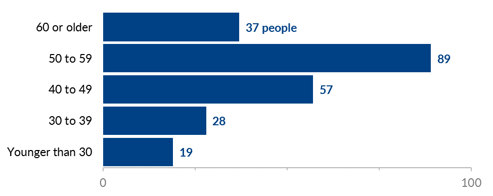
I agree it'd be better for the numbers in the non-stacked case to be at the top. Also, the custom is that if there's room past the single bar (in the positive or negative direction, wherever the bar extends toward) then the label would be outside the bar. There's more text contrast there. Example elastic/elastic-charts#1277 This may not be the place to raise this issue, but our bar charts, and charts in general are configured with a suboptimal balance of font size and data glyph (bar rectangle, etc.) shape. The fonts are small and the data shapes are large. It looks like a functional prototype not the final product. It's also an issue from an accessibility viewpoint: the user gets a huge piece of help in determining the screenspace size of the data shapes, but it's at the expense of font size. Also, even if there's ample room and the user has something like 3 bars, it shouldn't take up all that space. There ought to be a ratio of font size to bar width. For example, on the above images, the bar thickness is easily 3x that of the category labels, and the slightly taller value label inside the bar is also barely over 1/3rd of the height. 1.618x (golden ratio) to around 2x ratio would work but 3x is visually and accessibility wise unbalanced. Eg. this uses around 2x, despite few bars (if there are many bars, it's OK for the text to be about as tall as the bar is thick). This page has a couple of bad examples or unsupported advice, but most charts have a good font/shape balance. Big bars, small fonts is the main way to recognize Kibana visualizations in the wild |
@markov00 I agree. But how can I get this as default in the theme? The theme is static and doesn't know what is the current rotation state. Inside the theme object, we don't know if the chart is rotated or if it is stacked. That's why I had to pick one default alignment that would make more sense to most use cases. Then in the demo, we're showing that you don't need to use the defaults but implement an alignment that makes sense: The first time a value label is enabled it is aligned at the end of the bar chart. But then you have the option to center align. The idea is that users can play around with the toggles and copy the configuration that makes sense for their use case. We even recommend just use value labels when it's strictly necessary. |

|
Preview documentation changes for this PR: https://eui.elastic.co/pr_4845/ |
|
Preview documentation changes for this PR: https://eui.elastic.co/pr_4845/ |
Default theme@markov00 as we agreed, the default theme keeps the value labels vertically/horizontally centered. Demo (https://eui.elastic.co/pr_4845/#/elastic-charts/categorical)@cchaos and @markov00 for the demo in our docs, I removed the center value labels switch option. Now according to the configuration, the value labels adapt.
✔️ When stacked the labels get centered
✔️ They are now positioned near the edge of the bar
Generated configurationI also improved the data of the "Copy code of current configuration" and removed the
Next
@monfera I'm looking forward to elastic/elastic-charts#1277. Render bar labels outside of the bar is going to be a great enhancement. 👍🏽 |


|
Preview documentation changes for this PR: https://eui.elastic.co/pr_4845/ |
| <EuiFlexItem> | ||
| <ChartCard | ||
| title="Value labels" | ||
| description="Value labels can add too much detail and make categorical charts more difficult to interpret. Consider showing them only when the values are of extreme importance." |
There was a problem hiding this comment.
suggestion: usually the reason why you want to show numbers on a chart is that you want to clearly present the exact number (all digits/decimal digits are important). If that is the case, a suggestion could be to include, on the side, a small table that definitely shows clearly all the numbers and allow the user to sort them by value or categories.
| offsetX: rotated ? 2 : 0, | ||
| offsetY: rotated ? 0 : -2, |
There was a problem hiding this comment.
From what I see, this is used as padding on the text. We can probably introduce a default or custom padding and we can get rid of this part
There was a problem hiding this comment.
Optional, but I'd love to see even more separation.
| offsetX: rotated ? 2 : 0, | |
| offsetY: rotated ? 0 : -2, | |
| offsetX: rotated ? 4 : 0, | |
| offsetY: rotated ? 0 : -4, |
| @@ -100,9 +100,17 @@ function createTheme(colors: any): EuiChartThemeType { | |||
| }, | |||
| barSeriesStyle: { | |||
| displayValue: { | |||
| fontSize: 8, | |||
| fontSize: 10, | |||
There was a problem hiding this comment.
You can also set a min and max font size, the code automatically uses the right size depending on the available space.
| <Axis | ||
| id="left-axis" | ||
| position={${rotated ? '"bottom"' : '"left"'}} | ||
| ${formatted ? 'tickFormat={d => `${round(Number(d) / 1000, 2)}k`}' : ''} |
There was a problem hiding this comment.
@markov00 The one thing I noticed is that when we format the tick labels on a particular axis, it does also get applied to the showValueLabel setting, except when the chart gets rotated. Is this a known issue in elastic-charts?

There was a problem hiding this comment.
thank you @cchaos you are right, this is an issue in our code. I will check and fix the bug soon.
| offsetX: rotated ? 2 : 0, | ||
| offsetY: rotated ? 0 : -2, |
There was a problem hiding this comment.
Optional, but I'd love to see even more separation.
| offsetX: rotated ? 2 : 0, | |
| offsetY: rotated ? 0 : -2, | |
| offsetX: rotated ? 4 : 0, | |
| offsetY: rotated ? 0 : -4, |
|
Preview documentation changes for this PR: https://eui.elastic.co/pr_4845/ |
Summary
Closes #4267.
This PR adds better value labels default styles for bar charts.
By default the value labels once enabled are going to:
textInvertible)The following demo
#/elastic-charts/categoricalwas updated and a "Show value labels" switch was added. The value labels adapt the position according to the configuration. They are positioned close to the edge of the bars.When it's multi-series and stacked the value labels are positioned vertically and horizontally in the center.
Checklist
[ ] Checked in mobile[ ] Props have proper autodocs and playground toggles[ ] Added documentation[ ] Checked Code Sandbox works for the any docs examples[ ] Added or updated jest tests[ ] Checked for breaking changes and labeled appropriately[ ] Checked for accessibility including keyboard-only and screenreader modes