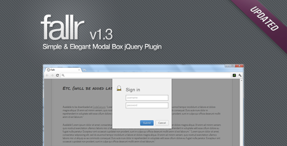
Fancy, simple, yet elegant modal box jQuery plugin
- Author : Faisal Salman <f@faisalman.com>
- Demo : https://faisalman.github.io/fallr-js
- Source : https://github.com/faisalman/fallr-js
- NPM : https://www.npmjs.com/package/fallr-js
<!-- include the required CSS -->
<link rel="stylesheet" type="text/css" href="jquery-fallr-2.0.1.css" />

<!-- include any version of jQuery before including plugin -->
<script type="text/javascript" src="jquery-1.7.1.min.js"></script>

<!-- include the plugin -->
<script type="text/javascript" src="jquery-fallr-2.0.1.min.js"></script>$.fallr.[method]([,options:Object] [,callback:function]);| method | description | example |
|---|---|---|
show |
Create and show message box | $.fallr.show({content: 'hello world!'}, function(){ console.log('message box appears'); }); |
hide |
Hide current active message box | $.fallr.hide(function(){ console.log('message box disappears'); }); |
resize |
Resize width/height of current active message box | $.fallr.resize({width: '500px', height: '400px'}); |
set |
Set default options that will be used for every message box instance in the page | $.fallr.set({duration: 1000, useOverlay: true}); |
blink |
Make the current active message box blinking | $.fallr.blink(); |
shake |
Make the current active message box shaking | $.fallr.shake(); |
| option | type | default | description |
|---|---|---|---|
buttons |
object |
{ button1 : { text : 'OK', danger : false, onclick : function () { $.fallr.hide(); }}} |
Buttons |
icon |
string |
"check" |
Icon |
content |
string |
"Hello" |
Message box content |
position |
string |
"top" |
Message box position, top/center/bottom |
closeKey |
bool |
true |
Closable by ESC key |
closeOverlay |
bool |
false |
Closable by overlay click |
useOverlay |
bool |
true |
Show overlay outside message box |
autoclose |
bool |
false |
Duration until message box close in miliseconds, false to disable |
easingDuration |
int |
300 |
Duration for animation |
easingIn |
string |
"swing" |
Type of easing when appear |
easingOut |
string |
"swing" |
Type of easing when disappear |
height |
string |
"auto" |
CSS value for exact height |
width |
string |
"360px" |
CSS value for exact width |
zIndex |
int |
100 |
Set z-index for message box |
bound |
string/object |
window |
jQuery selector for custom boundary |
afterHide |
function |
function () {} |
after hide callback |
afterShow |
function |
function () {} |
after show callback |
There are some predefined icons name you can use already: at, bars, book, calendar, photo, chart, chat, check, clock, gear, document, error, folder, heart, help, home, info, key, lamp, left, magnifier, mail, minus, pen, pin, plus, quote, reload, right, star, tag, trash, unlock, up, user, window, config.
To define another custom icon class name you have to edit the CSS file, then add a CSS class with .ficon- prefix like this:
.ficon-twitter {
    background-image: url('img/twitter.png');
}
The image format must be a PNG/GIF/JPG with recommended size 32x32 px. In the example above we can see that the twitter icon file is inside /img folder relative to the CSS file, then you can use it as:
$.fallr.show({icon : 'twitter', content: '<p>Hi there, see my new icon!</p>'});- CSS3 Github buttons by Nicolas Gallagher
- Iconic icon set by somerandomdude
Dual licensed under GPLv2 or MIT
Copyright © 2011-2014 Faisal Salman <f@faisalman.com>
Permission is hereby granted, free of charge, to any person obtaining a copy of this software and associated documentation files (the "Software"), to deal in the Software without restriction, including without limitation the rights to use, copy, modify, merge, publish, distribute, sublicense, and/or sell copies of the Software, and to permit persons to whom the Software is furnished to do so, subject to the following conditions:
The above copyright notice and this permission notice shall be included in all copies or substantial portions of the Software.
