Releases: gatanaso/multiselect-combo-box
v3.0.0-alpha.1
This release re-creates the component for Vaadin 22+
For a more detailed overview of all changes, please see: #106
Thank you to @web-padawan for the contribution 🙏
For examples of how this works, check out the demos: lumo theme demo and material theme demo.
Contributors
Assets 2
v.2.4.2
This is a bugfix release and no changes have been introduced in the functionality of this component.
The modifications are done to enable fixing issues in the java wrapper of this component (https://github.com/gatanaso/multiselect-combo-box-flow).
v2.4.1
This is a bugfix release and no changes have been introduced in the functionality of this component.
The modifications are done to enable fixing issues in the java wrapper of this component (https://github.com/gatanaso/multiselect-combo-box-flow).
v2.4.0
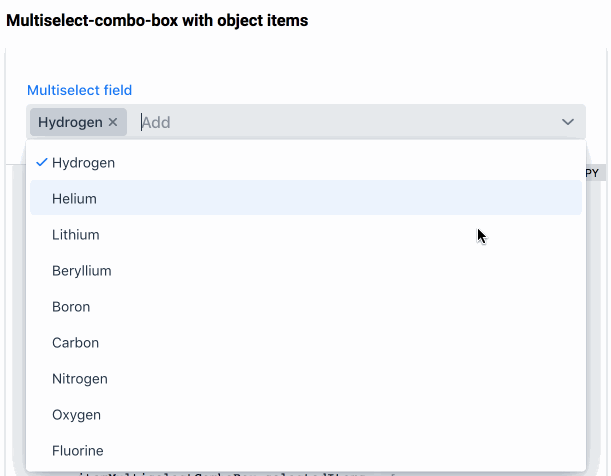
This release introduces the possibility to add custom values (#5) to the multiselect-combo-box 🎉

To enable custom values, set the allow-custom-values property of the component. When enabled, inputting a value and pressing enter fires a custom-values-set event. The new value is not automatically added to the existing values or items, instead it is up to the user to handle this event and decide how to process the value.
For examples of how this works, check out the demos: lumo theme demo and material theme demo.
v2.3.1
This is a bugfix release and no changes have been introduced in the functionality of this component.
The modifications are done to enable fixing issues in the java wrapper of this component (https://github.com/gatanaso/multiselect-combo-box-flow).
v2.3.0
This release comes with an awesome new feature, and that is the possibility to use item templates and custom renderers (#43) 🎉

Additionally it fixes an issue with the ordering of non-string items #55.
lumo demo: https://multiselect-combo-box.web.app/demo/
material demo: https://multiselect-combo-box-material.web.app/demo/material/
v2.2.0
This release introduces a much needed feature of the multiselect-combo-box and that is to keep the overlay open when selecting items (this was not previously achievable due to limitations in the underlying vaadin-combo-box).
Furthermore, with this release the component no longer has a default full width, but instead, it takes the amount of space it needs. This change breaks previous behavior in favor of better aligning with the core set of vaadin components.
Also, a new property readonlyValueSeparator was introduced, which enables customizing the value separator that is used for constructing the display value when the component is in readonly mode.
The default value of this separator is , .
multiselect-combo-box no longer has a default full width.
Backport of the clear button visible attribute
🎉 release for the Polymer 2 version of this component 🎉
To better align with the new defaults for the vaadin components, the clear-button-visible attribute is now also available to the multiselect-combo-box. With this update the component no longer displays the clear icon by default, but instead it needs to be specified explicitly. This change breaks the default behavior in favor of aligning better with the current default behavior of the vaadin-text-field and the vaadin-combo-box components.
clear-button-visible attribute or use the clearButtonVisible property.
ℹ️ Note: if the value of the multiselect-combo-box is empty, the clear button is always hidden.
Clear button visible attribute
To better align with the new defaults for the vaadin components, the clear-button-visible attribute is now also available to the multiselect-combo-box. With this update the component no longer displays the clear icon by default, but instead it needs to be specified explicitly. This change breaks the default behavior in favor of aligning better with the current default behavior of the vaadin-text-field and the vaadin-combo-box components.
clear-button-visible attribute or use the clearButtonVisible property.
ℹ️ Note: if the value of the multiselect-combo-box is empty, the clear button is always hidden.
Modifications for support of lazy data loading
This release introduces the modifications required by the Java wrapper to support lazy loading of items.