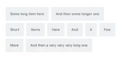
A Flow Layout is a container that orders its views sequentially, breaking into a new "line" according to the available width of the screen. You can compare it to a left-aligned block of text, where every word is a View. A common use for this layout is to create a tag cloud.
The end result looks like this:
- The layout algorithm behaves differently if your FlowLayout is nested in a
VStackor a scrollable parent, such asScrollViewor aList. Therefore, there's the Mode enum and mode property.
This component is distrubuted as a Swift package. Just add this URL to your package list:
https://github.com/globulus/swiftui-flow-layout
You can also use CocoaPods:
pod 'SwiftUIFlowLayout', '~> 1.0.4'import SwiftUIFlowLayout
struct FlowLayout_Previews: PreviewProvider {
static var previews: some View {
FlowLayout(mode: .scrollable,
items: ["Some long item here", "And then some longer one",
"Short", "Items", "Here", "And", "A", "Few", "More",
"And then a very very very long one"],
itemSpacing: 4) {
Text($0)
.font(.system(size: 12))
.foregroundColor(.black)
.padding()
.background(RoundedRectangle(cornerRadius: 4)
.border(Color.gray)
.foregroundColor(Color.gray))
}.padding()
}
}Check out this recipe for in-depth description of the component and its code. Check out SwiftUIRecipes.com for more SwiftUI recipes!
- 1.0.5 - Using preferences key to read view height.
- 1.0.4 - Fixed crash when changing item count.
- 1.0.3 - Removed
Hashableconstraint on data. Added convenience initializer when refresh binding isn't used. - 1.0.2 - Fixed layout issues with multiline items.
- 1.0.1 - Added
itemSpacingparameter. - 1.0.0 - Initial release.
