New Boards
From version 1.4 it has become a bit easier to create new designs for boards.
Only a few steps are necessary. For a new board the following graphics and colors must be provided. The developers can then add this in a few minutes and all users of the app can use the new boards.

If you "only" want to design a board, but have no idea about the code, that's no problem either. Just jump to step 3, download the zip and follow the instructions. If you then send us a zip file with the changed images, we will gladly install it.
Here's the steps you need to perform to create a new board design (assuming you have forked hape42/dailygammon to your own repository):
- In xcode, go to the asset catalog and you should see folders named 1,2,3, ...
- Create a new folder with the next unused number, e.g. 8. Please don't skip numbers.
- Click on this folder. On the right side you will see a column of the xcode UI with details of your folder. One line says "provides namespace" with an empty checkmark. Click this checkmark. (! - if you don't do this nothing will work)
- Copy all assets in folder 5 to your folder, e.g. arrow_down, background, etc. For each of these assets you should provide new images or colors.
- Create an issue here in github so that nobody else tries to pick the same number.
To register your design you need to write (or rather copy/paste) a tiny bit of code. Don't worry, it's easy.
- Open BoardSchemeVC.m in folder SetUp
- At the beginning of this file you'll see the declaration of a variable boardsArray. Head to the end of this declaration, which should look like this:
@{ @"number"      : [NSNumber numberWithInt:7],
    @"name"       : @"Mono HD",
    @"colorLight" : @"Light",
    @"colorDark"  : @"Dark"},
nil];
Let's assume you want to add design #8, which you want to call "Incrediboard" and where the color of checkers are pink and blue.
Copy and paste the four lines above and adjust them, so that it looks like this:
<@{ @"number"     : [NSNumber numberWithInt:7],
    @"name"       : @"Mono HD",
    @"colorLight" : @"Light",
    @"colorDark"  : @"Dark"},
@{ @"number".     : [NSNumber numberWithInt:8],
    @"name"       : @"Incrediboard",
    @"colorLight" : @"Pink",
    @"colorDark"  : @"Blue"},
nil];>
Now you should be able to build a new version of the DG app in xcode and run it in the simulator; go to settings, scroll down (in the simulator, click+drag) and select your design.
Not quite unexpectedly, your design will look exactly like the design you've copied. But as soon as you start changing assets in the asset catalog you will see them reflected in the simulator.
These are the files you change to change your design:
- arrow_down, arrow_left, arrow_right, arrow_up, arrow_x Size 250 width x 140 height. The arrows that show where the player's opponent has moved. Actually, you only have to change something here if the white arrows do not fit to the board background. If these elements are changed, please make sure that the image is much larger than the visible arrows. The transparent border is important so that the arrows can be positioned correctly on the board.
| arrow_down | arrow_left | arrow_up | arrow_right | arrow_x |
|---|---|---|---|---|
 |
 |
 |
 |
 |
- background (any size, should be pretty large, ideally 3:2 format) the background that is shown behind the board. It will be scaled to the size of the board. Better down scale than up scale 😉 This Example is 1109 × 925 pixels. But a background image does not necessarily have to exist. If it does not exist, the board is painted with the background color (ColorBoard).
If you see strange borders on the left/right side of your board, reduce the number of pixels it is wide by 1 or 2, or scale to an aspect ratio of 3:2.

-
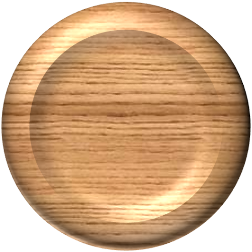
board Minimum size (702 x 548): a copy of your board to be shown in the settings. First do the whole design, then take a screenshot and scale to the right size.Of course, this can only be done by the developers in the simulator. If you "only" submit a design, we will do this step for you.

-
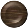
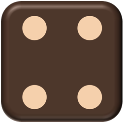
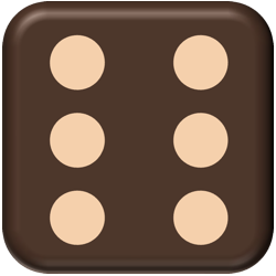
checker_lt & checker_dk : Minimum size 100 x 100. Checker for the light and dark color. The checkers can also be larger, for example 500x500. They will then be scaled down accordingly.
| checker_lt | checker_dk |
|---|---|
 |
 |
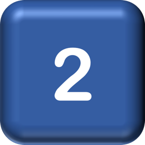
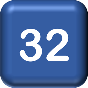
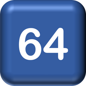
- cube1, cube2, cube4, cube8, cube16, cube32, cube64 (290 x 290): the representation of the doubling cube. Please note that unlike the real cube, a non-doubled cube shows "1" in the DG app, so you have to provide 7 images.
| cube1 | cube2 | cube4 | cube8 | cube16 | cube32 | cube64 |
|---|---|---|---|---|---|---|
 |
 |
 |
 |
 |
 |
 |
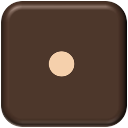
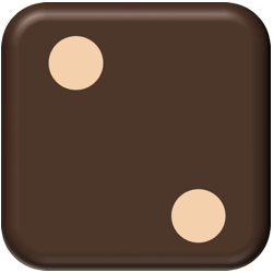
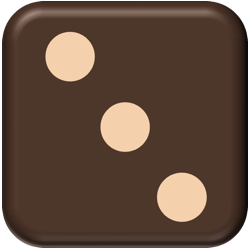
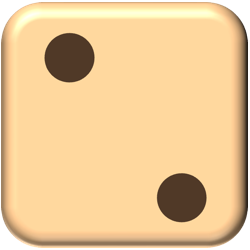
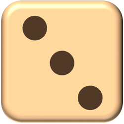
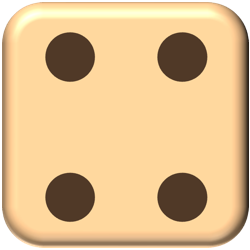
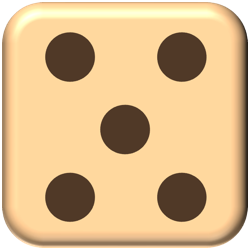
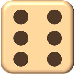
- die_b1, die_b2, die_b3, die_b4, die_b5, die_b6 (250 x 250): the dice of the dark color (the original board is blue/yellow)
| die_b1 | die_b2 | die_b3 | die_b4 | die_b5 | die_b6 |
|---|---|---|---|---|---|
 |
 |
 |
 |
 |
 |
- die_y1, die_y2, die_y3, die_y4, die_y5, die_y6 (250 x 250): same for the light color (from "yellow")
| die_y1 | die_y2 | die_y3 | die_y4 | die_y5 | die_y6 |
|---|---|---|---|---|---|
 |
 |
 |
 |
 |
 |
- off_dark, off_light (200 x 50): a checker that has been taken off the board that is stored in the tray on the right side - should visualize a vertical checker. Please ensure to add some space or shadow below the checker, or your vertical checkers will look like glued together.
| off_dark | off_light |
|---|---|
 |
 |
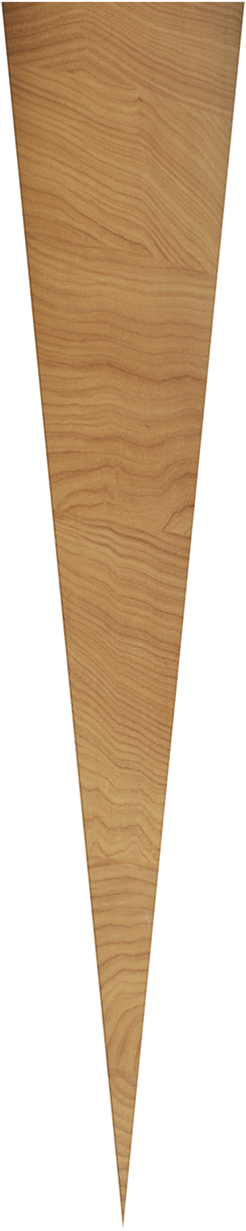
- point_dark, point_light Minimum size 100 x 500. A triangular dark point, facing down or up. Dark and light points should have different colors and are painted consecutively.We only need triangular facing down, we turning that in code.
| point_dark | point_light |
|---|---|
 |
 |
- tray_light: Size 53x269 - the background of the tray in which your checkers go during bearoff. Ideally uses a shadow that simulates light shining from top left corner into the tray.
Please ensure to only use public domain / CC0 or properly licensed textures for your images. DG has no page that shows names for textures with attribution licenses.
- ColorBarCentralStrip: the color of the thin vertical line that separates the left half of the board from the right one.
- ColorBoard: the color of the board. If you're using a background texture then only the two trays holding checkers that have been taken off are painted in this color. If you don't use a background image, this color is used to paint the board background. Usually slightly arker or brighter than the average color of the background.
- ColorEdge: the color of the area around the board. Usually slightly darker or brighter than the average color of background and fitting to ColorBoard
- ColorLabel1: label drawn around the name of the player playing the dark/blue checkers. Should be similar to the color of the checker_dk.
- ColorLabel2: same for the label drawn around the name of the player with the light/yellow checkers.
- ColorLabelText1: color of the name of the player with the dark checkers. Should be contrasting with ColorLabel1. ColorLabelText2: Same for the other player. Please note that the "upper player" is shown in a button, but as you can select which color to play with in the settings you still have to have good colors for both colors.
- ColorNumber: the color of the numbers of the points (1..24) shown above/below the points. Typically readable but not distracting.
- ColorTint: the color in which many texts of the app are painted, might be something that fits to the overall look and feel of the design.
Once you're done changing the images and colors, test your design in the simulator and use a pull request to get them into the DG code.
And for reference, here's a hand-written commented board with all images and colors.

Want to contribute to this Wiki?
Just do it