

videos are from the NativeScript Slides plugin. all features may not be implemented yet.
videos by Brad Martin
import { SlidesModule } from 'nativescript-ngx-slides';

import { AppComponent } from "./app.component";

@NgModule({
    declarations: [AppComponent],
    bootstrap: [AppComponent],
    imports: [NativeScriptModule, SlidesModule],
    schemas: [NO_ERRORS_SCHEMA]
})
export class AppModule { }<slides>
<slide class="slide-1">
<Label text="This is Panel 1"></Label>
</slide>
<slide class="slide-2">
<Label text="This is Panel 2"></Label>
</slide>
<slide class="slide-3">
<Label text="This is Panel 3"></Label>
</slide>
<slide class="slide-4">
<Label text="This is Panel 4"></Label>
</slide>
<slide class="slide-5">
<Label text="This is Panel 5"></Label>
</slide>
</slides>
.slide-1{
background-color: darkslateblue;
}
.slide-2{
background-color: darkcyan;
}
.slide-3{
background-color: darkgreen;
}
.slide-4{
background-color: darkgoldenrod;
}
.slide-5{
background-color: darkslategray;
}
Label{
text-align: center;
width: 100%;
font-size: 35;
margin-top: 35;
color: #fff;
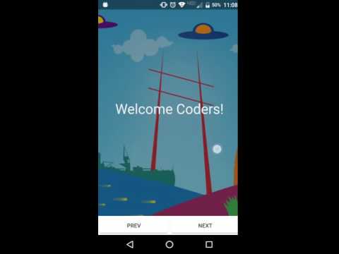
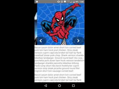
}Great for Intros/Tutorials to Image Carousels.
This very much a work in progress. Please feel free to contribute.
-
loop : boolean - If true will cause the slide to be an endless loop. The suggested use case would be for a Image Carousel or something of that nature.
-
pageIndicators : boolean - If true adds indicator dots to the bottom of your slides.
If the property pageIndicators is true you won't see the page indicators anymore as of 2.0.0 right away. there are two css classes exposed that you can setup however you like for active and inactive indicators. below is an example for semi translucent dots.
.slide-indicator-inactive{
    background-color: #fff;
    opacity : 0.4;
    width : 10;
    height : 10;
    margin-left : 2.5;
    margin-right : 2.5;
    margin-top : 0;
    border-radius : 5;
}

.slide-indicator-active{
    background-color: #fff;
    opacity : 0.9;
    width : 10;
    height : 10;
    margin-left : 2.5;
    margin-right : 2.5;
    margin-top : 0;
    border-radius : 5;
}- Clone repository to your machine.
- Run
npm run setupto prepare the demo project - Build with
npm run build - Run and deploy to your device or emulator with
npm run demo.androidornpm run demo.ios
- Does not work well inside of ScrollView or TabViews.
 |
 |
 |
 |
|---|---|---|---|
| Josh Sommer | dobjek | Eddy Verbruggen | Codeback Software |
for {N} version 2.0.0+