Draw transparent rounded rect ontop of icon when using windowHints, addressing issue Issue #183 #193
Conversation
|
@josh- I like this a lot, but in order to maintain configurability, do you think you could divorce this from the original background rounded rect? I'd like to keep the option for both. |
|
@jigish Yup, that sounds like an even better idea. Should I add a new Also, assuming someone configured Slate to draw the rounded rect behind the icon (as it is in the current shipping version) should a shadow/background be applied to the text? (Thinking of ways to improve readability). |
|
I would prefer that drawing in front simply became the default. I thought the last pull request that enabled the rectangles would draw in front of the icons but when it didn't I immediately set their alpha to transparent so that I wouldn't rip my eyes out. Thank you for fixing this! I think I made a 5 minute attempt and just gave up when I hit a roadblock. |
|
Hmmm just looked at the code and the only thing I think I might add a config option for is the rectangles being slightly smaller than the icon. Personally I think it looks awesome but I can see that some people may prefer it full size. Also I think it may change the sizing for people not using the icon as well. |
|
This should be merged at some time soon because it is amazing, even if it is not fully configurable. |
|
👍 |
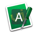
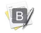
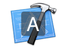
As noted by @slavick in #183, the window hints are currently quite difficult to read when drawn on lighter icons.
This change draws the transparent rounded rect infront of the icon, instead of behind it.
Some screenshots:
I'd like to get @trishume's thoughts on this too - since he was originally the one who implimented icons in window hints.
Also, some constants might need their name changed to reflect the updated position of the rounded rect.