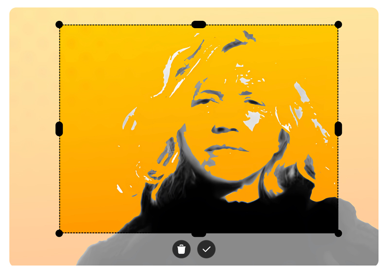
The ngx-smart-cropper component is an angular standalone component that allows users to upload, crop, and resize images with ease. It provides intuitive drag-and-resize functionality, grid overlays, and supports various aspect ratios and output formats.
- Upload and preview images.
- Intuitive drag-to-crop and resize handles.
- Emits cropped images as
base64data. - Responsive design and easy-to-integrate.
- Auto theme detection: Automatically detects the theme (light or dark) based on the image content.
npm install ngx-smart-cropper --save<input
type="file"
accept='image/*'
(change)="onFileChange($event)"
>
<ngx-smart-cropper
[imageType]="'jpeg'"
[cropX]="50"
[cropY]="50"
[cropWidth]="400"
[cropHeight]="300"
[theme]="'mixed'"
[imageSource]="imageSource"
(imageCroppedEvent)="imageCropped($event)"
></ngx-smart-cropper>
<img [src]="croppedImage"/>import { ImageCropperComponent } from 'ngx-smart-cropper';
@Component({
standalone: true,
imports: [ImageCropperComponent],
...
})
export class MyComponent {
croppedImage = '';
imageSource: string | null = null;
onFileChange(event: Event): void {
const input = event.target as HTMLInputElement;
if (!input.files || input.files.length === 0) return;
const file = input.files[0];
if (file) {
const reader = new FileReader();
reader.onload = (e: any) => {
this.imageSource = e.target.result;
};
reader.readAsDataURL(file);
}
}
imageCropped(event: any) {
this.croppedImage = event;
}
}| Input | Type | Default | Description |
|---|---|---|---|
cropX |
number |
50 |
Initial crop area x-coordinate. |
cropY |
number |
50 |
Initial crop area y-coordinate. |
cropWidth |
number |
150 |
Initial crop width. |
cropHeight |
number |
150 |
Initial crop height. |
imageType |
'png' | 'jpeg' | 'avif' | 'webp' |
'webp' |
File type for the cropped image. |
theme |
'light' | 'dark' | 'mixed' | 'auto' |
'auto' |
The theme property automatically adjusts the UI theme between light and dark modes based on the image content. When set to 'auto', it detects the proportion of white pixels in the image and switches to a dark theme if the image contains a high percentage of light pixels, ensuring optimal visibility and contrast. |
whitePixelThreshold |
number |
20 |
Threshold number for switching between dark and light mode when theme is set to auto. |
| Output | Type | Description |
|---|---|---|
imageCroppedEvent |
EventEmitter<string> |
Emits the cropped image data as a base64 string. |
MIT License. See LICENSE for details.
This project uses beautiful, customizable, and free Tabler Icons for its interface elements. Tabler Icons offer a wide range of icons with clean and modern designs, perfect for enhancing UI/UX in any application. Visit their website to explore more.
Feel free to open issues or contribute enhancements on GitHub.
