Soils are extremely valuable, but often not taken care of. Especially in cities, sealing the ground with impervious materials for housing, streets, and car parks, is very common. Soil sealing contributes to global warming, promotes water scarcity and flooding at the same time, and puts biodiversity at peril.
This map allows you to explore the average degrees of soil sealing in European cities. It is visible that, in general, the Nothern countries show a lower degree of soil sealing than Central European countries. The average degree of soil sealing across the cities in many European countries is higher than 50%.
Urban sprawl is a major issue even in the rural areas that I grew up in. Over the years new houses, and the associated shopping districts and parking lots, have been popping up everywhere - but old ones do not get broken down. I didn't have neighbours as a kid, but since then the suburbs have grown all around.
Initially, I was looking for data that would allow me to visualize the large extend of area that has been turned into living area over the past years, however the CORINE land use data was difficult to access. I decided that data wrangling was not the main point of this project for me, so I looked for already digested data.
I always wanted to create a map, since I find these visualizations often very attractive and insightful: Projecting information onto projections of the world.
Additionally, maps are one of the functionalities that d3 is especially powerful in, and I wanted to go for the meat of it ; )
After searching the site of the European Environment Agency for a fitting dataset, I found a set dedicated on soil sealing in European cities that had pre-processed data from the CORINE land survey easily accessible.
Searching those sites I had also discovered that the soil sealing relative to the countries' surface would be a number of usually below 4%, which would not have been interesting to visualize in the ways that I wanted to explore.
So I chose to use the data that went into generating this graph, but give it a different workover.
Datasets that compare a certain data value across different countries are often most intuitively displayed on a map. Being able to locate the different values geo-spatially allows us to anchor the information to reference points in the real world.
I chose to use a choropleth with a traffic-light scheme to allow a fast overview of the overall structure of cities in the given country. The colors code for the ordinal categories present in the original dataset - that is how many cities have at least 50% of their grounds sealed.
I chose to use two types of red for those countries above 50%, instead of different colors. This is because the dataset and my visualization is laid out to draw the decisive difference between above and below 50%. However, it is still interesting to get an understanding of which countries do have especially high rates of soil sealing in their cities, therefore I included also the darker shade of red for those with very high percentage values.
I sometimes find graphs and charts not completely straightforward to understand, yet I am all drawn-in by good data visualizations. Inspired also by this, I wanted to use images to display the ratios of soil sealing.
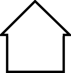
Icons carry a condensed meaning of what they represent and are easy for humans to process fast. By stacking the two different kinds of icons (house for sealed soil, and tree for un-sealed soil) to visualize the relationship between sealed and non-sealed grounds within a country's cities, I am hoping to give the user a more intuitive understanding of the situation and the possibility to compare between different countries.
I extracted the data from the .xlsx file provided on the website and exported it into .csv. After working with the data for a while, I realized that I didn't want to use the percentage of cities >= 50%. Some countries had many cities, others very few. It ranged from 1 to 106, so I decided to calculate the arithmetic mean (average) across all cities of each country instead.
Since the cities were not associated with distinct percentage values, but rather fell within one of four ordinal categories, I chose to assign the average percentage value of the range of a category to each city within.
For this I converted my file to .json for easier handling with python, did the necessary calculations in calculate_perc.py and updated the file with one column added.
I also had to rename the column headers, since they included whitespaces and some started with numbers.
Finally I was able to import and use my small dataset.
I worked on creating the logic to make the mosaic-visualization with the icons, which is basically a 100% stacked bar graph. My plan was to show them for each country separately in a modal window onclick.
Then I went to find geoJSON for creating my map of Europe.
A main task in the project was to fit the two different datasets together. E.g. the geoJSON dataset would list England, Scotland, Wales and Norther Ireland as separately addressable countries, but my soil sealing data was for the United Kingdom.
Additionally, there were some different namings and spellings present (e.g. "Walloon" <-> "Belgium", "Cz. Republic" <-> "Czech Republic", etc.).
In order to be able to combine the data, I had to either write programmatic logic or do data cleaning. As I also took this course as a chance to dive into learning JavaScript, I chose to deal with the issues in JS.
My first try on putting the working logic on gist can be viewed here: http://bl.ocks.org/martin-martin/3f8d02808e96dc1de24d
The initial visualization I posted consisted of a plain gray map with orange mouseover events for the countries present in the dataset. And a modal onclick with the tiled mosaic, and a title: http://martin-martin.github.io/sealed_cities_v1/
I gave the visualization out to scrutiny early on purpose, to maybe still take my project into a different direction.
However, I worked forward on it and I think by the time I received most of the responses, I already had some additional features implemented.
I morphed the map into a chloropleth, accounting for the different degrees of soil sealing, and added tooltip events that display the average % of soil sealed across the cites of one country, when hovering on the country.
The feedback I received was very useful and welcome. I introduced an info-box to describe succinctly what soil sealing is. Originally I had a link, but it seems it wasn't obviously findable. All in all I like the solution with the small infobox more.
I also added a button to show the map with all countries colored at the same time. This request came in twice, and it also makes sense. However, there is something about running with the mouse over the countries to get to only slowly and incrementally discover which country has which color and percentage amount, that I really liked. I found it to be very interactive, as it drew me to play around on my graphic repeatedly.
Therefore I didn't want to do away with this interactive feature and decided to add a button instead that would allow to toggle or display the colors.
Similarly, I decided not to implement the legend in the basic map. The chloropleth is a simple mapping of three arbitrarily selected ordinal values (<40%, 40-50%, >50%), that I color-coded in a traffic-light scheme. I have the feeling that this is rather straightforward to understand, and I felt that a legend would draw people away from interacting with the map.
There is a large extend of exploration that I would wish people would do with my visualization. Of course this is only possible within the limited scope that the data allows in the way I present it here.
However, there is a playful aspect to "chasing countries with the mouse" that I enjoyed myself quite a bit and thus wanted to keep in the final implementation.
This is also how I decided for the format to transmit the aspect of author-driven storytelliing that I included through adding the button. The button, called "Unseal Soil", displays all the colors of the countries together. At the same time, a sentence pops up declaring that human touch affects the environment, which is the big topic regarding soil sealing.
When moving the cursor now to one of the countries it displays the same behaviour as before, however when the mouse leaves, the country grays out. I woud wish this to be associated with soil sealing happening through human intervention.
Gradually, all the countries the user touches change to gray. Then they only display their colors, with the added information of the percentage sealed, on mouseover.
There is the wish to undo the color-loss, but going back does not put the country back into its original status. There is also a different push: the one to mouseover all of the countries after one of them has started to gray. I believe both speak in a subtle and emotional way about topics of environmentalism and purity, plus the way many humans are likely to deal with these things. This might not be noticed by many users, but for me it was quite clear and dear.
onclick, each country with associated data displays the previously mentioned 100% stacked bar graph as a mosaic of small images.
The opened modal box gives additional information about the selected country and the associated data:
- name of the country
- how many cities contributed to the dataset
- average soil sealing visualized in an icon-mosaic
- a legend explaining what the icons used stand for
I hope that this view gives a bit of a better intuitive understanding of how much is a certain percentage value in graspable units.
There's another opportunity for mouse-on-map exploring that I left in the final visualization:
Who can find the country with the lowest average percentage of soil sealing?
You can leave a comment if you do. ; )
Considering the additional feedback that rolled in after my first submission (on g+, Reviewer Feedback, and in-person), I've decided to do some major changes to the visualization.
Here's the initial updated version. I ended up realizing that the data was very badly represented in the graph, because it would cause confusion and even misinterpretation as to what does what mean.
Therefore I took a step back and tried to adapt the map to be more straightforward. I had already removed the button to display the color right on page load.
Next I reconsidered the tooltip, deciding to rather show absolut numbers instead of percentages here. The dataset contains too many means and percentage values altogether, so that it easily happens that the user could get confused as to what means what. I had the feeling that having an absolute value for a change would make it easier to grasp some aspect of the data.
For explanatory purposes, I also changed "Mouse-Over" to "Scroll over", which according to one feedback, felt more logical for a non-programmer. Finally I added an introductory text directly to the graphic, realizing that most people would never get to see the README file, but instead only the graphic. I added this text because most people I received feedback from had initially no idea what soil sealing is and why this is important. This text should give some context as to why it might be interesting for the user to consider the graph in the first place.
Regarding my personal additional small story, I've decided to reduce it to the fact, that when the user hovers on a country, it turns gray. With this I mean to symbolize the soil-sealing effect that human intervention has on the environment. But this is only a small personal visual treat, that does not necessarily need to be understood by the user in order to appreciate the visualization ; )
-
functionality working: http://bl.ocks.org/martin-martin/3f8d02808e96dc1de24d
-
first version for early feedback: http://martin-martin.github.io/sealed_cities_v1/
-
improvements, added color, infobox: http://martin-martin.github.io/sealed_cities_v2/
-
remove button, colors onload, legend http://martin-martin.github.io/sealed_cities_v3/
-
change tooltip, expand legend/colors, add info http://martin-martin.github.io/sealed_cities/
There are two main issues with the final visualization, that are there by choice, but might be problematic. Definitely they deserve to be mentioned:
-
Cyprus is part of the original dataset, however it is not visible on the Europe map that I chose to use.
-
The data has been pre-processed and I used it like a high-level library. Due to this, the percentage values are averaged twice (one time the average of a range is taken that a city is counted into - see above in Data Wrangling), and then the average over all these data points per country is used to arrive at the final value. There's quite some uncertainty about the validity of these values. First of all because I didn't proof them by referring back to the original dataset, and second because of the two steps of generalization through averaging that I take to come to the values I use.
One person suggested me to also display the mean and median value for the countries, to give a better sense of the distribution. I think that this is a valid point. I did, however, decide not to do this due to the already vague nature of the data that I am using. It is highly pre-processed and generalized data, therefore I rather leave out these values (that could only be similarly vague as the average) and commit to working with this single value. I am hoping that with this I also open the visualization to scrutiny, instead of giving it a undeserved look of high statistical integrity.
Instead, I took this project as an opportunity to tell a story with the data. And I do still hope that my data is somewhat sound and the story is not overly constructed, but instead comes from within the datasets I used. : )
DAND P6 | Data Visualization with D3.js | P6: Make Effective Data Visualization
Early feedback for final project under construction (includes little trees and houses ; )
martin-martin4d2
One big part of this Section of the ND is to get and incorporate feedback from others, so I decided to put this out in the current state.
It's not finished, but I'd be glad for feedback in this early stage.
There's a map, and there are individual 10x10 images squares that will represent each clickable country. And what? The percentage of soil sealing in European cities: https://gist.github.com/martin-martin/f7367d6de3701c2e21a7
: )
The idea is to display the map as the first and only thing on the page, and then pop-up modal boxes with the individual %-visualization regarding the cities of the clicked country.
Do say, compliment, criticize (especially this) - maybe it'll help me to develop the visualization into a better direction without getting too stuck with my image. I might also be stuck with it, just saying ; )
martin-martin4d2
... maybe too early. Didn't yet managed to make it work on gist/bl.ocks, so I draw my daring post back in... : )
stefan_1537033d
@martin-martin, have a look at https://pages.github.com/1 , Gists are better suited for 1-3 files, I think.
martin-martin1d
Thanks @stefan_153703, this was a good idea!
Here it comes: http://martin-martin.github.io/sealed_cities/
This is the first version where the functionality seems fine. I did not yet style it much, so it's an unpolished look. But I'm also up for style suggestions, although I have some ideas on how to do it.
I'm putting this out like this because I think that a big part of this project is to receive and iterate upon feedback that others give, so I'm excited to hear your thoughts! : )
Thanks!
stefan_1537037h
@martin-martin, Your visualization of the country details using symbols is making things clearer for me. I think it would be great to have a simple version of that in the overview map already, so that it is easier to compare countries. Choropleth?
martin-martin4h
Hei @stefan_153703!
How do you mean this? A legend for the three different colors I'm using on the start page?
e.g.
-----------------
(green)  <  40%
(orange) >= 40%
(red)    >= 50%
-----------------
Yeah, I think it's a chloropleth : ) At least that's what I think it is.
Or do you mean having the symbols somehow on the overview map?
stefan_1537033h
Sorry, I hadn't seen the last version. Just if you could see all country colors at once, for the big picture.
Martin Breuss9:15 AM
http://martin-martin.github.io/sealed_cities/
My P6 data visualization : D
I'll be gladly taking in your feedback, considering thoughtfully, and trying to implement what I like and manage to!
Thanks a lot. I like feedback ; )
Both getting and giving it.
Andrew Bauman10:12 AM+1
Wow, this is a really great visualization. Soil sealing is a hot topic in the Pacific Northwest (where I live). For me it would be useful to see the color code initially (see which countries are in green, yellow, or red state). currently you can only see that info on hover. To this end I might suggest adding showing the color code of the country along with a legend for the % sealed range encoded by each color.
Andrew Bauman10:15 AM
oh, I really like the grid on click, that 10 - 10 with each tile = to 1% is very informative.
Andrew Bauman10:17 AM+1
ah, one other thing, since values for each country represent the mean of several cites, consider giving the viewer the following information. Min, max, mean, median (mean you already have). This would allow the audience to get an idea of the distribution of the data.
Jenny Lu12:09 PM+1
Your visualization is really great! My only comment is that I have no idea what soil sealing is so maybe if you were to add a little blurb somewhere explaining what it is and why it's important?
Martin Breuss12:29 PM
Yay! Thanks +Andrew Bauman and +Jenny Lu ! Good points you put! : D
I like a bit the discovery of running over the map with the mouse - but I'll try to add a button so one can switch on the map color for all countries at the same time by choice. Distribution is actually quite crucial, that's true. Because it actually makes quite a difference sometimes and my visualization doesn't show this at all.
And sure I'll try putting a little info blob somewhere : ) There's a link up-right, but I'll get the info right inside!
Thanks you two! : )
Martin Breuss12:51 PM
By the way discovery: Who can find the country with the lowest average soil sealing ; )
Andrew BaumanMar 22, 2016
There is a link to soil sealing in the visualization. The information in the link explains it well. If people aren't able to notice the link (I saw it right away), it might be worth emphasizing it or including a short blurb.
Andrew BaumanMar 22, 2016
+Martin Breuss Sweden?
Martin BreussMar 22, 2016
+Andrew Bauman Nope. : )
btw: The newest version just went live. With a bunch of new features ; )
Eron LloydMar 22, 2016
Nice work! I'm a bit confused on the purpose of the alternative mouseovers, though, and my advice would be to be clear on the units of measure, and include the country name in the hover tool tip.
Andrew BaumanYesterday 9:46 PM
I like the unseal map feature, though I wish the map would remain unsealed as I mouse over (mousing over re-seals). What is the country with the lowest average soil sealing? I see Sweden with 33%, that seems to be the lowest, what am I missing?
Martin BreussYesterday 9:57 PM
Hei +Eron Lloyd and +Andrew Bauman ! You both mean that the mouseovers should always do the same, I believe. The re-sealing is supposed to be a story about human impact on soil (= the human-mouse-hand touches, the soil seals, country gets gray). But I see that this story is not really working out ; ) I'll work over it and think of something different! Thanks for the feedback.
Eron, what do you mean with "to be clear on the units of measure"?
Martin BreussYesterday 9:57 PM
+Andrew Bauman : It's a very small one hidden in the sea ; )
Martin BreussYesterday 10:03 PM
Also, I forgot to mention about the previous feedback (I mentioned it in the readme, but you obviously didn't see...) : I had decided not to implement a legend for the colors, because I felt it rather straightforward and I somehow had this wish to make people scroll along with the mouse across the map, so I wanted to keep away everything that might prevent them from doing so. (But my mouseovers went weird and it seems it's not working so well)
And I still think that the min, max, median would be good to have - however my original dataset is actually very preprocessed and the data is pretty polished already. I worked with means of ordinal categories (%-ranges), and then taking the means over all the values of the already-averaged cities... So I kind of decided not to be putting too many statistical values in there, because it feels unfair to pretend that it's a number-wise very precise map.
However, instead I'll be working on trying to make this shortcoming more clear on the visualization.
Eron Lloyd9:15 AM+1
By unit I mean what % are you illustrating? The data set indicates that it is "the proportion of cities per country that falls in a particular class regarding the degree of average soil sealing," so perhaps making that clear would help readers.
Hello @channel ! : ) I’ve finished the functionality (= raw version) of my data visualization, and wanted to ask for your feedback.
I decided to give it out early, because I think a big part of this project is to receive and iterate upon feedback!
So I’m looking forward to what you have to say. http://martin-martin.github.io/sealed_cities/
Thanks! : )
cms_6813 [1:40 PM]
@martin-martin: I like the elegance of your vis so far. While looking around it a bit gives a sense of what the colors mean, a key would help - and I'm sure you're working on it. Maybe you could design the key so that when you click on a color in it, the countries in that category are highlighted on the map.
martin-martin [1:45 PM]
Hei @cms_6813 ! Thanks for you reply : ) I’m thinking about doing some kind of legend for the colors - your idea of highlighting the same-colored ones sounds interesting too. I might be lonely in this, but I actually like the fact that it’s all gray and you discover which is which only by mouseover… : )
[1:45] I was thinking of adding a button to optionally switch on all the colors on the map.
cms_6813 [1:56 PM]
I would say it depends on your goals for what the audience should get out of it. I look forward to seeing the next iteration!
martin-martin [2:25 PM]
: ) I’ve actually already been working on it forward since I posted here! Mouseover and some styling wasn’t available initially ; )
The relevant bits regarding the design of the visualization.
The selected finding is clearly communicated. Design choices foster communication between the reader and the visualization.
The chart clearly shows the message. It's definitely meeting specifications as I was able to understanding the story the chart was showing. It's a great looking chart with a very interesting finding.
My critique of the visualization won't be a surprise to you because you talked about them in the README file. You've consciously made some decisions that are a little different than typical chloropleth visualizations, but you're aware that you've made those different decisions. For example:
- I would prefer that when the visualization loads, the countries already had their colors. Then I would see the trend right away.
- I thought that when clicking unseal map, then hovering over a country and the color went to gray was a mistake. I look at the visualization before the README file, so after the README I realized that was done purposefully
- In general, a visualization will have a legend for color
- the popup visualization is aesthetically very cool. But it doesn't really give me new information. An example of new information would've been a bar chart showing the soil sealing for each city in the country. Or a chart showing city population versus city % soil sealing. On the visualization itself, it wasn't stated how average was calculated. You're aware of the pitfalls of calculating the average of the percentages because you mentioned them in the README file. But also somebody seeing the visualization should be made aware of how average was being calculated.
- Keep in mind who the audience is for the visualization. Some people will have certain expectations about a map like this and could end up being confused by some of the design choices. It really depends on who the audience is and what the audience is expecting.
If the secret is that Malta has 25% soil sealing, then I found it. I wasn't sure if that was it.
The visualization includes interaction or animation. The interaction or animation may be simple, such as a hover, tooltip, or transition. Interaction or animation enhance understanding of the data.
The hovering with the tooltips is definitely helpful for understanding the data set.
The pop up, while from a technical stand point is really cool, doesn't really add extra information for the reader.
This feedback came from a person who is not associated with anything programming- or data-science related, so it was an interesting way to double check my current version of the project.
The feedback was very interesting. It wasn't clear what soil sealing is about. The infobox was discovered and read, but it took a while. Also, it was unclear that it contains a link that can lead to a more in-depth explanation. The question was asked, what are the impacts of soil sealing - in order to get a better understanding of why this might be important to oneself in the first place.
Then, the person could discover a clear trend on the chloropleth. "the scandinavian countries are more green than the ones in central europe", however when trying to dive deeper into the visualization, only more and more confusions came up.
It was unclear:
- what do the colors actually represent (the "% of cities per country with at least half their soil sealed" is not really easily understandable)
- and what does the data in the modal pop-up box mean?
Regarding the second one, it was expected to see such a visualization, however for each individual city, not the average across all cities.
The data used for the visualization contains too many averages over averages that make it end up being quite confusing and difficult to grasp.
One response was, that initially it felt very straightforward, however when trying to properly understand what is what and what does it mean, it got complicated.
This, I believe, is a result of me trying to explain the data correctly, but having chosen to process it in this way "average of average of ordinal category" makes it very difficult to explain it to someone concisely and understandably.
A feature request would have been to see the development through time, however this I cannot construct from the dataset that I have, since it is a snapshot of 2012.
One final comment was that the term "Mouse-Over" might not be understandable ("Scroll-Over" was instead suggested), and I understood that this is much more a term used within the programming community, but might be confusing for someone who hasn't programmed with JavaScript.
All in all this feedback made me realize a lot of fundamental shortcomings of my visualization, that I am not yet quite sure how I would be able to address or even them out.
It taught me to consider also the dataset more thoroughly before choosing it. Because if I would have the actual per-city-data, I could easily create the per-city-view that would be interesting and that is expected when opening the modal box.
If general audience would be my aim, I'd certainly need to get my hands on rawer data, so that I could do certain kinds of munging by myself, already considering the explainability of what I was doing to the data.
Having only the ordinal categories that I average over, created a confusing set of thought steps that are counter-intuitive and therefore difficult to follow for a viewer.
What I find rather interesting in this is, that even though the graphic looks quite straightforward and seemingly visually communicates something clearly - I am having big troubles to describe the esence of the dataset and eventually the visualization to the audience concisely.
This might be due to a lack of statistical practice and my own understanding of what can be done with the data, and it might also be partly the reason of choosing a pre-processed dataset that complicates matters.
- soil sealing data (cities): http://www.eea.europa.eu/data-and-maps/figures/degree-of-mean-soil-sealing
- geoJSON: http://grokbase.com/t/gg/d3-js/1372gq18j9/geojson-maps
- soil sealing data general (ancestor dataset): http://www.eea.europa.eu/data-and-maps/figures/degree-of-soil-sealing-as
- little house: http://www.clipartbest.com/cliparts/dTr/zby/dTrzbyLT9.png
- little tree: http://www.micnatur.pt/img/tree.svg
- tutorial: http://alignedleft.com/tutorials/d3
- csv: https://github.com/mbostock/d3/wiki/CSV
- linking csv: https://discussions.udacity.com/t/linking-csv-with-d3-js/160222
- getting data: https://leanpub.com/D3-Tips-and-Tricks/read#leanpub-auto-getting-the-data
- parsing data: http://learnjsdata.com/read_data.html
- joins: https://bost.ocks.org/mike/join/
- data in DOM: https://www.dashingd3js.com/using-data-bound-to-dom-elements
- binding data: https://bost.ocks.org/mike/circles/
- bar chart: https://bost.ocks.org/mike/bar/
- range: https://github.com/mbostock/d3/wiki/Arrays#d3_range
- http://stackoverflow.com/questions/18991680/d3-trigger-mouseover-event
- http://www.d3noob.org/2013/01/adding-tooltips-to-d3js-graph.html
- legend: http://zeroviscosity.com/d3-js-step-by-step/step-3-adding-a-legend
- flexbox chart: http://blog.scottlogic.com/2015/02/02/svg-layout-flexbox.html
- color legend: http://d3-legend.susielu.com/#color-examples
- JavaScript Basics: https://www.udacity.com/course/viewer#!/c-ud804/l-1946788554/m-2550568535
- Intro to jQuery: https://www.udacity.com/course/viewer#!/c-ud245/l-3314378535/m-3316638682
- Object-Oriented JavaScript: https://www.udacity.com/course/viewer#!/c-ud015/l-2593668697/m-3479768789
- modal 1: https://discussions.udacity.com/t/ways-to-get-a-clean-slate-with-js/160826
- modal 2: http://www.w3schools.com/howto/howto_css_modals.asp
- JS scopes: https://discussions.udacity.com/t/populating-a-div-inside-a-nested-function-call/160956/2
- Shark Attack: http://jchernov.com/post/46445834470/man-bites-shark
- http://www.datavizcatalogue.com/methods/stacked_bar_graph.html
- using color: http://www.perceptualedge.com/articles/visual_business_intelligence/rules_for_using_color.pdf
- misleading statistics: https://medium.com/i-data/misleading-with-statistics-c63780efa928#.j9u4nu4e0