This on-screen-keyboard mirrors the keys that the user presses on their physical keyboard. I made this after being inspired by u/zhengc's keyboard made with Adobe Illustrator. The original post can be viewed here.
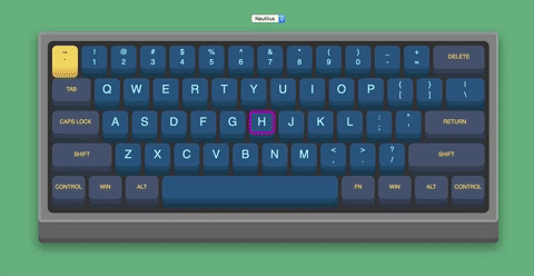
To use the keyboard, simply begin pressing keys on your keyboard. You will see the keys become pressed in on the virtual keyboard. Keys can be held down, or pressed briefly. When the keyboard detects that you have pressed down on a key, it adds the pressed class to that specific key. Once your finger has lifted from the key, the pressed class is then removed.

Keys can also be pressed by clicking on each one with a mouse. This achieves the same effect as pressing that key on the keyboard. When the mouse is hovered over a key on the virtual keyboard, a colored outline shows up on the edges of the key to let users know which key is about to be pressed.
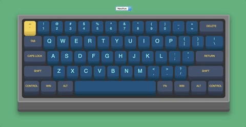
In addition to key highlighting, this keyboard offers users the ability to change between the different color schemes included. To do this, simply click the select box located above the keyboard, and choose the option that best suits you. Each option represents the name of that specific color scheme.
Just as this keyboard comes with default themes, you can create your own very easily. To add a new color scheme, open up the colors.css file and navigate to the bottom. Every color theme has 9 main components that need editing. use the following guide to make your own color theme. Please watch syntax carefully, the class names need to follow a specific format and are case sensitive!
- Choose a name for your theme. This will be used for every class associated with the theme.
- Make a class with the name of your theme completely lower case such as
default. This class is what changes the background color of the page.
.default {
   background-color: #A9DDF3;
}- Make a class to modify the colors of the keyboard's casing. The
background-colorrepresents the color of the inner casing. The next modification required is thebox-shadowproperty. Do not change the values of the margins, only the color associated with each shadow. the first shadow color represents the outline of the keyboard, the second is the large layer second from the bottom. Finally, the last color is the bottom layer of the keyboard case. The syntax for this class name isname of theme+Case.
.defaultCase {
   background-color: #ccc;
   box-shadow: 0px 0px 0px 5px #fff, 0px 35px 0px 5px #B3B3B3, 0px 45px 0px 5px #999999;
}- Make a class to set the
borderof each key for when the:hoverpsuedo class is applied. The syntax is the same as the following three classes, with:hoveron the very end. Instead of styling each one individually like below, this will apply to all three to improve consistency. Pick a color that has high constrast with the colors you intend to use.
.default1:hover, .default2:hover, .default3:hover {
   border: 3px solid #00ff00;
}- Make a class to set the first color associated with this theme. It's naming syntax is
name of theme+number of color(there are only 3, but feel free to add more.) Thebackground-coloris the color that the top of the key will be. The key has 2box-shadow's. Respectively, they are the color of the middle and bottom rows for each key. Finally, thecolorproperty represents the color of the font for the legends on the key.
.default1 {
   color: #fff;
   background-color: #666666;
   box-shadow: 0px 10px 0px 0px #4D4D4D, 0px 20px 0px 0px #444444;
}- Repeat step 5 for the 2nd and 3rd colors. The naming syntax should be the same as the first one, just with a
2or3instead of a1at the end of the class name. - Make a class to represent what a pressed key looks like. It's naming syntax is
pressed+name of theme (with first letter capitalized)+number of color,name of theme+number of color+:active. Each property represents the same things as the previous class, except these values have a smaller box-shadow. The colors should be the exact same!
.pressedDefault1, .default1:active {
   margin-top:10px;
   box-shadow: 0px 5px 0px 0px #4D4D4D, 0px 10px 0px 0px #444444;
}- Repeat step 7 for the 2nd and 3rd colors. The naming syntax should be the same as the first one, just with a
2or3instead of a1at the end of the class name. - The final step to complete the custom color scheme is to add the theme option to the
<select>box inindex.html. Add a new<option>with its contents beingname of theme (with first letter capitalized). It also needs avalueattribute that matches the name exactly. Then close the<option>and the color theme will be added!
<select>
   <!--Add your new option below all the existing themes-->
   <option value="Default">Default</option>
</select>