-
Notifications
You must be signed in to change notification settings - Fork 25.6k
New issue
Have a question about this project? Sign up for a free GitHub account to open an issue and contact its maintainers and the community.
By clicking “Sign up for GitHub”, you agree to our terms of service and privacy statement. We’ll occasionally send you account related emails.
Already on GitHub? Sign in to your account
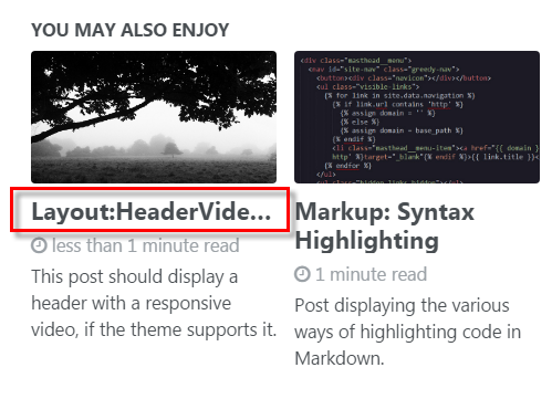
Items in "You may also enjoy section overlap" $x-large #1213
Comments
|
I think this is pretty rare... having a string of your length without any spaces. That's what is breaking the layout. The better option would be to apply some CSS that truncates it with https://software.intel.com/en-us/html5/hub/blogs/ellipse-my-text/ |
kkunapuli
pushed a commit
to kkunapuli/kkunapuli.github.io
that referenced
this issue
May 30, 2019
kkunapuli
pushed a commit
to kkunapuli/kkunapuli.github.io
that referenced
this issue
May 30, 2019
sumeetmondal
pushed a commit
to sumeetmondal/sumeetmondal.github.io
that referenced
this issue
Sep 10, 2019
sumeetmondal
pushed a commit
to sumeetmondal/sumeetmondal.github.io
that referenced
this issue
Sep 10, 2019
makaroniame
added a commit
to makaroniame/makaroniame-old.github.io
that referenced
this issue
May 18, 2022
makaroniame
added a commit
to makaroniame/makaroniame-old.github.io
that referenced
this issue
May 18, 2022
jchwenger
pushed a commit
to jchwenger/jchwenger.github.io
that referenced
this issue
May 5, 2023
jchwenger
pushed a commit
to jchwenger/jchwenger.github.io
that referenced
this issue
May 5, 2023
Sign up for free
to join this conversation on GitHub.
Already have an account?
Sign in to comment

I think possible solution would be to increase $x-large breakpoint.
My proposal is to change it from 1280px to 1680px.
The text was updated successfully, but these errors were encountered: