A simple use case for implementing a full customized theme on Android with Jetpack Compose instead of using the traditional MaterialTheme that follow Google Design Material.
This repository demonstrates how to configure and use custome themes in Jetpack Compose, the modern toolkit for building native Android UI. By following the examples in this repository, you'll learn how to create custom themes, switch between light and dark themes, and apply the theme that you customized to your composable functions.
The repository covers the following theme configuration topics in Jetpack Compose:
-
Creating a custom theme : Learn how to create a full customized theme with your own color palette properties, typography, shapes, and the most important the dimensions which the default MaterialTheme DOESN'T contains at all.
-
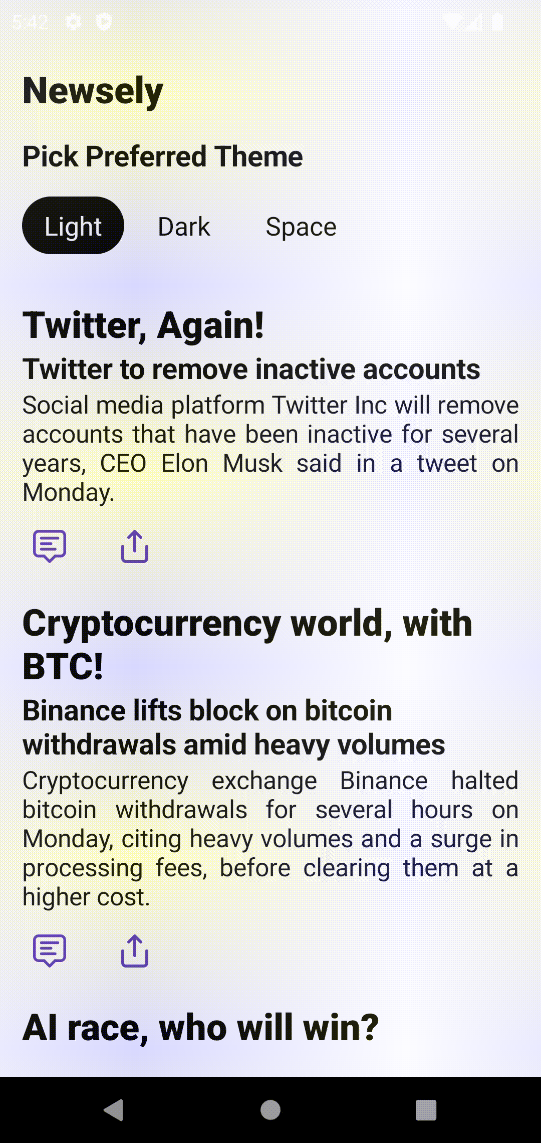
Support for Multiple theme mode : Discover how to support mulitple theme modes that fit with your application design without being limited for just Light & Dakr modes, and also how to switch between them DYNAMICALLY based on the user's preference or by providing an in-app toggle for picking the theme.
-
Applying themes to composables : Understand how to apply your custom theme to composable functions and ensure a consistent look and feel throughout your app. PLEASE NOTE that you should build your own basic composables like texts and buttons and checkbox by wrapping the default composables inside your composables because the default one uses the MaterialTheme internally by default and your theme will not be fully applied unfortunatelly.
The repository contains a sample Android app with examples for each of the features mentioned above. Explore the code to see how the different theme configurations are implemented and applied. To run the sample app, open the project in Android Studio, and click the "Run" button. The app will be installed on your connected device or emulator, and you can interact with the various theme configuration examples.
This project is licensed under the MIT License, so feel free to do what you want with it and enjoy.