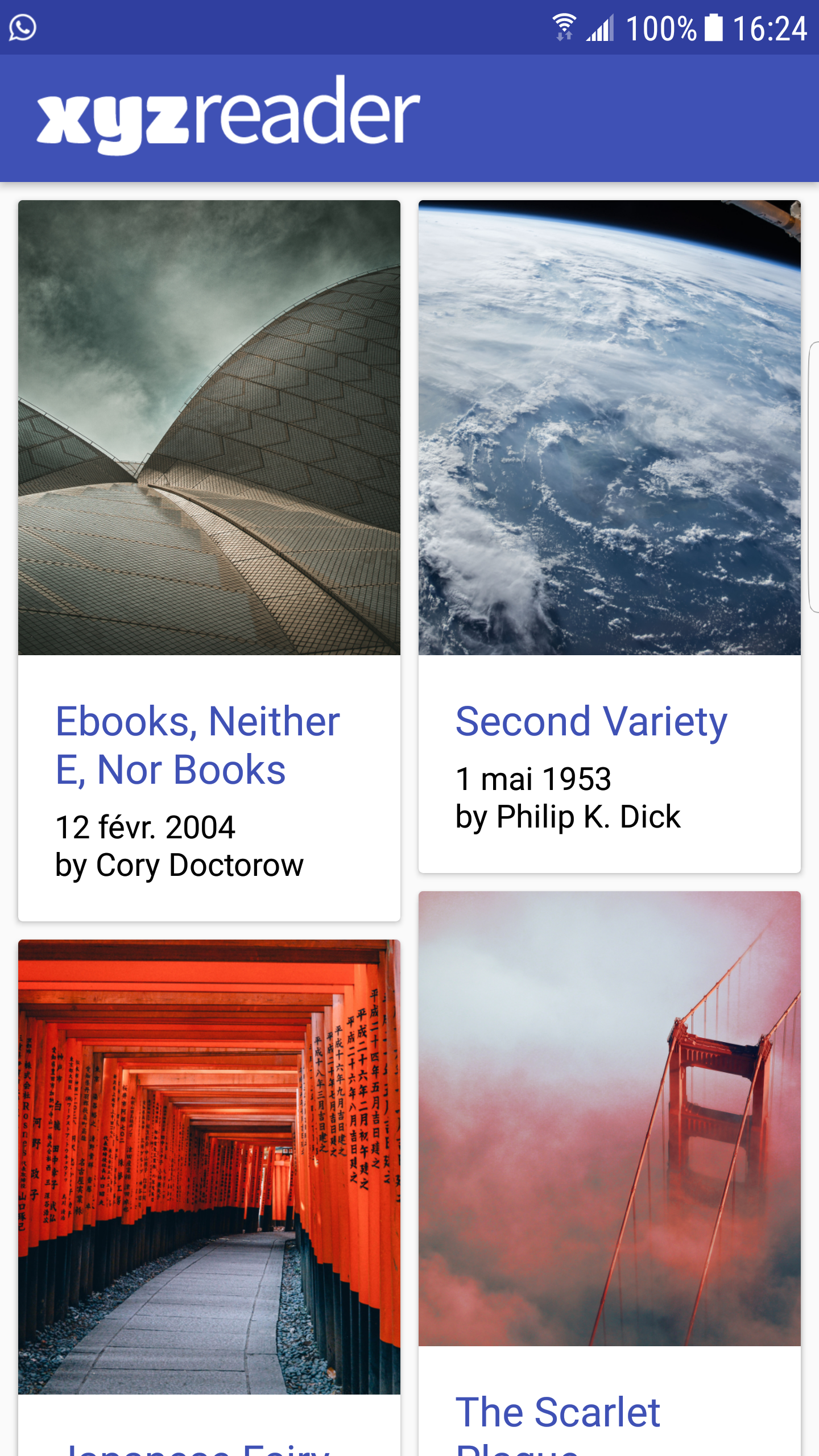
In this project, you will redesign an app to follow the Material Design guidelines and translate a set of static design mocks to a living and breathing app. Why this Project?
This project gives you an opportunity to improve an app’s design, a vital skill for building apps users will love. It also replicates a common developer task of updating and changing an app’s design as new standards are released. What Will I Learn?
Understand the fundamentals of Android design.
Apply Material Design guidelines to an mobile application.
Separate an interface into surfaces.
Effectively use transitions and motion.


App uses the Design Support library and its provided widget types (FloatingActionButton, AppBarLayout, SnackBar, etc).
App uses CoordinatorLayout for the main Activity.
App theme extends from AppCompat.
App uses an AppBar and associated Toolbars.
App provides a Floating Action Button for the most common action(s).
App properly specifies elevations for app bars, FABs, and other elements specified in the Material Design specification.
App has a consistent color theme defined in styles.xml. Color theme does not impact usability of the app.
App provides sufficient space between text and surrounding elements.
App uses images that are high quality, specific, and full bleed.
App uses fonts that are either the Android defaults, are complementary, and aren't otherwise distracting.
App conforms to common standards found in the Android Nanodegree General Project Guidelines.