Parallel Categories (parcats) trace type for multi dimensional categorical data #2963
Conversation
This was a relic of an older attempt to display a tooltip per color for the hover node.
It worked, but was pretty unwieldy.
Renamed shape categories to `linear` and `hspline` and made `linear` the default.
Added colorscale mock
(property isn't wired up properly yet)
More consistent with other traces, and now it's possible to display
only probabilities, only counts, both, none (with hover effects),
or skip (not hover effects).
There are three arrangement modes:
 - `perpendicular` (default): categories only drag vertically,
    dimension labels drag horizontally.
 - `freeform`: category labels can drag vertically and horizontally
    (in which case they pull the dimension along with them). Here
    dragging a category can reorder the categories and dimensions.
 - `fixed`: dragging of dimensions and categories is disabled.
Not working yet, just a checkpoint
Mocks updated, but not tests yet.
to the control font of dimension labels and category labels respectively
Makes the hoverlabel shifting logic more noticeable and shows off
the `counts` attribute
Now there are tests for 'freeform', 'perpendicular', and 'fixed'
arrangements for dragging the dimension label and category rectangle.
|
@jonmmease this is looking great! Aside from the comments above (all minor and straightforward, I think) the only thing I'd like to see is a mock that puts two |
This combines the former colorbar and font mocks. And adds a parcats
trace with a Latex category label as well.
|
Thanks @alexcjohnson! I really appreciate your time on this. In 4117612 I merged the font and colorbar mocks into I also took the opportunity to throw in a
Let me know if anything else comes to mind! |

|
Fantastic grid mock @jonmmease! Good idea to include pseudo-html. And I'm glad that it just worked ™️ 🎉 Having multiple traces also shows off that the default coloring behavior, which I hadn't noticed before, is to pull from the trace color sequence - hence the orange and green coloration when you don't specify a color. Is that really what we want, or would it be better to use |
|
That's a good point and I don't have a strong preference. The grey felt like a pretty boring default and I thought our default blue was a nicer starting point. I also liked that the default colors could be specified in a template with the In any case, if you have a preference for a different default I'm happy to make a change 🙂 |
|
Random last-minute thought: is "parcats" a more easily-grokked/commonly-used name than something like "alluvial diagram" ? I would maybe consider renaming this trace :) |
|
From my reading "alluvial diagram" is most often used interchangeably with sankey diagram. For example Wikipedia and datavizproject both define it to be essentially equivalent to our sankey diagram. |
|
OK. |
That makes sense, why don't we just use Looking at the examples you showed in the head of this PR, they include a feature we don't, which is categorical coloring based on the first dimension. Not needed for this PR though - I'll make another new issue. |
|
Sounds good. I'll do that tonight. What would be the best way to get at colorway from inside supplyDefaults? |
|
|
Alright, I just pushed the |
|
Beautiful! Yeah, to my eye a consistent blue (when that's the head of the colorway) is definitely better. Dunno if @etpinard wanted to take a last look at this, but from my side it's ready to go! 💃 |
|
I apologise if this might have been discussed before, but on
and most baselines, why isn't the parcats trace centered? |
|
The domain in most of the mocks is set to |
Wow. I totally missed that when 👁️ the mock JSONs. My bad. Let's merge this thing. |
Continuation of jonmmease#1, now against
masterin the plotly.js repo.I believe I addressed all of the outstanding code comments brought up in the old PR. Below is the original post, and my last few comments on the implementation.
@alexcjohnson @etpinard @monfera @chriddyp @jackparmer
Introduction
This PR is a proposal and an implementation of a new trace type for the interactive exploration of multi-dimensional categorical data sets. My working name for the trace is "Parallel Categories" or
parcatsfor short.The concept of this trace has been discussed previously in the following plotly.js issues:
parcoordsandsankey#2229I also briefly showed a prototype of this diagram to @chriddyp over screenshare several months ago.
Related work
The closest prior art to the Parallel Categories Diagram is the Parallel Sets Diagram by Robert Kosara and Caroline Ziemkiewicz.
Parallel Sets implementations / descriptions
Here are a collection of existing implementations / descriptions of the Parallel Sets Diagram
Parallel Sets Java Program
https://eagereyes.org/parallel-sets
This is a stand-alone Java program by Kosara that implements a Parallel Sets Diagram
Parallel Sets from the DataViz catalog
https://datavizcatalogue.com/methods/parallel_sets.html
D3 implementation of Parallel Sets
https://www.jasondavies.com/parallel-sets/
What's different about the Parallel Categories Diagram?
The primary difference between this Parallel Categories Diagram (parcats from here on) and the Parallel Sets Diagram (parsets from each on) is that the parcats diagram supports a more flexible path coloring scheme.
In all of the examples of parsets diagrams that I have found, the colors of the paths correspond to states in the left-most (or top-most) dimension. In contrast, for the parcats diagram, color may correspond to a column in the dataset that may or may not be present as a dimensions in the diagram.
This, admittedly modest, extension has several advantages. Path colors may be set using a numeric array and a color map just like many other plotly.js trace types (scatter, parcoords, etc.). This makes it possible to use the parcats diagram combined with other traces in brushing/crossfiltering configurations.
Dragging and Brushing example
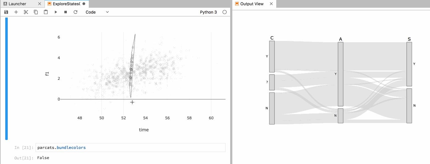
Here is an example of visualizing a 5-dimensional data set with two continuous dimensions and 3 categorical dimensions. This is accomplished by displaying the two continuous dimensions in a 2D scatter plot and the 3 categorical dimensions using the parcats diagram.
I created this example using a branch of plotly.py version 3 built against this branch of plotly.js.
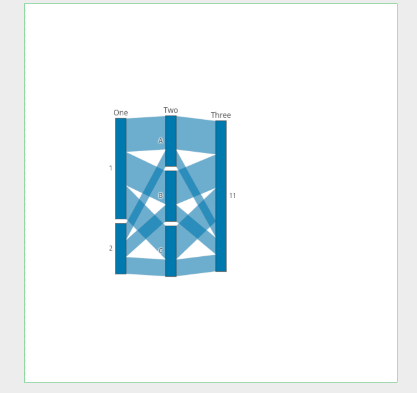
First I show the drag interactions supported by the diagram. Categories (the rectangles) and dimensions labels (dimensions are the columns of rectangles) can be dragged to reorder categories and dimensions. Upon release, the diagram animates to a relaxed state with equal spacing between dimensions and categories.
Selection events in the scatter plot are use to update the colors of both the selected points in the scatter plot, and the corresponding paths in the parcats diagram. Similarly, click events on categories and paths in the parcats diagram are used to update the colors in both diagrams.
As far as I'm aware, this is the only visualization of multi-dimensional categorical data that supports this kind of two-way data brushing. And, combined with plotly.py version 3, it is certainly the only visualization of this type that would be easily accessible to Python users.
Color bundling
There are two modes for how the colors of paths are arranged.
In the example above, color is not considered when sorting the paths. This is desirable in a brushing scenario so that the paths remain stable as the colors change during interactions. This behavior is specified by setting the
bundlecolorsproperty tofalse.Setting the
bundlecolorsproperty totruecauses paths with like colors to be bundled together as they pass through each category. This results in a cleaner looking diagram and is preferable in cases where the positions of paths do not need to remain stable as colors change.For example:
Mocks
Several simple mocks have been added as a part of the current test suite.
parcats_basicparcats_bundledparcats_unbundledAPI notes
I tried to model the API as closely as possible after existing trace conventions. There is a top-level
dimensionsproperty withlabelandvaluessub-properties just as with theparcatstrace. Path colors/colorscales are specified under adimension.markerparent property.Alternative approach
In the issues cited at the beginning of this PR there was some discussion on the possibility of adding categorical support to the existing Parallel Coordinates Diagram. This diagram was already well under development for our internal needs at the time of these discussions, so I did not pursue this approach.
TODO
Some items that I know still need to be done
Request for comments
So the top-level question for the plotly.js team is, are you all interested in having this diagram be part of plotly.js? It's not the most common use-case, but I think it would be another differentiating feature for the plotly ecosystem.
If you all are interested, I have internal funding to put a bunch more time into this through September. And if we can get it merged in during that time, I can continue helping out with basic maintenance after that.
Let me know what you think!
I just added a mock that demonstrates the
colorhovermode (parcats_hovermode_color).The basic idea here is that when you hover on a category, only the paths of a single color are highlighted. What's really useful about this is that the tooltip can then display the absolute probability of the paths of that color that pass through a given category. You can also display the conditional probabilities (Probability of blue given category A, probability of category A given blue).
Does
hovermodeof being an enumeration ofnone,category, orcolorseem like a reasonable way to specify this?@alexcjohnson
Regarding dragging, I went ahead and added a
sankeystylearrangementproperty to control the dragging behavior. There are three modes (names taken fromsankey.arrangement)perpendicular(now the default): categories only drag vertically,dimension labels drag horizontally.
freeform: category labels can drag vertically and horizontally(in which case they pull the dimension along with them). Here
dragging a category can reorder the categories and dimensions.
fixed: dragging of dimensions and categories is disabled.@alexcjohnson
I took a look back through the multi-label hover logic, and added a new
'dimension'hover mode to show it off. This hover mode will display a label for each category in the current dimension (Seeparcats_hovermode_dimensionmock).If you notice the hover label on
B, you can see how the label is pushed downward to keep it from overlapping with the label forC. It might be nice in some cases to also push labels upward to avoid collisions, but at the moment this only pushes things down.Now that there are multiple hovermodes and configurable hoverinfo I do like this mode as an option.
Font support added for dimension labels (
labelfont) and category labels (categorylabelfont).labelfontmatches the corresponding property name inparcoords.