A local school has decided to put together a flashcard application, Flashcard-o-matic, to help their students study online. Teachers will use this application to create decks of flashcards for the subjects they teach, and students will study the decks. The school needs you to build the application that the students and teachers will use.
<!---->1:1
Bootstrap 4 is included with the starter HTML. You're welcome to use vanilla CSS or Bootstrap 4 for styling your project. However, your finished product does not have to match the styles in the provided screenshots, as you will not be assessed on the styling or responsiveness of your project.
This project is designed to test your ability to work with rendering and state management using React. Before taking on this module, you should be comfortable with the following:
- Installing packages via NPM
- Running tests from the command line
- Writing React function components
- Creating routes, including nested routes, using React Router
- Using hooks like
useState(),useParams(), anduseHistory() - Debugging React code through console output and using the VS Code debugger
Follow the instructions below to get this project up and running on your own machine:
- Download the Qualified assessment files to your computer.
- Run
npm installto install the project.
Note: Work on this project locally, because Qualified's online IDE and Web Preview features don't work properly for this assessment.
To run the tests, you can run the following command:
npm test
Most of the tests in this project wait for content to load via the API before continuing the test. Before the implementation is complete, the content never loads so the test fails with a timeout. As a result, the tests will initially run slowly. It may take perhaps a minute or more for all the tests run. The tests will speed up as the implementation nears completion.
You can run the application using the following command.
npm start
The start command will start two servers concurrently:
- An API server, powered by json-server, running on
http://localhost:5000 - A React application running on
http://localhost:3000
To stop the servers from running, you can press Control+C.
If you are having problems running npm start on Windows, you may need to run the React client and server in separate terminals. Open a terminal and run npm run start:react to start the react application. Open another terminal and run npm run start:server to run the server.
You are tasked with building a number of different screens for the users of the flashcard app, as summarized below:
| Screen | Path | Description |
|---|---|---|
| Home | / |
Shows a list of decks with options to create, study, view, or delete a deck |
| Study | /decks/:deckId/study |
Allows the user to study the cards from a specified deck |
| Create Deck | /decks/new |
Allows the user to create a new deck |
| Deck | /decks/:deckId |
Shows all of the information about a specified deck with options to edit or add cards to the deck, navigate to the study screen, or delete the deck |
| Edit Deck | /decks/:deckId/edit |
Allows the user to modify information on an existing deck |
| Add Card | /decks/:deckId/cards/new |
Allows the user to add a new card to an existing deck |
| Edit Card | /decks/:deckId/cards/:cardId/edit |
Allows the user to modify information on an existing card |
All of the screens above will work on two common datasets. The datasets are related, and at times, you will need to work with both datasets to get the screens to work properly.
While working on these screens, you have both the tests and the screenshots below to act as a guide. You can create the screens in any order and are encouraged to organize your code using the grouping-by-route technique you learned earlier.
While working on this project, you should:
- Use well-named variables.
- Build small, single-responsibility components and functions.
- Display a "Not found" message if the user visits a URL that does not exist.
- Edit only files inside of the
public/src/directory.
While working on this project, you should not:
- Change the names of the API functions.
- Edit any of the files outside of the
public/src/directory. - Change the location of any of the existing files.
If you feel as though one of your solutions is working, but something isn't showing up right on the site or in the tests, reach out for help.
There are two datasets that are a part of this project: decks and cards.
You can view all the data inside of the data/db.json file. Each data set can be accessed via a named property in this file. The following is a partial listing of the data in data/db.json:
{
  "decks": [
    {
      "id": 1,
      "name": "...",
      "description": "..."
    }
  ],
  "cards": [
    {
      "id": 1,
      "front": "...",
      "back": "...",
      "deckId": 1
    }
  ]
}
Each Deck is an object with the following shape:
{
  "id": 1,
  "name": "Rendering in React",
  "description": "React's component structure allows for quickly building a complex web application that relies on DOM manipulation. "
}
A Deck represents a collection of flashcards, or simply cards.
Each card is an object with the following shape:
{
  "id": 1,
  "front": "Differentiate between Real DOM and Virtual DOM.",
  "back": "Virtual DOM updates are faster but do not directly update the HTML",
  "deckId": 1
}
Each card represents a flashcard with a front , where the question is displayed, and a back, where the answer can be found. A card also contains the deckId, which matches the card to the deck that the card belongs to.
There are several utility functions exported from src/utils/api/index.js that allow you to perform create, read, update, and delete operations with the API server. You will need to select and use the appropriate functions in your React components.
Note that the updateDeck(), readDeck(), and listDecks() functions call the API server using URLs that include a query string of _embed=cards. The results of the API calls for these functions will contain both the deck and the cards associated with the deck, so you won't have to make additional API calls to load the cards for each deck when you use these functions.
Please read the documentation in the file for more information.
You are tasked with creating the following screens that work with the above datasets.
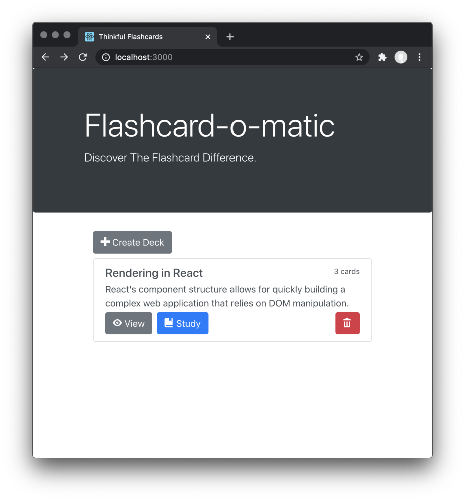
The Home screen is the first page the user sees. It is displayed at /.
1:1
The Home screen has the following features:
- The path to this screen should be
/. - A Create Deck button is shown, and clicking it brings the user to the Create Deck screen.
- Existing decks are each shown with the deck name, the number of cards, and a Study, View, and Delete button.
- Clicking the Study button brings the user to the Study screen.
- Clicking the View button brings the user to the Deck screen.
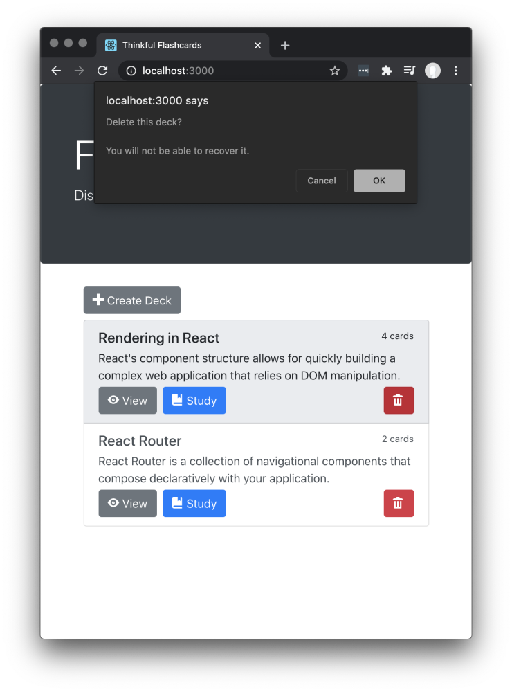
- Clicking the Delete button shows a warning message before deleting the deck.
When the user clicks the Delete button, a warning message is shown and the user can click OK or Cancel. If the user clicks OK, the deck is deleted and the deleted deck is no longer visible on the Home screen.
You can use window.confirm() to create the modal dialog shown in the screenshot below.
<!---->1:1
The Study screen is displayed at /decks/:deckId/study.
1:1
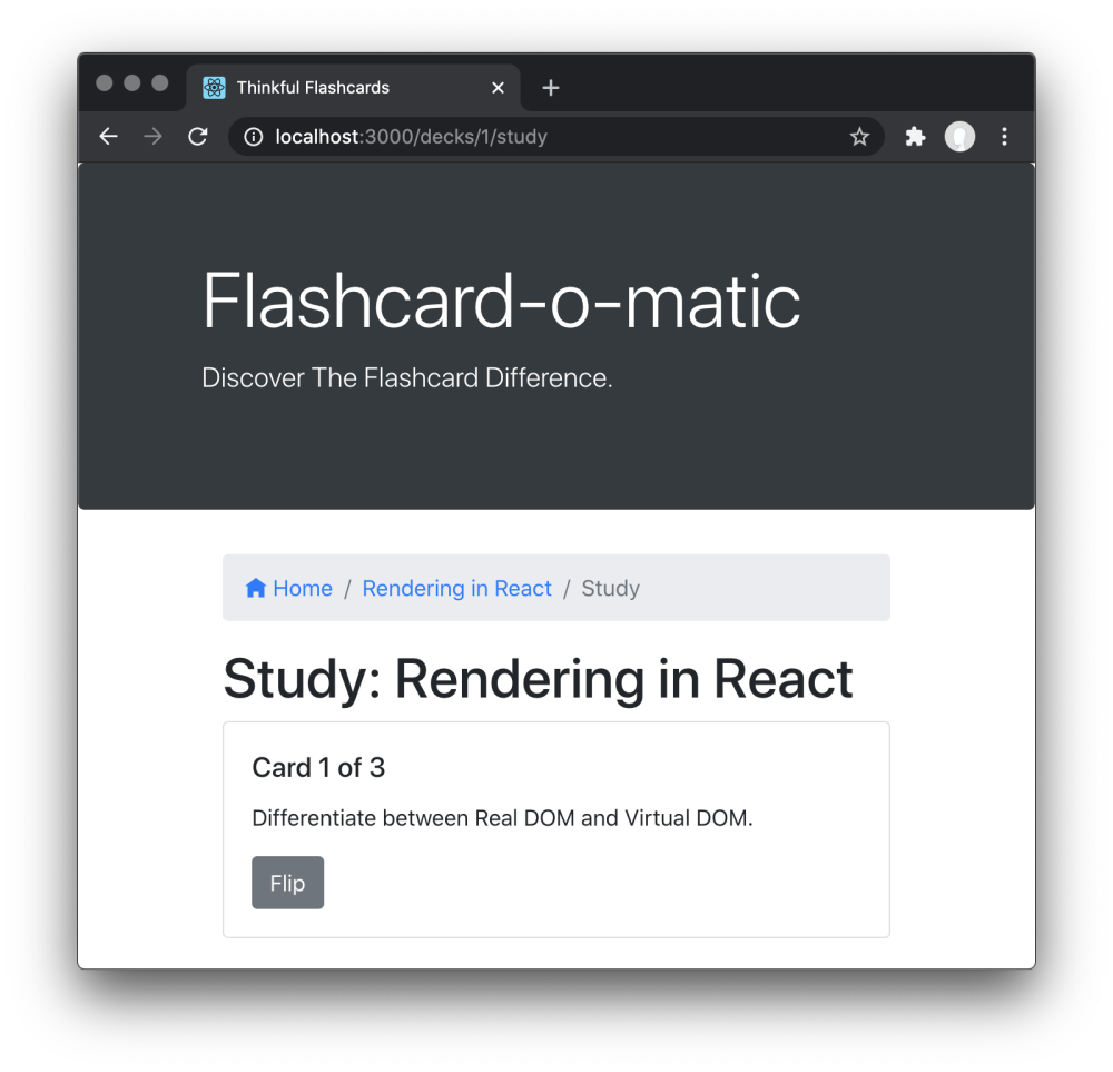
The Study screen has the following features:
- The path to this screen should include the deckId (i.e.,
/decks/:deckId/study). - You must use the
readDeck()function fromsrc/utils/api/index.jsto load the deck that is being studied. - There is a breadcrumb navigation bar with links to home
/, followed by the name of the deck being studied, and finally the textStudy(e.g.,Home/Rendering In React/Study). - The deck title (i.e., "Study: Rendering in React" ) is shown on the screen.
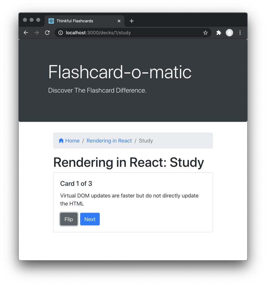
- Cards are shown one at a time, front-side first.
- A button at the bottom of each card "flips" it to the other side.
- After flipping the card, the screen shows a Next button (see the Next button section below) to continue to the next card.
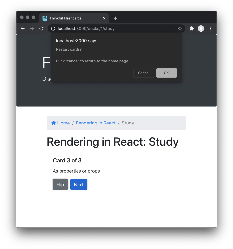
- After the final card in the deck has been shown, a message (see the Restart prompt section below) is shown offering the user the opportunity to restart the deck.
- If the user does not restart the deck, they should return to the home screen.
- Studying a deck with two or fewer cards should display a "Not enough cards" message (see the "Not enough cards" section below) and a button to add cards to the deck.
The Next button appears after the card is flipped.
<!---->1:1
When all cards are finished, a message is shown and the user is offered the opportunity to restart the deck. If the user does not restart the deck, they return to the home screen.
You can use window.confirm() to create the modal dialog shown in the screenshot below.
<!---->1:1
Studying a Deck with two or fewer cards should display a "Not enough cards" message and a button to add cards to the deck.
<!---->1:1
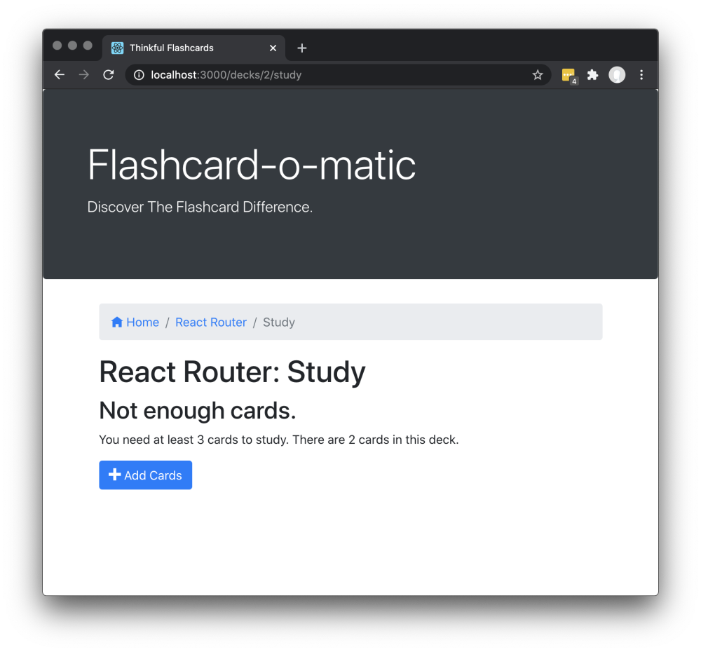
Clicking the Add Cards button should take the user to the Add Card screen.
The Home screen has a Create Deck button that brings the user to the Create Deck screen.
<!---->1:1
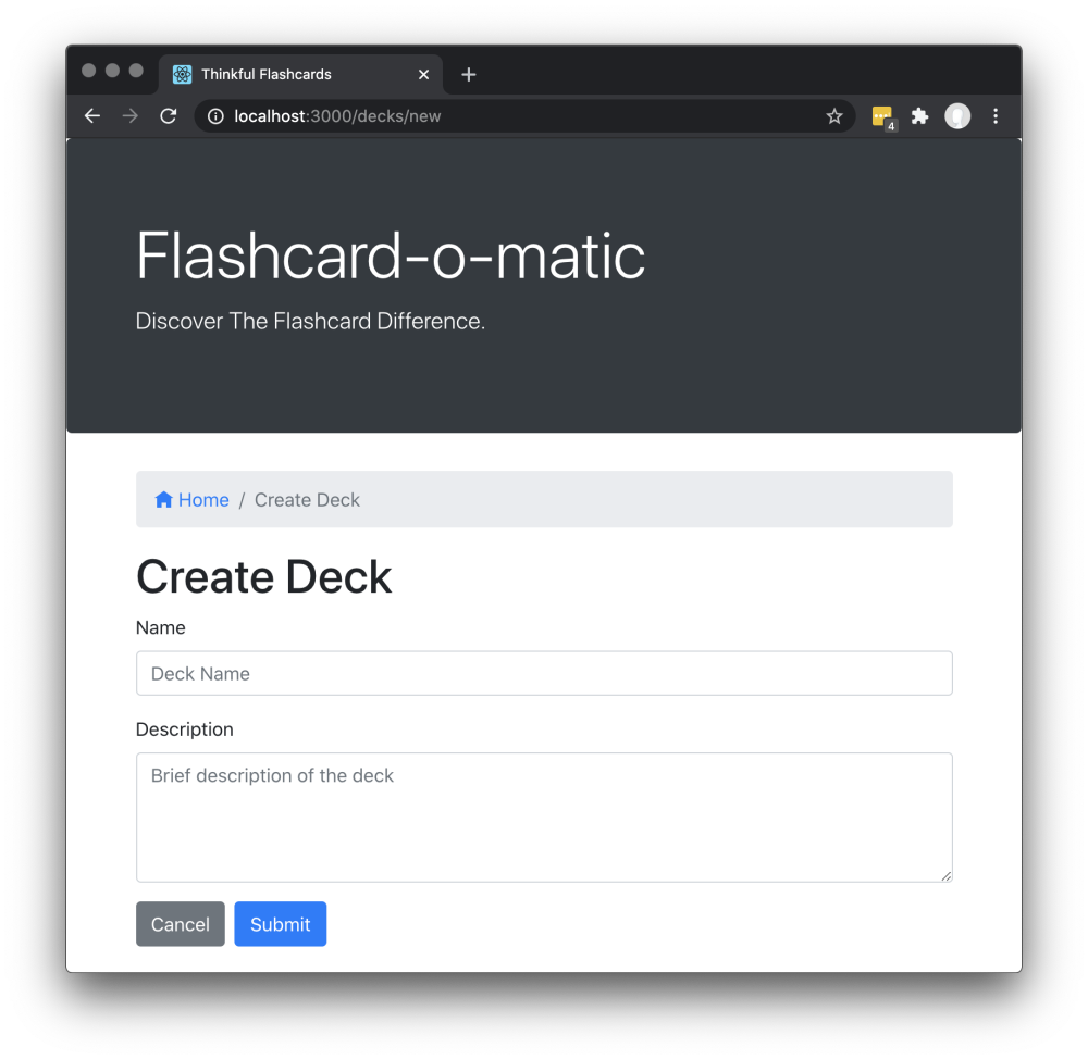
The Create Deck screen has the following features:
- The path to this screen should be
/decks/new. - There is a breadcrumb navigation bar with a link to home
/followed by the textCreate Deck(i.e.,Home/Create Deck). - A form is shown with the appropriate fields for creating a new deck.
- The
namefield is an<input>field of typetext. - The
descriptionfield is a<textarea>field that can be multiple lines of text.
- The
- If the user clicks Submit, the user is taken to the Deck screen.
- If the user clicks Cancel, the user is taken to the Home screen.
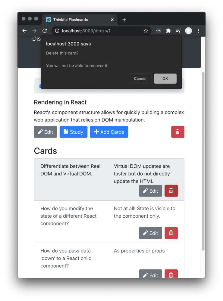
The Deck screen displays all of the information about a deck.
<!---->1:1
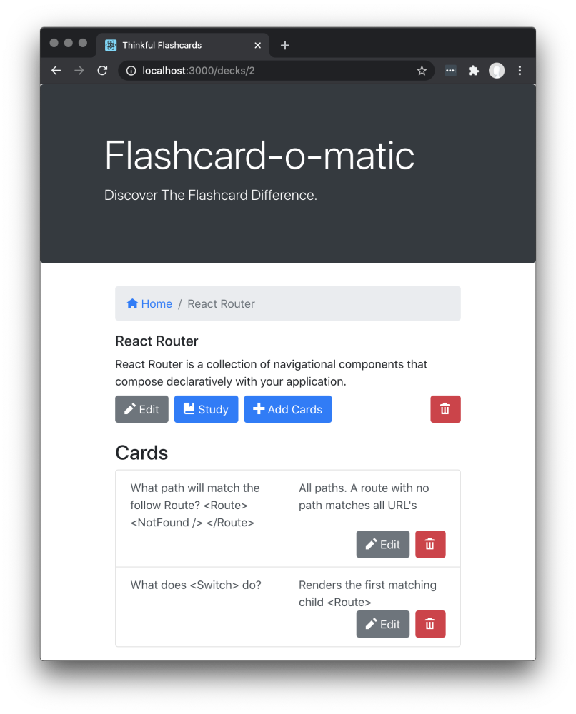
The Deck screen has the following features:
- The path to this screen should include the deckId (i.e.,
/decks/:deckId). - You must use the
readDeck()function fromsrc/utils/api/index.jsto load the existing deck. - There is a breadcrumb navigation bar with a link to home
/followed by the name of the deck (e.g.,Home/React Router). - The screen includes the deck name (e.g., "React Router") and deck description (e.g., "React Router is a collection of navigational components that compose declaratively in your application").
The screen includes Edit, Study, Add Cards, and Delete buttons. Each button takes the user to a different destination, as follows:
| Button Clicked | Destination |
| -------------- | ---------------------------------------------------------------------------------------------- |
| Edit | Edit Deck Screen |
| Study | Study screen |
| Add Cards | Add Card screen |
| Delete | Shows a warning message before deleting the deck]( See the "Delete Card Prompt" section below) |Each card in the deck:
- Is listed on the page under the "Cards" heading.
- Shows a question and the answer to the question.
- Has an Edit button that takes the user to the Edit Card screen when clicked.
- Has a Delete button that allows that card to be deleted.
When the user clicks the Delete button associated with a card, a warning message is shown and the user can click OK or Cancel. If the user clicks OK, the card is deleted.
You can use window.confirm() to create the modal dialog shown in the screenshot below.
<!---->1:1
The Edit Deck screen allows the user to modify information on an existing deck.
<!---->1:1
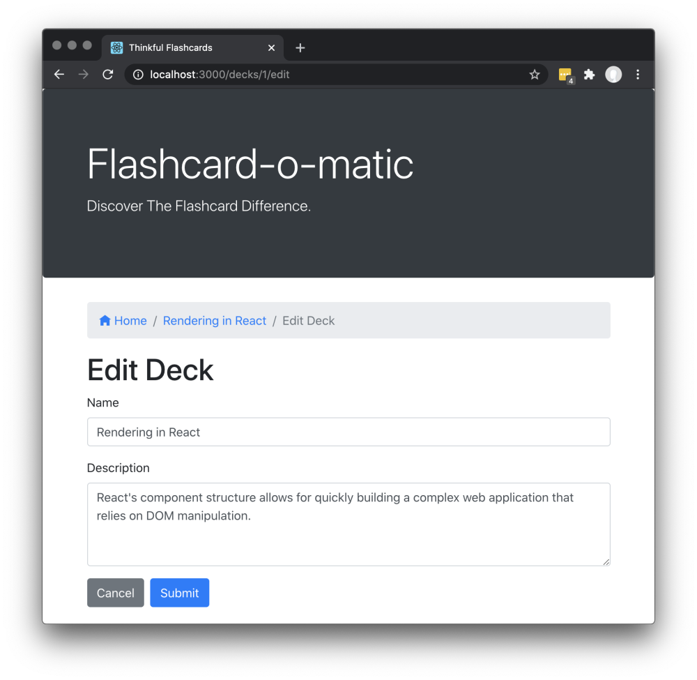
The Edit Deck screen has the following features:
- The path to this screen should include the deckId (i.e.,
/decks/:deckId/edit). - You must use the
readDeck()function fromsrc/utils/api/index.jsto load the existing deck. - There is a breadcrumb navigation bar with a link to home
/, followed by the name of the deck being edited, and finally the textEdit Deck(e.g.,Home/Rendering in React/Edit Deck). - It displays the same form as the Create Deck screen, except it is prefilled with information for the existing deck.
- The user can edit and update the form.
- If the user clicks Cancel, the user is taken to the Deck screen.
The Add Card screen allows the user to add a new card to an existing deck.
<!---->1:1
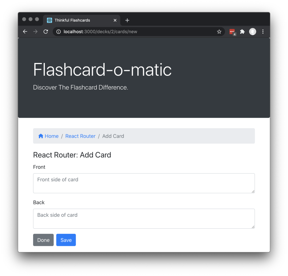
The Add Card screen has the following features:
- The path to this screen should include the deckId (i.e.,
/decks/:deckId/cards/new). - You must use the
readDeck()function fromsrc/utils/api/index.jsto load the deck that you're adding the card to. - There is a breadcrumb navigation bar with a link to home
/, followed by the name of the deck to which the cards are being added, and finally the textAdd Card(e.g.,Home/React Router/Add Card). - The screen displays the React Router: Add Card deck title.
- A form is shown with the "front" and "back" fields for a new card. Both fields use a
<textarea>tag that can accommodate multiple lines of text. - If the user clicks Save, a new card is created and associated with the relevant deck. Then the form is cleared and the process for adding a card is restarted.
- If the user clicks Done, the user is taken to the Deck screen.
The Edit Card screen allows the user to modify information on an existing card.
<!---->1:1
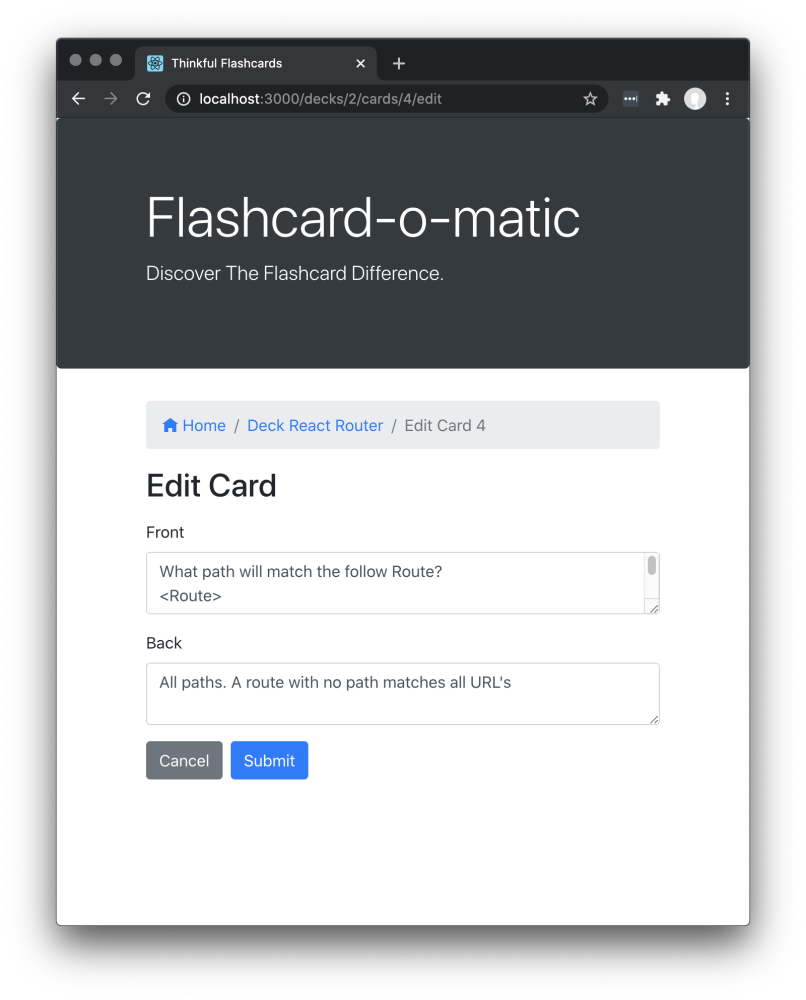
The Edit Card screen has the following features:
- The path to this screen should include the deckId and the cardId (i.e.,
/decks/:deckId/cards/:cardId/edit). - You must use the
readDeck()function fromsrc/utils/api/index.jsto load the deck that contains the card to be edited. Additionally, you must use thereadCard()function fromsrc/utils/api/index.jsto load the card that you want to edit. - There is a breadcrumb navigation bar with a link to home
/, followed by the name of the deck of which the edited card is a member, and finally the textEdit Card :cardId(e.g.,Home/Deck React Router/Edit Card 4). - It displays the same form as the Add Card screen, except it is prefilled with information for the existing card. It can be edited and updated.
- If the user clicks on either Save or Cancel, the user is taken to the Deck screen.
Note: In addition to needing to pass the tests and requirements in the instructions here, please review the Rubric Requirements for the human-graded part of this project in your Thinkful curriculum page.